

1.1 The 5 A DAY campaign
One health intervention aimed at families is the ‘5 A DAY’ campaign which encourages everyone in a family to eat five portions of fruits and vegetables a day. Since the 5 A DAY campaign started, the government has been gathering statistics about the consumption of fruit and vegetables.
The chart below illustrates the percentage of men, women and children who achieve 5 A DAY; the information is gathered from feedback given on one day each year from 2001 to 2011.
There now follows an activity which gives you the opportunity to think about how to read the information contained in a chart effectively, alongside learning about the percentage of people in the UK who achieved 5 A DAY. The activity centres around the chart below in Figure 1.
Effective study: reading a bar chart
The chart in Figure 1 shows data collected in England from 2001 to 2011. It contains three main types of information:
- the percentage of a population sample achieving 5 A DAY
- the year of data collection
- the population categories of men, women and children.
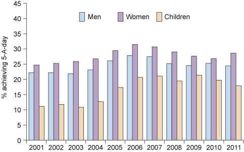
The label of the graph provides the additional information that the figures are based on one 24 hour period (i.e. one particular day).
When reading a chart such as a bar chart or pie chart, it is important to notice how the different elements are labelled. Here, the vertical axis shows the percentage ‘achieving 5 A DAY’. The height of each bar therefore represents a percentage achieving five portions of fruit and vegetables a day. For each year from 2001 to 2011 (arranged along the horizontal axis), figures are given for men, women and children. The blue bar represents men, the purple bar represents women, and the yellow bar represents children. The title of the chart is also key to its interpretation.
Between 2001 and 2006, the percentage of men, women and children achieving 5 A DAY increased overall, but after 2006 the figures began to fall. Each year shows separate columns for men, women and children, so they can be tracked separately. You can tell, for example, that in 2001 about 22% of men and 25% of women achieved 5 A DAY and for children the figure was about 11%. Now try this activity which is based on the chart, Figure 1.
Activity 1: Exploring how many people achieved 5 A DAY
a.
The percentage increased from 11% to 22%
b.
The percentage increased from 25% to 29%
c.
The percentage stayed the same
d.
The percentage decreased from 30% to 17%
The correct answer is a.
a.
women
b.
men
c.
children
d.
all groups performed the same
The correct answer is a.
Question 3
Can you think of one limitation of the information provided in the chart – in other words, is there a question you can think of that it does not answer?
Question 4
Discussion
You may have thought about how the information given in the chart cannot answer the question of why the trend is rising and falling in this manner. You were told in the introduction to the chart that the figures were collected after the 5 A DAY campaign started, so the increase could be due to the success of this campaign. This does not explain why the figures began to fall later on. You might also have wondered whether the same people were sampled each time, or whether they were different on each occasion.