

1.2 Interpreting a pie chart
Now, have a go at interpreting a pie chart. The chart below shows how, in 2012, consumer spending on different types of food and drink for the household was spread between a range of different food types. If the whole ‘pie’ represents all the spending on food and drink, the segments show the portion of spending on each food type. Again, the figures are percentages. You can assume that the figures represent an ‘average consumer’.
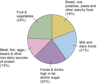
Activity 2: Spending on different types of food
a.
Fruit and vegetables
b.
Milk and dairy foods
c.
Meat, fish, eggs, beans and other non-dairy sources of protein
d.
Foods and drinks high in fat and/or sugar
The correct answer is a.
a.
Meat, fish, eggs, beans and other non-dairy sources of protein
b.
Milk and dairy foods
c.
Bread, rice, potatoes, pasta and other starchy food
d.
Foods and drinks high in fat and/or sugar
The correct answer is a.
Question 3
As in Activity 1, can you think of a limitation about the information given in this pie-chart?
Discussion
A limitation of this pie chart is that the expenditure does not give a guide to the amounts of food bought or eaten. It also does not account for meals eaten in restaurants.
Graphs and charts provide a lot of information, but any results need to be interpreted with caution. When you read a chart or a graph, you want to know where the information has come from, so that you can make judgements about how seriously you should take the figures. As the charts in this section are based on government statistics you would expect them to have been compiled in a reasonably thorough way. If, however, a graph claims to show information about family life in the UK, and it was compiled from a survey of ten families in Scotland, you might be less confident of it indicating a general picture of the UK population. To be representative it would need to be a much bigger sample and include people from all over the UK.
Social norms around food shopping, cooking and eating are important in setting the scene for children’s learning of appropriate eating behaviour. But have changes in families had an effect on eating and health (and, if so, what)? We will go on to consider this question in the next section.