
3 Combining words and pictures
So what happens when we put words and pictures together? Illustrations can often be an integral part of literary texts for children and can convey important aspects of the meaning of the text. In some instances, the use of illustration is mostly decorative, but in others it can be a key element of the narrative itself. In fact, literature for children is a field in which the potential of the mixture of words and images is exploited to the full.
One important role of images in a children’s text may be to echo or reinforce the story as conveyed in words. Alternatively, the image may add something more substantial in terms of detail or atmosphere. It may even suggest additional storylines, subplots or a backstory. However, the relationship between word and image may be even more complex and even contradictory. Figure 4 below shows a double-page spread that occurs early on in the book The Tale of Peter Rabbit (1902) by Beatrix Potter. The next activity asks you to think about the ways in which these words and images relate to each other.
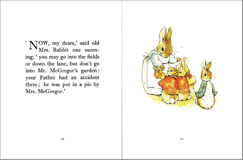
We know from the words on the left that Mrs Rabbit is issuing instructions and a kindly but stark warning to her children. The image on the facing page, however, alerts us to the fact that, as in all the best stories, things are unlikely to be straightforward, and something will go wrong. Mrs Rabbit is fully focused on her children, who are, in turn, attentive to her words – at least, three of them are. Peter has his back to his mother and is clearly not listening. His coat is a different colour from that of the others – another clue that he is different, in attitude as well as gender. He seems impatient to leave (and his eye direction leads us to turn the page ourselves). Potter is, therefore, providing visual clues for the reader that foreshadow Peter’s disobedience and its almost fatal consequences. This unspoken tension – between the image of the rebellious child hero on one hand and the words which emphasise the parental voice requiring obedience on the other – may be an important part of the thrill for a young reader.
Activity 3
Look at this series of images from children’s books. As you browse through the slide show, consider the following:
- What role is the image playing in the story?
- How fundamental is the image to the story? (Would the story stand alone without the pictures?)
- What kind of audience were the images designed for?
- What can you tell about the historical era in which the book was produced, judging by the images?
Discussion
- The images play a variety of different roles. In some cases, they are purely decorative, as in the case of Walter Crane’s front cover design for Little Red Riding Hood. Some illustrations enhance the text, but the words could stand alone – the example from Alice in Wonderland is a case in point. Others add a significant dimension to the words. The cover illustration of The Best Bat in the School is a good example of this. It depicts a schoolgirl batting energetically in a cricket match; not only is it clearly designed to appeal to female readers, but it also makes a statement about girls being heroic, strong and sporty. In many cases, the visual aspect is fundamental to the text – in the Asterix the Gaul comic book, for example. This image also combines words and graphic techniques – for example, large bold letters for shouting – as a narrative technique. There are other examples of this; for example, the string of words used as a dog lead in Charlie and Lola: We Honestly Can Look After Your Dog .
- In some of the examples for younger children, the visual and material aspects of book design are completely fundamental to the reading of the story – The Very Hungry Caterpillar is a well-known example of this, where a small child’s fingers become the caterpillar. On the In the Night Garden web page, interactive circles of colour are used to guide the reader’s pathway through the story.
- We can infer quite a lot about the type of audience these books are intended for, simply from the way they look. Images aimed at younger children tend to have bright colours and bold lines. It is interesting to note the contrast in the use of colour between Inquisitive Peter and other Funny Tales and the Walter Crane Red Riding Hood. The latter’s sophisticated colours and detailed drawing seem to be aimed at the purchasing adult, while the bright colours and humorous images of the former seem designed to entice the child reader. The Wolves in the Walls, aimed at readers of 7+ years, provides an interesting contrast: its colours are muted and even sombre, reflecting the sometimes darker content of contemporary fiction for this age group.
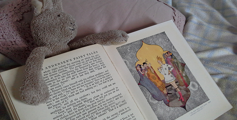
- The images also give a lot of clues about the historical era when they were produced. They show that styles of illustration have changed over the years, as a result of evolving tastes and book production technologies. For example, the colour palette of The Best Bat in the School has definite echoes of Britain between the two World Wars, and Rackham’s fine line drawings in the Alice in Wonderland example are typical of the nineteenth and early twentieth century.