
The Greek philosopher Aristotle in De Sensu considers sight as the most important among the senses, while in De Anima he states that ‘The purpose of sight is colour’. The significance of colour as the ultimate manifestation of sight was developed further in Byzantium, where colour was associated with both earthly and heavenly powerfulness; as such it was discussed extensively in patristic and rhetorical texts.
Byzantine art is constricted by the rigorous rules of expressing dogma and fundamental beliefs associated with the representation of the Divine, which has to remain close to the original in order to ensure worship of the Divinity’s true image, rather than fall into the trap of praying to idols. As such, change in Byzantine style and iconography was excruciatingly slow. Similarly colour, while able to add a dimension of variation in certain scenes, was not totally independent from theological debates and scrutiny. The relative limited repertoire of scenes – and to an extent palette - in Byzantine art reflect Christian beliefs and are not a manifestation of the artist’s incompetence, as Vasari has implied in his The Lives of the Artists.
For the Orthodox faithful a Byzantine church offered a major visual stimulus in their daily/weekly surroundings, which compared to present-day life was significantly limited. The manipulation of colour and its association with specific iconography, could have made a lasting impression that reinforced theological points.
To illustrate this, let us examine an example of the Transfiguration of Christ in Byzantine art.
 Transfiguration of Christ
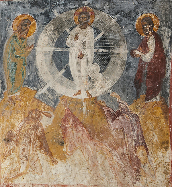
You see here an example of the scene from the church of the Transfiguration (Christ the Lord) in the village of Chandras (location Panteli) in Siteia, eastern Crete, dated to the first half of the fifteenth century
 Map of Crete
This is a typical representation of the scene in Byzantine art, with Christ in the top middle and flanked by the prophets Elijah (left) and Moses (right). At the bottom part of the scene, Christ’s disciples Peter, John and James (from left to right) react with amazement and fright to the divine event they are witnessing. The surroundings are meant to be both fictional and real; their main function is to underline the immateriality of the saintly figures - of Christ in particular - by depicting them floating in space and defying the laws of gravity. Christ’s white robes, as specified in the synoptic Gospel (Matthew 17: 1-9; Mark 9: 2-9; Luke 9: 28-36), attract the attention of the faithful and hold their gaze, primarily because they direct them to an even more important theological issue, expressed through colour: the glory (mandorla) which engulfs Christ. It consists of three circles of different colour: the inner, which is dark blue (almost black); the middle, which is light blue; and the outer which is white, just like Christ’s attire. Hence the mandorla becomes lighter as it moves outwards.
As everything else in Byzantine art, this is highly intentional: it is there to remind the faithful that the Transfiguration is a feast of light, as described in the homilies of Church Fathers – and what other colour is better associated with light than white? Furthermore, white is directly connected with purity; Christ’s both human and divine natures are pure. Another significant detail here is the three circles with the three different colours of Christ’s glory (madorla) – a clear reference to the Trinity of which the Transfiguration is a manifestation.
The neutral yellow and pinkish / red colours seen on the mountains and the garments of the other saintly figures are peripheral and help to further highlight the dominance of the white, as indeed does the blue background – denoting both the visible worldly sky and the invisible heaven above - which by contrasting with the bright white, it brings it even more in the foreground.
The message is clear: Christ is light, Christ is pure, hence Christ is the hope and the salvation that lies within brightness and purity.
Like the history of art? Try a FREE course
-
Delacroix
Learn more to access more details of DelacroixIn this free course, Delacroix, you will be introduced to a variety of Delacroix's work and will see how his paintings relate to the cultural transition from Enlightenment to Romanticism. You will study Delacroix's early career, his classical background, the development of Romantic ideas and their incorporation into his work. You will have the ...
Level: 1 Introductory
-
Napoleonic paintings
Learn more to access more details of Napoleonic paintingsIn this free course, Napoleonic paintings, we will examine a range of Napoleonic imagery by David, Gros and a number of other artists, beginning with comparatively simple single-figure portraits and moving on to elaborate narrative compositions, such as Jaffa and Eylau. In so doing, we will have three main aims: to develop your skills of visual ...
Level: 2 Intermediate
-
Making sense of art history
Learn more to access more details of Making sense of art historyYou can prepare for this free course, Making sense of art history, by looking around you. It's likely that wherever you are you'll be able to see some images. It's also likely that many of these will be intended to have some sort of effect on you. In the course itself you will be exploring the power of images via a study of contemporary art ...
Level: 1 Introductory
Rate and Review
Rate this article
Review this article
Log into OpenLearn to leave reviews and join in the conversation.
Article reviews