

5.4 Question 3: Are there more warm colours than cool colours or vice versa?
Colours such as red, yellow, orange and some greens can be seen as ‘warm’ while blues, other greens, purples and even some shades of red can be described as ‘cool’. Warm colours tend to convey a positive, cheerful mood while cool colours can suggest calmness and serenity or perhaps sadness and gloominess. It's arguable that the dominance of blue in The Dance, for example, contributes to the peaceful night-time feel of the painting, while the dominant reds, yellows and greens in Afrodizzia help to convey a positive, cheerful mood.
The next activity offers you an opportunity to consider the use of colour.
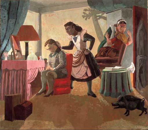
Activity 6: The use of colour in Paula Rego's The Maids
Look at Plate 4 below and make some notes on the use of colour in this art work, responding to the questions you have just worked through:
Has a wide or narrow palette of colours been used?
Have contrasting colours been placed next to each other?
Are there more warm colours than cool colours or vice versa?
Plate 4
In your response, try as far as possible to consider the relationship between techniques and effects in the art work, in terms of both:
a.the mood conveyed by the colour in the work
b.the possible use of colour to control the way that you read the work.
Your response to this activity will provide further evidence that you might find useful when constructing an interpretation of this art work later. You could consider experimenting with making notes in the form of a table; you might try replicating the table below in order to organise your notes.
| Question | Technique | Effect |
|---|---|---|
| Has a wide or narrow palette of colours been used? | ||
| Have contrasting colours been placed next to each other? | ||
| Are there more warm colours than cool colours or vice versa? |
Discussion
I found Paula Rego's use of colour in The Maids to be effective both in conveying mood and in controlling my reading of the painting. She uses quite a wide palette of colours, and, for me, this tends to give the painting a fairly energetic feel, although perhaps not the vibrancy that might be expected from such colours. I thought that the painting felt quite homely, partly because of the use of warm colours but I also felt that the use of contrasting colours (red and green, for example) added a sense of drama or even tension.
Let's continue by exploring our fourth question about colour.