

7.2 The representation of depth
Many artists (though not all) are interested in making two-dimensional art works (a flat canvas, for example) look three-dimensional, especially when they are depicting objects and scenes from the real world. It's possible to create a convincing illusion of a three-dimensional pictorial space on a flat surface by using one or more of the following techniques, which will all be explained shortly:
a.overlapping
b.diminishing scale
c.atmospheric perspective
d.vertical placement
e.linear perspective
f.modelling.
When analysing the composition of an art work it's always worth assessing the extent to which it appears to be three-dimensional and identifying the techniques that have been used in order to achieve this effect. At the end of this section you'll analyse the representation of depth in Paula Rego's The Maids and Chris Ofili's No Woman No Cry. First, though, let's take a look at the six techniques listed above.
Look at Plate 14, The Dance, in which Paula Rego has represented eight figures dancing by a stretch of water. Clearly, the surface of the canvas upon which it is painted is two-dimensional. Yet, Rego has depicted a pictorial space that is deep enough to contain eight people. In metres, what do you think is the depth of the pictorial space that is being represented in the painting? I guessed that the area of land upon which the people are dancing appears to recede for about ten metres before it meets the water. The water itself is more difficult to assess and could perhaps be receding for several kilometres. So, how has the illusion of depth been achieved?
Plate 14
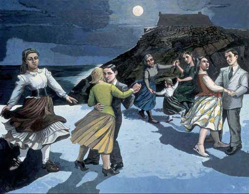
(a) Overlapping
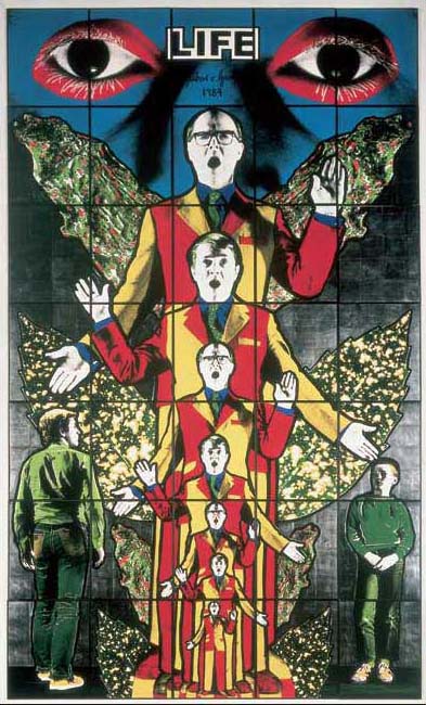
Look closely at the two people depicted as dancing together towards the foreground of the pictorial space in The Dance (the woman is wearing yellow). We assume that the man is behind the woman because the woman's figure is overlapping his. When objects partially overlap other objects, we perceive them as being closer than the covered objects. Overlapping alone creates a very limited illusion of depth, however. You can see evidence of this in Plate 7, Gilbert and George's Life. Here, even though the seven overlapping figures in the centre of the work do suggest that there is some depth, the pictorial space is still pretty shallow; I'd guess no more than about a metre in depth.
Plate 7
(b) Diminishing scale
Another common technique for representing the illusion of depth is the depiction of similar objects as being smaller the further they are away from the picture plane. For example, in The Dance, the figures depicted as dancing towards the foreground of the pictorial space are shown as being larger than the group of three figures dancing together further back in the pictorial space.
(c) Atmospheric perspective
Colour and value can also be used to help represent the illusion of depth, with objects that are depicted as being closer to the picture plane being more brightly coloured and featuring greater value contrast than those depicted as being further from the picture plane. This is often accompanied by a lessening of detail, dulling of colour and reduction in value contrast in objects further away from the picture plane.
Again, The Dance illustrates this well. There is much more value contrast in the figures closest to the picture plane, who are also represented using more intense colours than those appearing to be further back in the pictorial space (especially the group of three figures dancing on the right). There's also a noticeable lessening of detail in the more distant figures.
(d) Vertical placement
We perceive comparable-sized objects that are placed lower in the image as closer to us, and objects that are placed higher as being further away. Once again, this is evident in both The Dance and Life.
(e) Linear perspective
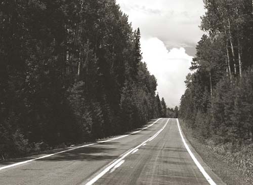
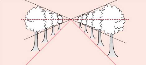
Linear perspective makes use of an optical illusion, which affects us all the time when we observe the reality around us. Imagine you are standing on a bridge, looking at the road fading away far in the distance (see Figure 3 below). Notice that the road appears to get narrower as it recedes towards the horizon. Notice also that the trees at the edge of the road appear to be getting smaller. If we reduced this image to mere lines and shapes, we'd get something that looks like Figure 4. In Figure 3, notice that the lines that mark the edges of the road appear to converge the further away from us they are. These converging lines create what is known as a linear perspective that has been used to represent the illusion of depth by artists for centuries.
Linear perspective is based on the idea that all lines that converge in the same direction will eventually meet (and disappear) at a single vanishing point on the horizon line and all shapes will get smaller in all directions as the distance from the eye increases. To check whether linear perspective is being used to represent depth in a given painting, all you need is a ruler and a pencil, as you'll see from working through the next activity.
Activity 10: Checking for linear perspective in Paula Rego's The Policeman's Daughter
Look at Plate 15, Paula Rego's The Policeman's Daughter. Print a copy and then place your ruler along the diagonal line that marks the bottom edge of the window and draw a pencil mark following this line, but continuing to the edges of the composition (as shown in Figure 5 in the discussion below).
Now do the same with any other diagonal lines in the composition.
Plate 15
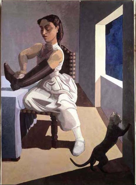
Discussion
How many lines did you find? Figure 5 below shows some of the lines in The Policeman's Daughter that are contributing to the system of linear perspective (and the illusion of depth) in the painting. There is also a circle around the vanishing point, which is actually behind the figure in the picture.
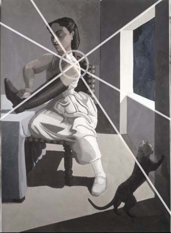
Figure 6 shows something similar for Paula Rego's painting The Dance, in which the system of linear perspective is much more subtle.
(f) Modelling
Modelling is the use of value contrast to suggest three-dimensional forms in a painting.
Not all art works will lend themselves to discussion of the representation of depth. For example, Plate 9, Fiona Rae's Untitled (yellow) is largely two dimensional. I say ‘largely’ as some spectators might feel that the contrasting colours draw them ‘into’ the painting, thereby giving it a three-dimensional feel.
Plate 9
Activity 11: Comparing the representation of depth in The Maids and No Woman No Cry
Take a look at Plates 3 and 4 and make notes on the differences and similarities in the way depth is represented in each art work, exploring techniques (a) to (f) above.
Plate 3
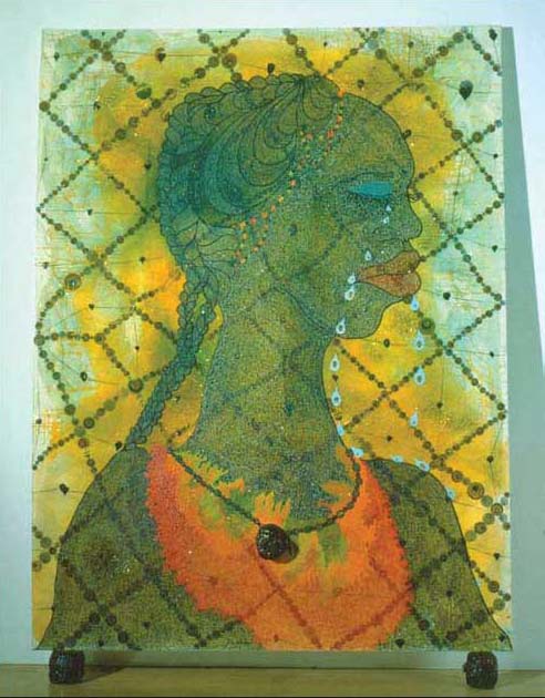
Plate 4
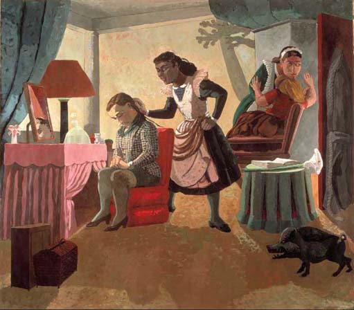
As ever, consider the relationship between techniques and effects in each art work. Your response to this activity will provide evidence that you will find useful in helping you to reach an interpretation of these two art works later.
| Representation of depth | Technique: No Woman No Cry | Effects: No Woman No Cry | Technique: The Maids | Effects: The Maids |
|---|---|---|---|---|
| (a) overlapping | ||||
| (b) diminishing scale | ||||
| (c) atmospheric perspective | ||||
| (d) vertical placement | ||||
| (e) linear perspective | ||||
| (f) modelling |
Discussion
For me, the most obvious difference between these two art works appears to be that while The Maids features quite a deep pictorial space (perhaps as much as four and a half metres), the pictorial space of No Woman No Cry is fairly shallow and as a result the painting feels quite flat.
In No Woman No Cry, there's some use of overlapping in the grid-like pattern that appears to stretch across the front of the painting, but this adds little in terms of depth. The woman's head and body is given some solidity by very subtle modelling, but there's only one person in the picture and neither diminishing scale, nor vertical placement are used to suggest depth. Neither linear nor atmospheric perspective seem to feature in the composition and, as a result, the depicted figure appears to be pushed towards the front of the pictorial space, close to the picture plane.
In contrast, most of the content of The Maids appears to be some distance from the picture plane and this is emphasised by the patch of yellowy brown colour that occupies the otherwise largely empty foreground area. This, in turn, gives a sense of depth and recession, as does the extensive use of overlapping, the diminishing scale of the women represented and the use of vertical placement (notice that the items at the bottom of the composition, for example, the pig on the right and the basket on the left, appear closer than those at the top). Modelling helps to give the figures a three-dimensional feel and, while there is no atmospheric perspective, the use of linear perspective does help to suggest the illusion of depth.
In The Maids, diagonal lines in the composition also help to draw the spectator's eye into the pictorial space, again adding to the sense of depth. In the next section you'll look further at the various effects that might be conveyed by the use of line.