
2 The temperature in the polar regions
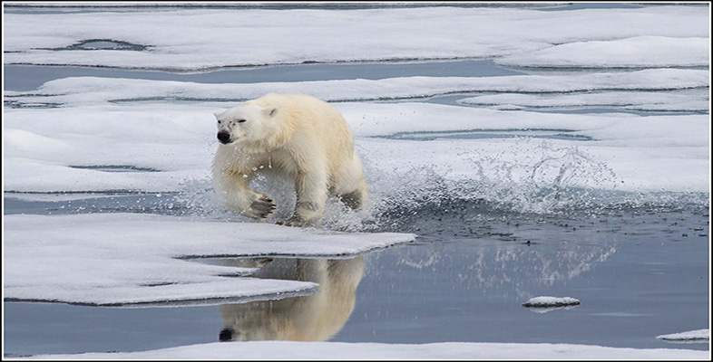
One of the defining features of the frozen planet is the incredible cold. We will investigate the climate by comparing and contrasting temperatures from two different locations in the polar regions. Figure 2 shows the average (mean) atmospheric surface temperature from two research stations, one in the Southern Hemisphere at the South Pole, and one in the Northern Hemisphere at a Canadian town called Alert on the edge of the Arctic Ocean.
The mean monthly atmospheric surface temperature is the average of the temperature data collected at that location during each calendar month.
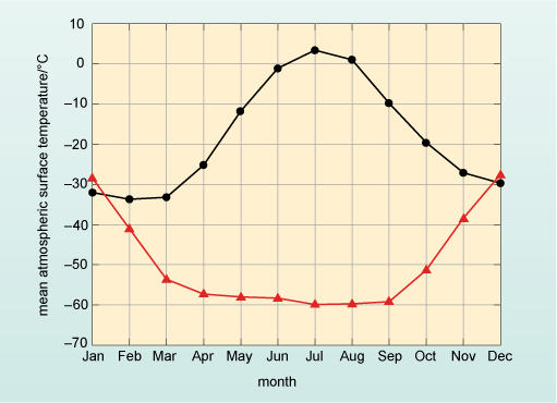
Looking at the two lines in Figure 2, the temperatures are reasonably close in the months of January and December but between these two months the lines diverge significantly until in July there is a difference of over 60 °C between them.
Which of the two lines in Figure 2 represents the mean atmospheric surface temperature from Alert and which line represents the temperature at the South Pole?
Alert station is in the Northern Hemisphere which should have the warmest temperatures in June, July and August – so the black line (circles) represents measurements from Alert. Therefore, the red line (triangles) represents the temperature recorded at the South Pole.
Box 1 explains the different features of graphs and describes how averages or means are calculated.
Box 1 Graphs, averages and means
Graphs are diagrams that show the relationship between two different quantities. The quantities and their values are displayed on two reference lines, called the axes, that are at right angles to one another and the axes are marked to show the range of possible values of the quantities. For example, in Figure 2 the axes are temperature and month. In graphs, the relationship is shown by a straight line or a curve of plotted points (the points may or may not be shown), so Figure 2 shows the relationship between mean atmospheric surface temperature and time given by the months of the year; in other words, how atmospheric surface temperature varies over the annual cycle. With this information, one can now find corresponding values for the two quantities that are plotted. As with all scientific diagrams, graphs follow a set of clear conventions, which are highlighted in Figure 3.
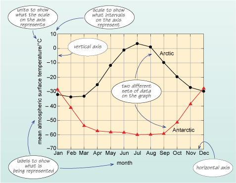
The two quantities being described, mean atmospheric surface temperature and month, are represented by the vertical and horizontal axes, respectively. Each axis is labelled clearly to indicate what units are used, and has a marked scale. In this example, the vertical axis represents mean atmospheric surface temperature with units of degrees Celsius represented by °C; the scale ranges from −70 °C to +10 °C. The horizontal axis shows the months of the year. There are two lines plotted on the axes that represent the values for mean atmospheric surface temperature for two locations: one in the Northern Hemisphere and one in the Southern Hemisphere, for specific months. The circles and triangles on the lines represent the actual mean temperature at that month, and the lines join the data points to show how the mean temperature changes between them. For example, to find the atmospheric surface temperature in degrees Celsius corresponding to February in Antarctica, start by finding the point on the horizontal axis representing February, and ‘draw’ a line vertically upwards until it meets the plotted line for Antarctica. Then ‘draw’ a line horizontally from that intersection to meet the vertical axis and read off the corresponding temperature in degrees Celsius. You should find that the temperature in February in Antarctica is about −40 °C.
To work out a representative value for the temperature for each month, an average is used to give an idea of a ‘typical’ or expected value. There are different ways of expressing an average value but the most common is the mean (which is often referred to as the average, as done here). The average (or mean) is obtained by adding up all the values of a set of data and dividing by the number of items in the data set. In the example here, the temperatures in three successive Junes for the black line (Alert) in Figure 2 were 1.0 °C, 1.2 °C and 0.9 °C. The mean temperature is the total divided by the number of measurements, which is written = (1.0 + 1.2 + 0.9) ⁄ 3 = 1.0 °C. By looking at that mean of three years’ data you should be able to determine a more typical value for the temperature. The data points on both lines in Figures 2 and 3 represent the mean of over 50 years of temperature data.
Having established which line represents which location, one can immediately see that the range (i.e. the difference between the minimum and maximum values on the graph) in temperature at Alert is ~35 °C with winter temperatures being about −30 °C and summer temperatures being about +5 °C. (The ~ symbol means approximately.)
What are the corresponding summer and winter temperatures and range at the South Pole?
The summer temperatures in January are about −30 °C whilst winter temperatures are a staggering −60 °C. The range is approximately 30 °C.
At the South Pole, the difference between summer and winter temperatures is a little less than in the Arctic – but the regions do differ in one other important way.
How do the rates of change in temperature from month to month compare at the two sites?
In the Arctic there is a gradual rise to a maximum temperature in July, followed by a gradual fall to winter. In contrast, at the South Pole the temperature is actually reasonably constant at ~−60 °C for the months from April to September, with a relatively shorter period of cooling and warming.
Question 1
In London, the mean minimum atmospheric surface temperature is ~7 °C for January and the mean maximum atmospheric surface temperature for August is ~22 °C. What is the range of temperature in London between January and August and how does this compare with the two sites shown in Figure 2?
Answer
If the minimum average surface temperature for London is ~7 °C in January and the maximum average surface temperature is ~22 °C in August:
- range = (maximum – minimum)
- = 22 °C – 7 °C
- = 15 °C
So the range of temperature in London is 15 °C. This is much smaller than the range at the polar regions. At Alert the temperature range between summer and winter (Figure 2) is 35 °C, whilst at the South Pole it is ~30 °C.
London is of course a long way from the poles but comparing the climate of a European city with the polar regions begs some serious questions: why does it get so cold in the polar regions? Why is the difference between the winter minimum temperatures and the summer maximum temperatures so great? Before you can answer those questions, you need to first spend a little time looking at how the polar regions are mapped (Box 2).
The annual range in temperature in both polar regions is approximately 30 °C and their winter temperatures are below −30 °C. In the Arctic there is a smooth cycle between summer and winter, whereas in the Antarctic temperature falls to a minimum and then stays relatively constant.
Box 2 Mapping locations on planet Earth – the latitude and longitude system
The terms latitude and longitude are used to identify the position of particular places on the Earth. On most maps you can see vertical and horizontal lines to divide up regions. Lines that run from east to west in the maps are called lines of latitude, and the lines that run north to south are called lines of longitude. You can see this in Figure 4, where the vertical red lines are the lines of longitude, and the horizontal blue lines are the lines of latitude.
If you take a roughly spherical fruit such as an apple and hold it so that the stalk is at the top (equivalent to the North Pole), draw six equally spaced horizontal lines equivalent to some of the blue latitude lines in Figure 4, then slice along these lines, you can see that each slice will have the same width of skin because the blue latitude lines are equal distances apart. On the Earth, the distance between the middle (the Equator at 0° latitude) and the very ‘top’ (the North Pole at 90° latitude) is divided up into 90 lines called degrees of latitude, which are approximately 110 km apart. These 90° of latitude are the Northern Hemisphere and any latitude north of the Equator is labelled ‘N’ after the value. From the Equator to the South Pole there are also 90° of latitude and this is the Southern Hemisphere, which are labelled ‘S’ after the value. Throughout this course the term ‘high latitudes’ is used to denote latitudes greater than ~66° N or ~66° S, conversely latitudes in the range ~30° N to ~30° S are referred to as low latitudes.
If you take another apple and draw lines on it to match the red longitude lines in Figure 4, then cut the fruit along them, this time you will end up with wedges. If you think about the wedges and the skin width, the width of skin is greatest in the middle of the fruit (the Equator on Earth), whilst at both ends the width of the skin is reduced to zero. You can see this clearly in the view of the Earth from the North Pole in Figure 5.
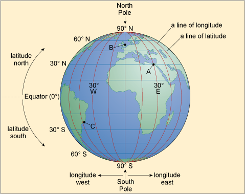
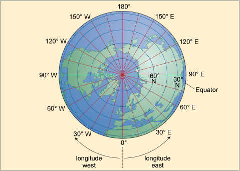
In Figure 4 you can see that the blue lines of latitude are always the same distance apart, whereas Figure 5 shows the distance between the red lines of longitude decreases towards the North (and also the South) Pole, where they actually meet. The Earth is divided into 360 of these lines, called degrees of longitude, and at the Equator the distance between each line is 110 km, just like the distance between degrees of latitude. However, the further one goes from the Equator, the shorter the distance between the lines of longitude becomes. In London, the distance between each line of longitude is about 70 km, and even if it were possible it would take a very long time to walk all 360 degrees of longitude from London and back again around the world. At the North Pole and South Pole you could do it in just seconds. For historical reasons, the 0° longitude line runs through Greenwich in London and, looking down from the North Pole in the direction of Greenwich, in a clockwise direction the degrees of longitude range from 0° to 180° (by convention this is the Western Hemisphere labelled ‘W’), and in an anticlockwise direction they range from 0° to 180° (the Eastern Hemisphere labelled ‘E’). (Note: At 0° longitude you can write either 0° E or 0° W.) If I gave you my location in degrees latitude and longitude you could see exactly where I was on Earth – for example, I am writing this from approximately 51.57° N 0° E, which is in London, England and 51.57 degrees of latitude north of the Equator, and in line with Greenwich.
The use of latitude and longitude was rare, except amongst sailors and the armed forces, until relatively recently. But this is changing, as ever more people are using electronic equipment such as mobile phones and in-car navigation, which routinely use satellites in a system called GPS (Global Positioning System) to determine location very accurately.
The distance between each degree of latitude is always the same wherever it is on the planet, whilst one degree of longitude varies depending on the latitude at which it is measured.
Question 2
Take a moment to estimate the approximate latitude and longitude of the following points on Figure 4: A, Cairo; B, London; and C, Rio de Janeiro.
Answer
From Figure 4 the locations are:
- A.Cairo: 30° N, 30° E
- B.London: ~50° N, 0° E
- C.Rio de Janeiro: ~20° S, 45° W
It is harder to estimate the latitude and longitude of London and Rio de Janeiro using the widely spaced scales of Figure 4, but higher resolution maps will usually have a smaller scale grid.