The frozen planet
Use 'Print preview' to check the number of pages and printer settings.
Print functionality varies between browsers.
Printable page generated Thursday, 18 April 2024, 7:26 AM
The frozen planet
Introduction
The parts of our planet that are covered with ice – the so-called frozen planet – have captured human imagination for thousands of years. Restricted to high mountains and towards the poles, they have low human populations but have been the focus of interest from nations, explorers, business people and scientists. In this course the discussion will concentrate on the largest component of the frozen planet, which is closest to the poles: the Arctic to the north and the Antarctic to the south.
This OpenLearn course provides a sample of level 1 study in Science.
Learning outcomes
After studying this course, you should be able to:
demonstrate knowledge and understanding of the core concepts in physics, biology, chemistry, geology and basic mathematics that underpin our understanding of the polar world
demonstrate knowledge and understanding of the processes and interactions (physical, biological, chemical and geological) which shape the polar environment at different temporal and spatial scales
express concepts in an objective and factually correct way
make sense of information presented in different ways, including textual, numerical or graphical material.
1 Views of the frozen planet
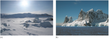
The Ancient Greeks were aware of and had perhaps even visited the Arctic, which they called Arktos. They imagined there must be a similar but opposite cold southern landmass to balance the world so they coined the name ‘Ant Arktos’, which has developed into the Antarctic. Superficially the two polar regions are very different but they also have many similarities (Figure 1).
In this course you will investigate and discover the processes that have shaped the polar world. The first activity investigates your current knowledge of the polar regions.
Activity 1 Your personal view of the frozen planet
The aim of this activity is for you to write down your initial thoughts about the polar regions without doing any research. So please jot down your responses to the following questions, answering first for the Arctic, and then the Antarctic.
- a.What three images or impressions come to mind?
- b.What three words, phrases or names do you first think of?
- c.What is the last news story you remember about each region?
- d.Who owns it?
Answer
The set of answers shown below is from one of the team who asked a family member with no experience of the frozen planet. Here are her answers:
- a.Images for the Arctic: cold; polar bear; igloo. For the Antarctic: penguin; whale; ice.
- b.Words for the Arctic: polar bear; the Titanic; Eskimo. For the Antarctic: the windiest and coldest place on earth; heroic exploration; remote.
- c.For the Arctic: a news story about the continued shrinking of the sea ice. For the Antarctic: a news story about a giant iceberg the size of Wales breaking away and drifting northwards.
- d.For the Arctic: it is owned by Russia, Canada, Norway and America. For the Antarctic: the United Kingdom, Argentina and perhaps the United States or Russia?
You should keep in mind that these answers are most likely not definitive.
It would be surprising if in your answers to Activity 1 there was not at least some mention of ice and the cold. Personally, I was surprised to see no mention of the dark and the incredible beauty, but that is just my view. What is clear is that the cold and climate of both regions are highlighted along with the wildlife. There were media stories about how the regions are changing and finally there appear to be some interesting questions around the subject of ownership. Ownership relates to the management of, and ultimately who could live in the polar regions.
The defining feature of the polar environment is the cold so it would not be surprising if in your answers to Activity 1 you had mentioned it. Then there is the wildlife, the history of exploration, the isolation, the beauty and so on. Fundamentally the polar regions are most likely all of the things you mentioned in your answer to Activity 1 but they are not geographically isolated. In this course you will discover why the poles are cold, and investigate key features of the frozen planet. You will discover that processes operating at the poles affect all of us and consequently their future is our future.
2 The temperature in the polar regions
One of the defining features of the frozen planet is the incredible cold. We will investigate the climate by comparing and contrasting temperatures from two different locations in the polar regions. Figure 2 shows the average (mean) atmospheric surface temperature from two research stations, one in the Southern Hemisphere at the South Pole, and one in the Northern Hemisphere at a Canadian town called Alert on the edge of the Arctic Ocean.
The mean monthly atmospheric surface temperature is the average of the temperature data collected at that location during each calendar month.
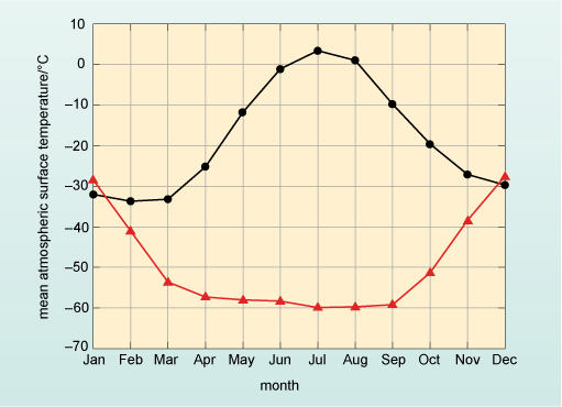
Looking at the two lines in Figure 2, the temperatures are reasonably close in the months of January and December but between these two months the lines diverge significantly until in July there is a difference of over 60 °C between them.
Which of the two lines in Figure 2 represents the mean atmospheric surface temperature from Alert and which line represents the temperature at the South Pole?
Alert station is in the Northern Hemisphere which should have the warmest temperatures in June, July and August – so the black line (circles) represents measurements from Alert. Therefore, the red line (triangles) represents the temperature recorded at the South Pole.
Box 1 explains the different features of graphs and describes how averages or means are calculated.
Box 1 Graphs, averages and means
Graphs are diagrams that show the relationship between two different quantities. The quantities and their values are displayed on two reference lines, called the axes, that are at right angles to one another and the axes are marked to show the range of possible values of the quantities. For example, in Figure 2 the axes are temperature and month. In graphs, the relationship is shown by a straight line or a curve of plotted points (the points may or may not be shown), so Figure 2 shows the relationship between mean atmospheric surface temperature and time given by the months of the year; in other words, how atmospheric surface temperature varies over the annual cycle. With this information, one can now find corresponding values for the two quantities that are plotted. As with all scientific diagrams, graphs follow a set of clear conventions, which are highlighted in Figure 3.
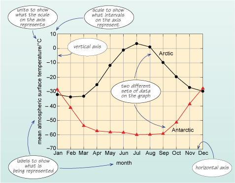
The two quantities being described, mean atmospheric surface temperature and month, are represented by the vertical and horizontal axes, respectively. Each axis is labelled clearly to indicate what units are used, and has a marked scale. In this example, the vertical axis represents mean atmospheric surface temperature with units of degrees Celsius represented by °C; the scale ranges from −70 °C to +10 °C. The horizontal axis shows the months of the year. There are two lines plotted on the axes that represent the values for mean atmospheric surface temperature for two locations: one in the Northern Hemisphere and one in the Southern Hemisphere, for specific months. The circles and triangles on the lines represent the actual mean temperature at that month, and the lines join the data points to show how the mean temperature changes between them. For example, to find the atmospheric surface temperature in degrees Celsius corresponding to February in Antarctica, start by finding the point on the horizontal axis representing February, and ‘draw’ a line vertically upwards until it meets the plotted line for Antarctica. Then ‘draw’ a line horizontally from that intersection to meet the vertical axis and read off the corresponding temperature in degrees Celsius. You should find that the temperature in February in Antarctica is about −40 °C.
To work out a representative value for the temperature for each month, an average is used to give an idea of a ‘typical’ or expected value. There are different ways of expressing an average value but the most common is the mean (which is often referred to as the average, as done here). The average (or mean) is obtained by adding up all the values of a set of data and dividing by the number of items in the data set. In the example here, the temperatures in three successive Junes for the black line (Alert) in Figure 2 were 1.0 °C, 1.2 °C and 0.9 °C. The mean temperature is the total divided by the number of measurements, which is written = (1.0 + 1.2 + 0.9) ⁄ 3 = 1.0 °C. By looking at that mean of three years’ data you should be able to determine a more typical value for the temperature. The data points on both lines in Figures 2 and 3 represent the mean of over 50 years of temperature data.
Having established which line represents which location, one can immediately see that the range (i.e. the difference between the minimum and maximum values on the graph) in temperature at Alert is ~35 °C with winter temperatures being about −30 °C and summer temperatures being about +5 °C. (The ~ symbol means approximately.)
What are the corresponding summer and winter temperatures and range at the South Pole?
The summer temperatures in January are about −30 °C whilst winter temperatures are a staggering −60 °C. The range is approximately 30 °C.
At the South Pole, the difference between summer and winter temperatures is a little less than in the Arctic – but the regions do differ in one other important way.
How do the rates of change in temperature from month to month compare at the two sites?
In the Arctic there is a gradual rise to a maximum temperature in July, followed by a gradual fall to winter. In contrast, at the South Pole the temperature is actually reasonably constant at ~−60 °C for the months from April to September, with a relatively shorter period of cooling and warming.
Question 1
In London, the mean minimum atmospheric surface temperature is ~7 °C for January and the mean maximum atmospheric surface temperature for August is ~22 °C. What is the range of temperature in London between January and August and how does this compare with the two sites shown in Figure 2?
Answer
If the minimum average surface temperature for London is ~7 °C in January and the maximum average surface temperature is ~22 °C in August:
- range = (maximum – minimum)
- = 22 °C – 7 °C
- = 15 °C
So the range of temperature in London is 15 °C. This is much smaller than the range at the polar regions. At Alert the temperature range between summer and winter (Figure 2) is 35 °C, whilst at the South Pole it is ~30 °C.
London is of course a long way from the poles but comparing the climate of a European city with the polar regions begs some serious questions: why does it get so cold in the polar regions? Why is the difference between the winter minimum temperatures and the summer maximum temperatures so great? Before you can answer those questions, you need to first spend a little time looking at how the polar regions are mapped (Box 2).
The annual range in temperature in both polar regions is approximately 30 °C and their winter temperatures are below −30 °C. In the Arctic there is a smooth cycle between summer and winter, whereas in the Antarctic temperature falls to a minimum and then stays relatively constant.
Box 2 Mapping locations on planet Earth – the latitude and longitude system
The terms latitude and longitude are used to identify the position of particular places on the Earth. On most maps you can see vertical and horizontal lines to divide up regions. Lines that run from east to west in the maps are called lines of latitude, and the lines that run north to south are called lines of longitude. You can see this in Figure 4, where the vertical red lines are the lines of longitude, and the horizontal blue lines are the lines of latitude.
If you take a roughly spherical fruit such as an apple and hold it so that the stalk is at the top (equivalent to the North Pole), draw six equally spaced horizontal lines equivalent to some of the blue latitude lines in Figure 4, then slice along these lines, you can see that each slice will have the same width of skin because the blue latitude lines are equal distances apart. On the Earth, the distance between the middle (the Equator at 0° latitude) and the very ‘top’ (the North Pole at 90° latitude) is divided up into 90 lines called degrees of latitude, which are approximately 110 km apart. These 90° of latitude are the Northern Hemisphere and any latitude north of the Equator is labelled ‘N’ after the value. From the Equator to the South Pole there are also 90° of latitude and this is the Southern Hemisphere, which are labelled ‘S’ after the value. Throughout this course the term ‘high latitudes’ is used to denote latitudes greater than ~66° N or ~66° S, conversely latitudes in the range ~30° N to ~30° S are referred to as low latitudes.
If you take another apple and draw lines on it to match the red longitude lines in Figure 4, then cut the fruit along them, this time you will end up with wedges. If you think about the wedges and the skin width, the width of skin is greatest in the middle of the fruit (the Equator on Earth), whilst at both ends the width of the skin is reduced to zero. You can see this clearly in the view of the Earth from the North Pole in Figure 5.
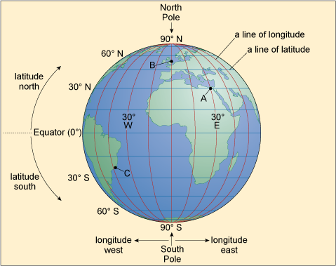
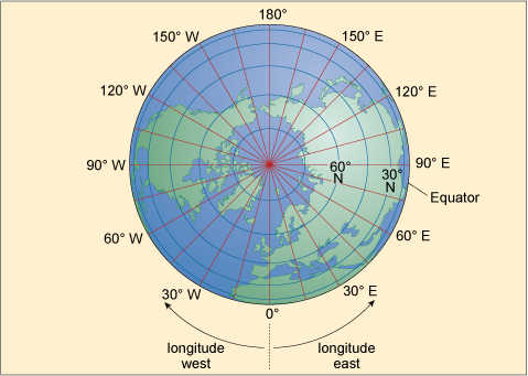
In Figure 4 you can see that the blue lines of latitude are always the same distance apart, whereas Figure 5 shows the distance between the red lines of longitude decreases towards the North (and also the South) Pole, where they actually meet. The Earth is divided into 360 of these lines, called degrees of longitude, and at the Equator the distance between each line is 110 km, just like the distance between degrees of latitude. However, the further one goes from the Equator, the shorter the distance between the lines of longitude becomes. In London, the distance between each line of longitude is about 70 km, and even if it were possible it would take a very long time to walk all 360 degrees of longitude from London and back again around the world. At the North Pole and South Pole you could do it in just seconds. For historical reasons, the 0° longitude line runs through Greenwich in London and, looking down from the North Pole in the direction of Greenwich, in a clockwise direction the degrees of longitude range from 0° to 180° (by convention this is the Western Hemisphere labelled ‘W’), and in an anticlockwise direction they range from 0° to 180° (the Eastern Hemisphere labelled ‘E’). (Note: At 0° longitude you can write either 0° E or 0° W.) If I gave you my location in degrees latitude and longitude you could see exactly where I was on Earth – for example, I am writing this from approximately 51.57° N 0° E, which is in London, England and 51.57 degrees of latitude north of the Equator, and in line with Greenwich.
The use of latitude and longitude was rare, except amongst sailors and the armed forces, until relatively recently. But this is changing, as ever more people are using electronic equipment such as mobile phones and in-car navigation, which routinely use satellites in a system called GPS (Global Positioning System) to determine location very accurately.
The distance between each degree of latitude is always the same wherever it is on the planet, whilst one degree of longitude varies depending on the latitude at which it is measured.
Question 2
Take a moment to estimate the approximate latitude and longitude of the following points on Figure 4: A, Cairo; B, London; and C, Rio de Janeiro.
Answer
From Figure 4 the locations are:
- A.Cairo: 30° N, 30° E
- B.London: ~50° N, 0° E
- C.Rio de Janeiro: ~20° S, 45° W
It is harder to estimate the latitude and longitude of London and Rio de Janeiro using the widely spaced scales of Figure 4, but higher resolution maps will usually have a smaller scale grid.
3 A flat map of a spherical world
A geographical map is a two-dimensional representation of the actual physical topography of a geographical region, and whilst almost everyone is familiar with, for example, a road map, mapping is a complex subject. The making of maps is called cartography and fundamentally it is about the relationship between data (the information you wish to display and convey) and space. This is both the geographic space being represented and the space available on a sheet of paper or display screen. The data are represented by points (to show location) and lines (to show connections or borders), by symbols (to convey features), and finally by names and colour and/or shading (to represent areas). Of course, the names of places, like London, or contour lines representing height, don’t physically appear on the ground where they are shown on maps!
One of the challenges facing cartographers as they try to express both data and space at the largest scales (i.e. the whole Earth or large sections of it) is the classic problem of representing features on the curved surface of a spherical Earth (or globe, see Figure 4) on a plane (or flat) surface.
Activity 2 Shapes on a peeled orange
Take an orange and draw the outline of two shapes on its peel with a felt pen. On one side draw a circle and on the other a square, making sure your shapes cover at least a third of the surface of the orange. Now peel the orange, trying to leave the skin in one piece. Take your peel, and put some cuts in it at the edges with a knife or scissors so that it will lie completely flat on a table.
Can you still see your shapes with exactly the same outline as when you drew them?
Answer
You were asked to draw two large shapes so that you can see the distortion. Depending on where you put your cuts it is unlikely that your shapes will be exactly as you originally drew them. In the jump from three dimensions to two dimensions the shape has become distorted. The way this distortion is avoided is by using a map projection.
In your answer to Activity 2, whether you could see your shapes in the same way you drew them depends on where you made the cuts. But it is possible to make a flat drawing of the surface of the orange with your shapes on to show them as you actually drew them. This is called a map projection. All projections involve some sort of compromise because it is just not possible to keep everything completely accurate when shifting from three dimensions to two. An example of a projection of map data is shown in Figure 6a, which is the Earth in what is called the Lambert equal-area azimuthal projection. It is round like Figure 4 and you should be able to recognise some of the land shapes in this map.
Is it possible for you to hold an orange or apple in such way that you can see both poles as shown in Figure 6a?
No! You can only see the top or the bottom at one time.
Figure 6a is clearly distorted so that both poles are visible.
What are the most distorted countries shown in Figure 6a?
Australia is completely unrecognisable along with the Pacific coast of Russia and North America.
In Figure 6a, the amount of distortion changes with distance from the centre of the map at 0° N 0° E. To demonstrate this, there are a number of circles overlain on the picture. Each one of the circles encloses an equal surface area of the Earth. If you think back to your orange, imagine covering it with regularly spaced round stickers about 1 cm across. Each sticker would cover the same surface area of the orange. But in the projection in Figure 6a the size of the circles is varying – they are larger the further away they are from the centre of the map.
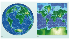
If the circles appear larger but are actually the same size, what is happening to the surface area that they cover?
The surface area is being distorted on the map so that it appears larger.
If there was no distortion in the projection, then all of the circles would be the same size all over the map.
A commonly used map projection is the Mercator projection (Figure 6b) and on it the lines of longitude and latitude cross at right angles. This picture also has the same circles as Figure 6a which cover an equal area.
How do the circles change size relative to the Equator in the Mercator projection?
The circles are equal in size along lines of latitude near the Equator but increase in size with distance from the Equator.
Clearly the Mercator projection is distorting land away from the 0° latitude line.
Based on the size of the circles, how are Greenland and Antarctica distorted by the Mercator projection relative to their actual size?
Because the circles are larger towards the poles, the Mercator projection shows Greenland and Antarctica as larger than they should be. As there is no single point for a pole, Antarctica is virtually unrecognisable.
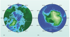
The Mercator projection is often used for maps with a small range of latitudes so there will not be very much distortion. When there is a large range of latitude like in Figure 6b, it is not easy to determine the relative sizes of different regions. There are many different projections and it is important to keep in mind that all of them distort geographic data to a certain extent. The key is to choose a projection that distorts your geographic region of interest the least. This course is focused on the polar regions and for this reason you will frequently encounter what is called the stereographic projection (Figure 7a, b), which is equivalent to being above the North and South Poles and looking downwards. The stereographic projection is very good for showing the high latitudes as there is only significant distortion at large distances from the poles.
Looking at the stereographic projection starting at the pole and working outwards, the lines of equal latitude are dotted and increasing in size (as shown in Figure 5). In Figure 7, the first dotted circle is at 75° north (or south) and the second 60° north (or south). Lines of equal longitude are just like hours on a clock, and are described in Figure 5.
4 The energy balance
In Section 2 it was noted that temperature differences between the higher and lower latitudes are large, but before continuing, it is necessary to define what is actually meant by temperature. Your experience will be from the sensations of warmth and coldness, but what is temperature from a scientific perspective? The temperature of a material is actually an indication of its energy, and to understand the relationship between temperature and energy, one needs to know the make-up of the material. All substances are made of small constituent parts called atoms (see Box 3). For example, humans contain a large amount of carbon, hydrogen and oxygen atoms, and breathe in air which contains mostly nitrogen atoms.
Box 3 The chemical elements
Every object on Earth is made of chemical elements. Most elements were created in the nuclear furnaces of exploding stars in the early Universe, so you and the Earth around us are made literally from stardust. There are 109 named elements, of which 92 occur naturally on Earth. Many will be familiar, such as carbon and oxygen. Of the known elements, up to 30 are believed to be essential to the survival of living organisms. Each element can be represented by a chemical symbol of one or two letters, a shorthand form of its current name or, sometimes, its Latin name. The smallest recognisable part of a chemical element is called an atom.
Some common examples of elements are shown in the table. C stands for carbon and Ca for calcium, Fe refers to ferrum, the Latin name for iron, and Na to natrium, which is Latin for sodium. Few elements exist as single atoms and so they are usually found combined together either with other atoms of the same element, or with atoms of other elements to make compounds. There is an enormous range of possible combinations of different elements and therefore an enormous number of chemical compounds. The smallest amount, or building block, of any substance – compound or element – comprising two or more atoms, is called a molecule.
| Element | Symbol |
|---|---|
| carbon | C |
| hydrogen | H |
| oxygen | O |
| nitrogen | N |
| calcium | Ca |
| phosphorus | P |
| sulfur | S |
| sodium | Na |
| iron | Fe |
The symbols of the elements are put together to give the formula of a compound. For example, hydrogen and oxygen combine to make water, which has the formula H2O. The number 2 indicates that two atoms of hydrogen combine with one atom of oxygen to make one molecule of water. The subscript number refers to the element it follows, so for H2O the 2 refers to hydrogen and not oxygen. In contrast, a number before the formula refers to the number of individual molecules. For example, 3H2O indicates three molecules of water, but these three molecules contain six atoms of hydrogen and three atoms of oxygen in total.
4.1 What is energy?
Energy is a word in common use but with a variety of everyday meanings. It does however have a precise scientific meaning and is an important concept.
Think of two or three phrases in which you include the word ‘energy’ in an everyday sense.
Possible examples are: ‘Where do children get their energy from?’, ‘I haven’t got the energy to get up’ or ‘Sweets are full of energy’.
None of the everyday uses of the word ‘energy’ is very precise but they all encapsulate the notion that energy enables activity to take place. This is also at the heart of the scientific notion of energy.
Energy is a physical property possessed by a substance and it is a measure of its capability to ‘make things happen’. In order for things to happen, some of the energy within the substance must be transferred to another object and a common consequence of the transfer of energy to an object is to cause its temperature to rise. For example, if I use energy to rub my hands very hard 10 times, they will be warmer when I have finished. Another example is when you burn fuel under a pan of water: energy is transferred from the flame to the water and, as a result, the temperature of the water increases. The heat is increasing the random motion of its constituent atoms or molecules and so the temperature of a substance is a measure of how much energy of motion – so-called kinetic energy – the atoms or molecules within it have. A high temperature corresponds to a high rate of internal motion and high kinetic energy of the substance’s particles.
The ultimate source of almost all the energy reaching the Earth’s surface is the Sun. (There is some heat energy flow from the interior of the Earth to the surface, but the amount is small compared with the solar contribution.) The incoming energy is transmitted across space by solar radiation (the Sun’s rays), and when it reaches the Earth it is transferred to its surface, or to your skin which, as you will know from experience, warms up. How much the Earth or your body heats up is, as in the next section, down to the energy balance.
4.2 The importance of albedo and heat capacity
Different materials reflect differing amounts of radiation away from them and the property that measures the amount of reflection (often expressed as a percentage) is called the albedo. When solar energy reaches the Earth’s surface, a certain amount of it is reflected straight back out into space and only the portion that is not reflected heats up what it falls on. The result is that on a warm sunny day if you put your hand on a black car and then on a white car, you will notice that the black car feels warmer. (Perhaps you could try this the next time it is sunny but be careful of car alarms!) The reason the black car is warmer is because it has a lower albedo than the white car, and so less energy is reflected away from it, so it heats up more. Table 1 shows the albedo of some typical surfaces on the Earth. For example, the surface of the ocean has an albedo of 3%, which means that 100% – 3% = 97% or almost all of the incoming energy from the Sun actually heats the water.
| Surface | Albedo (%) |
|---|---|
| ocean surface | 3 |
| conifer forest in summer | 9 |
| grassy fields | 25 |
| sea ice | 40 |
| desert sand | 40 |
| fresh snow | 80–90 |
Using Table 1 how much solar energy would be available to heat up the snow surface?
Fresh snow has an albedo of 80–90%. Assuming it is 80%, this means that only 100% – 80% = 20% is available to heat up the snow surface.
Figure 8 shows an example of this.
Question 3
If the same amount of energy reaches a desert and a conifer forest in summer, what proportion of the energy is available to heat up the material? If snow then falls to cover the conifer forest, what will be the proportion of energy available to heat up the forest?
Answer
If the same amount of energy reaches a desert and a conifer forest in summer, the amount of energy available to heat up the material will be the same for both. Table 1 shows you that a desert has an albedo of 40%, so the proportion of energy available to heat up the sand will be:
- proportion of energy = 100% – 40% = 60%
so, 60% of the incoming energy will be available to heat up the sand.
For the conifer forest in summer, Table 1 shows that a conifer forest has an albedo of 9%, so the proportion of energy available to heat up the forest will be:
- proportion of energy = 100% – 9% = 91%
If snow falls on the conifer forest, then its albedo will increase from 9% to 80–90% and so the proportion of energy available to heat up the conifer forest will be:
- proportion of energy = 100% – 80% = 20%
So only 20% of the incoming energy is now available to heat up the forest, and almost all of the incident energy is reflected away. Clearly the albedo is extremely important for the polar regions.
Once the albedo has reflected away part of the incident energy, there is one more effect to consider: different materials heat up by different amounts for the same amount of energy that they receive, as determined by their specific heat capacity. This is a measure of how much energy it takes to raise the temperature of 1 kg of a particular substance by 1 °C. A lower specific heat capacity means that it takes less energy to heat up something, and vice versa. Although the term may be unfamiliar, the concept most likely is not.
Activity 3 The effect of specific heat capacity
For this activity you will conduct a thought experiment – that is, one where you only think about what will actually happen.
Imagine a hot sunny day. On a table outside in the sunlight there is a glass containing 1 kg of water (i.e. 1 litre), a 1 kg piece of cork and a 1 kg piece of iron. Ignoring albedo effects and assuming that all three items absorb the same amount of energy from the Sun, put the three objects into order determined by how hot each will become after 1 hour. (Ignore all sources of heat except that directly received from the Sun.)
Answer
When you think about it, metal heats up very quickly, so you most likely recognised that the 1 kg of iron would be the hottest. It does not take very much heat energy to change the temperature of the iron because it has a low specific heat capacity. The other two items are harder to place, but the cork will be cooler than the iron and finally the coldest will be the water, which has the highest specific heat capacity of the three.
Water has an extremely high specific heat capacity and it takes a vast amount of energy to heat it. This fact is often used to our advantage. For example, virtually all car engines use water in their cooling systems to stop the engine overheating.
Taking into account the combined effects of the albedo and specific heat capacity, even two adjacent areas, such as a beach and the sea lapping on it, will heat up by different amounts on a sunny day. If you compare a tropical sea with the high albedo icy pictures shown in Figure 1, you can start to get an understanding of the temperature records shown in Figure 2. There is one more important feature to understand before putting the Arctic and the Antarctic into context; that is, how the energy from the Sun is distributed over the Earth.
A fraction of the solar energy received by an object is reflected away depending on its albedo. The amount an object then heats up is determined by its specific heat capacity. In the range of albedos the ocean surface has a very low value of 3%, whereas fresh snow has an albedo of 80–90%.
5 Energy from the Sun
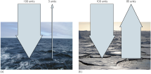
Although the Earth as a whole intercepts more or less the same amount of solar radiation from day to day, the amount received at any single point on the Earth’s surface varies dramatically because the Earth rotates on its axis once every 24 hours. From the point of view of a person standing anywhere on the Earth’s surface, the Sun appears to rise, travel across the sky and set. As a result, the angle at which solar radiation hits the Earth’s surface at any one point is constantly changing. On a summer’s day it is cool at dawn, but very hot by the afternoon, before again cooling at the evening. The location on the Earth is also important. If the Earth presented a flat circle towards the Sun, then the energy would be equally shared over the area of the circle (Figure 9a). But of course the Earth is not flat – it is a sphere.
Looking at Figure 9b, why would the solar energy received at the surface be different at low latitudes compared with high latitudes?
At high latitudes the light will travel through more of the atmosphere and when it reaches the surface it will be received over a larger area. So overall, the intensity will be reduced.

At higher latitudes the energy is reduced because its path through the atmosphere is longer and it is spread over a larger area. As a consequence, the equatorial regions will always be warmer than the polar regions simply because they receive more solar energy over the same area, but this is before the higher albedo of ice-covered land is taken into account (Section 4.2). The uneven heating of the Earth’s surface drives the weather and ultimately the global climate system.
5.1 The seasons
There is one final point to discuss related to the cycles of energy and that you most likely noted when you looked at Figure 2. When it is warm in the Northern Hemisphere (the black line on Figure 2), it is clearly cold in the Southern Hemisphere (the red line). This is because of the seasons, and anyone living away from the equatorial regions of the Earth has experienced their effect. Figure 10 shows the hypothetical situation in which the Earth’s axis of rotation is at right angles to the plane of its orbit. (If you have difficulty thinking about this you can again use an orange and a felt pen to mark out a location at high latitude and the Equator.)
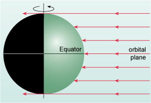
Imagine the Earth in Figure 10 with the 0° longitude line just at the boundary between the black and the green. If you rotate the Earth by one complete cycle, how long will the day be at the Equator compared with high latitude?
Night and day would always be the same length (i.e. 12 hours each) everywhere around the globe, except at the poles, which would have perpetual twilight.
But no planet in the Solar System has an axis of rotation that is aligned as shown in Figure 10.
What would be the implication on the day length if in Figure 10 the axis of rotation was not vertical?
The length of time each latitude on the Earth was facing the Sun would be different.
The axis of rotation of the Earth is currently at an angle of 23.4° to the vertical (see Figure 11) and, over the course of a year, the direction the axis points to changes relative to the Sun. Following on from the questions you have just answered, you can see that there will be implications for the day length at different latitudes and times of the year. At midday the Sun is overhead at the Equator only twice a year at what are called the equinoxes. These equinoxes fall on 21 March and 21 September. At other times the latitude at which the midday Sun is overhead moves between 23.4° N, which is called the Tropic of Cancer, and 23.4° S, which is called the Tropic of Capricorn, and back again (Figure 11b).
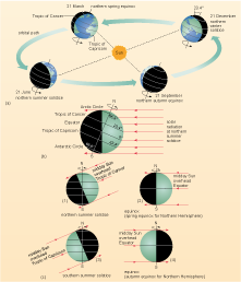
Figure 11a shows the passage of the seasons for the Northern Hemisphere. Along the Tropic of Cancer, the midday Sun is overhead and maximum solar radiation is received, during what is called the spring equinox. The longest day in the Northern Hemisphere is on 21 June, which is called the summer solstice. After this date the days begin to shorten. At the autumn equinox on 21 September both day and night are of equal length, but day length continues to shorten until the winter solstice on 21 December, which is the shortest day of the year. After this, days lengthen until the spring equinox on 21 March where again the day and night are of equal length.
In Figure 11 when will the Equator receive maximum solar radiation at the surface? (Hint: when is the Sun overhead at midday?)
The Equator receives maximum solar radiation at the equinoxes in March (spring) and September (autumn): see Figures 11c (2) and (4).
Poleward of the tropics, the Sun is never overhead, although it is at its highest elevation (the angle between the Sun and the horizon) at the summer solstice (Figure 11b and c (1) and (3)).
What will be the day length at the North Pole and South Pole at the northern summer solstice?
At the North Pole, the axis of rotation is facing the Sun and so it will never be dark. At the South Pole, the axis of rotation will be facing away from the Sun and so there will be 24 hours of darkness.
In their respective summers, the high latitudes experience the so-called ‘midnight Sun’ where the Sun never sets, and in their winters there is a ‘polar night’ where the Sun never rises and there is complete darkness. The lowest latitude at which there is polar night and midnight Sun has a special significance and a name which you are certain to have heard of. The current tilt of the Earth’s axis is 23.4° and there are 90° of latitude between the Equator and the poles (Box 2). So 90° – 23.4° = 66.6° and the lowest latitude that you would be able to experience the midnight Sun in the northern summer and the polar night in the northern winter is 66.6° N. This is called the Arctic Circle. The Antarctic Circle is at 66.6° S.
As the Sun dips below the horizon, the atmosphere can also bend the light, which keeps some daylight present – to experience complete darkness of a true polar night one would have to be at higher latitudes than 66.6°.
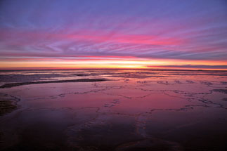
On the ground the distinction between polar day and polar night is not completely obvious. Just like the winters you experience on successive days, the midday Sun gets lower and lower in the sky. As it gets close to the horizon, if it is not completely overcast, the days become one very long sunset (Figure 12) with intense purple and red colours.
To demonstrate your understanding of the sections you have read so far, now answer Question 4 [Tip: hold Ctrl and click the link to open it in a new tab.]
The polar regions receive less solar energy than close to the Equator because of the shape of the planet and because the solar radiation has to pass through more atmosphere. The seasons occur because the axis of Earth’s rotation is at an angle to the Sun. This angle is also responsible for the latitude of the Arctic and Antarctic Circles, and polar day and polar night.
6 Defining the Arctic and Antarctic
You have seen how cold the polar regions can be (Figure 2) but how do you define what is meant by the terms ‘Arctic’ and ‘Antarctic’? The way this is done is extremely important for managing these areas. For example, one can hardly propose to save ‘Arctic wildlife’ unless you know where the Arctic begins and where for example it turns into northern Europe. Could the Arctic Circle be a useful definition for the Arctic?
At what latitude is the Arctic Circle?
The Arctic Circle is at the latitude 66.6° N.
Consider the Shetland Islands north of the British mainland. The islands are at approximately 60° N, 1° W (you can locate them on, for example, Figure 7a). In the Shetland Islands, the mean temperature, even in the coldest month of the year, is above ~5 °C and there are no glaciers.
From Figure 7a what latitude is the most southerly tip of Greenland?
The southern tip of Greenland just touches the 60° N grid line, therefore it is at ~60° N.
The southern tip of Greenland is called Cape Farewell and for seven months of the year the mean temperature is below 0 °C.
Question 4
On the basis of the text in Section 5, in no more than 100 words explain why Cape Farewell would be expected to receive roughly the same amount of solar energy as the Shetland Islands over the course of a year.
Answer
Both Cape Farewell and the Shetland Islands are the same distance from the Equator at ~60° N (Figure 7a). Because they are both in the Northern Hemisphere and both at the same latitude, over the course of a year (from Figure 11), they could be expected to receive a similar amount of solar energy.
The two locations in the Northern Hemisphere and at the same latitude 700 km south of the Arctic Circle have quite a different climate. Greenland, which has the largest icecap in the Northern Hemisphere, is by any definition Arctic, but the Shetland Islands are not. Clearly, a particular latitude is not adequate to define the Arctic.
One island in the Southern Hemisphere is South Georgia, which is located in the South Atlantic Ocean at 54° S, 36° W.
Box 2 gave a latitude for London, England. Would you expect South Georgia to have a similar climate to England?
Because South Georgia is at a similar latitude to London it would be expected to receive roughly the same amount of solar energy over the course of a year. On this basis, all other things being equal, it is not unreasonable to assume they would have a similar climate.
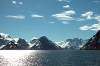
Figure 13 shows the coastline of South Georgia and almost 60% of the island is covered by glaciers! But there are no glaciers in the UK. So choosing a latitude to define both polar regions does not seem to make sense. Another simple method could be to use the habitats of particular animals. For example, you could say that ‘Antarctica is where penguins live’, but there is a species of penguin found nesting on the coast of southern Africa and even a penguin species in the Galapagos Islands near the Equator! So that doesn’t work either.
6.1 Habitats and temperatures: defining the Arctic
The difference in temperatures between Greenland and the Shetlands demonstrates that latitude – and as a consequence the amount of solar radiation received at the surface – cannot be used to define the Arctic. But what if you used temperature instead of latitude? In Africa Mount Kilimanjaro is 5895 m high and is relatively close to the Equator. Around its base is a vast diversity of trees, other plants and wildlife, but as you ascend the mountain, temperatures decrease and the diversity of plants and wildlife decrease as well. Pretty soon, if you keep climbing up, you will notice the density of trees thinning and becoming sparse, until eventually you will leave them behind. Above the line of trees (the so-called treeline), it is relatively barren compared with the base of the mountain. Keep ascending and temperatures continue to fall and eventually you will reach snow. On Kilimanjaro the temperature decreases with height – but on Earth, whilst the temperature clearly does not follow lines of latitude, it will decrease as you head towards the North Pole.
If you start on the Canadian border in a forest, what do you think will happen to the number of trees as you head northwards towards the pole?
As you head towards the pole the temperature will decrease and, just like climbing Kilimanjaro, the number of trees will decrease until eventually they are left behind.
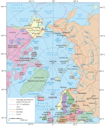
North of the treeline in the Northern Hemisphere is the so-called tundra, which to a person used to more temperate latitudes is really at first impression a bit bleak. At this point the mean atmospheric surface temperature in July will be approximately 10 °C. North of this it will be colder. The treeline itself represents a physical boundary beyond which trees cannot thrive because of a combination of light availability and temperature that would prevent tree growth – and so north of the treeline is often used to define the Arctic. If one circumnavigated the Northern Hemisphere and drew a line between all the regions where the mean atmospheric surface temperature in July was 10 °C, this line (the so-called 10 °C July isotherm) could also be used to define the Arctic. The locations of both the treeline and the 10 °C July isotherm are shown in Figure 14. The lines actually match rather well considering that the growth of trees is not linked to temperature alone.
Can you think of one simple advantage on the ground of using the treeline to define the Arctic compared with the 10 °C July isotherm?
You can see the treeline and don’t need any special equipment!
Question 5
Look at the stereographic projection in Figure 14 and take a moment to write down (in no more than 100 words) where the 10 °C isotherm and the treeline are close and where they are far apart, and note how they relate to the latitude of the Arctic Circle.
Answer
In North America, Canada and Siberia, along the coasts, the lines are close together. The only significant divergence is in Russia between the longitudes ~40° E and 90° E where the treeline is much further south than the 10 °C July isotherm. Both the treeline and the 10 °C isotherm are generally south of the Arctic Circle in the Western Hemisphere and north of the Arctic Circle in the Eastern Hemisphere.
But both of these definitions – the treeline and the 10 °C July isotherm – are not boundaries that humans have marked, but ones that are dictated by environmental processes. In other words, they provide a natural definition.
Another way of mapping the Arctic region is to consider who lives there and where, as shown in Figure 15.
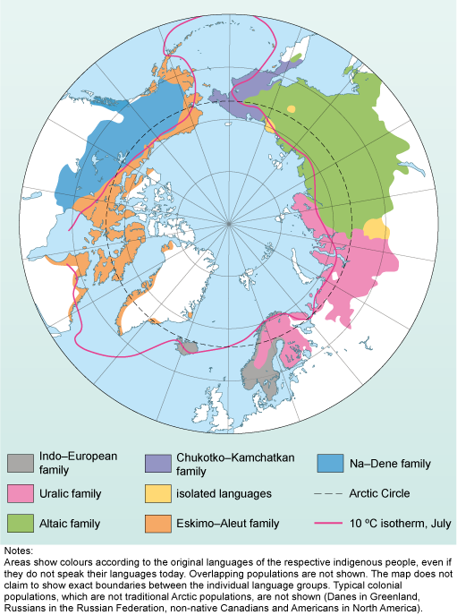
Based on the 10 °C July isotherm in Figure 15, how many different groups of indigenous peoples live in the Arctic?
There are at least six indigenous peoples living in the Arctic.
Arctic peoples are culturally diverse and the entire region has a population of ~4 million with many different languages. Because of this the Arctic will be defined through environmental boundaries of the 10 °C July isotherm or the treeline.
6.2 A line in the ocean: defining the Antarctic
The final section in this course starts with a simple question.
Given the distribution of land shown in, for example, Figure 6b, and the location of the treeline shown in Figure 14, do you think that the treeline will be useful for defining the Antarctic?
No. The majority of land in the Southern Hemisphere is closer to the Equator than the treeline would be – in addition there are no trees in the ocean!
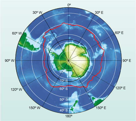
Clearly the treeline is not going to be a sensible way of defining the boundary of the Antarctic. As a continent, it is similar to Greenland in that it is covered in a very large ice cap with only a tiny fraction of the land being ice-free. Figure 16 shows Antarctica and the location of the Antarctic Circle at 66.6° S as a solid black line. At the beginning of this section you encountered the island of South Georgia north of the circle.
How much of South Georgia is covered in ice?
Almost 60% of the island is ice-covered.
To define the Antarctic it would clearly be a good thing to include South Georgia, as much of it is covered in ice and snow. Unfortunately there is no simple way. In terms of international law, Antarctica is land that is south of 60° S; but animals that only live in the Antarctic can be found as far north as 52° S. Which is right? Both are, to a certain extent, but the reason the cold environment extends so far north is that around Antarctica is a strong cold clockwise-circulating ocean current which isolates the ocean and lands to the south. This is the Antarctic Circumpolar Current, and the northern boundary of it is marked in red in Figure 16.
Find the location of South Georgia on Figure 16 at 54° S, 36° W. Which side of the red boundary is it on?
The island is south of the boundary.
South of the red boundary in Figure 16, Antarctic animals can range freely and icebergs, pieces of glacier that have broken off and are drifting in the ocean, can be expected at all times in the cold waters. Because it marks the division between polar and more temperate oceans, the boundary is called the Polar Front. For this course the Antarctic is defined as the region south of the Polar Front.
7 Summary
- The polar regions are cold because only a fraction of the solar energy received at the surface of the Earth actually heats them. The remaining energy is reflected back out into space.
- The inclination of the axis of the Earth’s rotation to the Sun is responsible for the seasons, the latitude of the Arctic and Antarctic Circles and polar day and polar night.
- The Arctic is a culturally diverse region and is commonly defined by the locations of the treeline or the mean atmospheric surface temperature in July being 10 °C.
- The region south of the Polar Front is the Antarctic. South of this are cold waters, Antarctic wildlife and ice-covered lands.
Conclusion
This course has introduced the polar climate by showing the annual cycle of mean atmospheric surface temperature at two locations. In their respective winters, both hemispheres are extremely cold and there are very large differences in temperature between winter and summer. The low temperatures are caused by reduced energy from the Sun coupled with a high albedo. It is possible to define the Arctic using both temperature and the northern limit of tree growth. But defining the Antarctic it is more problematic, and here an ocean front that separates warm and cold waters is a sensible definition.
Acknowledgements
This free course was written by Mark Brandon.
Except for third party materials and otherwise stated (see terms and conditions), this content is made available under a Creative Commons Attribution-NonCommercial-ShareAlike 4.0 Licence.
The material acknowledged below is Proprietary and used under licence (not subject to Creative Commons Licence). Grateful acknowledgement is made to the following sources for permission to reproduce material in this free course:
Figures
Course image Smudge 9000 in Flickr made available under Creative Commons Attribution-ShareAlike 2.0 Licence.
Figures 1, 6, 7, 8, 12, 13 and 16: Copyright © Mark Brandon
Figure 14: Copyright © National Snow and Ice Data Center
Figure 15: Copyright © Arctic Council Secretariat.
Every effort has been made to contact copyright owners. If any have been inadvertently overlooked, the publishers will be pleased to make the necessary arrangements at the first opportunity.
Don't miss out
If reading this text has inspired you to learn more, you may be interested in joining the millions of people who discover our free learning resources and qualifications by visiting The Open University – www.open.edu/ openlearn/ free-courses.
This free course is adapted from a former Open University course called 'The frozen planet (S175)'.