Making sense of art history
Use 'Print preview' to check the number of pages and printer settings.
Print functionality varies between browsers.
Printable page generated Tuesday, 9 June 2026, 7:31 PM
Making sense of art history
Introduction
In this course you'll explore a further arts discipline – art history. But why study art history? Look around you, it's likely that wherever you are you'll be able to see some images – for example, on posters, magazine covers or food packaging. It's also likely that many of these images will be intended to have some sort of effect on you. For example, an image on a cereal packet might be intended to persuade you that eating the product will make you healthy, whereas the images on the front page of a magazine will be chosen to encourage you to read on. While you won't be studying cereal packets and magazine covers in this course, you will be exploring the power of images via a study of contemporary art from the 1980s onwards.
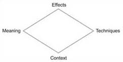
The Study Diamond
The Study Diamond represents an approach to analysing and interpreting texts such as poems, works of art, pieces of music and works of literature. When used methodically, the Study Diamond provides a reliable and reusable formula for arriving at well-argued conclusions when interpreting a particular work.
There are four points to the Study Diamond:
- effects
- techniques
- context
- meaning
You will apply the Study Diamond to the analysis of art works as well as developing your study skills. Both the activities and the text in this course are designed to be worked on while you look closely at the art works.
Plate 1: Turner prize artists
Rather than giving a historical overview of art, as might be suggested by the term ‘art history’, we'll concentrate on looking at art produced by artists nominated for the Turner Prize. It's worth pointing out that while we're concentrating on art produced since the 1980s, you can apply the same techniques that you will learn here to the study of any art work, from any period.
The Turner Prize is awarded each year to an artist who has made an outstanding contribution to art in Britain during the previous twelve months. I've chosen to concentrate on the Turner Prize because I believe that many of the art works nominated for it have important things to say about the times in which we are living. The art works that you'll encounter here are visually diverse, ranging from pickled cows to paintings made with elephant dung and glitter. Some are beautiful, some are shocking and many might appear on first sight to be very confusing. I can't predict whether you'll like all (or, indeed any) of them, but I hope that by the end of this free course you'll agree that contemporary art can be extremely thought-provoking. Taking the time to look beyond the immediate appearance of an art work to consider what the artist might be trying to say can be immensely rewarding.
This OpenLearn course provides a sample of level 1 study in Arts & Humanities
Tell us what you think! We’d love to hear from you to help us improve our free learning offering through OpenLearn by filling out this short survey.
Learning outcomes
After studying this course, you should be able to:
identify the effects of art works
understand a range of artistic techniques, such as the use of colour, composition and medium
recognise the relationship between effects and techniques in a range of art works
understand some of the factors involved in interpreting meaning
understand the significance of context in informing the interpretation of art works.
1 What is art?
We need to think about how to define art before we begin to look at it more closely. It is notoriously difficult to pin down a clear definition of art, so in this course we'll be considering some fresh approaches to its study rather than providing a definitive answer to the question ‘what is art?’ Considering many different interpretations when studying texts also applies to the study of paintings, sculptures and installations. So, although I'll often follow the activities in this course with interpretations of the art works that you'll be studying, this is not intended to provide you with an answer that is better than your own. Rather, I am simply offering another interpretation which you may be able to contrast with your own. Let's start by looking at two art works.
Activity 1: Looking at two art works
Look at Plates 10 and 17 below, and make some notes for each one in response to the following questions.
Do you like it?
How does it make you feel?
Is it art? Briefly explain the reasons for your answer.
Don't spend more than a minute or two responding to each question. Questions 1 and 3 require a simple ‘yes' or ‘no’ answer and some brief explanation for question 3. For question 2 you could record your immediate feelings about the works represented, using one word answers (for example ‘happy’ or ‘confused’) rather than complete sentences.
Plate 10
Plate 17
Discussion
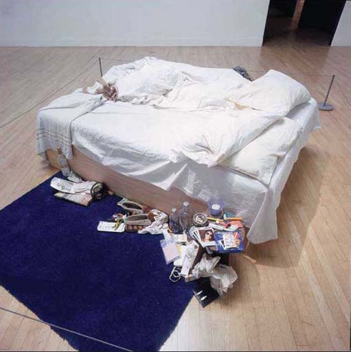
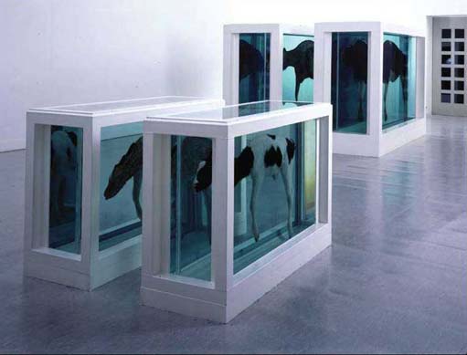
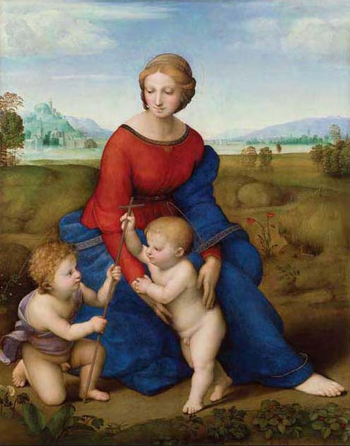
Your own response to each activity will largely depend on your taste, background and personal experiences. I'm guessing, however, that for this activity, Damien Hirst's Mother and Child Divided will prompt more people to answer ‘no’ for questions 1 and 3 than will Raphael's Madonna of the Meadow. The range of answers for the second part of question 3 is likely to be particularly wide. Personally, while I feel that Madonna of the Meadow is quite peaceful and seems to convey a feeling of warmth and tenderness, I find Mother and Child Divided to be pretty disturbing and I feel uncomfortable about looking at it closely.
I tried this activity on a colleague and she confessed that Mother and Child Divided summed up all her fears about not being able to understand contemporary art. She said, 'I don't know whether I'm supposed to like it or not but don't really like to say so'.
You may already have your own feelings about contemporary art and if you have, the next activity will allow you to get them down on paper. You'll also get a sneak preview of the art works that you'll be exploring in this course.
Activity 2: Thinking about studying contemporary art
Skim through the art works below and then make some notes in response to the following question.
What are your feelings about the prospect of studying contemporary art?
Be as clear as possible here; later in the course you'll return to the notes that you've made to see whether your feelings have changed.
Plate 1
Plate 2
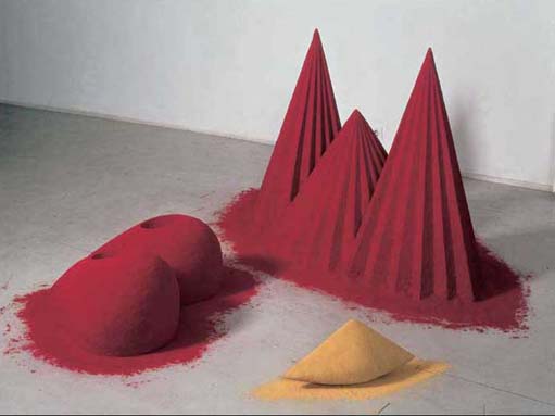
Plate 3
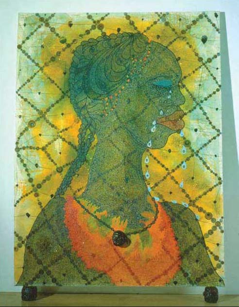
Plate 4
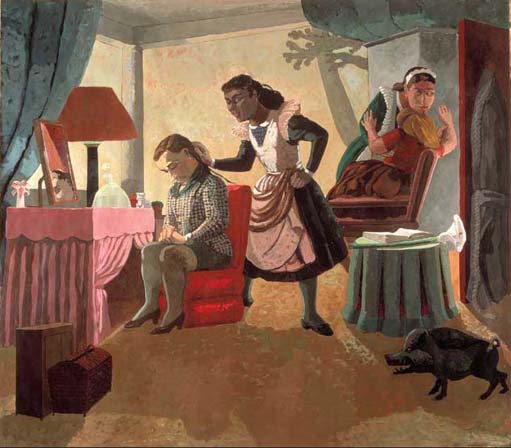
Plate 5
Plate 6
Plate 7
Plate 8
Plate 9
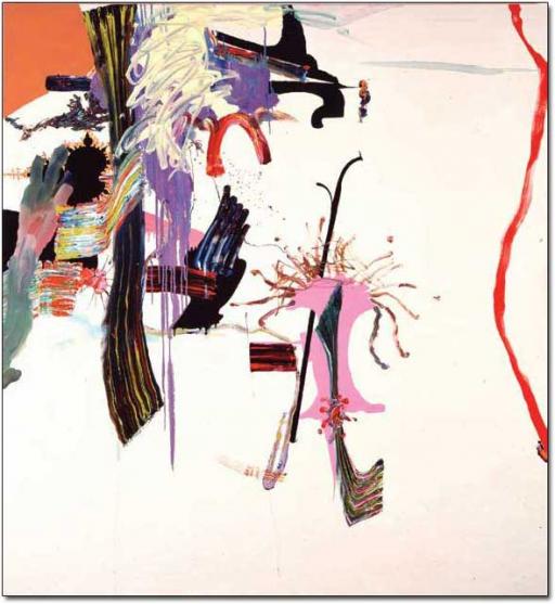
Plate 10
Plate 11
Plate 12
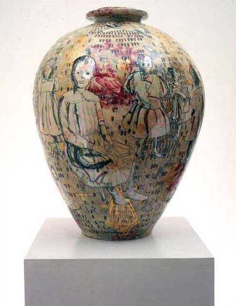
Plate 13
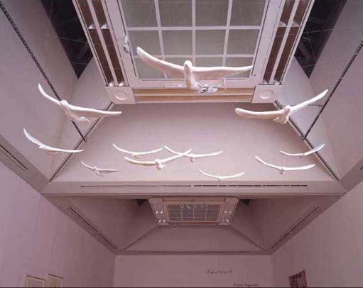
Plate 14
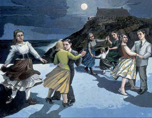
Plate 15
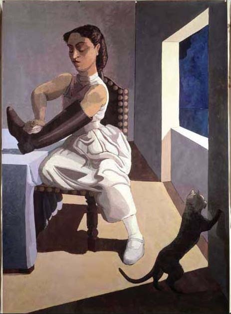
Plate 16
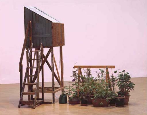
Plate 17
Discussion
Of course, since this activity is about recording your own feelings, once again there's no right or recommended answer. Maybe you're entirely comfortable about approaching contemporary art. If so, then hopefully this course will introduce some fresh ways of looking at art works produced since the 1980s. If you're in any way uneasy about studying contemporary art then I hope your study of this course will give you some pointers about how you might approach art works that seem to offer no easily identifiable meaning at first glance.
A common response to contemporary art is to query whether art works such as those reproduced in the Plates are actually art at all. This can be seen in the following comments, posted in the ‘Have Your Say’ section of the BBC News website. These comments followed a fire in a London art handlers' warehouse, in which over one hundred works were destroyed, including works by Tracey Emin (see Plates 1, 13 and 16) and Damien Hirst (see Plate 10).
Plate 1: Turner prize artists
Plate 10
Plate 13
Plate 16
I can't imagine how anyone can call a tent or a shed art. I can only assume it's because they can't paint, sculpt or turn a clay pot. This fire is no great loss to the art world …
[Gareth Dunn, Edinburgh]
Couldn't have happened to a better collection, the works of Emin and Hirst in particular. I have always thought the rubbish produced by these people would make a good bonfire. We are continually insulted by these people who tell us that if we don't love and appreciate these works then we must be stupid. I, for one, remember the fairy tale of the Emperor's new clothes …
[Kate Rodgers, West Midlands]
… I've got a few unmade beds for sale to interested bidders. In fact for the right price I'll throw in the stroppy teenage occupant. He can reduce any tidy room to the state of Tracey's bedroom if left to his own devices for a day or two.
[Karen Wood, Lincolnshire] (BBC News website, 2005)
You'll remember that in Activity 1 you were asked to consider whether Damien Hirst's Mother and Child Divided is art. If you decided that it isn't art, then you're not alone in thinking in this way. When Hirst won the Turner Prize in 1999, the prominent art critic Brian Sewell was unimpressed, commenting:
I don't think pickling something and putting it into a glass case makes it a work of art. It is no more interesting than a stuffed pike over a pub door.
(Channel 4 website, 2005)
If you concluded that Mother and Child Divided is art, then you're also not alone. Hirst has many fans, one of whom acclaimed the work as having:
The integration of thought and feeling and the combination of complexity with visual and emotional power that is characteristic of major art.
(Socialist Review website, 2005)
One reason for this difference in opinion is likely to be that the writers differ in what they think makes something art. The question ‘What is art?’ has been the subject of hot debate by art historians for many years and in the next activity you'll attempt to answer the question yourself.
Activity 3: What is art?
Make some notes about the sort of things that you consider to be ‘art’.
Make a list of any common characteristics that these ‘art works’ have. (For example, are they already exhibited in galleries, do they display technical skill, do they have the power to move you emotionally?)
Try to write a one sentence answer to the question ‘What is art?’ using your notes from Activity 1 as a basis for your response.
Discussion
Did you find this activity difficult? If so, then you're not alone. For hundreds of years people have been asking the question ‘what is art?’ and as yet no universally agreed answer has been reached. In fact, it's quite likely that there is no right answer. It's possible, though, that you might have identified some of the following as characteristics that art works tend to have in common:
being displayed in galleries
being produced by a recognised artist
showing evidence of technical skill
expressing an emotion or a point of view
being the result of a creative process by an artist
being unique
being labelled as ‘art’ by the person who created it.
The Collins Paperback English Dictionary defines art as:
'The creation of works of beauty or other special significance' and, 'Human creativity as distinguished from nature'.
(Collins, 2000)
How far does this reflect your own views? If you want to amend your own definition in the light of this, do so now.
At the end of this free course you'll revisit the question ‘What is art?’ to see if your answer to it has changed as a result of your studies. The question is also relevant to your work in the next section, where you'll begin exploring the wide range of reactions to the Turner Prize and to the art works that have been nominated for it.
2 The Turner Prize: an annual farce or a celebration of creativity?
The Turner Prize is really the artistic equivalent of the Emperor's new clothes – incomprehensible rubbish worshipped by a narrow and increasingly out-of-touch clique.
(Tate Britain website, 2006)
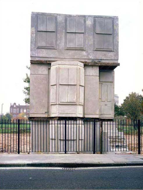
Ever since its foundation in 1984, the Turner Prize has been controversial; the quote above from The Daily Mail is typical of the type of criticism it attracts. In 1993 there was even an ‘Anti-Turner Prize’. It awarded £40,000 (twice as much as was awarded to that year's Turner Prize winner) to Rachel Whiteread (see Plate 6) for producing the ‘worst’ body of work that year. The money was nailed to a wooden frame and secured to the railings outside the Tate Gallery. Whiteread was allowed thirty minutes to accept it or see it burnt; she accepted the money but immediately gave it away to ten artists in financial need and to the housing charity Shelter.
Plate 6
So why is the Turner Prize so controversial? As you work through this course you'll be encouraged to think about this question and by the end you should have reached some well-informed conclusions about why Turner Prize-related art is often less than enthusiastically received. By now you might be wondering whether the Turner Prize is worth studying at all, bearing in mind the negativity that surrounds it. Rest assured, the prize does have its fans. For example, art critic Iain Gale asserts that while:
… art prizes abound – all might learn from the Turner. It is a benchmark. If it didn't exist we would have to invent it. It stimulates debate, it engages and provokes. We need such catalysts. Love it or loathe it, the Turner has gradually put contemporary art within the public domain.
(Gale, Scotland on Sunday, 2001)
The Turner Prize's potential to stimulate debate, engage and provoke is one of the reasons why we have chosen to focus on it. We will continue by exploring some reactions prompted by the Turner Prize. The Tate Gallery, which hosts the Turner Prize exhibition, encourages the general public to record their comments on the nominated art works both in a special ‘comments room’ at the gallery and in a ‘Post Your Comment’ section on the Turner Prize website. The following comments were posted by the public in response to the 2004 Turner Prize shortlist.
Comments from the ‘Post a Comment’ section of the 2004 Turner Prize website
Art. What Art?
‘The standard shown this year is terrible. I can't recall a poorer shortlist.’
‘There is simply no talent on show. The only difference between the average person in the street and previous artists whom have won this prize is publicity. It's that simple.’
‘Damn Right!!’
‘I agree with this comment as I too feel that according to this year's shortlist anyone could be considered an artist not due to artistic talent but due to random and meaningless, abstract work … ’
‘Great comments! Art in the Turner Prize does seem to revolve around fame and celebrity. When are people going to realise that art is about integrity and talent or ability, and if you don't have that you don't have anything!’
‘I completely agree. Everyone just seems to invent all sorts of meaningful explanations for things that do not have any meaning whatsoever. I really enjoyed the comments room – it was enthralling.’
(Tate Britain website, 2005)
Perhaps the most frequently repeated complaint in these comments was that the artists creating these art works were not showing any talent or artistic ability. Many of the comments also questioned whether the shortlisted works were actually art at all. You've touched upon this issue already and you will revisit it again later.
It's significant that several of the comments mention not being able to understand the works featured in the 2004 shortlist. Some people fear there may be a hidden meaning that they're not getting and that by saying they do not understand a work, they'll appear foolish. After the warehouse fire, a report in The Times commented that:
The visual arts make the British nervous. We don't know what we are looking at and we don't know how to look.
(Winterson, The Times, 2004)
In this course, you'll learn that the analysis and interpretation of contemporary art isn't a process of uncovering a mysterious hidden meaning. Rather, it involves the spectator (the term used in this course to describe a viewer of an art work) performing a step-by-step examination of the work in a very similar way to the examination of any other text (for example, a haiku poem). As you work through this course you'll build on the skills that you've already gained to help you find a way of approaching contemporary art and writing well argued accounts of art works. This will involve using all four points of the Study Diamond to:
find a framework for analysing art texts
better understand some of the reactions to art works shortlisted for the Turner Prize.
In the next section, you'll start work on point 1 above, using the effects point of the Study Diamond to help you begin interpreting some Turner Prize-related art works.
3 Art works and their effects
3.1 Introduction
Your study of art history will start with the effects point of the Study Diamond. This seems especially relevant to an examination of art by Turner Prize-nominated artists as you've seen that such art seems to provoke dramatic reactions. You'll be looking in detail at two types of effects, namely:
the way you feel when you look at an art work and how to record these feelings
the way you read the art work in a particular way, focusing on one aspect of it before others.
As you work through this section you'll start gathering evidence that you can use to support an analysis of the possible meaning of some Turner Prize-related art works. Perhaps the most important evidence is that which records your own reaction to these art works. When analysing any art work you should try to trust your own feelings and thoughts about what you see, and record these, rather than referring to other people's reactions to find out what you should be feeling and thinking.
3.2 Recording your feelings
Artists strive for their art works to have effects on the spectator, even though they cannot necessarily predict precisely what sort of effects these will be. Our immediate reactions to any art work are, therefore, an essential consideration when analysing that work. However, it can be very difficult to recall how we felt when we experienced a particular art work for the very first time. The more we look at something and examine it in detail, the more distanced we become from its original impact on us. For this reason, as a student of art history, it's important to record the immediate effects of any art work that you encounter. That way, you'll have evidence with which to build a more complete account of the art work, including its immediate effects, if you're asked to discuss that work in more detail.
Activity 4: Recording the effect of some Turner Prize-related art works
Take a look at Plates 2 to 14 attached below. These art works have all been created by artists who have appeared in Turner Prize shortlists. For the moment, you should ignore the titles of these works.
Look at the reproductions one at a time and for each art work note your first impressions. This could be the first word that comes into your head when looking at the art work, or the way that the art work makes you feel. Don't spend too long doing this activity, and try to avoid starting to think in depth about the subject matter of the art work, or what it might mean. For the moment, just record the immediate impact of the work by describing the effects that it has on you. Don't worry about writing complete sentences; just a word or two for each art work will be fine.
Plate 2
Plate 3
Plate 4
Plate 5
Plate 6
Plate 7
Plate 8
Plate 9
Plate 10
Plate 11
Plate 12
Plate 13
Plate 14
Discussion
What did you think? I'm sure that if everyone who studied this course compared their answers it would soon be clear that there's no right answer and that the effects that an art work has can depend on many factors. In particular, such things as your background and emotional state at the time of viewing the work can be quite important. I've recorded my own initial impressions about some of these works in Table 1 below. How do your first impressions compare with mine?
| Art work | Effects and comments |
|---|---|
| 2 | Multicoloured. Fragile. Spiky. |
| 3 | Colourful. Dignified. Sad. |
| 4 | Alice in Wonderland. Story-telling. Intriguing. |
| 5 | Messy. Confusing. |
| 6 | Bland. Concrete. |
| 7 | Bright. Photographic. Joyous. |
| 8 | Colourful and complex. Dizzy. Flowing. Psychedelic. |
| 9 | Basic. Confusing. Splodges. |
| 10 | Repulsive. Dissections. Sad. |
| 11 | Cute. Sturdy. |
| 12 | Intriguing. Delicate. |
| 13 | Wistful. Flimsy. |
| 14 | Calm. Rhythmical. |
You'll be revisiting many of these works later in order to think about whether your feelings change as you learn more about them. However, the main focus of your study will be:
Chris Ofili's No Woman No Cry (Plate 3)
Paula Rego's The Maids (Plate 4)
Tracey Emin's The Perfect Place to Grow (Plate 16).
As references to these plates are made, please make sure that you look at them to confirm what is being said about these art works. Just as with poetry, regular and detailed reference to the text is essential.
As you work through this course you'll use each point of the Study Diamond to help you to gather evidence about these art works. This will allow you to gradually build a well argued analysis of what you think these art works mean and what their significance is. With this task in mind, you should now allocate a separate section of your notes (perhaps using a fresh page) to each of the three art works. Put the art work title and the artist's name at the top of each page and for The Maids and No Woman No Cry, write down your first impressions of the works, as recorded in Activity 4.
3.3 Reading an art text
Having noted the immediate effect of an art work in terms of the way that it makes you feel, or the mood that it seems to convey, the next thing you can usefully do is to record the journey your eye takes as it experiences the work. This process of examining an art work is often called ‘reading’. Recording your first ‘read’ of an art work can give you some valuable supporting evidence to use when analysing it in more detail.
Activity 5: Reading some Turner Prize art works
Take a look at Plates 3 and 4 attached below and make notes on the path your eye takes as it moves over the art work, or ‘reads’ it, and then respond to the following questions.
What initially catches your eye? Where do you go next? And after that?
Where do you end up? Do your eyes stray away from the work altogether?
Is there anything that you didn't notice at first but saw later in your reading?
Did your eyes keep coming back to a particular part of the art work?
Is there anything that you didn't look at or thought wasn't important?
You don't need to write anything too elaborate for each of these questions. A list of the order in which you read the painting would be ideal as a response to questions 1 and 2, while answering question 3 should only take a few words. You should record your ‘readings’ of The Maids and No Woman No Cry in the appropriate sections of your notes.
Plate 3
Plate 4
Discussion
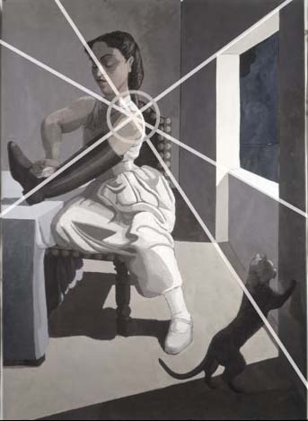
How did you get on? As an example of the sort of journey one might take around an art work, here's an account of my first reading of The Maids.
My eye was initially drawn to the white of the central figure's apron and then to her face. After this, I followed her arm down to the figure sitting on the red chair and then had a look around the items on the table in front of this figure. My attention was caught once more by the figure in the centre but then I noticed the shadows on the wall. After looking at these my eye was drawn to the two figures on the right and then down to the flower placed on the table below them. After this, I wasn't tempted to look away from the painting but instead found myself looking again at some of the areas I had already explored, sure that there were probably details that I had missed. It was then that I noticed the pig-like creature in the bottom right-hand corner of the painting.
Was your reading of The Maids very different? If you have the time and the opportunity you could ask other people to record their journey around these art works. Don't be surprised if they take a different route from your own.
Much like the author of a poem or a historical text, artists use a range of techniques in order to encourage the spectator to read art works in a certain way. In the next section you'll explore the connection between effects and techniques.
4 The relationship between effects and techniques
4.1 Introduction
Think back to Activity 4. Did you find yourself concluding that you liked or disliked any of the art works? Or even that you loved or hated them? Just as with poetry, liking or disliking something is a common first reaction to an art work; there's nothing wrong with having these feelings. It's advisable to monitor your own feelings carefully, and not to distance yourself from an art work because you're afraid you're not going to understand its meaning. As you know, an art work is often created in order to appeal to your feelings, so it would be rather odd if you ignored these. Along these lines, the 2003 Turner Prize winner Grayson Perry (see Plate 12) said:
I think it's about time that people started to bring their senses into play more and trust their bodily reactions to work – become more willing to say, ‘Wow! That is really lovely. I love that!’, rather than looking for the meaning of it all the time.
(Perry, The Guardian online, 2003)
Plate 12
Having said this, for academic purposes it's also helpful to allow some reaction time after your first impression, and to think about the techniques that have achieved these effects. So pause and think about what it is about the appearance of an art work that affects you in a certain way. Consider just what the artist involved might be trying to say via this work. Then, rather than simply saying ‘this painting is really gloomy, I just don't like it’, you can say something like ‘this painting makes me feel gloomy and uneasy because of the dominant purple and green colours’. Such a statement makes a connection between the effects and techniques points of the Study Diamond and can form the basis of an argument about the possible meaning of an art work.
For now, we're going to shift our attention to the techniques point of the Study Diamond, focusing on those techniques that have been used in some of the Turner Prize-related art works that you've already encountered. This exploration of the relationship between effects and techniques will also allow you to gather some more information about The Maids and No Woman No Cry that you can use as evidence to support an interpretation of their possible meanings.
4.2 The form of art: looking at techniques
In art history the word ‘form’ is used to describe the overall shape and structure of an art work. Various techniques will have been used to create this form. You'll learn about some of the techniques that will best help you to analyse and eventually to interpret our three chosen art works. You'll look at the following techniques:
use of colour
use of medium
arrangement of the composition.
Initially you'll focus on the techniques used in paintings and later you'll extend your exploration of techniques to cover sculpture and installations. You'll encounter a lot of new technical terms in the next few sections. While this may appear a little daunting at first, rest assured that each term will be explained fully. By the end of this free course you'll have developed a valuable approach that will allow you to systematically analyse art works from all time periods.
5 Colour
5.1 Introduction
Colour can have a range of effects on us as spectators: for example, it can have an emotional impact, or it can encourage us to read the art work in a particular way. Here, you'll look at a range of questions that might be asked of the use of colour, namely:
Has a wide or narrow palette of colours been used?
Have contrasting colours been placed next to each other?
Are there more warm colours than cool colours or vice versa?
Are the colours largely bright or dull?
In what way is dark and light colour used?
For each question you'll be encouraged to consider whether the use of colour conveys a particular mood or emotional effect and whether the use of colour helps to determine the order in which we read the art work.
5.2 Question 1: Has a wide or narrow palette of colours been used?
The word ‘palette’ is used when describing the number of different colours that are present in an art work. A painting with many different colours, for example Chris Ofili's Afrodizzia (Plate 8), can be said to feature a wide palette of colours. In Paula Rego's The Dance (Plate 14) the range of colours is more limited, comprising mostly blue and yellow hues, so the painting can be said to feature a narrow palette.
Plate 8
Plate 14
Having identified the variety of colours that have been used in an art work, it's important to explore the effects of this. In Afrodizzia for example, the wide colour palette might be seen to convey a sense of confusion, giving no clues about which part of the painting to focus on first. It might also be seen to contribute to a joyous or cheerful feel. In my response to Activity 4 I described Afrodizzia as being ‘psychedelic’ and ‘colourful’. Clearly the colours had an immediate impact on me. In comparison, The Dance, with its more limited palette, feels calm, stately and subdued, effects that seem to be in keeping with the moonlit scene represented.
5.3 Question 2: Have contrasting colours been placed next to each other?
Contrasting colours are those that are opposite, or almost opposite each other on a colour wheel. Their emotional effects can be to suggest drama, tension or perhaps vibrancy, as in Afrodizzia where it's arguable that the contrasting colours add to the lively, joyous feel of the art work. The effects of contrasting colours can cause the spectator to read a painting in a particular way by drawing their attention to areas of importance. For example, in The Dance, the contrast between the yellow dress of the woman placed left of centre in the composition and the blue that surrounds it tends to draw the spectator's eye to this area of the painting.

5.4 Question 3: Are there more warm colours than cool colours or vice versa?
Colours such as red, yellow, orange and some greens can be seen as ‘warm’ while blues, other greens, purples and even some shades of red can be described as ‘cool’. Warm colours tend to convey a positive, cheerful mood while cool colours can suggest calmness and serenity or perhaps sadness and gloominess. It's arguable that the dominance of blue in The Dance, for example, contributes to the peaceful night-time feel of the painting, while the dominant reds, yellows and greens in Afrodizzia help to convey a positive, cheerful mood.
The next activity offers you an opportunity to consider the use of colour.
Activity 6: The use of colour in Paula Rego's The Maids
Look at Plate 4 below and make some notes on the use of colour in this art work, responding to the questions you have just worked through:
Has a wide or narrow palette of colours been used?
Have contrasting colours been placed next to each other?
Are there more warm colours than cool colours or vice versa?
Plate 4
In your response, try as far as possible to consider the relationship between techniques and effects in the art work, in terms of both:
a.the mood conveyed by the colour in the work
b.the possible use of colour to control the way that you read the work.
Your response to this activity will provide further evidence that you might find useful when constructing an interpretation of this art work later. You could consider experimenting with making notes in the form of a table; you might try replicating the table below in order to organise your notes.
| Question | Technique | Effect |
|---|---|---|
| Has a wide or narrow palette of colours been used? | ||
| Have contrasting colours been placed next to each other? | ||
| Are there more warm colours than cool colours or vice versa? |
Discussion
I found Paula Rego's use of colour in The Maids to be effective both in conveying mood and in controlling my reading of the painting. She uses quite a wide palette of colours, and, for me, this tends to give the painting a fairly energetic feel, although perhaps not the vibrancy that might be expected from such colours. I thought that the painting felt quite homely, partly because of the use of warm colours but I also felt that the use of contrasting colours (red and green, for example) added a sense of drama or even tension.
Let's continue by exploring our fourth question about colour.
5.5 Question 4: Are the colours largely bright or dull?
Two colours may have the same hue (for example blue) but one may be vivid and the other dull. Look again at The Dance (Plate 14). Here, the sky is depicted using both dull and bright blue colours. However, neither dull colours nor bright colours dominate the painting; rather there's probably an equal amount of each.
Plate 14
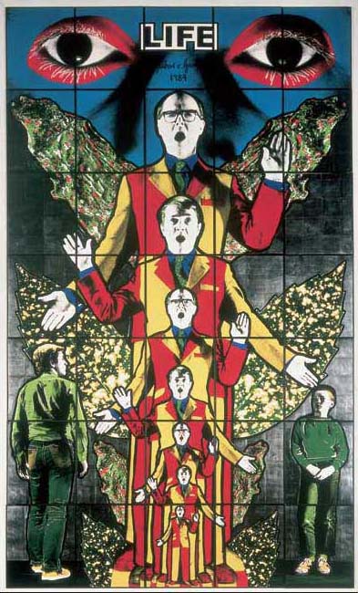
Having identified the extent to which dull and bright colours feature in a painting, consider the likely effects of this. For example, an art work with mostly bright colours can suggest a livelier mood than one where the colours are mostly dull. Regarding your reading of the painting, if both bright and dull colours are present, your eye tends to be drawn to the bright colours first. Bright colours can also give an artificial feel, as in Life by Gilbert and George (Plate 7), where intense reds, yellows, greens and blue are dominant.
Plate 7
Activity 7: The use of brightness of colour in Paula Rego's The Maids
Look at again at The Maids (Plate 4) and add to your notes on the use of colour in this art work by responding to the question: are the colours largely bright or dull?
Plate 4
Again, you should consider the relationship between techniques and effects in the art work in terms of:
a.the mood conveyed by the colour in the work
b.the possible use of colour to control the way that you read the work.
You should add your response to this activity to your exsitng notes on the The Maids, perhaps by replicating the table below.
| Question | Technique | Effect |
|---|---|---|
| Are the colours largely bright or dull? |
Discussion
In Activity 6, I noted that although a wide palette of colours has been used, Rego's painting is not particularly vibrant. I think that this is partly due to the quite extensive use of dull colours (for example, the large patch of dark yellowy-brown towards the bottom of the painting). This area appears to separate us (the spectators) from the main content of the painting and, in turn, seems to give the impression that the action depicted in the painting is taking place on a stage. It's also arguable that this quite empty area psychologically distances us from the people in the painting, as we're not really encouraged to feel that we are part of the action. Does the painting have these effects on you?
Again, your conclusions about the relationship between technique and effect in The Maids may have been very different. Please make sure you note your conclusions clearly as they will be valuable evidence upon which to base an interpretation of the meaning of the painting later in the course.
5.6 Question 5: In what way is dark and light colour used?
How light or dark a colour appears is termed its tone or ‘value’. A colour's value is increased, or lightened, by adding white or another lighter value colour to it. A colour's value is decreased or darkened by adding black or a darker value colour to it. In The Dance, for example, the foreground area features both dark and light blues. Technically, the lightened colours are called ‘tints’ and the darkened colours are called ‘shades’.
Colour value is one of the most powerful aspects of form that can be used by an artist to create visual contrast in a painting. It can have considerable impact on the spectator, both by suggesting particular emotions and moods and by encouraging the spectator to read a painting in a certain way. Value can also be used to help in the representation of objects from the real world, for example, when an artist is trying to represent a three-dimensional shape or to represent light in a painting.
When exploring colour value in an art work, we can ask the general question: ‘In what way is colour value used?’ This can be subdivided into several further questions of which I have chosen four.
How wide is the range of colour values featuring in the art work? In other words, what is the distribution of colour values from dark to light?
The breadth of the value range in a painting can be effective in helping to convey mood. For example, a painting comprising mostly dark colour values can make a work appear gloomy and sombre; whereas one with middle range colours can convey softness and harmony; and a painting comprising mostly light colour values can suggest optimism and cheerfulness.
Are contrasting colour values present in the art work? Or are dark and light colour values placed adjacent to each other?
Essentially, the greater the difference between light and dark colour values in a particular area, the more attention that area will attract.
Are contrasting colour values used to model three-dimensional forms?
In The Dance, for example, the contrast of light and mid colour values in the arm of the woman in yellow near the centre of the composition gives the limb a sense of roundness and solidarity.
In what way are the colour values distributed throughout the art work?
Concentrating most of the light values in one area of the composition and most of the dark values in another can be effective in emphasising one area of an art work over the rest. When light and dark values are placed adjacent and are distributed evenly throughout the art work it can give the composition a sense of ‘movement’, causing the eye to move from place to place rather than focusing on one particular area.
Look again at Paula Rego's The Dance (Plate 14). This painting features an even distribution of colour values, with dark and light colour values appearing throughout the composition. This seems to give the composition movement, leading the spectator's eye from one dancer to the next.
Plate 14
In Chris Ofili's Afrodizzia (Plate 8), while light and mid values tend to dominate much of the composition helping to convey a positive energetic feel, the dark values that are present in the tiny faces that punctuate the composition add additional interest and cause the spectator to pay extra attention to these areas of the work.
Plate 8
Activity 8: The use of colour value in Paula Rego's The Maids
Take a further look at The Maids (Plate 4) and add to your notes on this painting, commenting on the use of colour value in it, using the four questions above.
Plate 4
Again, when writing your response you should consider the relationship between techniques and effects in the art work in terms of:
a.the mood conveyed by the colour values in the work
b.the possible use of colour value to control the way that you read the work.
You should add your response to this activity to the notes you have already made on The Maids. Again, you could complete a copy of the table below.
| Question | Technique | Effect |
|---|---|---|
| How wide is the range of colour values featuring in the art work? | ||
| Are contrasting colour values present in the art work? | ||
| Are contrasting colour values used to model three-dimensional forms? | ||
| In what way are the colour values distributed throughout the art work? |
Discussion
The use of contrasting colour values makes me feel slightly uneasy about the painting, while also controlling my reading of it by drawing my eyes to the lighter areas. Again, you might have decided that colour value worked in a very different way and, as ever, there's no right answer, but your response here should, as always, be based on a careful reading of the painting.
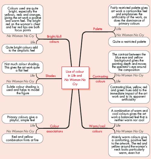
This section on colour was quite demanding in that it contained a number of new technical terms. I hope that you've enjoyed finding out a little more about some of the art works that you've already encountered while learning about new terms. Next, you'll consolidate your work on the use of colour by comparing the relationship between techniques and effects in Chris Ofili's No Woman No Cry and Gilbert and George's Life.
5.7 Comparing art works
One of the most important ways that an art historian can discover more about the relationship between effects, techniques, context and meanings in an art work is to compare it with another art work. For example, a comparison of two works depicting the same subject matter but in different ways might better highlight the effects of the techniques that have been used. This can also reveal much about the way each artist has attempted to convey a possible meaning through their use of form.
Activity 9: Comparing the use of colour in No Woman No Cry and Life
Look at Plates 3 and 7 below and make notes on the differences and similarities in the way that colour is used in each art work.
Plate 3
Plate 7
Use the questions in Table 5 (below) to help you with your answer. Don't forget to consider the relationship between techniques and effects in each art work in terms of:
a.the mood conveyed by the colour in the work
b.the possible use of colour to control the way that you read the work.
Your response to this activity will provide further evidence that you can use when planning an interpretation of No Woman No Cry later. You could consider trying either a table or a mind map to structure your notes. A possible table format is provided below.
| Technique: No Woman No Cry | Effect: No Woman No Cry | Technique: Life | Effect: Life | |
|---|---|---|---|---|
| Has a wide or narrow palette of colours been used? | ||||
| Have contrasting colours been placed next to each other? | ||||
| Are there more warm colours than cool colours or vice versa? | ||||
| Would you describe the colours as being bright or dull? Are there more bright colours than dull colours (or vice versa)? | ||||
| Has colour value been used? |
Discussion
How did you get on? To give you an idea of the way in which both mind maps and tables might be used to make comparisons of two art works, I've presented my own, brief, conclusions in both these formats.
| Technique: No Woman No Cry | Effect: No Woman No Cry | Technique: Life | Effect: Life | |
|---|---|---|---|---|
| Has a wide or narrow palette of colours been used? | Quite a restricted palette | Gives a natural feel to the art work. Keeps the spectator focused on the central figure | Fairly restricted palette of more ‘expressive’ colours. Dominance of primary colours | Gives art work a cartoon-like feel and emphasises its artificiality |
| Have contrasting colours been placed next to each other? | Contrast between the blue eye and yellow background | Gives the painting depth and moves the spectator's eye around the composition | Contrasting blue, yellow, red and green hues | Add to the immediate impact of the art work and to its apparent artificiality |
| Are there more warm colours than cool colours or vice versa? | Mainly warm colours are used. The red and yellow around the woman's neck looks particularly warm, even hot | This gives a comforting, positive feel to the work | A combination of warm and cool colours has been used | This gives the art work a balanced feel that is neither warm nor cool overall |
| Would you describe the colours as being bright or dull? Are there more bright colours than dull colours or vice versa? | The colours used are quite bright, especially the yellows, reds and oranges | This gives the art work a positive and warm feel. The bright red on the woman's chest and red lips are focal points to which the spectator's eyes are drawn | Quite bright colours | Adds to the simplistic feel |
| Has colour value been used? | Subtle colour value shading is used depicting the woman's head, neck and body | This helps to model figure, giving it solidity and making it look realistic and natural | Not much colour shading. Value contrast is widespread | This gives the art work quite a flat feel. The value contrast gives the work a cartoon-like feel |
6 Medium
The word ‘medium’ (plural ‘media’) refers to the substance used to make a particular art work. The range of media used in the art works featuring in this course is wide, including oil paint, animal carcasses, elephant dung, photographs, glitter and road signs. When analysing the relationship between techniques and effects in any painting you should note the medium from which it has been made. Ask yourself why the medium was chosen. Some helpful questions are:
Does the medium impose any limitations on the way the artist works, or allow any particular effects?
Is the medium used unconventionally or is the medium itself unconventional and, if so, does this contribute to the expressive effect of the art work?
Does the medium used suggest a particular mood?
Does the medium used prompt the spectator to read the work in a particular way?
In the following discussion, you'll explore each of these questions in more detail.
1 Does the medium/media used impose any limitations on the way the artist works or allow any particular effects?
An artist might choose to work with a particular medium for practical reasons. For example, oil paint takes much longer to dry than tempera and watercolour, and results in a glossy finish rather than a matte one. As it is slow drying, oil paint can be carefully blended to make the soft, seamless shadows necessary when ‘modelling’ three-dimensional forms in a painting. Oil paint is also very flexible and can be applied in both thick textured brushstrokes and thin fine detail. The oil in oil paint makes pigments translucent, allowing artists to apply paint in thin layers or glazes, generating rich, glowing colours. All these properties make it especially good for depicting the textures of different surfaces.
2 Is the medium used unconventionally or is the medium itself unconventional, and, if so, does this contribute to the effect of the art work?
Examples of media that have been used in Turner Prize-related paintings include oil paint, watercolour, oil pastel, pencil, tempera, photographs and ‘found’ objects (items that already exist, and are not made for artists). Sometimes the medium used in an art work can contribute to its emotional effect and its possible meaning, for example, when an artist uses an unconventional medium. The use of familiar found objects such as sweet wrappers, newspaper cuttings and bus tickets can make an art work feel very accessible to the spectator, and relevant to their own life. But this can also prompt the criticism that the artist has not demonstrated any artistic skill and has just borrowed existing objects rather than creating new ones.
3 Does the medium used suggest a particular mood?
Heavily applied oil or acrylic paint can suggest a more dramatic mood than the smooth finish of watercolour, which is often associated with landscape painting.
4 Does the medium used prompt the spectator to read the work in a particular way?
If an art work features a mixture of media, the spectator is often drawn to look at the areas featuring less conventional media first. In Chris Ofili's Afrodizzia, for example, where the media used include paper collage, oil paint, glitter, polyester resin, map pins and elephant dung on linen, the eye tends to be drawn to the small photographs appearing throughout the composition and also to the blobs of elephant dung.
Record the medium-related details that are given in the captions for The Maids (Plate 4) and No Woman No Cry (Plate 3).
Plate 3
Plate 4
7 Composition
7.1 Introduction
The term composition refers to the arrangement of the different elements that make up an art work. When discussing composition there are many areas you might explore. Here you'll focus on:
the representation of depth
the use of line.
7.2 The representation of depth
Many artists (though not all) are interested in making two-dimensional art works (a flat canvas, for example) look three-dimensional, especially when they are depicting objects and scenes from the real world. It's possible to create a convincing illusion of a three-dimensional pictorial space on a flat surface by using one or more of the following techniques, which will all be explained shortly:
a.overlapping
b.diminishing scale
c.atmospheric perspective
d.vertical placement
e.linear perspective
f.modelling.
When analysing the composition of an art work it's always worth assessing the extent to which it appears to be three-dimensional and identifying the techniques that have been used in order to achieve this effect. At the end of this section you'll analyse the representation of depth in Paula Rego's The Maids and Chris Ofili's No Woman No Cry. First, though, let's take a look at the six techniques listed above.
Look at Plate 14, The Dance, in which Paula Rego has represented eight figures dancing by a stretch of water. Clearly, the surface of the canvas upon which it is painted is two-dimensional. Yet, Rego has depicted a pictorial space that is deep enough to contain eight people. In metres, what do you think is the depth of the pictorial space that is being represented in the painting? I guessed that the area of land upon which the people are dancing appears to recede for about ten metres before it meets the water. The water itself is more difficult to assess and could perhaps be receding for several kilometres. So, how has the illusion of depth been achieved?
Plate 14
(a) Overlapping
Look closely at the two people depicted as dancing together towards the foreground of the pictorial space in The Dance (the woman is wearing yellow). We assume that the man is behind the woman because the woman's figure is overlapping his. When objects partially overlap other objects, we perceive them as being closer than the covered objects. Overlapping alone creates a very limited illusion of depth, however. You can see evidence of this in Plate 7, Gilbert and George's Life. Here, even though the seven overlapping figures in the centre of the work do suggest that there is some depth, the pictorial space is still pretty shallow; I'd guess no more than about a metre in depth.
Plate 7
(b) Diminishing scale
Another common technique for representing the illusion of depth is the depiction of similar objects as being smaller the further they are away from the picture plane. For example, in The Dance, the figures depicted as dancing towards the foreground of the pictorial space are shown as being larger than the group of three figures dancing together further back in the pictorial space.
(c) Atmospheric perspective
Colour and value can also be used to help represent the illusion of depth, with objects that are depicted as being closer to the picture plane being more brightly coloured and featuring greater value contrast than those depicted as being further from the picture plane. This is often accompanied by a lessening of detail, dulling of colour and reduction in value contrast in objects further away from the picture plane.
Again, The Dance illustrates this well. There is much more value contrast in the figures closest to the picture plane, who are also represented using more intense colours than those appearing to be further back in the pictorial space (especially the group of three figures dancing on the right). There's also a noticeable lessening of detail in the more distant figures.
(d) Vertical placement
We perceive comparable-sized objects that are placed lower in the image as closer to us, and objects that are placed higher as being further away. Once again, this is evident in both The Dance and Life.
(e) Linear perspective
Linear perspective makes use of an optical illusion, which affects us all the time when we observe the reality around us. Imagine you are standing on a bridge, looking at the road fading away far in the distance (see Figure 3 below). Notice that the road appears to get narrower as it recedes towards the horizon. Notice also that the trees at the edge of the road appear to be getting smaller. If we reduced this image to mere lines and shapes, we'd get something that looks like Figure 4. In Figure 3, notice that the lines that mark the edges of the road appear to converge the further away from us they are. These converging lines create what is known as a linear perspective that has been used to represent the illusion of depth by artists for centuries.
Linear perspective is based on the idea that all lines that converge in the same direction will eventually meet (and disappear) at a single vanishing point on the horizon line and all shapes will get smaller in all directions as the distance from the eye increases. To check whether linear perspective is being used to represent depth in a given painting, all you need is a ruler and a pencil, as you'll see from working through the next activity.
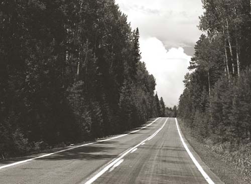
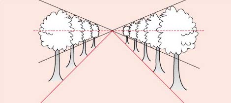
Activity 10: Checking for linear perspective in Paula Rego's The Policeman's Daughter
Look at Plate 15, Paula Rego's The Policeman's Daughter. Print a copy and then place your ruler along the diagonal line that marks the bottom edge of the window and draw a pencil mark following this line, but continuing to the edges of the composition (as shown in Figure 5 in the discussion below).
Now do the same with any other diagonal lines in the composition.
Plate 15
Discussion
How many lines did you find? Figure 5 below shows some of the lines in The Policeman's Daughter that are contributing to the system of linear perspective (and the illusion of depth) in the painting. There is also a circle around the vanishing point, which is actually behind the figure in the picture.
Figure 6 shows something similar for Paula Rego's painting The Dance, in which the system of linear perspective is much more subtle.
(f) Modelling
Modelling is the use of value contrast to suggest three-dimensional forms in a painting.
Not all art works will lend themselves to discussion of the representation of depth. For example, Plate 9, Fiona Rae's Untitled (yellow) is largely two dimensional. I say ‘largely’ as some spectators might feel that the contrasting colours draw them ‘into’ the painting, thereby giving it a three-dimensional feel.
Plate 9
Activity 11: Comparing the representation of depth in The Maids and No Woman No Cry
Take a look at Plates 3 and 4 and make notes on the differences and similarities in the way depth is represented in each art work, exploring techniques (a) to (f) above.
Plate 3
Plate 4
As ever, consider the relationship between techniques and effects in each art work. Your response to this activity will provide evidence that you will find useful in helping you to reach an interpretation of these two art works later.
| Representation of depth | Technique: No Woman No Cry | Effects: No Woman No Cry | Technique: The Maids | Effects: The Maids |
|---|---|---|---|---|
| (a) overlapping | ||||
| (b) diminishing scale | ||||
| (c) atmospheric perspective | ||||
| (d) vertical placement | ||||
| (e) linear perspective | ||||
| (f) modelling |
Discussion
For me, the most obvious difference between these two art works appears to be that while The Maids features quite a deep pictorial space (perhaps as much as four and a half metres), the pictorial space of No Woman No Cry is fairly shallow and as a result the painting feels quite flat.
In No Woman No Cry, there's some use of overlapping in the grid-like pattern that appears to stretch across the front of the painting, but this adds little in terms of depth. The woman's head and body is given some solidity by very subtle modelling, but there's only one person in the picture and neither diminishing scale, nor vertical placement are used to suggest depth. Neither linear nor atmospheric perspective seem to feature in the composition and, as a result, the depicted figure appears to be pushed towards the front of the pictorial space, close to the picture plane.
In contrast, most of the content of The Maids appears to be some distance from the picture plane and this is emphasised by the patch of yellowy brown colour that occupies the otherwise largely empty foreground area. This, in turn, gives a sense of depth and recession, as does the extensive use of overlapping, the diminishing scale of the women represented and the use of vertical placement (notice that the items at the bottom of the composition, for example, the pig on the right and the basket on the left, appear closer than those at the top). Modelling helps to give the figures a three-dimensional feel and, while there is no atmospheric perspective, the use of linear perspective does help to suggest the illusion of depth.
In The Maids, diagonal lines in the composition also help to draw the spectator's eye into the pictorial space, again adding to the sense of depth. In the next section you'll look further at the various effects that might be conveyed by the use of line.
7.3 The use of line
Lines can be a very powerful way of controlling the spectator's experience of an art work. When used effectively, lines can lead us into and through a composition, moving us along a visual path. Here you'll explore the effect of two types of line: directional lines and contour lines.
(a) Directional lines
Lines can create directional movement within the composition, leading the spectator's eye around and through the pictorial space. Lines can also keep the viewer's eye from leaving the picture. There are three types of straight directional line: horizontal, vertical, and diagonal.
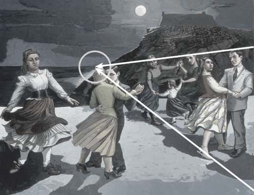
Diagonal lines produce the most energy or movement in terms of the way that they draw the spectator into the pictorial space and control their reading of a composition. For example, in Gilbert and George's Life (Plate 7) it's arguable that the diagonal lines formed by the edges of the wings and the men's arms work in guiding the eye around the composition and towards the men's faces, as shown in Figure 7 below.
Vertical lines can also add movement and energy to an image and can be particularly effective in stopping the spectator's eye from leaving the pictorial space. In Rego's The Policeman's Daughter (Plate 15), it's arguable that the strong vertical line created by the wall on the far right-hand side of the composition works in this way.
Plate 15
Horizontal lines tend to produce a stationary feeling. The most common place for horizontal lines to be found is in the representation of a horizon. If unbroken, a clearly defined horizon creates a rather static composition, for example in Rego's The Dance (Plate 14), where it's arguable that the strong horizon counterbalances the implied movement of the dancers to give the composition stability.
Plate 14
(b) Contour lines
Line can also be used to outline forms; such contour lines can be described in terms of their thickness and sharpness. A comparison of Rego's The Policeman's Daughter and Gilbert and George's Life shows the former using quite subtle, soft thin lines to outline the woman's figure, while the latter uses clearly delineated, thicker and darker lines. For me, the dark, sharp outlines in Life tend to give the art work a particularly unrealistic effect. What do you think?
You'll consolidate your work on line in the next activity.
Activity 12: Comparing the use of line in the composition of The Maids and No Woman No Cry
Looking carefully at Plates 3 and 4, make notes on the differences and similarities in use of line in these art works, basing your response on the discussion above.
Plate 3
Plate 4
Don't forget to consider the relationships between techniques and effects in the art work in terms of the significance of line in conveying an emotional effect and the use of line to control the way that you read the work.
Discussion
I felt that there was a significant difference in the way directional lines are used in each painting.
In The Maids, I found my eye being led around the composition by some of the more dominant directional lines. For example, those at the top of the table, the top of the door, the shadow on the wall, the edge of the central figure's skirt and the women's limbs.
However, in No Woman No Cry the only apparent directional lines are those of the grid-like pattern. Although this perhaps helped to keep my eye moving randomly around the composition, I didn't find that this controlled my reading of the painting in the same way as the lines in The Maids. You may disagree, however.
Both paintings feature the use of thin contour lines around the edges of the figures that are depicted. I felt that this gave both art works a slightly simplistic feel, as it is clear where each object begins and ends, especially in The Maids.
Don't worry if you didn't make all of the points mentioned. My analysis is intended to give a particularly detailed overview of the way techniques and effects might be related in terms of the composition of these two art works. Do revisit the art works in the light of my comments.
7.4 Summary
You've now reached the end of this section which contains a number of new technical terms. As a result, you should be developing your understanding of the way artists might use techniques such as colour, medium and the various elements of composition in order to achieve a variety of effects on the spectator. In the next section you'll begin to consider how the techniques and effects points of the Study Diamond can be related to the transmission of a possible meaning, and whether information about the context of an art work can enhance your analysis.
8 Meaning and interpretation
In this section you'll begin to develop your skills in using the Study Diamond to construct well-argued interpretations. You'll use the evidence that you've already gathered relating to the relationship between techniques and effects in The Maids and No Woman No Cry to support an argument about the possible meaning of these art works.
Activity 13: An initial interpretation of The Maids and No Woman No Cry
Look again at Plates 3 and 4 and spend a little time thinking about what each of these works might mean, and the message or messages that the art works might convey. Make some notes recording your thoughts.
Plate 3
Plate 4
You will only be able to offer an initial interpretation at this stage as we have not considered the context. Don't worry if you don't yet have a clear idea of what these art works might mean. Your answer at this stage can be quite speculative, perhaps a few suggestions which you're not yet sure about, or perhaps a list of your ideas or thoughts about the art works. As far as possible, your suggestion about the possible meaning of these art works should be based on your existing ideas about the relationship between effects and techniques in each one.
Discussion
Do you have clear ideas about what you think these art works might mean? If you do have ideas about the meaning of these works, you should be prepared to revise them once you've learned a little more about each artist and about the context in which the art works were produced. It's important to keep an open mind when interpreting art works. It's also important to acknowledge that other people may reach very different conclusions about the meaning of a particular art work. However, even if your own interpretation of the meaning of an art work is different from those of other people, it will still be valid if it is based on evidence about the relationship between techniques and effects.
Conclusion
This free course provided an introduction to studying Arts & Humanities. It took you through a series of exercises designed to develop your approach to study and learning at a distance, and helped to improve your confidence as an independent learner.
A level History of Art with the NEC

In the time of social media, images pervade our lives. From magazines to book design, houses to swimming pools, the study of art informs you about the world, improving your visual literacy and analytical skills.
From the Renaissance to surrealism, A level History of Art with the NEC will provide you with the skills to read imagery and to better understand the world around you.
Enrol from £795.
References
Acknowledgements
Course image: geir tønnessen in Flickr made available under Creative Commons Attribution-NonCommercial-ShareAlike 2.0 Licence.
Grateful acknowledgement is made to the following sources for permission to reproduce material in this course:
The content acknowledged below is Proprietary and used under licence (not subject to Creative Commons licence). See Terms and Conditions.
Special Restriction:
In order to benefit from this OpenLearn course and the teaching/learning objectives incorporated, the artwork acknowledged below must be used in context at all times and must not be used separately or with any other materials. The acknowledgements must be easily accessible and identifiable to users at all times.
The material acknowledged below is Proprietary and used under licence (not subject to Creative Commons Licence). See terms and conditions.
Grateful acknowledgement is made to the following:
Plate 3.1 Rachel Whitehead, House, 1993. © The artist. Courtesy Cagosian Gallery. Photo: Tate Photography.
Gilbert and George, Life from Death Hope Life Fear, 1984, handcoloured photographs, framed on paper, unique. © Gilbert and George. Courtesy Tate, London, 2005.
Jake and Dinos Chapman, CFC76311561.1, 2002, painted bronze, 92 x 58 x 49 cm. © The artists. Courtesy Jay Jopling/White Cube, London. Photo: Gareth Winters.
Tracey Emin, My Bed, 1998, mattress, bed, lined, pillows, suitcase, ephemera, 79 x 211 x 234 cm. © The artist. Courtesy Jay Jopling/White Cube, London.
Damien Hirst, Mother and Child Divided, 1993, steel, GRP composites, glass, silicone sealants, cow, calf, formaldehyde solution, tanks: 190 x 323 x 109 cm and 103 x 169 x 63 cm. © Damien Hirst. All rights reserved DACS 2009.
Plate 3.3 Anish Kapoor, As If to Celebrate, I Discovered a Mountain Blooming with Red Flowers, 1981, drawing, wood and mixed media, 97 x 77 x 160 cm object, 33 x 71 x 82 cm object, 21 x 16 x 47 cm sculpture. © Tate, London.
Plate 3.4 Chris Ofili, No Woman No Cry, 1998, acrylic paint, oil paint, resin, pencil, paper collage, Letraset, glitter, map pins and elephant dung on linen with two dung supports, 244 x 183 x 5 cm © Chris Ofili. Courtesy of Chris Ofili – Afroco and Victoria Miro Gallery Tate Photography.
Plate 3.5 Paula Rego, The Maids, 1987, acrylic on canvas backed paper, 214 x 244 cm. Courtesy The Saatchi Gallery.
Plate 3.6 Tomoko Takahashi, Learning How to Drive, 2000, mixed media installation, dimensions variable. © Courtesy of the artist and Hales Gallery. Photo: Tate Photography/Mark Heathcote.
Plate 3.9 Chris Ofili, Afrodizzia, 2nd version, 1996, acrylic, oil, resin, paper collage, glitter, map pins and elephant dung on canvas with two dung supports, 244 x 183cm. © Chris Ofilli, Courtesy of Chris Ofili – Afroco and Victoria Miro Gallery.
Plate 3.10 Fiona Rae, Untitled (yellow), 1990, oil on canvas support, 214 x 198 cm. © Fiona Rae. Courtesy Timothy Taylor Gallery. Photo: Tate Photography.
Plate 3.13 Grayson Perry, Golden Ghosts, 2001, earthenware, 64 x 27 x 27 cm. Courtesy © The artist and Victoria Miro Gallery, London.
Plate 3.14 Tracey Emin, In My Family When Someone Dies They Are Cremated And Their Ashes Are Thrown Across The Sea, 1997, plaste, white paint, eleven seafulls, 450 x 555 x 413 cm (variable) installation. © The artist. Courtesy Jay Jopling/White Cube, London. Photo: Stephen White.
Plate 3.15 Paula Rego, The Dance, 1988, acrylic on paper laid on canvas support, 213 x 274 cm © The artist. Courtesy Tate, London, 2005.
Plate 3.16 Paula Rego, The Policeman’s Daughter, 1987, acrylic on canvas backed paper, 214 x 53 cm. © The artist. Courtesy The Saatchi Gallery, London.
Plate 3.17 Tracey Emin, The Perfect Place to Grow, 2001, wooden shed and trestle, plants, with a single monitor, super-8 film transferred to colour video, audio track, 2 minutes looped, 216 x 83 x 162 cm installation. © The artist. Courtesy Jay Jopling/White Cube, London. Photo: Stephen White.
Plate 3.18 Raphael, Madonna im Grünen (Madonna of the Meadow), 1505 or 1506, oil on wood panel, 113 x 89 cm. Kunsthistorisches Museum, Wien oder, KHM, Wien.
Copyright © The British Library
Don't miss out:
If reading this text has inspired you to learn more, you may be interested in joining the millions of people who discover our free learning resources and qualifications by visiting The Open University - www.open.edu/ openlearn/ free-courses