Systems diagramming
Use 'Print preview' to check the number of pages and printer settings.
Print functionality varies between browsers.
Printable page generated Tuesday, 9 June 2026, 10:22 AM
Systems diagramming
Introduction
Pictures speak louder than words. But how can you use diagrams to help you? This course, Systems diagramming, looks at how diagrams can be used to represent information and ideas about complex situations. You will learn how to read, draw and present diagrams to help illustrate how ideas or processes are connected.
This OpenLearn course provides a sample of level 1 study in Computing & IT.
Learning outcomes
After studying this course, you should be able to:
appreciate diagrams as a powerful aid to thinking and acting
distinguish between systems diagrams and diagrams helpful in systems work
demonstrate sufficient skills to ‘read’ and ‘draw’ a wide range of diagrams, following given conventions, that help improve an understanding of a situation
select diagrams suited to the needs of the situation being investigated and the purposes/preferences as the diagrammer.
1 How to use this course
This course is a learning resource. Like all resources, there are different ways to use it depending upon what you are trying to achieve. Whatever you are trying to achieve it is important that you not only read the text thoroughly but also undertake the Activities (there are no ‘set’ answers to these Activities as they are personal to you but I have provided my own, or other people's, responses). After all, this is a course that helps with systems thinking and practice, and without practising your thinking using diagrams you may not learn how powerful such tools can be.
This course also has visual materials that deal with the mechanics of using diagrams in a way that text alone cannot convey. So further practice will come from viewing the animation.
Some people seem to have a natural talent for diagramming, just as some have a natural talent for playing the piano. But many people find it rather awkward and difficult at first. In a way, that is an encouraging sign: it shows that you are genuinely coming to grips with something unfamiliar; and, after all, there is no point in studying what you already know how to do. But it will require perseverance and you can't expect to grasp it all straight away.
In particular this course looks at how diagrams can be used to represent information and ideas about complex situations and in particular for identifying and working with systems of interest. You can often summarise how ideas or processes are connected much more neatly in a diagram than in words; you can also show someone else how something works by drawing a diagram of it. This means that you need to be confident with using diagrams in systems work. You need to learn how to read diagrams about complex situations – extracting information from them and interpreting what they mean. You also need to learn how to draw diagrams of your own, so that you can capture your own ideas and interpretations of a complex situation on paper. And finally you need to know how to present diagrams so that others can successfully read them.
The sections of this course cover the range of what? when? how? why? and who? questions on aspects of diagrams and diagramming:
Section 2 discusses how diagrams are representations or models of situations used to capture ‘information’ in a visual form, showing multiple relationships between ‘things’ in a non-linear fashion. It also looks at the relationships between ‘events/activities/entities’ on the one hand and between ‘thoughts’ on the other – with some diagrams mixing the two together.
Section 3 notes that diagrams are generally used to help your own understanding of written text; to help your own thinking about a situation; to convey understanding to others – to do that you need to be able to read them effectively.
Section 4 claims that diagrams are used in systems thinking and practice to capture as much information as possible about a situation, to help explore a situation, to help to analyse a situation, to represent a system of interest, to plan and implement changes to a situation, to help in decision making and to help with quantitative model building.
The course has a link to an animated tutorial that covers the purposes, elements and conventions of specific types of diagrams most widely used in systems studies. It also acts as a glossary of the major diagramming types used in systems work.
2 What is a diagram?
Diagrams are all around us. We all try to make sense of the world around us and this sense is displayed in two ways.
- We all have our own ‘internal models’ of how things work based on our experiences and our interpretation of those experiences. These ‘internal models’ shape our thoughts and actions and lead us to expect certain outcomes from certain activities. They change and evolve with new experiences or (hopefully) when challenged by new information. They are the means by which we make sense of the world by searching for familiar patterns or creating new ones out of all the information we receive.
- Although ‘internal models’ are personal we also use them to share our ideas and understandings by comparing them with those held by others through the conversations we have and the things we do. This enables us to build up ‘external models’, where patterns of ideas, things or activities are recognised and understood by many people at the same time, e.g. a table of the physical properties of matter.
Such ‘external models’ underpinned by shared assumptions are commonplace, often to the point where we take them for granted. This can be particularly so where we try to use diagrams to represent and communicate complex information simply and quickly.
Activity 1
Try to think of three examples of diagrams you see regularly in your home.
Write down what they represent to you.
Say what you use them for.
Discussion
Here are my responses
-
The first thing I had to hand was a ‘do it yourself’ (DIY) manual (being used a lot because I have just moved into a new house). This was full of diagrams of bits of rooms, fixtures, fittings, tools and other equipment that I might want to build or use myself around the house.
-
Next I picked up a road map from the hall. This is a very colourful diagram that uses many types of symbol, but I find it easy to follow, using the key, and invaluable in planning my car journeys. It ‘represents’ how certain features in the real world relate to each other in terms of distance. So I know that the distance from Milton Keynes to Birmingham is about 110 kilometres and that I can drive there in just over an hour (given the right traffic conditions!).
-
The last diagram I noted was the symbols on my wristwatch. This has a mixture of thick and thin lines around the outside of a circular face, but no numbers. I know from experience these lines represent the hours in half a day and minutes in a full hour and help me to ‘tell’ the time.
I can see a pattern in the examples I used in my answers. I started off with diagrams of real world objects albeit displayed in a way that makes things clearer than just a photograph of the finished item. Then I chose a road map, which is a very simplified diagram of what I would see if I were looking down from a plane. This diagram sets out to highlight certain things – such as roads, service-stations and motorway junctions – that are relevant to car journeys. Yet although the diagram shows things that are actually there for my eyes to see, it does not aim to look at all like what my eyes would see. It is symbolic and much easier to ‘read’ than an aerial photograph, because it leaves out a lot of unnecessary detail and has standard symbols for representing the things I need to know about. Finally, I ended up with a diagram of something you can't actually see, though it is a model of something you ‘know’ exists – time, represented by a sequence of minutes and hours. This last example is a more abstract representation of ‘reality’ than the earlier ones, but is still an efficient way of organising information.
Another impression I get from these examples is that they are all reasonably familiar. We all ‘understand’ and ‘use’ certain types and styles of diagrams from an early age, e.g. reading the time from a watch face. However the types and uses of diagrams are often rooted in different cultural, social or academic settings. Thus a modern map looks quite different to an eighteenth century map while digital watches have replaced analogue ones for many people.
2.1 Diagrams as models
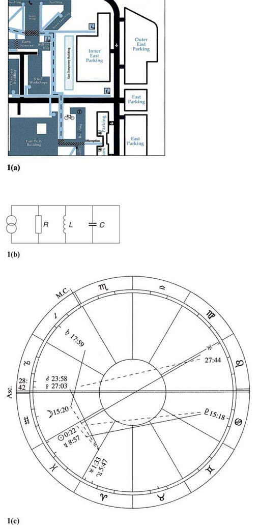
Diagrams come in many forms and uses, but for systems thinking and practice it is useful to think of them as models (meaning ‘representations of reality’ in everyday usage). The term ‘model’ is used in a variety of contexts, even when there is a more commonly used term especially appropriate to its own context: models of terrain are usually called ‘maps’; models of electrical components wired together are usually called ‘circuit diagrams’; and models of the configuration of the planets within the zodiac are called ‘horoscopes’ (see Figure 1).
However, systems practice usually goes beyond lay usage (i.e. models are ‘representations of reality’) to consider the representation of structures that do not readily exist, except in the mind. Thus a plan of a house not yet constructed or a diagram of the social relationships between a group of children can be usefully called a model. In each case we must be prepared to accept that there can be many different perceptions of this ‘reality’ by different people (different architects produce different plans). No perception can be singled out as being more ‘real’. Indeed, people may each have different internal models of ‘reality’, but may not appreciate that there can be such differences.
So to be useful, diagrams being used as external models need to follow agreed conventions and should select those features of most interest in a situation and show the relationships between them.
It is no accident that the three examples mentioned above concern relationships between the constituent elements:
-
the map deals with how each building is related to its neighbouring buildings;
-
the circuit diagram shows how each component is related (via wire connections) to other components;
-
the horoscope indicates the angular relationships of planets to each other and to the zodiacal signs.
2.2 Features of diagrams
As there is variety in the types of diagrams we can see and use we need to think more broadly about what diagrams are trying to represent. One distinction which follows on from the discussion above is:
-
Analogue representations: these diagrams look similar to the object or objects they portray. At their simplest they are photographs of real objects and at their most complicated they are colourful, fully labelled drawings of the inner workings of organisms or machines.
-
Schematic representations: these are plans or diagrams which represent the essence of ‘real world’ objects or phenomena, but do not look similar to them. Maps and plans are prime examples.
-
Conceptual representations: these diagrams largely try to describe interrelationships between ideas or processes that cannot be readily observed, but are put forward as a model for acceptance by others. They are mostly used to represent non-visual features where the emphasis can be as much on emotional or abstract relationships as with rational and real relationships. These interpretations may not always be shared by others (because they are based on our internal models) but are essential elements of the diagrammer's own view of the world.
A second distinction arising from this discussion relates to which building blocks (words, lines, symbols, pictures, numbers) that we use to represent things dominate the diagram:
-
pictorial diagrams: pictures and symbols dominate;
-
non-pictorial diagrams: words and lines dominate.
There are also the diagrams where numbers or mathematical relationships dominate, but in this course we deal mainly with non-mathematical relationships and so exclude the charts and graphs most commonly found in scientific and technological texts.
2.3 Structure and process
Diagrams are normally intended to describe either structure or process and not both. Table 1 gives a classification of diagram types by structure or process. Another way to view this is to note that there are diagram types that represent largely static relationships and those that represent situations over a period of time. Though some, like the influence diagram, may appear to contain both structure and process, the emphasis is on the static relationships, not the temporal processes, in the situation.
| Structure | Process |
|---|---|
| Spray diagram | Multiple cause diagram |
| Relationship diagram | Input-output |
| Systems map | Flow-block |
| Influence diagram | Flow-process |
| Rich picture | Rich picture |
| Force-field diagram | Conceptual model |
| Causal loop | |
| Activity sequence | |
| Decision trees | |
| Control model |
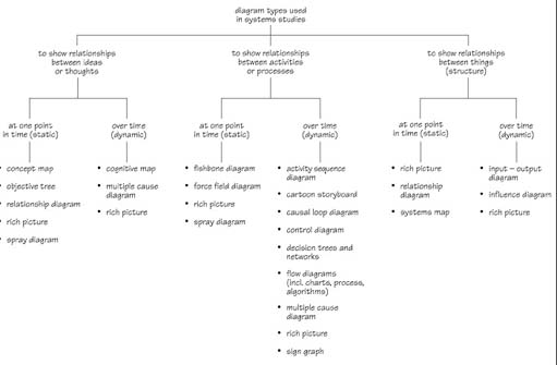
Another classification of diagram types is shown as Figure 2. This orders diagrams by the two main features introduced above: namely, whether they emphasise thoughts, things or processes and whether they show static or dynamic relationships. This does distinguish between many of the diagram types, but some are found in more than one category. However this is not the only way to group diagram types as you will see later in Section 4. It is also my view on how to group them. You may have other ideas when you have finished reading the course!
This brief outline of the types of diagrams you will meet gives you some idea of their main features, but how and when do you use them? We will be looking at both these questions in this course, although the emphasis will be on the non-pictorial schematic and conceptual diagrams. Before we do so I want to re-emphasise that whenever we take in, think and express new ideas, we describe and represent the ‘reality’ we perceive (in words, lines, pictures, symbols or numbers) by making simplifications for some purpose. This has to be the case, because reality is so complicated. It is essential to simplify ‘the real world’, in order to be able to describe it, or think about it. In simplifying, we select certain features of a situation – the essentials – to communicate a clear message, without too much clutter obscuring the view. The view, or perspective, taken and the choice of features is extremely important in conveying that message (or the message that we convey!).
3 Why do people use diagrams?
Influences on how we perceive diagrams
A few people find diagrams unhelpful; but many people who regularly use words find the discipline of conveying ideas in diagrammatic form both sharpens their understanding of the ideas and opens their eyes to alternative views. Diagrams are, like words, intensely personal ways of sharing information and seeing someone else's ideas in diagrammatic form can give a new view of what they are trying to communicate. Diagrams can also suggest new and unexpected relationships between ideas about a situation and new and unexpected ways of moving forward in a situation.
3.1 Visualisers and verbalisers
A major point about diagrams is that some people naturally relate well to them and use them frequently, while others tend to prefer textual material. The former are sometimes referred to as visualisers and the latter as verbalisers. There is nothing wrong with either of these tendencies, but in subjects like systems thinking, social science or technology, where text and diagrams support each other, it is important to be comfortable with both. In addition, it is helpful to remember that one's own preference is unlikely to suit everyone. So when verbalisers communicate they need to make an effort to use diagrams to supplement, or even replace words, while visualisers need to remember that for some people diagrams need more textual support than they might expect.

3.2 Varying cognitive styles
Cognitive style plays a large part in the way we use and see diagrams. Some people tend to prefer linear processes with clear cause and effect, while others prefer associative logic and situations where cause and effect are less clear. Similarly, a distinction can be drawn between those who tend to use exclusive, either/or thinking which can be developed into matrices or algorithms, while others are more likely to use inclusive modes of thought, disliking either/or scenarios and being more comfortable with parallel or multiple processes.
Both approaches – the clarity and linearity sought by some, and the interrelationships considered important by others – are relevant to the use and usefulness of diagrams and need to be considered in each instance where a diagram is being chosen to represent a situation.
3.3 Conveying information to others
Diagrams are used extensively in most types of texts, but why do authors use them? There are two main reasons:
-
to illustrate what something looks like;
-
to demonstrate how objects or ideas or quantities are organised or related.
However this is only one side of the situation, as such diagrams are usually intended to passively communicate models from one person to many (authors to readers). The main power in diagrams comes from an individual or group using them to actively further their own thinking. Although you need to do a lot of the former activity as a student or an employee, it is the latter activity that is central to much systems work.
But there is also a subsidiary reason I hinted at. Authors also use diagrams:
-
to decorate and enhance the text to make it more pleasing to read.
3.4 Thinking through diagrams
One of the features that characterises complex situations is the interconnectedness of the components within them. Understanding such situations can defeat our descriptive abilities. Words alone either confuse still further or misrepresent the situation altogether. For this reason, diagrams are a characteristic feature of systems approaches to understanding complex situations. Diagrams allow the relationships between parts of the situation to be seen at the same time as the parts themselves. Figure 3 is an example. Imagine trying to write Figure 3 down in words. You might conceivably start your first sentence with any one of the components. You would then use the words of the arrow labels to connect each component with the one that follows. Finally, you would have to say that in fact the last link of the chain is connected to the first. It would take several sentences and would be tricky to ensure that the reader understood that the links were at least as important as the components. The reader might also get the impression (even though you didn't mean it) that the first component you mentioned was somehow the one that ‘starts it off’.
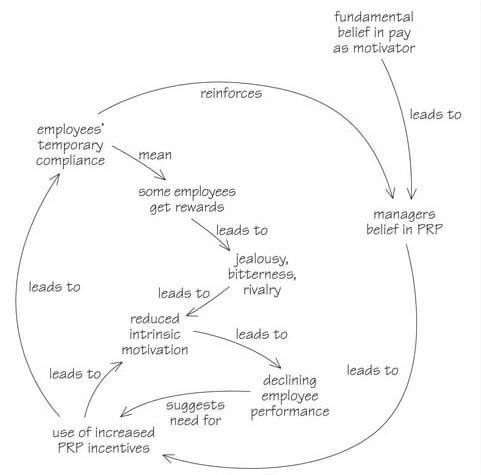
Whether you agree with the arguments expressed in Figure 3 or not, I hope that you can now appreciate that diagramming is a way of representing complex situations that allows us to represent the complexity while seeing the individual components and their connections to other components at the same time. One of the problems with written accounts is that they are ‘linear’. In other words, the sentences follow one after another, in a given order. This is fine for accounts of events that do happen in sequence, but not where things are intimately connected and do not come in a particular order, or form various circles of activity that reinforce particular behaviour. The type of diagram shown in Figure 3 can be seen as a series of interconnected sentences. But the sentences have escaped from the normal linguistic convention in which one sentence follows another in order. In making that escape, a whole new way of thinking opens up. But like ordinary language, there is more to understanding diagrams than the words they contain. To convey their full meaning, they must follow conventions, much as a list of words must follow grammatical conventions to become a meaningful sentence. Understanding and being familiar with the conventions allows you to convey a wealth of meaning in your diagrams.
Another reason for using diagrams is the way that they highlight things that are effectively disguised by using text; for example the interconnectedness between apparently unrelated events or activities. They do this by providing another viewpoint. So diagrams are not simply for the diagrammer to convey meaning to a reader. Diagrams make the diagrammer aware of previously unrealised features of the situation. I have been using diagrams for a long time now and I'm still astonished by the powerful insights they give me. One useful technique is to draw diagrams while reading. You can supplement the author's choice of diagrams with ones that suit you personally, or you can convert text to diagrams that suit you. Another useful technique is to carefully scrutinise the diagrams people use to see what they reveal and what they conceal about a situation.
3.5 Working with other people's diagrams – representing text as diagrams
In this section I want to show how you can use diagrams to help you understand what someone else has written, and it does not matter how well you can draw as long as they make sense to you. As you become more confident at drawing diagrams for yourself, you will then be able to move on to drawing diagrams to show someone else.
At this stage you might still be doubtful as to the usefulness of diagrams for understanding situations. So, why not try using one?
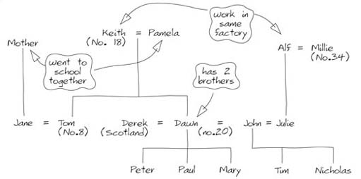
Box 1
Jane is married to Tom and they live at No. 8. Tom's sister Dawn lives at No. 20 and has three children, Peter, Paul and Mary. Her partner Derek left her 4 years ago and moved to Scotland, but now she is living with John. John has two children of his own, Tim and Nicholas, from his marriage to Julie. Julie's father, Alf, works in the same factory as Tom's father, while Dawn and Jane's mother went to school together. Alf and Millie live at No. 34. They used to live at No. 6, but moved after the children left home. Dawn has two older brothers, one of whom has moved away. Keith and Pamela are Tom's parents, but Pamela died last year. Keith now lives alone at No. 18.
Activity 2
Quickly sketch one or two diagrams to more clearly convey the relationships described in Box 1. It is a good idea to start with a large blank piece of paper so that your diagram won't be cramped.
Discussion
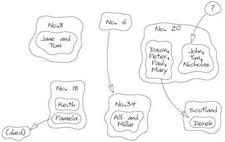
The situation described in the box is messy and complicated to follow as text. When I gave this activity to several students some produced diagrams like that shown in Figure 4. This does begin to make the situation more understandable, but is still a bit messy. However, other students eventually realised that they needed two diagrams. The first one (Figure 5) shows who is related to whom as just two family trees while the second (Figure 6) shows who lives in which house. I certainly found that looking at these two diagrams made things a lot clearer for me, in particular the relationships between two different sets of connected things. Of course, these are the ways some chose to represent the situation and the diagrams do not include all the information given in the box – they selected what they thought was essential. Someone who read an early draft of this section suggested that I could mark on Figure 6 the arrivals and departures as well (see Figure 7) as some tried to do in Figure 4, while a few students actually drew Figure 6 as a line of boxes rather than blobs to show that the street is likely to be a ‘line’ of houses. You could have used different ways of analysing this text, such as spray diagrams, but whatever the type of diagram I am sure that the process of producing the diagram improved your understanding of the situation. Whether you think your diagram would clearly convey the situation to other people can only be tested by trying it out and indeed the comments of others can be very helpful, as seen above.
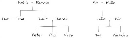

I hope this example has shown you some of the value of using diagrams rather than text to represent some relationships. Diagrams allow the relationships between parts of a situation to be seen at the same time as the parts themselves. And, whether or not your diagram makes sense to other people, it can help you to understand. When you can see the whole situation sketched out in front of you, then you are in a position to check (or ask someone else to check) whether all the links you have shown are logical, and whether you have included all the essential components. If the diagram does not make sense to you, then it may be that you have failed to understand the text. But if your diagram does make sense then there is an additional bonus – it is often much easier to remember information in diagram form than as strings of information. Which would you find easier to remember – the text in Box 1 or the diagrams the students produced?
3.6 Key points
Diagrams can be helpful in clarifying your thinking because:
-
they can summarise complex situations, allowing you to appreciate the complexity while seeing the individual components and the connections between the components;
-
they can give you new insights into a situation by making you think carefully about the components and connections and by helping you to learn more effectively.
3.7 Working with other people's diagrams – reading diagrams
Reading diagrams is an equally useful skill to that of drawing diagrams. Not only does it help you understand what other people are trying to convey, it also helps you be critical of the diagrams you draw yourself. In some cases diagrams are used to make the text look pretty or appealing and do not add to the understanding of the reader (hopefully not the case with the diagrams here!). Even when they are used more effectively there is a need to be critical of what information is being conveyed. One approach I have used is to ask myself a series of questions (as with analysing text, the choice of approach depends upon both the situation and your preferred style of working). The first set of questions are straightforward and relate to the features of the diagram that are present:
-
Is there a reference or an explanation of the diagram in the accompanying text?
-
Is there a title or legend explaining what type of diagram it is and/or what the diagram is trying to represent?
-
Are there labels on features shown in the diagram?
-
What are the size and scale of the objects?
-
Is there a key explaining the particular use of symbols in the diagram, e.g. what the lines/arrows and boxes/blobs represent?
-
Is there an acknowledgement indicating where the diagram may be taken from?
Activity 3
Spend a few minutes looking critically at the diagrams in Figures 8 and 9 and write down what you see as general features of them.
Discussion
My responses
The first thing that I noticed in tackling this activity was that two of the broad categories I listed earlier in Section 2 are represented: a non-pictorial, conceptual and a partly pictorial, schematic diagram respectively. The second thing is that both of the diagrams use a mix of words and lines. There are titles but no key, and since they have been taken from elsewhere I do not know if they were mentioned and/or discussed in the accompanying text. Despite this, does this initial analysis help us ‘read’ the diagram and extract the relevant ideas the ‘author’ wished to convey?
3.8 Reading diagrams: questioning what they say
With each of these diagrams and others we are trying to read there is another set of more searching questions we can ask:
-
What is the purpose of the diagram, i.e. what is it aiming to tell us?
-
How is the information imparted?
-
What assumptions does it make about our ability to understand it?
-
What are we expected to remember from it?
-
How successful is it in doing all of the above?
Activity 4
Look at the diagrams again and apply these questions to them. You may find this activity difficult until you have worked through more of this course but have a go now and come back to it again when you have completed the course.
Discussion
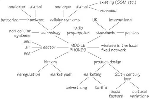
My response to Figure 8
Purpose: The purpose is summed up by the caption or title (which should be a major function of the title). With no other indications we do not know if this is someone's summary notes for helping to write a paper or give a talk or what someone has produced after reading a book on the subject.
How imparted: The information is imparted in a clear manner through the use of words and interconnecting lines radiating from the original topic.
Assumptions: That these are notes, but whose notes is not clear.
Remember: That there are a lot of topics and activities relevant to a high-technology area such as mobile telephony and that these include social, legal and economic ones as well as the technological ones.
How successful: This diagram does successfully convey the message that there are many aspects to mobile telephony that need to be considered, but without knowing its purpose precisely it is hard to know how successful it has been in achieving that purpose.
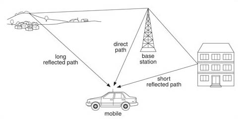
My response to Figure 9
Purpose: To show that signals can take more than one path to a receiving mobile telephone and that these vary in length. The significance of this is not clear from the diagram and its caption alone and may have been mentioned in the accompanying text.
How imparted: The information is imparted through a mixture of realistic pictures and lines with arrows to indicate the paths of a mobile telephone signal.
Assumptions: That the length of the arrows is representative of the lengths of the signal's paths and that the mobile phone is being used in a moving car.
Remember: That mobile telephone signals take direct and indirect paths to the receiving phone.
Successful: This method of representation makes an immediate visual impact and gets the main message across quickly. The implicit message of the different lengths of signal path are less certain and does not say at all what the actual distances involved may be, nor the likely speed or position of the car and hence the phone.
I hope that this activity and my responses have made you think a bit harder about what diagrams are trying to communicate to you and how you can interpret them. This is not always easy. It can involve familiarity with the conventions. It can involve moving between a diagram and some associated text. It can involve changing your ideas about a situation. It may require a different approach to the one I have used here. And sometimes, as with a difficult piece of text, you have to get what you can out of a diagram even if you have not fully grasped all its nuances. The best way of learning to read diagrams is to gain experience with a wide variety of diagrams over time so that you automatically question what they ‘say’ to you.
3.9 Key points
Diagrams can be helpful in:
-
understanding a situation;
-
analysing a situation;
-
communicating with others about that analysis;
-
planning to deal with a situation, both logically and creatively; and
-
implementing, monitoring and evaluating those plans.
They are therefore used at different times and in different ways within the same investigation and many investigative methods involve these different phases. Systems thinking is also about understanding situations for some purpose, usually to effect some changes. The key is that it does it by representing a chosen system of interest and that is often best done through diagrams.
4 Why do systems thinkers use diagrams?
Systems thinking and concept
Much can be said about systems thinking. However it is worth reiterating some key points here as they are central to understanding the purpose of the diagrams discussed later in this section.
The word system is one that is in regular everyday use. People talk, for example, about ‘the social security system’ and the ‘telephone system’. Gamblers boast about ‘having a system’ for winning at roulette. Young people talk about being ‘against the system’.
The trouble with everyday speech is that it is often imprecise. People mean different things by the same word. When a gambler speaks of having an infallible system for winning, for example, he is using the term in a different sense from an engineer who works on the telephone system. Since the concept of system is absolutely central to using systems thinking, we cannot afford the potential confusion that this might cause.
The definition of a system that I most use has four parts:
-
A system is an assembly of components connected together in an organised way.
-
The components are affected by being in the system and are changed if they leave it.
-
The assembly of components does something.
-
The assembly has been identified by someone as being of interest.
These all seem straightforward enough, but they each have important implications. Let's examine them in turn.
-
A system is an assembly of components connected together in an organised way.
The stress here is on the word ‘organised’. This means, for example, that the components of a clock piled together in a heap on a table awaiting assembly do not constitute a system. After assembly, however, they do make up a system because their interconnections have been organised.
-
The components are affected by being in the system and are changed if they leave it.
As an example, think of the physiological system that is your body. Its components are organs such as your heart, liver, kidneys and lungs. Clearly they are changed if they are removed from the system: they decay, they become inert and lifeless.
So far, so good. But actually this part of the definition has very far-reaching implications. For if the components are different in some way when they're in the system from when they're not, then the system as a whole must have properties deriving from the interactions of the components that cannot be deduced or predicted from an inspection of its components taken in isolation. One common way of putting this is to say ‘the whole (i.e. the system) is greater than the sum of its parts’.
-
The assembly of components does something.
This part of the definition covers two aspects. First, systems are dynamic entities. Second, and even more important, that a system behaves as if it has some purpose.
Thus to return to an earlier example, it is inadequate to talk about the telephone system as if it were just a thing that everybody instantly recognises and fully understands in the same way as, say a pencil (this passive use of the word system as a noun is the most common everyday use). Rather, we need to talk about a ‘system for employing engineers’ or a ‘system for enabling friends and family to chat to each other’ or ‘a system to give investment returns to shareholders of the telephone company’ – a construction which uses active verbs to highlight its dynamism and purpose and so make it more specific and identifiable.
-
The assembly has been identified by someone as being of interest.
This is important because it brings out the fact that a system is essentially a private, personal idea: a construct. A system can be (and often is) simply a personal ordering of reality, the result of seeing some degree of orderly interconnectedness in some part of the world. Thus a system, any system, can be many different kinds of system simultaneously, depending on who is studying it and why, as shown immediately above. In some cases we might agree on the purpose of the system, in other cases we may have to deduce a purpose for the chosen system.
My definition of a system is incomplete, however, without considering two other, related, terms: environment and boundary.
The reason for this is that you can only define a system by ‘drawing’ a boundary that distinguishes those bits of what you ‘observe’ from everything else, i.e. the system's environment (see Figure 10). Hence you cannot think of a system without thinking of its boundary and what is outside the boundary (its environment).
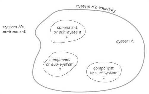
The concept of environment might seem reassuringly familiar to you: it's a term in daily use – such as when people talk about ‘pollution of the environment’. But the everyday interpretation of the term, which usually amounts to ‘everything out there’, is too fuzzy, too imprecise to be useful. So we adopt a more restricted interpretation:
The environment of a system is made up of those things that are not part of the system, but can affect the system.
The concept of a system boundary follows naturally from that of environment. It is simply a notional line that divides a system from its environment. This means that a boundary is a subjective idea. A system boundary doesn't have to correspond to any real-life barrier or the limits of an organisation for instance.
Choosing where to draw a system's boundary therefore requires you to exercise some judgement. It also depends very much on your reasons for examining the system. Thus, if you're interested only in the reason why a particular component in your car has failed, it may be appropriate simply to draw the boundary round the engine or a particular sub-system of parts (e.g. the electrical system). But if you are a government safety official investigating why a particular component tends to fail in a certain make of car, you may have to widen the boundary to include the dealer-network for the marque in question, the factories that manufacture the model, suppliers, subcontractors, trade unions, etc. Knowing where to draw the boundary is one of the fine arts of systems practice. Where you choose to draw it can often say a great deal, not just about your views, but also about your values.
4.1 Systems diagrams and diagrams helpful for systems work
Diagrams are used extensively in systems thinking and practice. All of those types included in the animated tutorial, as well as other types not covered there, can or have been used in systems studies. As mentioned at the beginning of the course the use of diagrams is very personal. For instance I find it helpful to group diagrams into three sorts depending on when they are to be used:
-
when you have not yet identified a system of interest within a complex situation and you are just trying to make sense of it;
-
when you are representing a system of interest and so use a diagram with an explicit or implicit boundary included on it; and
-
when you are analysing the structure or processes within particular aspects of your chosen system of interest. These are the groupings I have used in the animated tutorial.
Fisher and Hudson (1997), on the other hand, have developed a way of looking at the use of diagrams and have identified three major phases – creativity, connectivity and communication. They suggest that skill in using diagrams comes from using all three phases in a diagramming cycle (Figure 11). What follows is an explanation of their views, which means you may have to look at the descriptions of the diagram types in the animated tutorial to understand them fully.
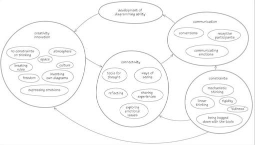
In order to allow maximum flexibility and creativity in the creativity phase, there are no rules for using diagrams, though Checkland (1981), for example, has suggested some minimum desirable elements such as structure and process in rich pictures. Normally, such diagrams are private to the author and only use whatever conventions are sufficient to allow the author to recover the ideas in the diagram at a later stage.
The purpose of the connectivity phase is to enable the author to make whatever connections are helpful for understanding a situation or planning to change a situation. During this phase it is still possible to use a private language, but it is likely that the author will begin to use conventions, which might readily be understood by others.
The purpose of the communication phase is to develop diagrams that enable the author's ideas to be shared with and/or communicated to others. Diagrams developed in the communication phase need to be structured and to use recognisable conventions. However, the use of such conventions is likely to inhibit creativity and, in order to understand and analyse the responses which the author receives to their work in this phase, they must return to the creativity phase.
4.2 Diagrams for understanding
Diagrams for understanding are best developed within the creativity phase, though sometimes you can go straight on to using a diagram more suitable to the connectivity phase. Most diagrams for understanding begin at the centre of the sheet of paper and work outwards. Buzan's (1974) spray diagram is built up from an initial idea with its branches; these branches have their own branches and so on until you reach the detail at the end of each twig. This technique is particularly useful for analysing printed information which may be very difficult to understand; set out in diagrammatic form, one can see how balanced or disjointed the information is.
However, spray diagrams rely on there being logical connections between the elements and relatively linear relationships between the core idea and the detail at the periphery. So they tend to be more useful when you want a relatively straightforward ‘understanding’ of a situation and not when you want to develop a more creative understanding.
When Peter Checkland began to analyse human activity systems, he and his colleagues developed a technique which he called the rich picture because it contains more than should be necessary to understand the situation. Rich pictures need a lot of space and you don't have to be an art expert – indeed, artistic flair can sometimes be a diversion from the goal of drawing useful rich pictures.
Rich pictures require you to make pictorial representations of each of the elements in a situation and annotate any interactions and relationships between the elements in the situation. These are not normally linear and the precise nature of the relationships between certain elements may be unclear. Don't try to impose order on a rich picture; it is intended to assist in understanding a complex situation and trying to impose order denies the very complexity of the situation. For example, if you identify ‘problems’ in a rich picture, you will have prejudged the situation and thus also what might be ‘solutions’.
Having said that, a rich picture may suggest interactions and relationships of which you had been unaware and you may wish to ‘redraw’ the picture to highlight these interactions and relationships. This is perfectly alright as long as you keep the original picture to remind you what it looked like and remember that ‘redrawing’ a rich picture is the equivalent of moving from the creativity to the connectivity phase and imposing your version of a more ordered reality on the complex situation.
4.3 Diagrams for connectivity
Relationship diagrams offer one way of putting more order into your understanding of a situation. Each element of a situation is named in an oval and lines between ovals indicate that there are relationships between the particular elements – but no more than this!
Systems maps are another way of developing one's understanding of a situation. Systems maps are essentially ‘structure’ diagrams. Each element or sub-system is contained in a circle or oval and a line is drawn round a group of elements or sub-systems to show that the things outside the line are part of the environment while those inside the line are part of the system. There are NO lines connecting elements, sub-systems or systems in a systems map; it is purely a statement of the structure as you see it in your mind.
Influence diagrams are developed from systems maps and indicate where one element in the situation has some influence over another. Arrows indicate the direction of the influence and the lines between elements may be of different thickness, shading or colour in order to distinguish strong and weak influence. Strictly speaking, influence should only be shown from elements at a higher or at the same level in the system; that is to say, subsystems cannot influence systems and sub-systems and systems cannot influence the environment – but some people do not follow this convention.
Where a clear pattern of cause and effect can be discerned in a situation, the causal loop and multiple cause diagrams may be useful in describing the interactions between different elements in a situation. By convention, multiple cause diagrams have the elements laid out, without ovals or any other sort of enclosure, in whatever way assists in clarifying the processes. Elements are joined by arrows indicating where there is a causal relationship between the elements. Where there is cause and effect in both directions between two elements, separate arrows indicate this.
4.4 Diagrams for further analysis and quantitative model building
To gain further understanding of the connectivity in a situation, a multiple cause diagram can be converted into a sign graph by indicating whether the cause has a positive effect or a negative effect by adding the respective signs. Not all multiple cause diagrams lend themselves to this treatment as you need much greater knowledge of the situation to be able to be sure about the causal chains in a situation and the effects they are likely to have. Sign graphs are particularly useful for establishing the variables and relationships needed for a quantitative mathematical model.
Process engineers have long used diagrams to describe processes. Among these are input-output (or ‘black box’) diagrams and flow diagrams, in which linked ‘inputs’ and ‘outputs’ are described. These are sometimes split into flow-block diagrams describing flows between components and flow-process diagrams describing flows between processes. Others include decision sequence diagrams, in which ‘decisions’ lead to ‘actions’ which lead to new ‘decisions’, and algorithms (or flow charts) in which the type of decision and the impact of alternative outcomes to a decision are set out diagramatically. These all tend to be more suited to situations where the connectivity is relatively clear. Algorithms or flow charts are also invaluable when trying to convert a mathematical model into the steps that can then be translated into computer software code.
4.5 Diagrams for diagnosis
As the detail of the connectivity revealed through a diagram increases, many diagrams can be used for diagnosis by comparing a diagram of what should be happening with what is happening. This approach has been developed in detail by Bignell and Fortune (1984) to analyse systems failures. They argue that all satisfactory systems have functioning decision-making, operational and performance monitoring systems and that many failures can be explained by a failure in one of these aspects, even when the other elements of the system were working satisfactorily. Other failures can be explained by weaknesses in connectivity between the elements of a system leading to ‘systemic failures’ – that is, failures in which individual elements of the system functioned satisfactorily in isolation, but the ways in which they were connected or interacted together led to a failure of the system as a whole.
4.6 Diagrams for planning and implementation
The first principle in planning is: be clear about your own direction and purpose – in other words, your values and why you are doing anything. You can use the technique of asking why? And then why? of the answer. And then why? of the answer to that. Keep repeating this process until you get back to your underlying values to create an objectives tree or network to help you define the direction in which you wish to go and the steps necessary to get there.
In an objectives tree, the statements you might make about what you wish to do, how you might do it and why you are doing things are related to each other. Why people are doing things should come at the top of the tree and how they are doing them at the bottom. With several levels, many what? statements are also how? statements in relation to a higher what? statement. With such multiple objectives an objectives tree or network can become quite complicated, but should provide a clearer idea about the important relationships between what you are doing and why.
Conceptual models can be used to analyse a human activity system both to identify potential weaknesses in the connectivity of the human activity system and to plan human activity systems so that there is adequate connectivity between the elements in the system.
The most immediate how? statements in an objectives tree or network can probably be related to a group of people who can be viewed as a human activity system about whom you can draw systems maps and conceptual models. Diagrams can be used to share understanding, diagnoses and design and the stages in implementing new relationships may be helped by the use of flow-block and decision-sequence diagrams or algorithms (flow charts) to plan a process or a relatively stable sequence of activities. Systems maps may help to orient people to new relationships and ways of working and you can use a spray diagram to plan any report or documentation you may produce.
4.7 Diagrams for communication
Commonly used diagrams for communication follow conventions that are widely understood, many diagrams used for connectivity as previously discussed also lend themselves to use in communicating ideas. A diagram developed for communication:
-
is large, clear and well laid out;
-
has shading and/or colour for emphasis;
-
has a title; and
-
has a key to the meaning of all the symbols used in the diagram.
Annotation, notes and/or narrative may be necessary but in general two simple diagrams are preferable to one complicated one.
The type of diagram you draw depends on the purpose for which you draw it; bear in mind few people ever get it ‘right’ first time. If you are using diagrams to aid understanding of written material (or vice versa) put the diagrams as close to the text to which they refer – don't hide them away in an appendix.
Having read this far you may still be unsure about drawing diagrams. You will only get real value from drawing diagrams as part of a larger course, as this course is only designed to get you started and be a continuing reference work.
Conclusion
This free course, Systems diagramming, provided an introduction to studying Computing & IT. It took you through a series of exercises designed to develop your approach to study and learning at a distance, and helped to improve your confidence as an independent learner.
This OpenLearn course provides a sample of level 1 study in Computing & IT.
References
Acknowledgements
All materials included in this course are derived from content originated at the Open University.
Andy Capp cartoon: “The Boss wants us at the ground early” © Mirrorpix
Don't miss out:
If reading this text has inspired you to learn more, you may be interested in joining the millions of people who discover our free learning resources and qualifications by visiting The Open University - www.open.edu/ openlearn/ free-courses