Design thinking
Use 'Print preview' to check the number of pages and printer settings.
Print functionality varies between browsers.
Printable page generated Friday, 26 April 2024, 3:31 AM
Design thinking
Introduction
Are you ever frustrated with something that you thought you could design better? Perhaps something at work, or in your local community? Design thinking can structure your natural creativity to come up with solutions to all kinds of problems, and have fun during the process too!
In this course, you will find a mix of inspirational readings, ‘how to’ guides and practical design activities. This course will give you examples of each, discussing ‘What is design,’ showing you ‘How to make compositions’ and introducing you to a simple, but effective drawing technique by way of a hands-on activity.
This OpenLearn course is an adapted extract from the Open University course U101Design thinking: creativity for the 21st century.
Learning outcomes
After studying this course, you should be able to:
have an awareness of how design thinking can be applied in a wide range of contexts, from the personal to the global
investigate and think creatively about design problems and opportunities
initiate an attitude of playfulness to aid design thinking
develop visual literacy and articulacy to explain design decisions
use computing tools and online environments to aid design thinking.
1 Before you begin
Before we begin to talk about design thinking, you may be wondering what exactly design is. Perhaps you had some idea when you chose to study this course, in which case, see if the ideas here meet your expectations. You might be surprised at how widely we define design. Designs are the things that design thinking produces - the products of thinking if you like. First, we will consider what design is, as well as considering its purpose and effects.
The equipment you need
You will need a copy of a newspaper or a magazine. For example, one of the free ‘weekend’ magazines that come with the Sunday newspapers would be suitable.
2 Design around us
Almost everything you see around you is designed; that is, it exists as a result of human thought about what is needed. As I sit in my office (Figure 1), I see a telephone, a cup, a desk light, a building opposite my window, a computer in front of me, the chair I am sitting on, and the clothes I am wearing. These are the obvious objects of design. However, there are less obvious things, too: the software I'm using to write this paragraph, the circuit boards in the computer (and the chips on the circuit board), the timeline I have on my whiteboard, the way I have organised the books on my shelves, the noticeboard where I've pinned up images, documents, lists and reminders. (And, of course, those images, documents, lists and reminders themselves.)
If I look out of my office window I can see natural things like trees, which you might think are definitely not designed. However, even these might be objects of design; trees might be positioned according to an overall plan, for example. Even the variety or look of trees might be a consequence of human intervention through propagation or pruning!
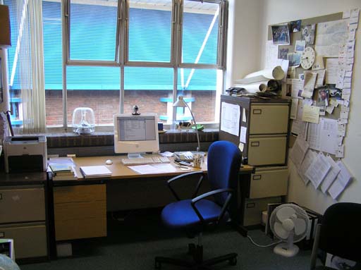
Activity 1 Design in an office
Look at the photo of the office above and list the things you see under three category headings:
- things that are designed
- things that look like they've been designed by the person using the office
- things that are definitely not designed.
Discussion
- Things that are designed: It’s a long list! The windows, the window catches, the window opener, the desk light, the filing cabinets, speakers, the cup, the telephone, the calculator, the clock, etc.
- Things that the office user has designed: This is not a long list! The noticeboard, the layout of the desk.
- Things that are definitely not designed: Although you can’t see them in the photograph, you might have thought about things through the window, e.g. the sky or birds on the opposite building.
When I sit in my office, I can probably see about 1500 individual things that are designed (including things like books and magazines, but not including the sub-components of things).
Most of the things I have around me have been designed by others, but some have been designed by me. The layout of my room, for example, and the way I organise my work are both designed by me. The layout of the documents I've written and the way I've dressed is something that I've consciously done, too. In some respects I've designed without knowing about it!
Designer Design
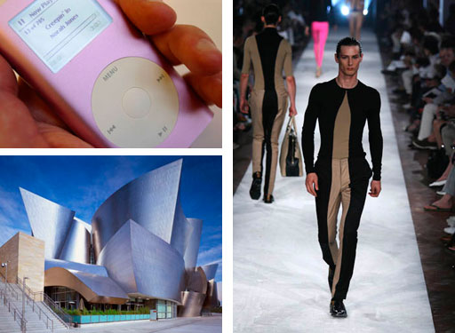
If you ask most people what they think design is, they will probably mention something like the Dyson vacuum cleaner; something that looks a bit different from other things in the same category (in this case vacuum cleaners) and that probably claims to outperform them as well. The iPod is something else that people associate with design; something that looks good and performs differently. But, it’s not only objects that can have this ‘design’ cachet. A gleaming new building might be introduced as ‘designed by Frank Gehry' (for example), or a new fashion collection 'designed by Alexander McQueen’ (Figure 2).
This is what I call ‘Designer Design’; things that are produced to showcase design, and which are marketed and written about accordingly. (They usually have a price tag to match!) Several years ago there was a fashion trend for ‘designer’ jeans, which were styled individually, and that stood out from other types of jeans. The word ‘designer’ was being used to imply that these jeans had more value, possibly because they’d had the singular attention of one individual. In fact the word ‘design’ is used far more often than you might think.
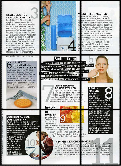
Activity 2 ‘Design’ in print
Leaf through a newspaper or ‘weekend’ magazine and try to find where the word ‘design’ (or ‘designer’, ‘designing’, etc.) appears. For each case note down whether it is being used in a descriptive sense, describing a new project, for example, or whether it is being used in a marketing sense, to lend increased value to a product.
Discussion
I found an article called ‘Clean lines for hospital fittings’:
- ‘More than 70 designers have teamed up …’
- ‘A lot of hospital furniture has nooks and crannies that are repositories for bugs, so the challenge was to design those out.’
- ‘The [Design] council then called on designers to offer alternatives.’
- ‘One team [was asked] to redesign a bedside chair.’
These suggest to me examples of where the word ‘design’ is being used in a descriptive sense, to indicate the activity that was carried out. ‘Design’ is not explicitly being used here to indicate that the things are more valuable because they have been designed.
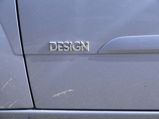
Here is a very different example of something that I found. I was in a car park in Scotland when I noticed the word ‘DESIGN’ on this Ford Fiesta car door (Figure 3). This seems to be a clear case of where the word is being used to suggest extra value over a ‘normal’ Ford Fiesta.
Quiet Design
‘Designer Design’ sometimes puts people off engaging with design. It sometimes seems as if things have been ‘given’ to us by designers, rather than being something we participate in. Yet there is another side to design that I will call ‘Quiet Design’. By this I mean the kind of design that you or I might do to our personal space, or the things that are designed but go unnoticed. These are things that quietly improve our lives without us realising until we stop and think. One example is road design, where an improved junction or roundabout can significantly ease congestion, and with it, motorist stress. Another is something as simple as a new park bench in just the right place to provide a fabulous view.
Quiet Design is much more prevalent than Designer Design, and impacts almost every aspect of our lives. That's not to say that Quiet Design isn’t designed by professionals, most of the time it is, but sometimes it’s not referred to explicitly as design. We might better describe Quiet Design as being the products of design thinking.
A good example of a Quiet Design thinker is Frank Blackmore, who had the idea of the traffic roundabout. His design thinking affected the whole country (and many more), yet he is little known.
Activity 3 Optional reading
Frank Blackmore died in 2008. If you have time, you may wish to read his obituary to see how influential he was.
2.1 A world of stuff
In his book Creativity, Innovation, and Making Stuff (2007), Rich Gold calls the totality of designed things we have around us ‘the plenitude’. He looks around his kitchen and tries to count the number of things there are:
I can easily count a thousand, but the actual answer is fractal. Every appliance, every tool, even every food (certainly if you count pesticide residue) is compound and is composed of tens, hundreds, sometimes thousands of other things. And every day new shopping bags arrive filled with yet more things. The bags were filled at malls and supermarkets, themselves filled with millions of things. It’s a lot of stuff.
Some of the stuff is called media and it’s filled with transient, slightly more ethereal stuff. Some large part of the stuff in the media are words and images designed to get us to purchase the non-mediated stuff (and services to manage the stuff). While it is true that each piece of stuff satisfies some desire, it is also true that each piece of stuff creates the need for even more stuff. Cereal demands a spoon; a TV demands a remote. The stuff coevolved and is intertwined and interdependent. Recently some of the stuff, like an early Disney movie, has begun to chat and dance behind our backs. And all the while, more bags of stuff keep coming in the door.
This world of stuff is ‘the plenitude’, according to Gold. Tellingly, he says that each piece of stuff ‘satisfies some desire’ and this is a key feature of design. Design is something that meets a desire, and the reason that the desire is there in the first place is because somehow there is an unfulfilled need asking to be met. It may be a better way to slice bread. It may be a new bypass or a new pair of trousers. Whatever the need, design is something that can help.
Why is there a need in the first place? This is rather a fundamental question! Gold points to the fact that fulfilling one desire creates a need for other things. Twenty years ago we communicated with other people using telephones, but these were tethered to one place (‘landline phones’). When the technology had been developed sufficiently, and the things were made available, we discovered we ‘needed’ mobile phones. But the first mobile phones were very big to carry around, so we designed smaller mobile phones. Then we realised it would be handy to listen to music and take pictures and surf the Web on our phones, so a new generation of mobile phones was created. Well, you get the idea. What we need is defined as much by what we currently have, and the possibilities that suggests, as it is by what might be considered our fundamental needs – for food, shelter, light, etc.
Activity 4 Essential or not?
Have another look at Figure 1, the picture of an office. I've listed ten objects from the photo in the table below and I want you to try and work out what associated need is being fulfilled by each thing (the needs of office work). Try and classify them as either essential or non-essential to doing work. What role do you think that the non-essential things have?
| Object | Need | Essential/Non-essential | ||||
| Computer | ||||||
| Chair | ||||||
| Fan | ||||||
| Printer | ||||||
| Pictures | ||||||
| Clock | ||||||
| Filing cabinet | ||||||
| Noticeboard | ||||||
| Window | ||||||
| Desk |
Discussion
| Object | Need | Essential/Non-essential |
| Computer | Store and do work, communicate | essential |
| Chair | For comfort and support | essential |
| Fan | To make the air cooler | non-essential |
| Printer | To have a paper copy of documents | non-essential |
| Pictures | For pleasure | non-essential |
| Clock | To tell the time | essential |
| Filing cabinet | To store things | non-essential |
| Noticeboard | For reminders | essential |
| Window | To give light | essential |
| Desk | To provide a surface to work on | essential |
For me the non-essential things tend to be things that are not used all the time, or that relate to other non-essential things. For example, the printer and the filing cabinet seem to be related in some way, so perhaps there is a possibility to do without both? Do you agree with my categorisation? Some people might think that a fan was meeting an essential need, for example. I think that differences like this tell us quite a lot about the nature of ‘need’. Some things that we think of as essential – and are prepared to argue are essential – are often not essential to other people. The idea of what we need is deeply connected with design thinking, and it is a topic we will return to.
You might be surprised by just how many ‘needs’ are being met in our everyday environment. We tend to think of needs as fairly simple and singular things, but in reality they are manifold and complex, and change many times during the course of a day.
2.2 Changing our behaviour
The word ‘need’ also implies improvement. We design new things because we think they will improve our lives somehow; for example, they may make us look better, feel better about ourselves, develop us, help us communicate more or get about more easily. Design changes us for the better.
Or does it? Can you think of any design that doesn't make us better or has made things turn out for the worse?
Activity 5 For better or for worse
On a blank sheet of paper make three columns and label them as follows:
| Example | Better/Worse | Intentional/Unintentional |
Now look through a newspaper or magazine and find five examples of design (Quiet Design or Designer Design). Note these in column 1. Then, for each of your five examples note down in the second column one reason why the example has made the world a better place, and one reason why it might have made it a worse place (although, perhaps, you might not be able to think of anything here). In the third column, for each reason you’ve listed in the second column, note whether you think the reason you’ve given in the second column was intentional or unintentional.
Discussion
Here are a couple of things I found in my newspaper. One was an article about how the design of urban environments has largely been done by men for men, without considering the needs of women – bus shelter seats that are difficult to sit on, for example. The other was an article about the design of new schools, and how the way that they are currently funded largely prohibits teachers from contributing to the design process. My columns look like this:
| Example | Better/Worse | Intentional/Unintentional |
| Urban environments (bus shelters) | + Provides shelter from the elements - Doesn’t meet the needs of some users |
Intentional Unintentional |
| New schools | + Meet the needs of modern education - Poor teaching environments |
Intentional Unintentional |
The effects of design are often a little different from the intentions of a designer or design team, and sometimes drastically so. In the 1990s, a new computer-aided dispatch system designed to make the emergency response of the London Ambulance Service quicker and more efficient actually resulted in more deaths through ambulance delays (Masters, 1997). We can be quite sure that this was not the intention; nevertheless people lost their lives as a result of design. Another example is that of mobile phones. As we noted before we now have an extraordinary ability to communicate wherever we are, though at the same time if this happens to be on a quiet train we curse mobile phones under our breath, and are sometimes even moved to intervene.
Design, intentionally or unintentionally, changes our behaviour. This is, perhaps, the hallmark of design. Lawrence Lessig has noticed how designs (he calls them ‘things’) often have a ‘law-like’ character, regulating our behaviour in certain ways. Lessig (1999) describes four ways in which our behaviour is controlled and regulated. Let’s look at the example of parking:
- The first is by the law. It is determined that it is illegal to park in some places, and most people generally observe this law. If they break this law, and are observed to have done so, they are penalised.
- The second is by norms. In places where people do park they observe an unofficial code – 'leave a bit of distance between the car you are parking next to', or 'don't block someone else's exit'.
- The third is by the market. Whether you can afford to park affects your ability to park. So if the market determines a price that you cannot afford (or refuse to pay), then you will look for somewhere else to park.
- The final way is by architecture (what we can think of as design). A few painted lines on a piece of tarmac mean that we all park in a certain orientation, because the architecture 'tells' us to.
Activity 6 Design and behaviour
Taking the activity of driving in a car, provide an example for each of the four ways listed above that regulate our behaviour.
Discussion
Law: By law we have to drive on the left, and to a speed limit.
Norms: When we pull over on a narrow road to let someone else pass, we expect that they will acknowledge our action.
Market: Using an alternative route to avoid paying a road toll, or buying a more economical car to save money on fuel.
Design: An indicator provides a way to tell other people that we are turning. An accelerator allows us to go faster.
Activity 7 Optional reading
Even an activity as simple as walking can be regulated by things. Just putting up a sign saying ‘do not walk here’ has the effect of regulating and ordering our walking behaviour. The following short article, In the Street by Peter Campbell, gives you some idea of the kind of things that influence our walking behaviour in an urban environment.
Design, then, is one of the factors that shapes the way we live, generally for the better, but not necessarily so.
2.3 Involving other people
If design is something that is able to improve our lives and shape our behaviour, it self-evidently originates from, and involves, people. In contrast to an activity like art, which often (though certainly not always) involves only one person in its production, design usually involves a number of people in several different roles. Design, then, is something that is inherently social or, put another way, something that creates social or cultural value. Of course, this value can come in a lot of different forms: ease and effectiveness of use, economic value, aesthetic value, functionality, meaningfulness, all these things and more contribute to the way in which design creates value.
Let’s think about the number of people that might be involved in design. First of all we have the designer themselves. For the moment we can assume that they are at the fulcrum of a design process. But perhaps there is more than one designer? If the product is complicated – a car, or a television, or a piece of software, for example – then there will be lots of designers working together. Even for seemingly simple products there will often be more than one designer involved.
The designer, or team of designers, is usually working on behalf of someone: the person we normally call the client. The client is the person who has the ‘unfulfilled need’ we mentioned earlier; they have a problem that needs solving and are usually prepared to pay to have it solved. The solution to their problem will often involve two further groups of people: manufacturers who will make the product, and users who will use or consume the product. Together these four groups form the core of people involved in design (Figure 4). Note that the design is at the centre of the dialogue with different stakeholders.
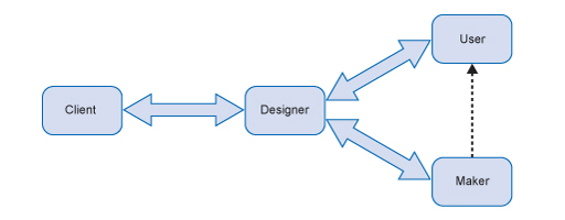
The role that these types of people play – designer, client, and user – can often overlap and, especially for design students, be the same person. Generally, however, these will be different people or groups of people. There are, of course, other groups involved. For example, makers ensure that what is being constructed is done so in appropriate ways. Market researchers may also be engaged to ask questions about the potential design.
In the past, the role of the designer was reasonably clear; the designer was the person who came up with the ideas and presented them to the client, who then chose the one they liked best. Designers also tended to stick to specific disciplines: graphic designers concentrated on graphics, architects on buildings, fashion designers on clothing, and product designers on products. In the past few years, though, a different kind of designer has emerged. This is a person who is able to bring together expertise to tackle more complicated problems, not necessarily problems that can easily be solved by just one discipline. This is a person who can ‘organise’ a solution by using a number of methods. An example of this kind of design is work that has been done in the NHS on improving healthcare services – you can find out a little more on this page.
You can see the expertise that is available – doctors, nurses, managers, patients, technical staff, politicians even – who will all have an opinion on the best way to improve healthcare. The designer’s role here is to listen and help these different groups engage with one another in producing a solution to the problem. In a sense the designer is much quieter with this kind of design, more of a listener and thinker than a presenter of ideas; a producer of quiet design!
Activity 8 Different people
Imagine that you are designing a new countryside footpath for the National Trust after the completion of a new road. List the types of different people that you might involve to help you arrive at a solution that would please everyone.
Discussion
You might have:
- Different types of walker
- People who maintain the footpaths
- Countryside alliances
- Naturalists and conservationists
- Walkers’ organisations
- Landowners
- Local council members
- Road builders.
And that is in addition to the stakeholders outlined above – the makers and the clients!
You see how complicated design can be! Everyone has an opinion on what they think should be done, and it is the designer’s job to evaluate these and weigh them against each other. And sometimes it's not possible to please everyone.
Activity 9 Watch
This video features people involved in the design thinking field, and will provide you with a perspective on design thinking. The video runs for 4 minutes, during which our guest designers talk about what ‘design’ means to them.
Transcript: What is design?
2.4 Summary
If you look up the word ‘design’ in a dictionary you will find it is both a verb and a noun. As a verb it means to plan, to draw, to contrive, to intend. As a noun it refers to a drawing, an object, a plan or a scheme. This part of the course has tried to extend this conventional idea of what design is.
We have looked at some aspects of design that you may not have thought about or noticed before, and which may even have surprised you. These aspects include the improving characteristics of design, the way that design regulates our behaviours, and the different people that produce and use design. I think this shows something about the responsibilities we have in our designer role.
- Design is all around us.
- Design satisfies need.
- Design creates value.
- Design changes behaviour.
- Design involves people.
3 Composition in design
In this part of the course, you will learn about composition in design. Composition is a characteristic of all types of design. It can be found in written designs, such as novels and poems. It’s found in time-based media such as music or films, and it’s found in visual and physical design, such as postage stamps, products and architecture. Understanding the principles of composition will help you make better designs.
This part of the course guides you through the principles of composition using a wide range of examples of design outputs. There are a number of exercises to help you apply your learning and to experiment with variations in composition.
The equipment you need
- Some sheets of scrap paper.
- A pencil and a ballpoint pen.
- Post-it® notes (optional).
- A digital camera.
3.1 Principles of composition
The composition of a design informs our understanding of it, shapes our feelings about it and guides the use we make of it.
Take music, for example. When we talk about the composition of a piece of music we mean its structure, organisation and rhythms. We use these to help us make sense of the music. We respond emotionally to the composition and make judgements about whether we like it or not.
Structure, organisation and rhythm are just some of the components that, together, form design composition.
We will explore some of the more important principles of composition and reveals how they underpin a wide range of design in the physical world around us.
3.1.1 Structure
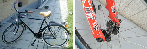
Some things we own consist of only one part. Here we’re thinking of a metal spoon, a wooden walking stick or an attractive pebble picked up on a beach. But most things we own consist of many parts. Take a bicycle (Figure 5), for example. It has wheels, a frame, a seat, and mudguards. Even parts such as the brakes consist of many smaller parts fixed together – brake pads, wires, nuts and bolts. In all cases these objects have a structure. In the case of the spoon it has only one part and this part is the structure. For the bicycle it is the ‘assembly’ of the many parts that creates the structure.
Just having all the necessary parts for a structure is little use. This is like having all the parts for your bicycle brake but not putting them together. They wouldn’t work – the bicycle wouldn’t slow down when you applied the brake. What’s important is the organisation given to these parts. This idea of creating organisation by assembling parts into structures lies at the heart of design composition.
Activity 10 Make a paper composition
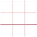
Take four square Post-it® notes or sheets of paper. Using faint pencil lines divide each sheet into thirds horizontally and vertically as shown in Figure 6a.
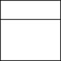
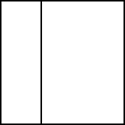
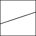
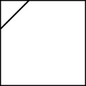
Using this grid as a guide draw a straight line on each sheet. For this use a pen so that your lines stand out clearly. Your lines must start and finish where a grid line meets the edge of the paper, that is, they can be vertical, horizontal or diagonal (see the examples in Figures 6b–6e).
Place the four sheets in a line and rearrange them until you produce a composition you like. You can turn sheets around and change the order. Then give a reason why you like this composition. Perhaps it reminds you of something?
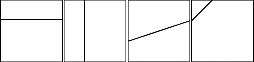
In this activity each sheet of paper with its single line was a part. You organised the parts into a visual structure by placing them in a line, and this created a composition. During this arranging activity you tried to think about any preferences you had, or what the shapes reminded you of. You were ‘reading’ the compositions just as you might read a written sentence and it began to appear as more than just ‘abstract lines on paper’.
We could have taken this further. We could have introduced more lines on each sheet – and perhaps more sheets. Just like the bicycle example we might find ourselves building assemblies of assemblies to make complex structures.
Also asking you to divide the squares into thirds wasn’t a random choice. We’ll return to the power of using thirds in composition later in this element.
This exercise also has applications in real-life design. Look around the room you are in right now. Can you identify an area that could be simplified and pictured with just a few lines? Figure 7 shows an example.
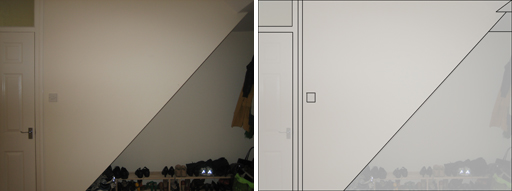
The photo and abstraction in Figure 7 demonstrate that most real-life situations can be reduced to simple visual compositions. Of course, such simplification means that some parts are left out, but this editing is a normal part of design thinking. Simplification also means that there is likely to be some repetition. In Figure 3 some of the horizontal and vertical lines are repeated in the abstraction, but this isn’t a bad thing. In fact, it is another important part of design composition.
3.1.2 Repetition
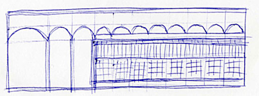
In section 3.1.1 we noted that structures are assemblies of parts. Figure 6f illustrated a composition that has an overall structure plus we can see the different parts that make up the structure (the individual pieces of paper and the lines on each sheet). However, what if each part was identical, that is, each contained the same line, in the same place and the paper was used the same way round? If they were all the same they would be displaying repetition in their composition. Look at the example of architecture in Figure 8. It is a building in the Indian city of Chandigarh, and was designed by Le Corbusier following India’s independence in 1947.
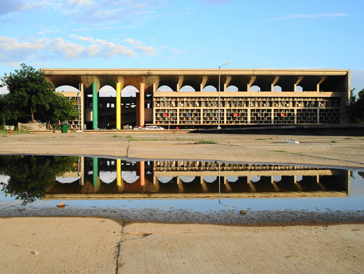
Look at how the repetition of parts in this building becomes a dominant feature of the structure and the overall composition. Not only can we see repetition in the roof arches, there is repetition in the wall structures. Looking for repetition is a good way to heighten your visual awareness.
Activity 11 Visual repetition
Take some photos that show visual repetition in design composition. You can choose any subject for your photographs, e.g. products, buildings, components, etc. If you are stuck for ideas look around shops or DIY centres that have many of the same items on display.
Discussion
Figure 9 shows some examples we found.
Repetition can be a significant feature in other fields of design. Look at the dress shown in Figure 10.

This dress uses repetition to create strong diagonal lines. These are so dominant they work like tones in music. You could imagine if you touched upon the dress, each line would make a different sound. They bring a rhythm to the design.
3.1.3 Symmetry
Symmetry is all around us. You only have to look at your own body to see that your right half is a mirror image of your left half – well approximately. This is an example of mirror symmetry with an imaginary mirror line running vertically through your head and body. Nature is a good source of examples of symmetry.
There are fewer examples of horizontal symmetry, some being a tin can, a scarf and the cross-section of a roof-supporting beam. Can you think of any others?
Symmetry is a variation of repetition and is exploited in a wide range of products. But just like the human body there can be subtle but important differences between the two halves of a product. Take a car for example. It is broadly symmetrical but, of course, it only has one steering wheel and one set of controls. What about your mobile phone? Some parts of the composition may be symmetrical while other parts are not.
Activity 12 Phone symmetry
Take your mobile phone or any other phone you have access to. Look at it carefully and make a simple drawing to show where it is symmetrical and where it is not.
Discussion
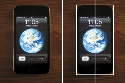
In overall structure this mobile phone (Figure 11) is symmetrical about a vertical centreline. It is not horizontally symmetrical because the screen shows the date and time on one end and a slide bar to access the menu on the other.
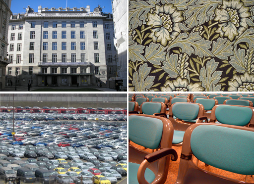
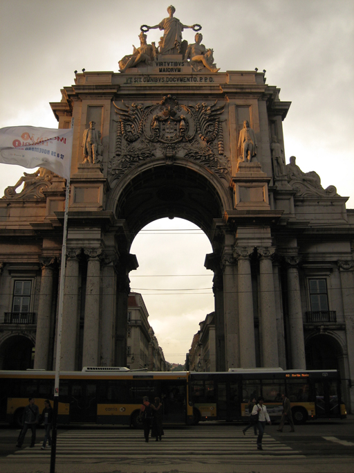
A lot of architecture is designed with symmetry in mind. This provides a sense of order, stability, permanence and safety, all of which are important in our perceptions of what successful buildings should intrinsically represent. For example, look at the city gate in Figure 12.
Symmetrical design, where the two sides mirror each other, can be seen in many examples of consumer products. This is because consumers often favour objects that are symmetrical. For example, course author Nicole Schadewitz made this observation:
When I purchased my mobile phone I think its symmetry did influence my decision to buy. Somehow the balanced layout of the elements on the screen seems calming, safe and reassuring. My sofa also has a symmetrical design; somehow it expresses stability and comfort to me.
Not all balanced compositions are symmetrical. Asymmetrical design is frequently seen around us but is often more complex and it is more difficult to achieve a balanced whole. For example, look at the T-shirt designs shown in Figure 13. Asymmetrical designs might use varying proportions and textures of elements to achieve their balance.
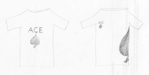
In the first T-shirt the Ace symbol and the word Ace are aligned on a vertical axis, so the composition is balanced. In the second design, a smaller ace symbol and word are positioned in the upper left corner. In order to balance the design, a scaled ace symbol is placed diagonally opposite.
Look again at the picture of Chandigarh High Court (Figure 14a), and note how this is an example of asymmetrical architecture.
Figure 14b is a sketch that helps to demonstrate this.
3.1.4 Proportion
There are many factors guiding a designer’s judgement of proportion. For an architect the proportion of a house doorway is guided by the height and width of the people who will pass through it. Similarly with knives and forks – their proportion is guided by the various sizes of the human hand. Some products are guided by technological factors, for example the ratio of height to width on a TV or computer screen. But what about graphic design where there are no physical human limitations or technological norms to conform to?
Most famously, the ‘Golden Ratio’ offers a solution. The ancient Greeks were the first to observe this phenomenon and to describe it mathematically. They saw this particular proportion in the structure of shells, horns, flower heads and many other examples of nature. Since this time it has been used as a guiding principle for establishing proportion. Let’s look at its characteristics.
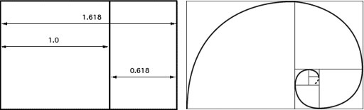
The rectangle on the left of Figure 15 consists of a square that has been extended on one side in the ratio 1 to 1.618. That is, if the square is 1 unit high the width is changed to 1.618 units.
The new smaller rectangle can be similarly divided in the ratio 1:1.618. And you can continue until the working area becomes too small.
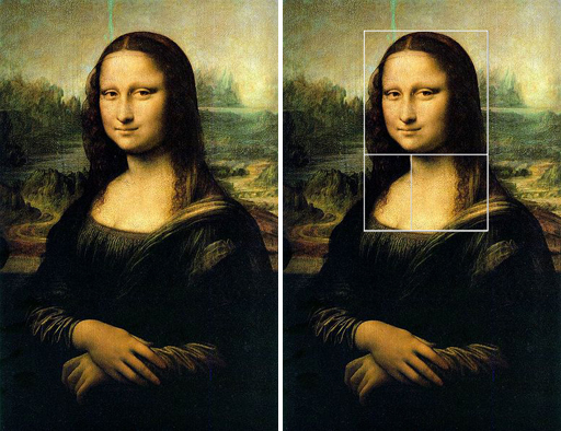
The artists in the Renaissance believed that if you arrange elements in the proportions of the Golden Ratio, the outcome would be visually pleasing. In retrospective analysis, proportions in Leonardo Da Vinci’s painting of the Mona Lisa seem to be based on the Golden Ratio (Figure 16, left). Another example of the application of the Golden Ratio can be seen in the proportions of the head and chest of Mona Lisa (Figure 16, right).
A simplified version of the Golden Ratio is expressed in the ‘rule of thirds’. This rule has already formed the structure for the Make a paper composition exercise. It says that if you divide your picture frame into thirds, that is, divide your total workspace into nine equal parts, this provides the necessary guidelines for placing text or images into a picture. Figures 17a and 17b illustrate this.
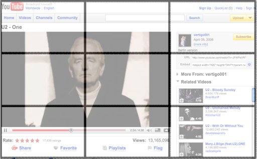
These two examples of modern graphic design exploit the rule of thirds. See how important parts of the composition start or finish on one of the guidelines. This rule has been widely used in photography but its direct and indirect influence can also be seen in the layouts of magazines, posters and web sites.
It has also been used to define the fronts of buildings such as office blocks. However, while the rules may provide a visually attractive facade to the building, the windows and doors might not end up in the appropriate places. Perhaps the requirements of the internal rooms, the circulation of people or safety should be considered first.
Even in graphic design these rules are really only guidelines. They provide pointers to help you achieve your design intention.
Activity 13 Rule of thirds
Now it is your turn to create a composition using the rule of thirds. Create a layout for a poster using the elements given in the interactive activity below. Simply click on an item to select it, e.g. a hand or a piece of text, then use the blue ‘action’ buttons to position and manipulate the items. You can scale and rotate each item, position items over one another, and also toggle the grid on and off.
Click on the link below to start the activity (open the link in a new tab or window by holding down Ctrl [or Cmd on a Mac] when you click on the link).
When you feel you have achieved a satisfying composition based on the rule of thirds click on ‘save’. This will allow you to save your design to your computer as a jpeg file. Use the title ‘Rule of Thirds’.
Discussion
3.1.5 Positive and negative space
Most pictures focus on something and we distinguish between this thing and its background because there is contrast between the two. We call these two characteristics the ‘figure’ and the ‘ground’. We might consider these as the ‘positive’ space and the ‘negative’ space.
Look at the poster in Figure 19. This displays a strong contrast between the colourful figures and the dark ground. Can you read it? It says IBM (eye, bee, M). Clarity of figure and ground is important if it is to quickly communicate its humour and its advertising message to viewers. Interestingly it exploits a lot of negative space when you might think the positive space – the letters – were more important.
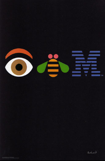
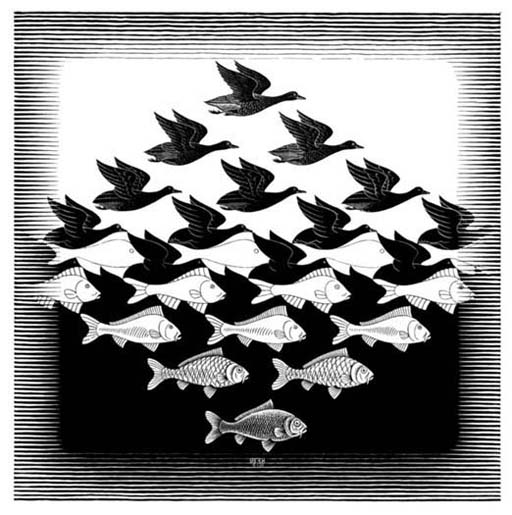
Figure 20 shows an example by M.C. Escher that cleverly uses positive and negative space. Can you see where the fish end and the birds begin? Also, which is the positive space and which is the negative space? The interrelation of positive and negative space in this composition provides an interesting metaphor for interrelations in nature.
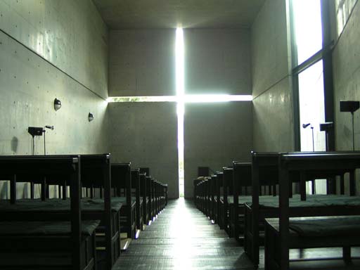
This principle of composition is not limited to artists. Figure 21 shows the interior of a church designed by Japanese architect Tadao Ando. Can you identify positive and negative space in his architecture? Whereas a cross is often the ‘figure’ attached to the wall (background) in a church, here Ando inverts this. He allows external light to enter in the shape of a cross, creating a strong contrast between the figure (cross) and ground (wall).
Activity 14 Figure and ground
Now it is your turn to create a composition where figure and ground, positive and negative space, are indistinguishable. The interactive activity below allows you to manipulate the white and black areas. Try to achieve an effect where the viewer can see two alternative images in your composition.
Click ‘View’ below to start the activity, which will open in a new window.
When you are satisfied with your composition, click the ‘save’ button. This will let you save a jpeg image on your computer.
Discussion
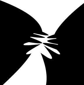
In this picture we can see a river flowing through a valley and also claws of an animal, maybe a bear holding something or something being ripped apart. Can you see these images too?
3.1.6 Emphasis and dominance
Designs often display a point of focus. In graphic designs this is usually associated with the figure (as opposed to the ground). This gives emphasis to the composition. Our eye is often taken from that which is emphasised (through scale, weight, contrast, colour, shape, isolation, etc.) to other elements of a composition.
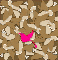
For example, in Figure 23 a brightly coloured bird stands out from the muted shades of the background. Our eye is drawn to that part of the composition and this is particularly useful if the image is complex. In this example the colour isolates the bird from the leaves.
Every newspaper or magazine we flip through bombards us with a constant flow of visual stimuli, such as advertisements. These fight for our attention through the use of visually dominant elements that often emphasise the selling point in the ad.
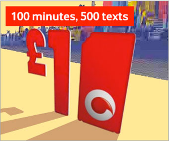
Figure 24 shows an online advertisement for a mobile phone service. It draws attention through the large red areas symbolising a mobile phone and the price of the service. The colour of the main elements sets them clearly in the foreground against a paler background. Large coloured areas dominate the composition.
3.1.7 Combining the principles of composition
Unity describes the wholeness of a design composition. Successful design displays a sense that the designer or design team has given due consideration to the various components of design composition, where the relationships between these components reinforce the main goal or communication that the designer had in mind.
The use of a variety of elements aims at creating interest and impact. Unity is achieved when:
- Elements within a composition are harmonious and not competing against one another. Any contrasts are planned.
- The core theme is communicated clearly.
- The whole design seems complete; as one.
Sometimes unity is deliberately avoided, which is a message in itself.
Activity 15 Unity
Look at Figures 25 and 26. Do you think unity is achieved? If not, why? What might non-unity mean?
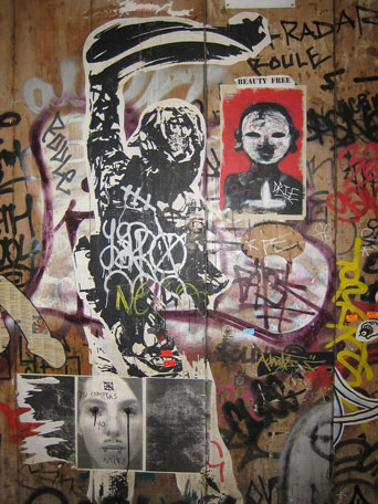
Discussion
We feel that in Figure 25 the various elements (posters, tags and graffiti) do not form a unity, but celebrate the fact that they were contributed by different artists. Everyone can use this space to fight for attention.
In Figure 26, the accumulation of a variety of building types does not achieve a visual unity. Again this variety expresses the importance of the different origins of the buildings and their purpose today.
3.2 Conclusion
This section has introduced you to some important principles of composition.
All designed things have a structure. It can be a physical structure or a visual structure. Some structures are an assembly of many parts.
Assembling parts can give rise to repetition. This creates a visual rhythm just like music can offer auditory rhythms.
Symmetry can bring a sense of order to a design composition. Asymmetry offers opportunities to achieve a more complex balance between visual parts.
There are some guidelines to achieving attractive proportions in visual design. The Golden Ratio and the rule of thirds are two such guidelines.
Visual composition consists of positive and negative space. Achieving your preferred balance between these can involve other principles of composition.
Composition often displays a point of emphasis. Colour or other forms of contrast can be used to create emphasis.
Often in design thinking, rules are made to be broken. There are many examples of successful design where these principles have been bent or broken. In order to understand when and how these rules can be broken to achieve a high impact, you can use your skills of sketching, modelling or prototyping to try out ideas and to get feedback from others.
4 Complex information
Being able to reduce complex information to simple information is an important skill to learn in design thinking because it provides a way to explore creative possibilities further.
In this activity you will take a photo of your hand, which is an example of complex information. You will then trace around the image, reducing it to a much simpler form.
The activity is designed to:
- Help you create something new from something familiar.
- Show you how the things you do on paper can be transferred to your computer.
You should allow up to 2 hours to complete this activity.
The equipment you need:
- a digital camera
- A4 plain or tracing paper
- a pencil and a thick felt-tipped pen
- a printer
- a scanner (recommended but optional).
4.1 The hand activity
Activity 16 Show your hand
Photograph your hand
Decide how you would like to show your hand. For example, you may wish the image to be very simple, or you could choose to photograph your hand holding or interacting with an object. If it helps, you can get someone else to take the photo or use a mirror. You could also make a picture of your hand using a scanner.
- Transfer your photograph to your computer
Upload the image from your camera to your computer. Use the title ‘Hand Photo’ and save it in an appropriate place.
- Trace your image
Print out a copy of your image. Place a blank sheet of normal A4 or tracing paper over the top of it, and then trace around the outline of your hand with a thick felt-tipped pen. If your hand was holding an object, you can include an outline of the object in your trace.
Tip: If you hold the photo and the blank sheet of paper up to a window or a desk light, it will be easier to see the outline to trace.
- Scan or photograph your hand trace
Photograph or scan your hand trace. Save the image to your computer using the name ‘Hand Scan’.
- Reflect
Spend a few minutes reflecting on this activity.
- Did you enjoy this activity?
- Think about what you liked or disliked about it?
- Did you find it difficult to decide what position to photograph your hand in, or have trouble getting your equipment to work?
Further reading
Rhodes, B. (2008) ‘Frank Blackmore’, The Guardian, 21 June 2008. Available online at: http://www.guardian.co.uk/ theguardian/ 2008/ jun/ 21/ 6
Useful links
If you have time, you may wish to watch these two short TED videos:
You can read more about the Golden Ratio and rule of thirds on Wikipedia:
References
Gold, R. (2007) The Plenitude: Creativity, Innovation, and Making Stuff, MIT Press.
Lessig, L. (1999) Code and Other Laws in Cyberspace, Basic Books.
Masters, S. (1997) ‘Emergency room: London’s ambulances won’t crash again, says new IT expert’, Personal Computer World, 12 June 1997. Available online at: http://www.computing.co.uk/ctg/analysis/1837417/emergency-londons-ambulances-wont-crash-it-expert.
Acknowledgements
The material acknowledged below is Proprietary and used under licence (not subject to Creative Commons licence). See Terms and Conditions.
This course was authored by Nicole Schadewitz, Emma Dewberry and Steve Garner.
Grateful acknowledgement is made to the following sources for permission to reproduce material in this course:
Peter Lloyd
© The Open University
Course image: Steve Jurvetson in Flickr made available under Creative Commons Attribution 2.0 Licence.
Figures 1 and 3: © Peter Lloyd
Figure 2: © Steven May / Alamy; WWD / Conde Nast / Corbis; Tom Mackie / Alamy
Figures 7, 11, 12, 14b, 18 and 22: © Nicole Schadewitz
Figures 8 and 26: © Wiki media Creative Commons licence
Figure 13: © Emma Dewberry
Figure 16: © Wikipedia Creative Commons licence
Figure 17a: YouTube, copyright unknown
Figure 19: Paul Rand for IBM
Figure 20: © The M.C. Escher Company - Holland
Figure 24: VodafoneTM advertisement
Figure 25: © macle, via http://www.flickr.com/ photos/ 7276607@N07/ 3322484174, used under Creative Commons licence
Figures 14a, 17b, 21 and 23: copyright unknown
Every effort has been made to contact copyright holders. If any have been inadvertently overlooked, the publishers will be pleased to make the necessary arrangements at the first opportunity.
Don't miss out:
If reading this text has inspired you to learn more, you may be interested in joining the millions of people who discover our free learning resources and qualifications by visiting The Open University - www.open.edu/ openlearn/ free-courses