Why maps are made
Use 'Print preview' to check the number of pages and printer settings.
Print functionality varies between browsers.
Printable page generated Saturday, 20 April 2024, 5:09 PM
Why maps are made
Introduction
This course looks at the prevalence of maps in everyday life, their uses and their importance. From mental maps to public transport and street maps it moves on to historical and history-making maps. Along with assessing the political importance of some maps it examines how we read maps and looks at how to evaluate the information contained within them. Although maps might seem to be objective and factual the course looks at the values embedded in both maps themselves and our perceptions of them.
This OpenLearn course provides a sample of Level 1 study in Geography.
Learning outcomes
After studying this course, you should be able to:
identify some of the important characteristics of maps in relation to their value to social science
recognise and give examples of how maps can influence our “view” of the world
describe the relationship between data and space as represented on a map.
1 Reading maps
1.1 What makes a map?
During 1999 The Millennium Mapping company launched a project that planned to change the way we looked at and record the UK. The intention was to take imagery of the entire country thus producing an immediate snapshot of life in the new Millennium. In many ways this imitated the Domesday Book of 1089 when William the Conqueror attempted to record all aspects of his new kingdom.
The Millennium Mapping company, unlike William, produced more than 56,000 aerial photographs that have subsequently been updated as well as being made available to the public from their associated website (http://www.getmapping.com [accessed 21 Dec 2006])
Indeed since that time they and many other companies have also captured aerial photography and satellite imagery that is now in regular use by public utilities, insurance companies and other private enterprises. Some companies also market historical aerial photography that offer us a different perspective: what was located in a particular place, say, before the second world war?
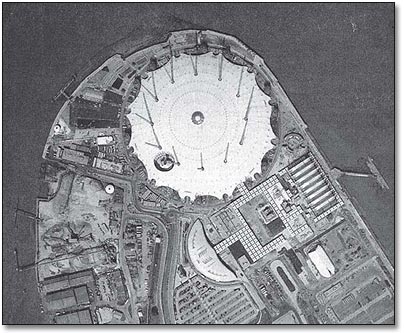
The illustration in Map 1, showing the Greenwich peninsula in London, gives us a birds eye view of an infamous building – the so-called Millennium Dome. In its relatively short life it too has made history.
The illustration, however, looks like a photograph. What is the difference between an aerial photograph and a map? Our maps are now being produced from photographs and satellite images and we will be able to construct our own maps using these. Does this therefore mean that maps have become objective and value-free?
2 Maps as everyday experience
2.1 How do we use maps?
Reading about maps, I have been struck by the number of times that the idea of ‘maps as part of our everyday experience’ has been mentioned. In fact, I was thinking about it recently, when I was preparing to travel from Belfast to London. I left home with a mental map of my journey to the airport – but on the way I found that the road was blocked by a burst water main. ‘Plan B’ was to consult my local road map for the quickest alternative and, in doing so, I wondered if my usual route really is the best one! I presume that the pilot of the aircraft on which I travelled had an appropriate route map, but there were maps representing the airline's routes in Europe and across the world in the magazine in the seat pocket. I used the London Underground from Heathrow Airport and consulted that now famous route map displayed at the station to decide where to get off. From there, it was a case of a street map to get me to the BBC.
Activity 1
What about maps in your ‘everyday experience’? Note that this does not mean maps that you actually use every single day. I mean, rather, our commonplace experience of maps. Make a quick list of maps that you experience in this way.
Discussion
Were you surprised, when you actually started to identify the common use of maps, at just how much they are part of our everyday experience? Or am I being optimistic in saying this? The kinds of thing you might have noted could include: newspaper or TV weather maps; ‘You are Here’ maps in town or shopping centres; road maps; travel brochures. You may well have thought of others.
2.2 Mental maps
One of the maps mentioned in the description of my journey to London is the idea of the ‘mental map’. This concerns the notion that we all carry maps in our heads. When asked for directions to a place, our reply is based on a mental map which may be quite close to a ‘real’ map; or may be quite impressionistic and have more to do with our feelings and senses. Have you ever been misled by directions which told you to turn, say, second left, only to discover that the person who gave the instruction had omitted to mention a narrow road or alleyway which you had counted as ‘second left’ but which they habitually ignore? We often give great detail about places close to us but become quite vague and inaccurate about places further away. This can be the case for our locality or home region or, when we think about other countries, continents or the world as a whole. We often recognise instantly an outline of, say, Australia or Scandinavia, yet can be almost unable to draw any such place by ourselves. And which place is further west – Carlisle or Edinburgh; or further south – Exeter or Brighton? On my mental map, Carlisle is much further west than Edinburgh but, in fact, they are almost on a line north-south, with the centre of Edinburgh, if anything, slightly more westerly. Similarly, with Exeter and Brighton, I imagine Exeter to be more southerly but it's not. You may have thought quite differently: you may have known ‘the truth’ by being familiar with these places. But next time a less than familiar place is mentioned, try imagining its location relative to somewhere else – and see if you are close.
So, with mental maps and others that we have noted, I am suggesting that maps are part of our everyday experience, even if not particularly noted or frequently used. Are they also useful in examining our ‘social worlds’? How might we use maps in social sciences?
3 Maps as knowledge
3.1 Maps as history
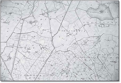
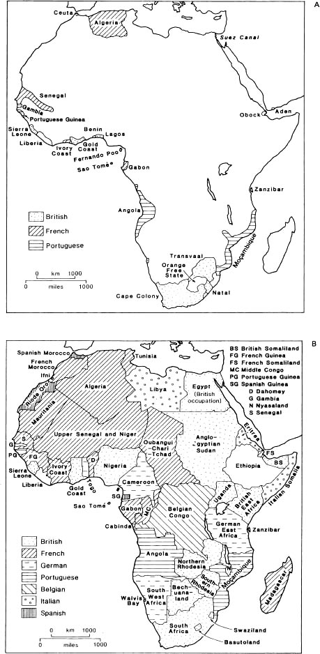
Maps represent knowledge of the time and space within which they are compiled and produced. In this way they form part of the historic record. An old map is a picture, albeit selective, of the past and forms a baseline for studying change. The first edition of the Irish Ordnance Survey (see Map 2 below) provides a picture of the landscape just prior to the Great Famine of the 1840s. What changes do you think might be seen by comparing the first edition with the second, which was produced later on in the nineteenth century? In some places you would find that settlements are greatly reduced in size but in others there seems little change: social scientists will want to ask ‘Why?’ Were the effects of the Famine geographically selective? What other changes were happening over the same period? Such questions will feed back into the circuit of knowledge.
Maps also represent those with the power to establish their view of the world as the accepted view, which can mean subverting alternate views. Indigenous peoples have had their own understandings and maps of their places but this did not stop Europeans from imposing a Western view of the same geographic space. Often this view was of empty territory, implying that it was free for colonization.
One example of how a line on a map actually made history concerns South America. Just after Columbus sailed across the Atlantic Ocean the Pope, asserting the ‘right’ to control non-Christian lands, drew a line to separate the spheres of influence of Spain and Portugal. Spain got the rights to ‘new’ lands to the west of the line and Portugal to the east. Basically this gave America to Spain and Africa to Portugal until, some five years later, the area we now call Brazil was discovered, to the east of the Pope's line, thus giving Portugal a hold in South America. Had the line been drawn differently, history would have been different for people in Brazil. The drawing of international borders in more modern times has had a similar effect in placing people on one ‘side’ or another and thereby affecting their lives. The partitioning of Cyprus or of India and Pakistan are examples.
3.2 Maps and the circuit of knowledge
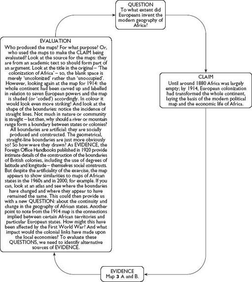
Activity 3
The circuit of knowledge starts with a question or questions. For example, look at Figure 1 and Map 3, A and B. Figure 1 shows how the circuit of knowledge can be used to investigate a question, using Map 3, A and B, as evidence.
Discussion
Of course, this brief, very partial exercise produces lots more questions for which we would need to evaluate other sources of evidence. The purpose, however, is to show that maps constitute a source of evidence alongside text, pictures, statistics and spoken words.
3.3 Maps and the modern world
Maps play a fundamental role in the functioning of modern Western societies. They are important as legal documents in both the public and private spheres: your proof of the boundaries of your property as well as the location of international borders. Maps are important in military campaigns, territorial disputes, explorations for mineral resources. Maps may be a source of conflict and competing claims to land and water. In some cases the conflicts are also cross-cultural. Western-style corporations laid claim to territory in Australia which was occupied by Aboriginal peoples who do not recognise that kind of property ownership. Indigenous peoples in Central America (e.g. in Honduras) have challenged logging companies through the legal process. In Northern Canada, the government recently re-established Inuit place names and thereby ‘redrew the map’, representing a major social and cultural development. Maps are also used to show the incidence and spread of pollution or disease, often in relation to international boundaries. You may have seen such maps in newspapers, for example, after Chernobyl, using arrows to indicate the direction of spread of radiation; or maps of the incidence of leukaemia, suggesting that the disease is clustered geographically.
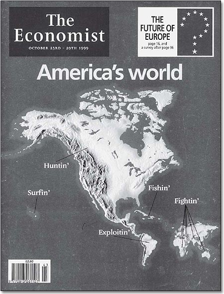
Maps also play a part in political and economic life in the form of cartoons, using humour to make a serious point (see Map 4 below).
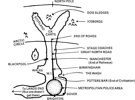
Another example using humour can be seen in Map 5 (below).
In England, the Doncaster and District Development Council published Ye Newe Map of Britain [see Map 5], as a way of drawing attention to the manner in which many Southerners in England misperceive the North. The Council wanted to attract more industry and jobs to the Doncaster area, and realised that many decisions affecting business locations were made in London. The idea was that if people have their legs pulled in this way they will re-examine their spatial biases and make more informed decisions in the future.
I hope you will look for your own examples of the use of maps in newspapers, books and on television. But I also hope to suggest that maps are interesting sources of information and that maps can be fun. In certain circumstances, maps matter, as in the law and also in the ‘claiming and naming’ of places. Being ‘on’ or ‘off the map’ can literally change your fortunes.
3.3.1 Mapmaking for the twenty-first century
In early mapmaking history, maps were compiled from travellers’ tales, sailors’ logs and other maps. Information could, therefore, come from various sources and different dates. By the nineteenth century, maps were being made by more technically and scientifically rigorous procedures. Recently, mapmaking has benefited from developments in electronic surveillance techniques and computer programming. The Ordnance Surveys are now using aerial photography coupled with detailed checking on the ground. Maps can be updated more regularly and easily and can also be compiled from a much greater variety of information. With Geographic Information Systems (GIS) we can draw in or exclude layer upon layer of data to build up the final version. Global Positioning Systems (GPS) enable us to check locations to amazing levels of accuracy. Computer systems enable us to centre our maps at will and to include and exclude what we choose. We are promised the Millennium Map on our PCs (see Map 1 and the newspaper article at the start of this course. This is said to provide the end-user with much of the power that was previously in the hands of professional mapmakers, but it should not lead us to imagine that maps are at last neutral. Decisions still have to be made about the data and compilations, and not all of those decisions are made by us.
4 Reading maps
4.1 Understanding the relationship between data and space
A map on its own is meaningless. Try showing one to a person from a culture which does not include mapmaking as we know it. A map is neither a picture nor a story – unless we know how to ‘read’ it. You have already developed ‘reading skills’ which will help in reading maps. For example, noting the title and the sources are common to all the uses of evidence in the social sciences. Critical awareness is vital in recognising how mapmaking involves selection, distortion and generalisation just as with text, photographs and statistics. None of these issues is necessarily a problem so long as you know about them. Maps, then, are an abstraction involving science and technology, imagination and skill and, above all, decisions. In order to bring a map alive, therefore, we need to know about the codes and conventions that lie behind its production and, also, to understand both the obvious messages and the underlying, often hidden, meanings.
Fundamental to producing a map is the relationship between data (the information you wish to display and convey) and space, both the geographic space being represented and the space available on the sheet of paper. Data is represented by points (to show location) and lines (to show connections), by symbols (to convey features) and by colour and/or shading (to represent areas). These are the codes which are part of the language of maps. The other side of that basic relationship between data and space is the classic problem of representing a spheroidal earth (or, globe) on a plane surface. The resulting ‘projections’ are often controversial. There are also conventions which are observed in mapmaking. Look at Map 6 which highlights the main conventions.
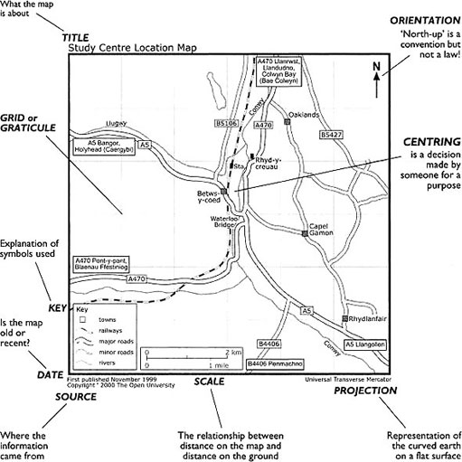
Some of the features on the diagram will be self-evident and, as noted above, you already know about viewing titles, sources, dates and authors critically, so I shall not discuss those things any further. Other conventions, like ‘projections’, may need some explanation. Our diagram does not mention the use of colour and our illustrations in this text are in black, white and shades of grey. Colour can play a major role in conveying messages on a map; for example, the use of red to show the British Empire or of black for a country to which ‘we’ are hostile. How colour or shading are used is important in reading maps because it may carry an otherwise hidden message.
In the following discussion of the conventions in Map 6, I shall follow another reading convention and work from the top-down.
Orientation
‘Orient’ is associated with the rising of the sun in the east and, in earlier times, many maps were drawn with east at the top. The convention of ‘north at the top’ is a northern hemisphere notion (compare with map 6 – click on 'view document' below) which possibly derives from the importance of the North (Pole) Star to the (North) Western maritime nations. The importance of the orientation of a map lies in the need to be able to ‘read’ directions (e.g. if north is at the top of the map, then we know that something in the lower left-hand corner is to the south-west of something in the centre). Orientation can be manipulated to make places seem more or less important, usually by putting them at the top – as with North. On a more personal level, it can be important to know the orientation of a map of a street or estate of houses in order to know at what time of day the sun will shine into the living room!
Click to view Map 7 which shows Australia at the top.
The grid or graticule
The grid is the ‘net’ of lines on a map which are used to establish a location. A rectangular grid can be used at, say, national level where the curvature of the earth's surface does not create significant distortion of distances when transferred to the flat page. The British and Irish Ordnance Surveys have their own grids which are printed on maps of England, Scotland, Wales and Ireland. They assume north to be at the top of each vertical line but, if this were really the case, they would not converge at the Poles. A graticule represents the meridians running north-south and the parallels of latitude running east-west.
Centring
What goes to the centre of a map will become the focus of attention and it can be manipulated according to the purpose of the map. On world maps produced in Western Europe, it is common to find Europe on or near the centre. This was reinforced by the international agreement which fixed the previously movable Prime Meridian (or 0 degrees of longitude) to run through Greenwich in southern England. This probably reflected Britain's political power, though it is sometimes said to be a tribute to John Harrison, the English clockmaker who invented the accurate means of establishing longitude. However, maps produced in the USA, for example, often have the Americas in the centre.
Key
Maps should have a key (sometimes called a legend) which describes and explains the symbols used to depict features on the map. We may be accustomed to the symbols used by our Ordnance Survey, but maps are made by many different people and organisations for many different purposes and it is important to check how lines, dots, icons, shadings and colour are used. Ideally, each map will carry its own key.
Scale
Scale is literally the distance on the map related to distance on the ground. For example, one centimetre on the map may represent one kilometre. Choice of scale is important because, as the area covered becomes larger, the scale is said to be smaller, and the smaller the scale the more detail is lost. For example, individual buildings become subsumed in a monocoloured patch representing a town – or even just a dot; twists and turns in rivers are represented as straight lines. A boundary measured on a small-scale map could seem to be much shorter than when measured at a larger scale because all the irregularities would be missing from the calculation. If you can find a map of part of the British or Irish coast and compare it with a small map of the whole of the British Isles, you will observe a similar phenomenon. If you hear a reference to, say, ‘300 miles of coastline’ you might pause to wonder how it was measured. Scale can be deliberately manipulated to ensure the inclusion or exclusion of certain things, with a technical excuse available to mask a deliberate ploy.
Projection
As noted above, this is about representing the globe on a flat sheet of paper. The classic image is of peeling an orange by slitting the skin down the lines of the segments and then trying to press the pieces of orange peel on to a flat surface. The result is some slight bulges and a lot of gaps! The point is that, no matter how we represent ‘the world’ on a flat surface, we lose some major property of scale or shape. Mercator's projection successfully represented direction, was quite good for shape with smaller outlines, but was bad for area and distance. Of the many attempts to improve on Mercator, one of the commonly used is the Peters projection which elongates landmasses but is better than Mercator in terms of area. You can see the world represented using the two different projections by opening Map 8 (Mercator) and Map 9 (Peters) below. Click on the 'view document' links and the maps will open in separate windows..
Click to view Map 8 (Mercator).
Clickto view Map 9 (Peters).
Because the Peters map is ‘equal area’, no place looks too big or too small, but Africa is made to look twice as long as it is wide. In fact, Africa is as wide as it is long. Compromise between the size distortion of Mercator and the shape distortion of Peters is reached by making ‘cuts’, which goes back to our notion of flattening out the orange peel. Cuts can be made in the oceans but, for this kind of projection to be used to represent the whole world, it is necessary to make a cut into the Asian continent southwards from the north coast. Clearly, this is a problem if you are interested in that part of the world! Because no projection can truly represent the globe (the world) we need to be aware of the strengths and weaknesses which the various projections have and evaluate the resulting maps accordingly. If you have an atlas to look at, you will find several different projections used in representing different parts of the world. Your atlas might also have a section which explains something about the different methods of projection. Basically, we cannot have a map of the world which is accurate for size and shape, distance and direction. We have to decide what we want to show and select a projection that best meets our purposes. These purposes may be sincere or misleading – and there is great capacity within projections to distort and mislead. However, at a more local level within, say, Britain or Ireland, we can largely ignore the problem of the curvature of the earth's surface and use a simple grid to construct a map.
Conclusion
This free course provided an introduction to studying geography. It took you through a series of exercises designed to develop your approach to study and learning at a distance and helped to improve your confidence as an independent learner.
References
Acknowledgements
The content acknowledged below is Proprietary (see terms and conditions) and is used under licence.
Grateful acknowledgement is made to the following sources for permission to reproduce material in this supplement:
Course image: CIFOR in Flickr made available under Creative Commons Attribution-NonCommercial 2.0 Licence.
Map 1 Image produced by: getmapping.com PLC, tel. 01252 845444, http://www.getmapping.com
Map 2 extract from Ordnance Survey (Six Inch Map) (1835) Permit No. MP001200
Map 4 © The Economist, London, 23–29 October 1999
Map 5 Gould, P. and White, R. (1974) Mental Maps. ‘How Londoners see the North – at least, according to the Doncaster and District Development Council’, courtesy of B. Urquhart.
Don't miss out:
If reading this text has inspired you to learn more, you may be interested in joining the millions of people who discover our free learning resources and qualifications by visiting The Open University - www.open.edu/ openlearn/ free-courses