Presenting information
Use 'Print preview' to check the number of pages and printer settings.
Print functionality varies between browsers.
Printable page generated Thursday, 25 April 2024, 6:38 PM
Presenting information
Introduction
Requires that Windows desktop be used in parallel with reading the book.
Tables and charts are a great way to present numerical information in a clear and concise form. This course explains how to use the Windows calculator to carry out basic operations and calculate percentages. You will then learn how to use charts and tables to represent and interpret information.
This OpenLearn course provides a sample of level 1 study in Computing & IT
Learning outcomes
After studying this course, you should be able to:
use the Windows calculator to carry out basic operations and calculate percentages
interpret and use information presented in tables and charts
round numbers appropriately.
1 Overview
1.1The Windows calculator
1.1.1 Operating the Windows calculator
The Windows calculator is supplied with the Windows operating system. This section provides you with basic instructions for its use, and a few practice activities. The Windows calculator also provides a help menu that you can use.
1.1.2 Launching the Windows scientific calculator
From the Start menu on your Windows desktop choose 'Programs', then 'Accessories' and then 'Calculator' (if 'Calculator' doesn't appear on the menu, click the double down arrows at the bottom).
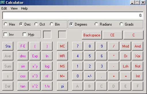
If this is the first time you have used the Windows calculator then it is possible that only the standard view of the calculator will be displayed, but you will need to use the scientific view. To display this, click on the View menu in the calculator's menu bar and select 'Scientific'. This will display the full scientific calculator shown in Figure 1.
1.1.3 Keeping the calculator running on your Windows desktop
When performing a number of calculations whilst using other programs on your computer, it's convenient to keep the calculator running in the background.
To do this click on the 'Minimise' button of the calculator's window (the leftmost button in the top right corner). When you are ready to start working with the calculator again, click the 'Calculator' button in the Windows taskbar. (The taskbar is usually at the bottom of the screen; it contains the 'Start' button.)
1.1.4 Simple arithmetic operations
To perform a simple arithmetic calculation:
-
Enter the first number in the calculation (for example '123') using one of the following methods:
-
Using your computer keyboard's numeric keypad, which (if you have one) is on the right of your computer keyboard. Check to see whether the Num Lock indicator light is on and if it is not press the NUM LOCK key.
-
Using your computer keyboard's numeric keys, which are immediately above the letters on your keyboard.
-
Clicking on the numbers on the on-screen calculator keypad.
-
-
Click / to divide, * to multiply, − to subtract or + to add, or enter these symbols from your computer keyboard. Note that you won't see the symbol on the calculator's display area.
-
Enter the next number in the calculation. For example, enter '3'.
-
Click '=' or enter the '=' symbol from your computer keyboard.
-
The answer to your calculation is displayed in the calculator's window. For the example '123 / 3 =' the answer displayed should be 41.
1.1.5 Clearing the previous calculation
To clear the previous calculation, click the 'C' button.
Provided that no operation has been performed on an entered number, an incorrect entry can be deleted one digit at a time by clicking the 'Backspace' button. (This is labelled 'Back' on some versions of the Windows calculator.)
1.1.6 Multiple operations
Sometimes you may wish to perform several operations in one step (for example: 35 / 10−3).
When you enter a number of operations one after the other, before clicking the '=key', the Windows calculator will evaluate the combination of operations in a particular order. This corresponds to the order used for any calculation that involves several arithmetic operations. Multiplication and division are evaluated first, then addition and subtraction.
In the example given above, this would result in dividing 35 by 10 (giving 3.5) and then subtracting 3 from the result, giving an answer of 0.5.
But maybe this wasn't what was intended? Maybe you had wanted to subtract 3 from 10 (giving 7) first and then divide 35 by this result, giving an answer of 5.
To force the calculator to perform certain operations before others you can place these operations in brackets. (You can use the bracket keys '(' and ')' on your computer keyboard or on the calculator.)
Activity 1 (self-assessment)
Using the Windows calculator, evaluate:
-
35 / 10 – 3 =
-
35 / (10 – 3) =
Answer
You should have obtained different answers for these two calculations:
-
0.5
-
5
If you didn't then it is probably because you were not entering the brackets correctly. Perhaps you forgot the closing bracket or the equals sign after the bracket?
For the first calculation no brackets were needed, because division is always evaluated before subtraction. For the second calculation, the brackets force the calculator to carry out the subtraction first.
Activity 2 (self-assessment)
Write down how you would use brackets to do the following calculations, then carry out the calculation using the Windows calculator. (Remember to clear the previous calculation before entering a new one.)
-
Add together 6 and 8 and multiply the result by 9.
-
Add 8 to 56 then divide the result by 8.
-
Subtract 81 from 129 and multiply the result by 16.
-
Add together 8 and 15 and divide 46 by the result.
Answer
-
(6+8)×9=126
-
(8+56) / 8=8
-
(129 – 81)×16=768
-
46 / (8+15)=2
1.1.7 Using the memory buttons
Calculations involving several operations can also be carried out in stages. One way to do this is to use the '=' key part way through the calculation. You can also use the calculator's memory.
The Windows calculator has a number of memory buttons, shown in Figure 2, to help you to perform calculations that have multiple steps.
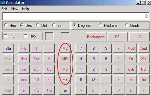
MS (memory store) stores the displayed number in memory.
MR (memory recall) recalls and displays the number stored in memory, erasing any number that was previously displayed. The number itself is still stored in memory.
M+ (memory +) adds the number displayed to the number stored in memory.
MC (memory clear) deletes the number stored in memory.
For example, let's repeat the fourth calculation in the previous activity: add together 8 and 15 and divide 46 by the result.
-
Enter '8+15 ='. The calculator will display '23'.
-
Then click the 'MS' key; this will insert the 23 into the calculator's memory.
-
Use the 'C' key to clear the calculator's display.
-
Enter '46 /' and press 'MR' to recall the 23 from memory.
-
Enter '=' to display the result.
Activity 3 (self-assessment)
Try the following calculation using the memory keys. Before you start, use the MC key to clear the calculator's memory, and the 'C' key to clear the display.
Add 63 to 39 then subtract the result from 181.
Answer
-
Enter '63+39 ='. The calculator will display '102'.
-
Then click the 'MS' key; this will insert the 102 into the calculator's memory.
-
Enter '181 −' and press 'MR' to recall the 102 from memory.
-
Enter '=' to display the result, which should be 79.
1 Overview
1 2 Forms of representing information
1 2.1 Using tables, percentages and charts
In the remainder of this course, we will look at some of the ways in which large amounts of information can be represented in a manageable form.
I will start by showing how a table can be used to summarise information. Then, I will look at how percentages can be used to compare different quantities. Finally, I will explore some of the ways in which information can be presented in a graphical form.
1 2.2 Reading a table
Tables are a common way of presenting information. We use tables to display key information, usually numbers. Tables can form a summary of information, or they may be a starting point for a discussion.
Tables can look quite formidable when a lot of information is presented all at once and finding your way around one can be difficult.
So how do you interpret a table?
The Sciences Good Study Guide (Northedge et al., 1997) advises that you should ask yourself these questions:
-
What is the table about?
The title of the table should tell you what it is about.
-
Where has the information come from?
The source of the information should be stated.
-
What do the rows and columns represent?
The labels for the rows and columns should tell you what they represent.
-
What do you want to know?
This will depend on your reasons for reading the table. You may want to look up a single piece of information, or you may be looking for overall patterns.
-
What are you expected to remember?
Tables often contain a great deal of information. You may not need to remember any of it. Usually, it's the overall trends that are important.
| Purpose of Internet use by adults, in Great Britain in April 2004, who had used it in the last three months | |
|---|---|
| Purpose of access | % |
| Finding information about goods or services | 78 |
| Searching for information about travel and accommodation | 68 |
| Using email | 85 |
| Telephoning over the Internet / video conferencing | 7 |
| General browsing | 65 |
| Finding information relating to education | 37 |
| Buying or ordering tickets / goods or services | 50 |
| Selling goods or services | 10 |
| Personal banking and financial services | 37 |
| Playing or downloading games | 13 |
| Using chat rooms | 19 |
| Playing or downloading music | 27 |
| Reading or downloading online news | 32 |
| Listening to web radio / watching web television | 16 |
| Downloading other software | 24 |
| Downloading images | 27 |
| Looking for a job / sending job application | 22 |
Activity 4 (self-assessment)
Study Table 1 above carefully and then answer the following questions.
-
Where has the information in the table come from?
-
In the rightmost column, 8 rows down, you will see the number 10. What does this represent? Write a sentence to explain what this tells us.
-
What is the highest number in the table? What does this represent?
-
What is the lowest number in the table? What does this represent?
-
What percentage of people who used the internet said they used chat rooms?
Answer
-
The source is the National Statistics Survey.
-
Of the people who had used the internet in the 3 months before the survey, 10% had done so for the purposes of selling goods or services.
-
The highest number in the table is 85%. This is the percentage of people who had used the internet in the 3 months before the survey for email.
-
The lowest number in the table is 7, which means that of the people who had used the internet in the 3 months before the survey, 7% had done so for telephoning and/or video conferencing.
-
Of the people who had used the internet in the 3 months before the survey, 19% had done so to use chat rooms.
1.2.3 Working with percentages
Table 1 used percentages, rather than actual numbers, to compare the number of people using the internet for each purpose. Numbers are expressed as if they are 'out of a hundred' when using percentages, which makes it easier to compare different values. You can recognise percentages by the % symbol which you can see at the top of the right-hand column of Table 1.
As you can see from halfway down the table, 50% of the people who had used the internet in the previous 3 months used it for buying or ordering things. (They may also have used it for other purposes.)
How many people is that? Obviously, that would depend on the total number of people. For argument's sake, we will say that 100 people in total had used the internet in the previous three months. That's relatively easy to work out: 50% of 100 is 50 out of 100, which is 50.
What if there were 200 people who had used the internet and 130 of them said that they used it for general browsing? This figure of 130 can be expressed as a percentage of 200.
Firstly, 130 is converted to a fraction of 200:
Then the fraction is multiplied by 100:
Which is:
(i.e. 13000 divided by 200)
which gives a result of 65.
If you wish, you can work this out using your Windows calculator; enter '130 / 200×100 ='.
We can now say that 65% of the 200 people who had used the internet said they used it for general browsing.
Activity 5 (self-assessment)
Try the following three percentage calculations.
-
In a survey involving 700 people, 420 people said that they use the Internet for general browsing. What percentage is this?
-
In a group of 320 students, 120 said that they mainly use a laptop in their studies rather than a desktop computer. What percentage of students use a laptop?
-
On a production line for computer monitors, 3 out of 750 monitors are faulty. What percentage of monitors are faulty?
Answer
-
420 / 700×100=60
So 60% of the people surveyed use the internet for general browsing.
-
120 / 320×100=37.5
So 37.5% of the students use a laptop.
-
3 / 750×100=0.4
So 0.4% of the monitors are faulty.
All the data in Table 1 is expressed in percentage form, but, if we know how many people were interviewed in the survey, we can work back from the percentage to find the actual number. Suppose 1700 people are interviewed in a survey and 56% of them say they have used the internet in the last 3 months. How many people does 56% represent? We can find out as follows.
First the percentage is expressed as a fraction of 100:
The fraction is then multiplied by the total number of people in the survey:
Using the Windows calculator, I enter '56 / 100×1700 ='. The result is 952. This means that 952 of the 1700 people surveyed used the internet in the last three months.
Now suppose that, according to the survey, of those 952 people who used the internet in the last three months, 85% used it for email. How many people out of the 952 used the internet for email? We can calculate the number by finding 85% of 952.
With the Windows calculator I enter '85 / 100×952 ='. The answer is 809.2 people, but common sense suggests that the answer ought to be 809.
1.2.4 Rounding
It looks as if there was an extra 0.2 of a person in the last calculation – why was this? Probably because the figure of 85% that we used was not precise. In fact 809 people, as a percentage of 952, is very slightly less than 85%.
Values are often rounded, and using these rounded numbers in calculations can give answers like 809.2 people. Here we can round the answer down to 809 people, because we know it must be a whole number and it is more likely to be 809 than 810.
When we want to give a number as a whole number, a decimal that is greater than 0.5 is rounded up, and a decimal that is less than 0.5 is rounded down. A decimal that is exactly 0.5 is usually rounded up.
We can use the 809.2 people as an example to show how this is done. Because we are rounding to a whole number, we need to look at the decimal part, which is .2. This is less than 0.5, so we round down, giving us 809 people. However, if the number of people had been 809.7, we would round up to give 810.
Rounding is not only used to make whole numbers. Often rounding is used to make long decimal numbers shorter. For example, we could round 63.87 up to 63.9.
In fact, the figure of 85% (people using email) must itself have been rounded to give a whole-number percentage. This means that it could originally have been any percentage greater than 84.5% and less than 85.5%. The precise result of expressing 809 people as a percentage of 952 is a long number beginning 84.9789, and going on for many more decimal places. It makes sense to round this percentage up to 85% in this context. (But if greater precision were required, rounding to 85% might be unacceptable.) If we use the same method of calculation as before we can work out that this 85% could represent any number of people between 804 and 813.
Activity 6 (self-assessment)
Assuming that 952 people had used the internet in the previous three months, use the percentages given in Table 1 to calculate the actual number of people who had used the internet for the following purposes:
(Round the resulting figures to the nearest whole number.)
-
General browsing
-
Selling goods and services
-
Playing or downloading games.
Answer
-
65% of people used the internet for general browsing; this is 65% of 952 people. Entering '65 / 100×952 =' into the Windows calculator gives 618.8. This figure rounds up to 619 people.
-
10% of people used the internet used for selling goods or services; this is 10% of 952 people. Entering '10 / 100×952 =' into the calculator gives 95.2. This figure is rounded down to 95.
-
13% of people used the internet for playing or downloading games; this is 13% of 952 people or '13 / 100×952', which gives 123.76. The decimal part of this number is .76, which is bigger than 0.5, so we round up to 124.
1 2.5 Reading a chart
Diagrams are a common graphical way of representing information. Processes and ideas can often be summarised more effectively in diagrammatic form than in words.
As a learner you need to be comfortable with reading graphical information. You also need to learn how to read diagrams in the sense of extracting information from them and interpreting what they mean.
A chart is a type of diagram used to summarise large amounts of numerical information in a graphical form. Charts also provide a useful way of showing relationships between different values.
You will come across different types of chart, such as line graphs, histograms, pie charts and bar charts. They are used for different purposes. In the remainder of this study session we shall focus on bar charts.
1 2.6 Bar charts
In a bar chart, information is represented by a series of bars of different heights or lengths. A bar chart has two axes, and labels on each tell us about the information being represented.
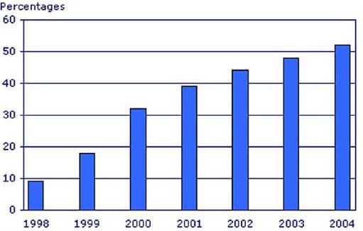
Figure 3 is a bar chart which shows how the percentages of people with home access to the internet have changed between 1998 and 2004.
Activity 7 (exploratory)
Study the bar chart in Figure 3. What do you think it shows about the growth in home access to the internet?
Answer
The first thing I noticed is that the bars are getting longer from left to right, so access to the internet increased during the period represented. However, the 'jumps' between the bars in the first few years seem to be larger than those for the later years.
My interpretation of this is that there was more rapid growth in internet access in those earlier years.
Although charts present information in a graphical form so that it can be grasped quickly, it is important to look carefully at a chart. You should look at the chart's title and the labels on the vertical and horizontal axes. Then pick one of the bars and work out what it represents.
The vertical axis of the chart in Figure 3 is labelled 'Percentages'. The values on the vertical axis go from 0 to 60 in intervals of 10 (0, 10, 20, 30 and so on); note that the fact that the vertical axis only goes up to 60 can make the percentages seem higher than they really are. The horizontal axis is labelled from 1998 through to 2004. Each bar represents data for one year from 1998 to 2004.
If I choose the bar for 1998 and look at the value on the vertical axis, I can see that it is just under 10%, so I can estimate that 9% of UK households had access to the internet at home in 1998. The bar for 2004 reaches a little over the 50% mark, so I estimate that 52% of households in the UK had access to the internet at home in 2004.
Activity 8 (exploratory)
Use the bar chart in Figure 3 to answer the following questions:
-
What percentage of households in the UK had access to the internet at home in 2001?
-
By how many percentage points did home access increase between 1998 and 2001?
-
By how many percentage points did home access increase between 2001 and 2004?
Answer
-
The bar for 2001 reaches to just under 40% on the vertical axis. I would estimate the value as 39%.
-
To find the increase, we subtract the value for 1998 (9%) from that for 2001 (39%). This gives an increase of 30 percentage points.
-
To find the increase, we subtract the value for 2001 (39%) from that for 2004 (52%). This gives 13 percentage points.
The solutions to the questions in Activity 8 confirm my initial impression (Activity 7) about the way in which home access to the internet has increased. Home access increased by more percentage points between 1998 and 2001 than between 2001 and 2004. So, although home access is still increasing, it does not seem to have been increasing as rapidly since 2001.
Conclusion
This free course provided an introduction to studying Computing & IT. It took you through a series of exercises designed to develop your approach to study and learning at a distance, and helped to improve your confidence as an independent learner.
References
Acknowledgements
Except for third party materials and otherwise stated (see terms and conditions), this content is made available under a Creative Commons Attribution-NonCommercial-ShareAlike 4.0 Licence
Cover image: Anssi Koskinen in Flickr made available under Creative Commons Attribution-NonCommercial-ShareAlike 2.0 Licence.
Grateful acknowledgement is made to the following source for permission to reproduce material within this course
Figure 3 Source: National Statistics website: Crown copyright material is reproduced with the permission of the Controller of HMSO
Don't miss out:
If reading this text has inspired you to learn more, you may be interested in joining the millions of people who discover our free learning resources and qualifications by visiting The Open University - www.open.edu/ openlearn/ free-courses