
In this article:
Click on a subtitle if you wish to jump to content:
Introduction
When we want to compare figures from two different countries, what makes for a fair basis of comparison? Does a house containing one person that produces one sack of rubbish a week produce more waste than a shared house of 4 students producing no rubbish for three weeks at a time then 15 sacks once a month? And how would they compare to a family of four producing 2 sacks a week? What is our basis of comparison? Rubbish per household, per person, per week, per month, per year?
In the video, Professor Hans Rosling demonstrates how development in terms of average income and lifespan has changed over the last two hundred years. In Europe, the industrial revolution led to increasing income, followed by increasing lifespan throughout the twentieth century. In other parts of the world, health started to improve in the second half of the twentieth century, followed more recently by a growth in income.
But given that these countries are all so very different not least in terms of population sizes or standards of living, how can we make fair comparisons between them? Rosling's approach is to use normalised or standardised figures that try to take away some elements of variation, such as the population size of a country, the period over which certain figures are reported or calculated, or the relative standard of living, in order to provide a common basis for comparison, for example, average income per person per day in purchasing parity dollars.
The GDP (Gross Domestic Product) metric that Rosling uses to compare income is normalised in two ways: against population size (the per capita, or per head of population, element) and against inflation and relative standard of living.
Test your understanding: What happens if we just look at GDP rather than GDP per capita?
If we just look at a country's overall income, a country with a large population but exactly the same income level per person as a small country will have a larger overall income. For example, if everyone in a country with a population of 1 million people earned $100 a day, the total personal income would be $100 million per day. For a country with a population of 100 million each earning $10 per day, it would be $1 billion. In which country are the individuals likely to be better off? Which generates the largest total personal income per day?
The idea of purchasing power parity dollars takes the idea of standardised income measures a step further by allowing us to compare incomes from the same country at different times, different countries at the same time, or different countries at different times. They take into account inflation and the cost of living in each country and provide a tool for comparing economies across time and geography.
One way of thinking about purchasing power parity is to consider the local prices paid for a globalised product, and then relate the local prices to a “standardised” price, such as the price in dollars. A lighthearted and informal way of understanding this is to consider the “Big Mac Index”, introduced by The Economist magazine in 1986, which is described as follows: "in the long run exchange rates should move towards the rate that would equalise the prices of an identical basket of goods and services (in this case, a burger) in any two countries". That is, we have a notional value (the price of a burger, or purchasing power parity dollar) that we assume is the same everywhere, and then use that to set an effective exchange rate between a local currency at a particular time and the notional value.
The same approach works over time: we assume the notional value of a portion of fish and chips, for example, to be fixed over time, and then consider how much people paid for it at a particular time using the currency of the time. We can then convert between a price of £X (1980 pounds) per portion of fish chips in 1980 and £Y (2015 pounds) per portion of fish and chips in 2015 using a notional (fixed over time) value portion of fish and chips to anchor the conversion rate.
The notion of purchasing power parity dollars can be quite hard to grasp at first. To learn more about it, read this BBC More or Less article: “When a dollar a day means 25 cents”.
Adjusted figures
As we have seen, sometimes we need provide some means of guaranteeing a fair basis for comparison and normalising a data set - that is, quote a value as a rate (per weekday, for example, or per head of population (that is, per capita)) or as a percentage - provides one way of doing this.
At other times, we may need to add another form of correction or adjustmentto the figures that allows us to be able to make a fair comparison against a particular basis. For example, for comparing quarterly figures across nations, such as the EU, a correction may be applied that takes into account the different number of working days (calculated as weekdays excluding holidays but not excluding strike days, perhaps) within each country to provide a standardised “quarter”. Quoting figures relative to the standardised quarter allows comparisons to be made across countries, or across different quarters within the same country.
If you do ever come across adjusted figures, you don't necessarily need to be suspicious of them, though it does help to know how they have been treated. For example, there may be very good reasons for adjusting time series data in a principled way. Suppose for instance you are looking at an indicator whose behaviour is proportional to the number of weekdays over which it is measured: the indicator counts 1 for each weekday, for example. If you are comparing monthly figures, all other things being equal, then for the first quarter of 2014 you would get monthly figures of 23, 20 and 21 even the daily rate was the same. Would we say that productivity against this indicator was greater in January, than in February or March? Possibly. Would we say thedaily productivity rate was greater in January, than in February or March? Hopefully not - because the daily rate is exactly the same.
Visualising GDP indicators
Hans Rosling suggests looking at the World Bank Indicator portal to find data on GDP per capita in PPP (purchasing power parity) dollars. Here’s the full World Bank definition of that indicator:
GDP per capita based on purchasing power parity (PPP). PPP GDP is gross domestic product converted to international dollars using purchasing power parity rates. An international dollar has the same purchasing power over GDP as the U.S. dollar has in the United States. GDP at purchaser's prices is the sum of gross value added by all resident producers in the economy plus any product taxes and minus any subsidies not included in the value of the products. It is calculated without making deductions for depreciation of fabricated assets or for depletion and degradation of natural resources. Data are in current international dollars based on the 2011 ICP round.
One thing you might notice about the web address for this dataset http://data.worldbank.org/indicator/NY.GDP.PCAP.PP.CD/ - is that it contains an identifier for the dataset: NY.GDP.PCAP.PP.CD. Many statistics publishers associate a unique identifier with each data publication so that they can be identified and referred to unambiguously. When you find a statistical product that looks like it might be useful to you, it’s always worth trying to find whether it has such an identifier; and if it does, make sure you keep a note of it - it may help you find the dataset in the future if the design of the website you originally found it on changes its design!
If you click on the Graph link for the dataset, you will be presented with a line showing the average World GDP per capita in purchasing power parity (PPP) dollars at the current rate. You can then add lines for additional countries to the chart.
See if you can plot the lines for the United Kingdom, China, and Bangladesh. Note that the vertical y-scale shows the annual GDP per capita in PPP $, rather than the more evocative daily rate that Hans used in his presentation. How do the incomes compare across the countries you selected?
Here’s the chart I managed to produce:
From the charts you should hopefully see that the the values are likely to have increased for all the countries (except, perhaps, during particular periods of time where “events” have occurred), although they are likely to vary widely in terms of value across countries from different parts of the world.
If you look at the range of dates over which the data is plotted, you may notice one of the shortcomings of the views that the World Bank Indicator Portal shows over the data: we can only inspect the data for a short period at a time. This means that we can’t easily look at how the income per person per day change across those countries over the past 20 years, for example.
We can, however, download the data as an Excel spreadsheet file or a CSV (comma separated value) text file that we could load into a spreadsheet application or statistical analysis package.
One of the problems with the World Bank GDP per capita in PPP $(NY.GDP.PCAP.PP.CD) dataset is that it only contains data going back as far as 1990. (Many of the other indicators on the site contain historical data going much further back in time.) To get the full historical data set that Hans used in his holographic data demonstration, we need to find another source of the data. In fact, Hans’ Gapminder Foundation website is one such source. If you search the Gapminder data store http://www.gapminder.org/data/ for gdp ppp you should see an indicator listed in the search results called Income per person (GDP/capita, PPP$ inflation-adjusted) (once again, this is the annualincome rather than the daily income value that Hans used in his video presentation). You can click on a link directly from the result to take you to a Gapminder motion chart visualisation of the data. We have also visualised some of the data in another motion chart shown below using the dailyincome (that is, the annual income divided by 365 days of the year).
In the next video, Hans Rosling will describe how we can use different sorts of scale to help us explore different aspects of the data. Before watching the clip, try creating your own Gapminder visualisation using a linear scale for the per day GDP/capita, PPP$ inflation-adjusted data and then again using the logarithmic (log) scale. Which view, if either, is more dramatic, and why? Which view, if either, do you consider to be more informative, and why? Which view, if either, do you consider to be most representative of income development in each country, and why?
Bendy scales
One of the things that Hans stressed in the video were the choices we have to make around what sorts of thing we put on each chart axis, as well as how we scale the axes. If you want to plot an indicator such as GDP, what sort of comparison or view do you actually want to support in the chart? If you want to show the rise in overall GDP across different countries over time, the most basic question to ask might be: in what currency? If each country has its own currency, what scale should you use? If you have multiple scales (one per currency) how do you scale them relative to each other? If a country’s currency has a revaluation in one particular year, how do you reflect that? Given the different relative cost of living in different countries, do you take that into account using something like a purchasing power parity correction? If you are interested in how much a country may have to invest per person, you may wish to scale against the size of the population. If you are measuring the productivity of the working population, you may wish to take into account the working age population. If there are periods of rampant inflation then stagnation at different times affecting prices used in calculating GDP, how do you address those? And so on.
If we step back from the detail of these different scales for a moment, you may notice that the choice of what to put on the axis may itself include different types of scaling. This is most obvious when we have an axis that clearly specifies units such as “millions of dollars”, but it also applies when we consider a scale such as “per 1000 people” or “per capita”. In some circumstances, we may need to do a calculation to map from our original data values (total GDP, for example) to a particular normalised expression of them (total GDP per capita, for example, where we divide the total GDP by the population size).
To my mind, these examples suggest two different sorts of scaling that may be applied to a particular axis: the magnitude of the unit - “millions of X”, for example; and a normalisation factor - such as per capita - that allows for a “fair” comparison of different values according to a common basis.
You may recall from the video that a third sort of scaling is also possible, and that relates to how far apart along the axis consecutive values are placed. Hans Rosling referred to this aspect of our scale selection in terms of using alinear scale, in which consecutive values are equally spaced along the number line that represents the axis; or a logarithmic scale, which he also referred to as a rubber scale. Hans suggested that one of the attractive properties of the logarithmic scale is that its stretchiness allows us to fit a wide range of values onto a single scale. Small values that are close to each other are stretched out, and much larger values are pushed closer together. So what’s actually going on in the logarithmic scale?
The special magic of the logarithmic scale is that equally spaced values along the scale are a constant ratio apart. This means that the logarithmic scale also has another interesting property that Hans did not discuss: straight lines show that data values increase at a constant proportional rate.
Let’s start to explore that idea a bit more, and pick it apart with some simple examples.
What happens if we look at the total GDP (in PPP $) over the last thirty years on a scatterplot? We'll use China as an example. First, using a linear scale.
From about the year 2000, the vertical space between consecutive yearly values seems to be increasing year on year. But what does that mean in terms of the percentage increase year on year?
If you have a house worth £100,000 pounds that goes up by 10% of its value in one year, it will now be worth:
100,000 + 10% * 100,000 = 100,000 + 10,000 = 110,000
So it’s worth £110,000 - £100,000 = £10,000 pounds more. If in the next year the price continues to rise at the rate of 10%, how much will it be worth?
110,000 + 10% * 110,000 = 100,000 + 11,000 = 121,000
The same percentage increase means a larger increase in value terms, because although we’re taking the same percentage, it’s from a larger initial amount. If your house was more of an estate and worth a cool ten million, a 10% increase would net you an extra million pounds on the price. And that’s the same percentage value that increases the £100,000 house by “just” £10,000.
This is because percentages actually define ratios: the term per cent means “per 100” and is used to scale a particular number or find a particular fraction of it. One number stands in a particular ratio to another: 5 is 10% of 50. In the same way that GDP per capita means “GDP per head”, and is calculated by taking the total GDP and dividing it by the total head of population to give the average GDP per person, so per cent means “per 100”: in other words, divide the original amount by 100. You will be familiar with the idea that 10kg means ten kilogrammes, or £5 means 5 pounds, or 100 km/h means 100 kilometres per hour. In all these cases, we define units for a particular scale (a kilogramme, for example) and then multiply them by a quantity (10, for example, in the case of 10kg). Per capita, and per cent, do the same sort of thing, although in the case of per cent we are not scaling according to a particular physical quantity (a kilogramme, or kilometre per hour), we are simply scaling in ratio terms. For example, in the case of 15%, this means counting 15 for every 100 of the original, that is, 15 per 100, or 15 per cent.
Thinking of percentages in these terms makes it clear that percentages must always be thought of in terms of a percentage of what. 10% in and of itself means nothing, it must be 10% of something or 10% x something or something x 10% to be meaningful.
What this means is that a fixed percentage - 5%, say, or 10% - can equate to different amounts depending on what it is a percentage of. 5% of 100 is 5, but 5% of 1,000,000 is 50,000. An increase from 10 to 11 is an increase of 10%, as is an increase from 50,000 to 55,000. If we were to use a linear scale to plot these values, with consecutive points on the x-axis having y-axis values going from 10 and 11, or 50,000 to 55,000, the distances between the pairs of points would be very different. But if we could somehow define the axis to show the percentage change going from one point to another, or the ratio of one value to the next, as well as their absolute values, the distance between them would be the same.
Test Your Understanding
Why might you argue that log scale is misleading? How does HR justify using the log scale?
The log scale appears to stretch out small values that would otherwise be close together and compress or close up large values that would otherwise be far apart. Hans Rosling would argue that neither scale is right or wrong in an absolute sense - the different scales make different things evident. For example, a log scale is good for showing differences in proportion. The claim Rosling makes here is that it is the proportional differences between indicator values for different countries that it is important to show, rather than the absolute numerical differences.
What is the special feature of the logarithmic scale that leads to Hans Rosling describing it as a rubber scale?
Using tick marks on the scale for values that are a constant ratio apart, rather than a strict numerical difference apart, means that as the numbers get bigger, the physical distances between the tickmarks don’t get increasingly far apart for the same ratio increase. For example, the distance between the values 1 and 10, a 10x ratio, is the same distance (one cm, say) as the distance between the values 10 and 100 or 100 and 1000 (which are similarly both 10x ratios).
Without changing the data, we can look at it using a linear rather than alogarithmic scale on the x-axis. This is worth bearing in mind - the data remains the same, it's just how we lay out the axis scales that we are changing. It also suggests that in general there may be a variety of equally valid ways in which we might plot a chart, and that the method we actually choose is does for some political or rhetorical (that is, persuasive) reason.
Using logarithmic scales to describe growth rates
When we use a linear scale to plot increases year on year, as the numbers get larger the differences between year on year changes also appear to get bigger. For example, the “distance” between 1 and 2 on a linear scale might be 1cm along the axis, and the distance between 2 and 4 would be 2cm. But in each case we have just doubled the value. On a logarithmic scale, the distance in cm along the axis between consecutively doubled values would be the same, irrespective of whether we double the actual values from 2 to 4 or 1 million to 2 million. That is, items the same distance apart on a logarithmic scale are related by the same ratio. For this reason, a logarithmic scale is sometimes also referred to as a ratio scale.
The following chart shows two sets of numbers, the first with values that keep doubling along the x and y axes (1, ,2, 4, 8, 16 and so on), the second where the values go up by a factor of 10 at each step (for example, 10, 100, 1000). The x axis is given a logarithmic scale and the y axis as a linear scale.
If you just view the 10x values, you should notice that they are equally spaced along the horizontal x-axis. The 2x values are also an equal distance from each other, although as you might expect the distance is less than for the 10x values.
If you change the vertical y-axis to a logarithmic scale, what would you expect to see? Try it and see.
Returning now to the China GDP plot, what happens if we change the scale to a logarithmic scale?
Now we see that there is a set of different straight line relationships over time, rather than a curve. The logarithmic scale is showing us that the rate of increase is holding steady, year on year. Many people are interested in rates of growth, that is, how much things increase in percentage terms year on year rather than in terms of absolute value. In such cases, you will find that they tend to use a logarithmic scale to display the data because an easy to recognise straight line shows that the growth rate is constant.
If the curve against the log scale tails off - then the growth rate has fallen. If it curves up “faster” than a straight line, the growth rate is increasing. Thegradient of the line, that is, it’s steepness, indicates the rate of growth. The steeper the line, the faster the growth rate.
Ratio scales and percentages
You may not have given much thought to what sort of a scale a percentage scale is before, but ponder this question for a moment: is it a linear scale or a ratio based one?
The percentage symbol - % - means per cent - ‘divided by some quantity corresponding to a whole and multiplied by 100’. If the whole was scaled to be a hundred, this fraction, or ratio of it, would be X%, that is, X per cent of the whole.
This means that the percentage scale actually behaves like a special sort of rubber scale. We get into the percentage space first by dividing through, or normalising, according to a value that corresponds to a whole, which is where the initial scaling trick hides. For example if you earn £20,000 and get a £2,000 pay rise that’s a pay rise of 2,000 divided by the whole (20,000) times 100 per cent: (2,000 / 20,000) x 100% = 10%. If you get a £2,000,000 pay rise on a salary of £20 million that’s (2 million / 20 million) x 100% = 10%. Plotting those two rises on a scale of £,000s places them very far apart with significant differences in the size of the gap representing the change of value arising from the pay rises. Placing them on a scale where 100% corresponds to the initial salary and 100% + the pay rise percentage shows what? That the two increases were exactly the same, according to that scale.
How ratio scales - such as percentages - scale
Percentages can go up and they can also go down; but apply the same percentage on the way up and then again on the way back down, or vice versa, and you won’t get back to where you started from.
In times of austerity, many people have been forced to take a pay cut. Suppose you earn £1000 a month and are asked to take a 20% pay cut on the basis that you will be given a 25% pay rise later. Is that a good deal? Did you remember to ask: per cent of what? 20% of £1000 means losing £200 a month to give a new income of £800. You then get a 25% pay rise - presumably not on the original salary, but on the reduced salary of £800. So how much does that equate to? £800 * 25% = £200. After the 25% pay rise you’ll get… £800 + £200 = £1000. Exactly what you started with.
As a ratio scale, rather than a linear scale, percentages also compound in a non-linear way: that is, they don’t go up smoothly when you combine them because you typically multiply them together, rather than add them together. If you have two consecutive 20% increases on the cost of an item, how much has it gone up by? If something costs £1 and it goes up 20% to £1.20, and goes up 20% on the new price to take it to £1.44 (20% of £1.20 is £0.24) the two 20% increases have given us a total increase of 44% - not 40% - on the original price.
Recalling that % means per cent or per 100, we can also write it as /100. So 5% is the same as 5/100. 5/100 can also be written as 0.05. A 5% increase means take the original amount ( 1x the original amount) and add 5%, or 0.05x the value, to it. That is, a 5% increase means multiply the original amount by itself (1x) and another 0.05x itself, to give 1+0.05 = 1.05 times the original amount.
To see how quickly the multiplicative effect can affect things, which would you rather have: interest on an end of term repayment loan held for 1 year, payable at an annual rate of 12.5% at the end of the year. Or interest levied at 1% a month for the year, payable at the end of the 12 month period. 12 lots of 1%? So that’s how much? 12%? In fact, it’s 12.68%. We multiply by 1.01 (the 1% rate) at the end of the first month, by another 1.01 at the end of the second month, by another 1.01 at the end of the third month, and so on, for all 12 months, to give an actual multiplier of 1.01 multiplied by itself 12 times, or 1.268. Take off the original 1 (the amount of the loan) and we have to pay back 26.8% of the original amount as interest.
Now consider interest compounded at 10% a month on the same terms as before, or a 150% interest payment at the end of the year. Remember the multiplier. 1.1 multiplied by itself 12 times is about 3.14. Take off our original stake and that means 2.14 times the original as interest: 214% of the original amount purely as interest. How about interest at 20% a month compounded, or 500% at the end of the year? 500%? You must be joking?! But the alternative is worse - 1.2 times itself 12 times is 8.91. Take off the original amount and that leaves an interest payment of 7.91 times the original - getting on for 800%. Don’t do it!
How do we talk about changes in percentage? Use percentage points
One final question that often occurs when discussing percentages relates to how we can talk about the difference between two percentage values in percentage terms. For example, what’s the difference between 10% and 40% in percentage terms? On the one hand, 10% represents a quarter of, or 25% of, the 40% quantity, since ( 10 / 40 ) x 100% = 25%. Conversely, there is a 300% increase in going from 10% to 40% since ((40 - 10)/10) x 100% = 30/10 x 100% = 300% (the (40 -10) part is the increase or “gone up” part of the calculation).
But 40-10 = 30, doesn’t it? So is there any way of talking about the 30 amount as that amount? Indeed there is, and that is to use the notion of percentage points. The difference between 40% and 10% is a drop of 30 percentage points, or minus 30 percentage points; conversely an increase from 10% to 40% is an increase of 30 percentage points.
This is one area where particular care needs to be taken when talking about percentages: if a number has gone down two percentage points it doesn’t mean that is has gone down by 2%. It means that some measure, expressed as a percentage, has gone down two points on that percentage scale. Percentage points therefore relate to linear scale differences between values measured along the same ratio based percentage scale.
For example, if an ethnic population rises from 1 million to 2 million in a particular country, that’s an increase of 100% or 1 million on the population count scale. If that population has gone from 10% to 15% of the overall population, that’s an increase of 50% in terms of the percentage increase, but an increase of just 5 percentage points along the percentage scale.
Summary
As well as choosing a particular chart type - a bar chart, a line chart, or a scatterplot, for example - and what values to plot on the horizontal x-axis and vertical y-axis, we also need to select what sort of scale to apply to the chart. In a bar chart, the scale is a categorical one, with equal width and equally spaced bars sorted either by ordering the bars alphabetically according to their labels, or by value. In charts with numerical axes, such as line charts or bar charts, we typically use a linear scale, where consecutive values are equally spaced. However, where values are not distributed evenly but are instead clumped together at low values and more widely spaced at large values, a "bendy" logarithmic scale on which "decades" of values (1 to 10, 10 to 100, 100 to 1000, etc.) can help make the chart easier to read. The logarithmic scale can also be used to show constant growth rates or rates of change as straight lines - doubling y values from 1 to 2, 2 to 4, 4 to 8, 8 to 16 as x increases 1 at a time can be depicted as a straight line if we use a linear scale for the x values and a logarithmic scale for the y values. In addition, the steepness of the slope of the line (that is, it's gradient) will indicates thegrowth rate.
When plotting your charts, there are therefore two reasons why you might one to explore the use of logarithmic as well as linear scales. One is purely pragmatic - to help you see the data points more clearly, or use a scale that allows them all to fit in the chart (imagine a chart with a few x values in the hundreds and one in the millions - you'd need a long scale!). Another is slightly more refined - to help you look for constant growth rates.
Articles in this collection...
-

An introduction to visualising development data
Watch now to access more details of An introduction to visualising development dataTony Hirst and Hans Rosling introduce us to visualising development data and explore bar charts, line charts and scatter graphs.
Level: 3 Advanced
-
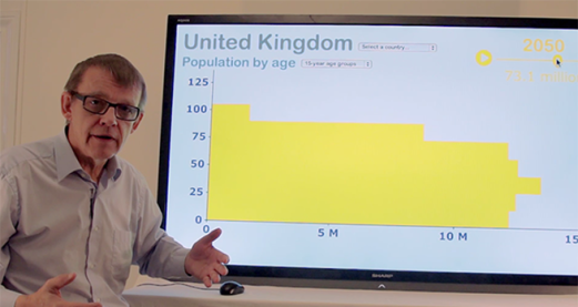
Looking at population data
Watch now to access more details of Looking at population dataTony Hirst and Hans Rosling take us on adventure through population data and what it can tell us.
Level: 3 Advanced
Explore more...
-

Visualisation: visual representations of data and information
Learn more to access more details of Visualisation: visual representations of data and informationModern society is often referred to as 'the information society' - but how can we make sense of all the information we are bombarded with? In this free course, Visualisation: visual representations of data and information, you will learn how to interpret, and in some cases create, visual representations of data and information that help us to ...
Level: 2 Intermediate
Rate and Review
Rate this video
Review this video
Log into OpenLearn to leave reviews and join in the conversation.
Video reviews