
2.3.3 Population pyramid
Both key variables of age and sex are combined in the population pyramid. A population pyramid is a graph which displays a population’s age and sex composition. The numbers or proportions of males and females in each five-year age group are represented using horizontal bars. Population pyramids of countries can differ markedly as a result of past and current patterns of birth rates, death rates and migration.
Figure 2.6(a) shows the population pyramid for Ethiopia and, for comparison, Figure 2.6(b) gives the data for Japan. The shape of the Ethiopian pyramid shows that there is a high birth rate and many more young people than old. The pyramid for Japan shows an ageing population with the majority of the people aged between about 30 and 70. There are also significant numbers of people, especially women, over 90 in Japan, indicating longer life expectancy.
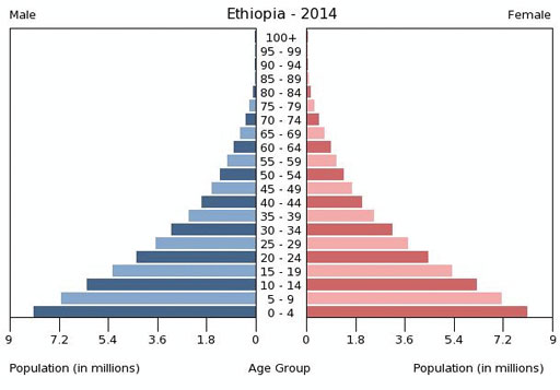
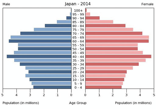
Look at Figure 2.6(a) and (b) and consider the three age groups used to calculate the age dependency ratio. How would the differences in the two pyramids affect the age dependency ratios for Ethiopia and Japan? (Hint: You do not have to calculate the ratio, just describe the differences.)
In Ethiopia there are many more people aged under 15 compared to the economically productive group, but few aged over 65. In Japan, there are more in the middle, productive, age group and a smaller proportion of children but also many more dependent older people. If this trend continues, in a few decades’ time there will be an even greater proportion of dependent elderly people in Japan compared to the economically productive middle group.
2.3.2 Sex ratio