

2.1 Introduction to data visualisation
In the following activity you’ll watch a TED Talk by infographics celebrity David McCandless, which will give you an overview of how such representations of data can be used. Please note that in the TED Talk, David McCandless uses the term ‘data visualisation’ a lot, in addition to the terms ‘infographic’ and ‘visualisation’. Infographics are closely related to, but not quite the same as, data visualisations – the latter being ‘tool[s] to interactively explore data’ (Cairo, 2014), while the former tend to be static representations of data. However, it’s worth noting that the terms ‘infographic’ and ‘data visualisation’ are often used interchangeably. You’ll read more about the distinction between the two later.
Activity 1 Strengths and weaknesses
- Watch infographics celebrity David McCandless’s TED Talk (2010), which introduces data visualisation. The video lasts 18 minutes.
- As you watch the video, make notes in the box below about the strengths and weaknesses of infographics and data visualisations.
Transcript
[CROWD LAUGHING]
[APPLAUSE]
[CROWD LAUGHING]
[CROWD LAUGHING]
[CROWD LAUGHING]
[CROWD LAUGHING]
[APPLAUSE]
[APPLAUSE]
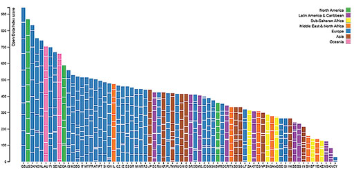
It is clear from the David McCandless TED Talk that infographics and data visualisations can be beautiful and engaging ways to present research, as demonstrated by Figure 4 (which has a marketing, rather than an educational research, focus).
In the next section you’ll investigate how the expressive power of infographics can be realised to help researchers compete for attention when disseminating research results. You’ll also study the ways in which the power of infographics can be harnessed to mislead, either intentionally or unintentionally.