

5.6 Question 5: In what way is dark and light colour used?
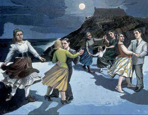
How light or dark a colour appears is termed its tone or ‘value’. A colour's value is increased, or lightened, by adding white or another lighter value colour to it. A colour's value is decreased or darkened by adding black or a darker value colour to it. In The Dance, for example, the foreground area features both dark and light blues. Technically, the lightened colours are called ‘tints’ and the darkened colours are called ‘shades’.
Colour value is one of the most powerful aspects of form that can be used by an artist to create visual contrast in a painting. It can have considerable impact on the spectator, both by suggesting particular emotions and moods and by encouraging the spectator to read a painting in a certain way. Value can also be used to help in the representation of objects from the real world, for example, when an artist is trying to represent a three-dimensional shape or to represent light in a painting.
When exploring colour value in an art work, we can ask the general question: ‘In what way is colour value used?’ This can be subdivided into several further questions of which I have chosen four.
How wide is the range of colour values featuring in the art work? In other words, what is the distribution of colour values from dark to light?
The breadth of the value range in a painting can be effective in helping to convey mood. For example, a painting comprising mostly dark colour values can make a work appear gloomy and sombre; whereas one with middle range colours can convey softness and harmony; and a painting comprising mostly light colour values can suggest optimism and cheerfulness.
Are contrasting colour values present in the art work? Or are dark and light colour values placed adjacent to each other?
Essentially, the greater the difference between light and dark colour values in a particular area, the more attention that area will attract.
Are contrasting colour values used to model three-dimensional forms?
In The Dance, for example, the contrast of light and mid colour values in the arm of the woman in yellow near the centre of the composition gives the limb a sense of roundness and solidarity.
In what way are the colour values distributed throughout the art work?
Concentrating most of the light values in one area of the composition and most of the dark values in another can be effective in emphasising one area of an art work over the rest. When light and dark values are placed adjacent and are distributed evenly throughout the art work it can give the composition a sense of ‘movement’, causing the eye to move from place to place rather than focusing on one particular area.
Look again at Paula Rego's The Dance (Plate 14). This painting features an even distribution of colour values, with dark and light colour values appearing throughout the composition. This seems to give the composition movement, leading the spectator's eye from one dancer to the next.
Plate 14
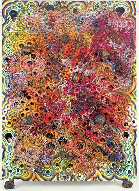
In Chris Ofili's Afrodizzia (Plate 8), while light and mid values tend to dominate much of the composition helping to convey a positive energetic feel, the dark values that are present in the tiny faces that punctuate the composition add additional interest and cause the spectator to pay extra attention to these areas of the work.
Plate 8
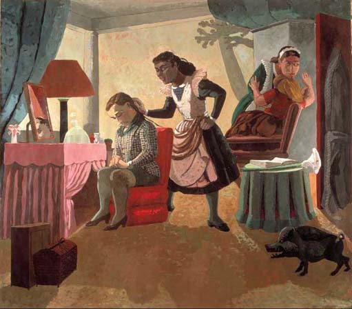
Activity 8: The use of colour value in Paula Rego's The Maids
Take a further look at The Maids (Plate 4) and add to your notes on this painting, commenting on the use of colour value in it, using the four questions above.
Plate 4
Again, when writing your response you should consider the relationship between techniques and effects in the art work in terms of:
a.the mood conveyed by the colour values in the work
b.the possible use of colour value to control the way that you read the work.
You should add your response to this activity to the notes you have already made on The Maids. Again, you could complete a copy of the table below.
| Question | Technique | Effect |
|---|---|---|
| How wide is the range of colour values featuring in the art work? | ||
| Are contrasting colour values present in the art work? | ||
| Are contrasting colour values used to model three-dimensional forms? | ||
| In what way are the colour values distributed throughout the art work? |
Discussion
The use of contrasting colour values makes me feel slightly uneasy about the painting, while also controlling my reading of it by drawing my eyes to the lighter areas. Again, you might have decided that colour value worked in a very different way and, as ever, there's no right answer, but your response here should, as always, be based on a careful reading of the painting.
This section on colour was quite demanding in that it contained a number of new technical terms. I hope that you've enjoyed finding out a little more about some of the art works that you've already encountered while learning about new terms. Next, you'll consolidate your work on the use of colour by comparing the relationship between techniques and effects in Chris Ofili's No Woman No Cry and Gilbert and George's Life.