
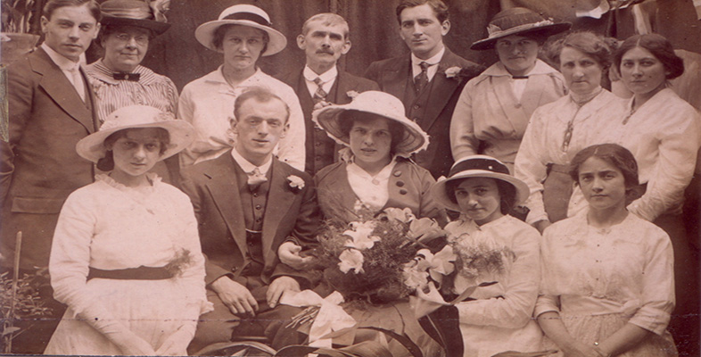
4.11 Colouring
The photographic print could also be ‘improved’ by the application of colour on the surface of the finished print. In the 1840s painters of miniature portraits, who faced redundancy after the introduction of photography, sometimes found employment hand-colouring daguerreotypes. The colouring of portraits commanded an additional charge and suggests that pictures chosen for colouring held a special significance for their owners. In the average high-street studio, the colourist never normally saw the original. Simple written instructions accompanied the print: eyes, blue; hair, brown; dress, green. The colour artist did whatever was necessary.
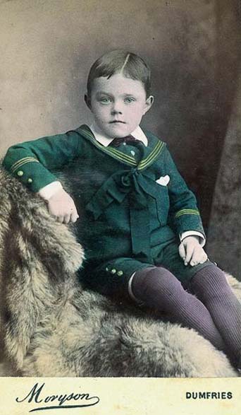
This is probably a good place to note that the tonal translation of colour in 19th-century photography was incorrect. Blues and violets usually translated too light, so skies were a constant problem. Yellows and reds, however, translated too dark. A blue-eyed blond with freckles could present real problems! So it's never a good idea to infer colours from early black and white photographs. Orthochromatic negatives were introduced towards the end of the 19th century.