

1 Are climate models wrong?
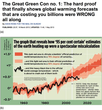
In March 2013, the Mail on Sunday reported that climate model predictions of GMST are ‘a spectacular miscalculation’ (Figure 2).
Emotive accusations
The Mail on Sunday article was published six months before the IPCC (2013) report and claims that climate model predictions of GMST are ‘a spectacular miscalculation’ because the observed GMST is ‘about to crash out of’ their range.
Given this media environment and the use of emotive language, how can the public assess the quality of media reporting about new climate studies?
Finding reliable information online is too large a topic to cover here. But if you want to hear directly from climate scientists, you could try climatefeedback.org [Tip: hold Ctrl and click a link to open it in a new tab. (Hide tip)] , a network of climate scientists that comment directly on news articles about their accuracy. Other useful and reliably accurate sources are the climate scientist list on Twitter https://twitter.com/ flimsin/ lists/ climatescientists Carbon Brief.
So were the climate models ‘wrong’, as the Mail on Sunday headline said? Important questions to consider are:
- Was it a fair comparison?
- How does the comparison look now?
- Once the comparison is fair and up-to-date, how much can you learn from it?
Fair comparison
The graph in the Mail on Sunday report says the dark and light red envelopes are the 75% and 95% ranges. In fact, this is an error: they are the 50% and 90% ranges. In other words, the key implies a worse match than it is, so the description of the comparison is not fair.
Full comparison
The observations do show a 15-to 20-year slowdown in the rate of global warming from around 1998 (a record high year, due to a large El Niño) to around 2014. This was often called the ‘pause’ or ‘hiatus’.
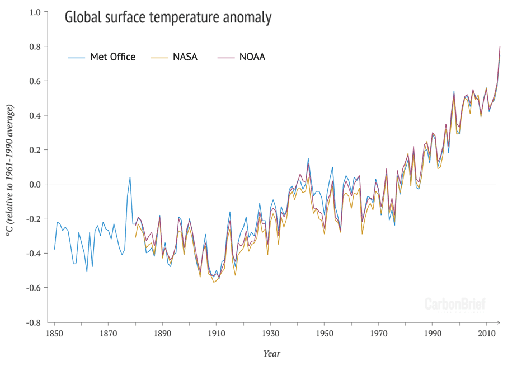
Several years have now passed since. On 20 January 2016, the world’s media announced the 2015 mean temperature: the record-breaking year had a dramatic effect on the dataset (Figure 3).
-
Does a comparison of GMST from 1997 to 2016 (Figure 3) provide enough information to judge whether the model predictions were ‘wrong’ (as the Mail on Sunday put it) about global warming?
-
Not with great confidence. The period is twenty years, far short of the usual 30-year definition of climate (Session 1). This means it is not a fair test, because climate predictions are only intended to be correct over the longer-term.
However, the longer-term climate model prediction does indeed appear to be successful. Of course, even this is not enough information to judge whether the model predictions were ‘wrong’: GMST is just one aspect of climate change. To test the reliability of climate models, we should – and do – compare with observations of all parts of the Earth system.