
2.2 Building the HR diagram
From looking at stars in the cluster M29 and in the constellation Orion, we have learned that stars have different colours related to their temperatures, and that the brightness of each star is also related to the colour and temperature.
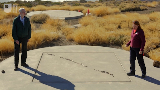
We are now in a position to put all this together. In science, one way of seeing how properties are related is to look for patterns by plotting one quantity against another on a chart or diagram. In this video, Jo and Alan explore the diagram that results from comparing the temperatures and luminosities of a large number of stars.
Transcript
This plot of the surface temperature of a star against its luminosity is called a Hertzsprung-Russell diagram after the astronomers Ejnar Hertzsprung and Henry Norris Russell who first plotted it in the early 1900s. This diagram makes it easy to see the patterns and correlations between the two parameters. In particular, most stars lie on the Main Sequence – a band running from the top left to the bottom right of the diagram. Within this main sequence, which represents the stable part of a star’s lifetime, the hotter a star is the more luminous it is (and hence the cooler a star is the less luminous it is). Temperatures on this diagram are measured in Kelvins (K). On the Kelvin scale, the freezing point of water is 273 K and the boiling point 373 K. To convert from Kelvins to degrees Celsius, subtract 273.
This diagram can also be used to answer the question – posed towards the end of last week – of how the Sun compares to other stars. As explained in the video the Sun is entirely average – with a modest luminosity and a yellowish-white colour, the Sun is not among the hottest, most luminous stars and it is not among the faintest and coolest stars either. Jo placed the Sun directly on the main sequence, slightly to the right of centre, indicating that it is indeed a fairly small and average star.
As you shall see later this week when thinking about stellar lifetimes, the fact that the Sun is such a relatively modest star is actually a very good thing for life on Earth.
While the main sequence represents the stable main part of a star’s lifetime, there are other groupings on the diagram representing different phases of a star’s evolution. In particular, many stars expand and cool to form red giants as their nuclear fuel runs out towards the end of their lifetimes, and in the process can become unstable and variable. Stars similar to our own Sun will eventually collapse to become white dwarfs – very hot but very compact bodies, seen at the bottom left of the diagram.