

1.4 Two investigative tools
Some objectives will necessarily be concerned with improving an existing situation, procedure, process or product in order to address a weakness; in other words, they will be concerned with reducing or eliminating problems. In order to do so effectively, the problem has to be investigated thoroughly to determine whether or not the problem is serious and whether it is worth tackling. There are two commonly used tools for this purpose, Pareto analysis and cause and effect diagrams.
Pareto analysis
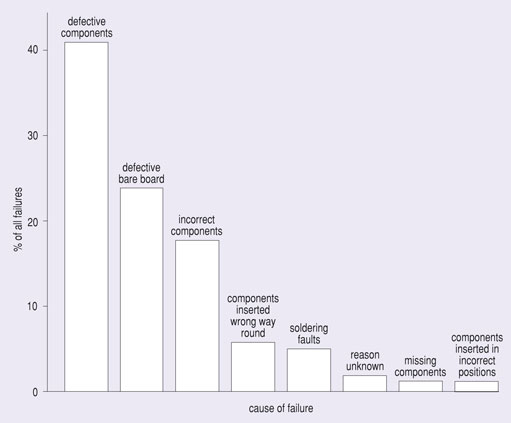
An Italian economist, Vilfredo Pareto, is credited with the development of this technique, which relies on an almost universal truism concerning the relationship between value and quantity. There are countless everyday examples: in a warehouse 20% of items will usually represent 80% of total stock value; 80% of quality problems will be accounted for by 20% of the possible causes of failure. The ratio of 20:80 occurs so often that many people think of this ratio as Pareto’s law.
For example, in a computer system there will be frequent but minor failures in disk accesses: these failures are normally overcome simply by retrying the access. Far more rarely, a disk’s read head will touch the delicate magnetic surface, and then the disk is effectively destroyed and access is impossible under any circumstances. The former occurs frequently but with little impact, the latter rarely but with great impact. Pareto analysis consists of drawing columns that represent the magnitude of a problem, or of each aspect of a large problem. These columns are then arranged in order of magnitude, starting with the largest. (The column height represents the value of correcting the problem, so columns of the same size may refer to small but frequently occurring difficulties or to major difficulties that occur less often.)
SAQ 3
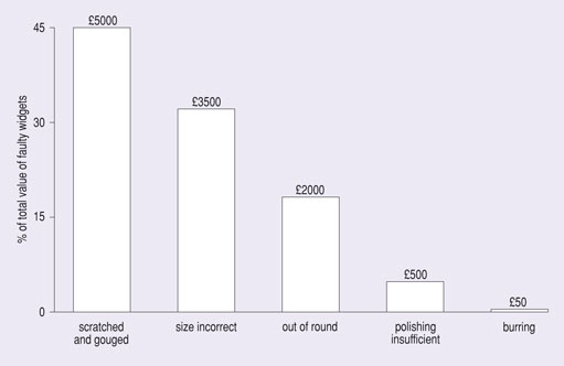
Assume that following an examination of the production records for widgets you find the following: of a weekly production of 100 000 widgets worth £10 each, quality control staff remove 5 due to unacceptable burring remaining on the metal, 200 because they are unbalanced (out of round) and 50 to be repolished as the polishing is not good enough. Customers in the same week returned a shipment of 500 because they arrived scratched and gouged and so were unusable, and a shipment of 350 because the size despatched was not the size ordered. (Both returned shipments incurred additional shipping charges, but for this question you should focus only on the values of the shipments.) Either draw columns or use the figures given here to undertake a Pareto analysis.
- (a) Place these categories of faulty widgets in order from most to least value.
- (b) Where does the analysis suggest you could achieve the greatest improvement in quality?
Answer
(a) In Figure S.1 we have drawn columns showing the cost of each category of fault and the percentage of total production that this represents, but this problem is simple enough for you to be able to manipulate the figures directly. The order is:
- 500 scratched and gouged
- 350 incorrect size despatched
- 200 out of round
- 50 substandard polishing
- 5 burring.
(b) The analysis suggests that the greatest value improvement can be obtained by addressing the scratching and gouging problem, and then by correcting problems in the despatch of orders.
In reality the Pareto analysis may produce different results as other factors are certain to have an effect. Rectifying the problem of the incorrect size of widget will probably entail only the cost of taking the 350 wrong ones back into stock and despatching the right ones. The 200 widgets that were out of round will have to be scrapped and replaced by new ones at twice the cost of the faulty 200.
Having identified which problems might merit further investigation, the next stage is to study the symptoms of the problems, develop theories of the causes of those symptoms and then carry out further analysis and experimentation to establish true causes. A technique which is likely to be useful here is cause and effect diagramming.
Cause and effect diagrams
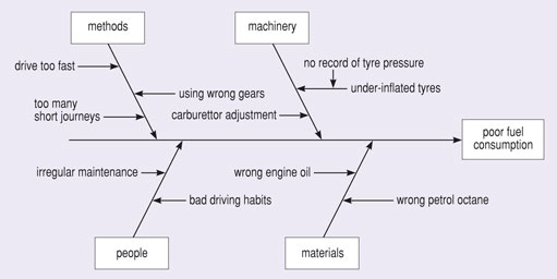
Cause and effect diagrams are often known as Ishikawa or fishbone diagrams. Their origin lies in the investigation of sources of variation in production processes. The resulting diagram is a way of identifying, sorting and then displaying the possible causes of a specific problem or quality characteristic. So, you will be able to illustrate the relationship between a specific outcome and all the factors that influence it. The diagram can then be used to identify areas where data should be collected for further study.
The first step involves the definition of an occurrence (an effect). The next step is to identify those factors which contribute to it (the causes) and then examine them in order to determine the root causes of the effect, because they are the ones that must be tackled. In practice, this is achieved by establishing the categories under which the causes will be listed. There are four commonly used categories:
- methods, machinery, materials and people, or
- policies, procedures, people and plant.
Sometimes a fifth category, environment, is needed. An example is shown in Figure 3. Note that major causes are connected directly to the main arrow, sub-causes (such as under-inflated tyres in the figure) are connected to these lines, and sub-sub-causes (such as no record of tyre pressure) are connected to these. This establishes a chain of major and minor causes within each of the categories.
Activity 3
While you do not have enough information to draw a complete cause and effect diagram for the fuel consumption problem, you should be able to formulate questions that will reveal more detail so that you can identify a cause that you can take more action on. Give an example related to the contributing causes of irregular maintenance.
Discussion
When we think about cause and effect, it is common to consider the reasons for things. So, we want to explore the reasoning that leads to evaluations at increasing levels of detail. The simplest way to do this is to ask a series of questions such as: why was maintenance so irregular?
One response might be that the driver was not aware of the frequency with which the car had to be serviced. Another driver might know when to have the maintenance done, but not always have the money to pay for the work.
As the analysis proceeds, it should help you identify those causes that warrant further investigation. The overall balance of the diagram can be informative. For example, areas where the diagram is getting busy in terms of the number of items and level of detail may indicate a need for further investigation. Those causes that seem to be repeated in more than one branch may be the root causes that you should be acting upon. Assess each cause for what might be measured so that it is possible to quantify the effects of the changes made within a project.
Having determined the source of a problem and the value that would accrue to the organisation if it could be eliminated or at least greatly reduced, the resulting objective should become clear, and possibly so should some strategies to achieve the objective.