
2.7 Housing affordability in the UK
With the focus now on the UK, now you will explore a range of measures of housing affordability to see if UK house prices are ‘too high’.
Figures 7−9 show three different measures of affordability for two different types of buyer: first-time buyers who are more likely to be from younger generations; and existing homeowners who will typically be older. The three measures are:
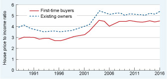
- House price-to-income ratio (Figure 7). Unlike Figure 6, this is the actual ratio itself not an index relative to the long-run average. The ratio shows by how many times house prices are higher than the annual gross income of buyers. For example in 2016, on average first-time buyers homes cost 4.5 times the amount of their annual income.
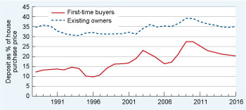
- Deposit as a percentage of the house purchase price (Figure 8). For example, in 2016, existing owners on average put down a deposit equal to 35% of the purchase price of the property. (The remaining 65% was provided by a mortgage loan.)
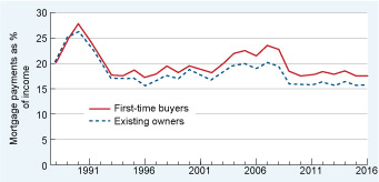
- Proportion of household income spent on mortgage repayments (Figure 9). For example, in 2016, first-time buyers spent 17.5% of their gross income on mortgage payments. A common ‘heuristic’ (meaning a rule-of-thumb or mental short-cut) is that households should spend no more than 30% of their disposable income on total housing costs (mortgage or rent, regular property taxes and home insurance) but of course individual households may have to, or choose to, spend more.
When looking at Figures 7−9, it’s important to bear in mind that you are looking at data only for people who have bought homes. Trends in the data are useful as an indicator of how affordability has changed over time. However, they do not tell you anything about the number of households who may have wanted to buy a home but have been squeezed out of the market by rising house prices.
Activity 5 Comparing affordability measures over time
Based on Figures 7 to 9, write two paragraphs:
- a.the first comparing the three measures of housing affordability in the UK for first-time buyers and existing owners over the period 1988 to 2016.
- b.the second giving your conclusion, based on the evidence in the charts, on whether UK house prices are ‘too high’.
Discussion
There are many different paragraphs you could write, but here is an example of the points you are likely to have included:
- a.There was a marked upward shift in the house price-to-income ratio from 2004 onwards, affecting both first-time buyers and existing owners, suggesting that UK homes became less affordable. Deposits as a percentage of purchase price have not changed greatly over the period for existing owners, but have generally increased for first-time buyers reaching a high of about 28% in 2009 before falling back to 20% in 2016. By contrast, mortgage payments as a percentage of income, while higher for first-time buyers than existing owners, have fallen for both groups over the period.
- b.The evidence from Figures 7 to 9 suggests that house prices have increased relative to income over the last decade or so and that first-time buyers are having to find larger deposits than in the past before they can get on the housing ladder. However, once they have made the purchase, the cost of their monthly mortgage payments is more affordable than in the past.
It’s important to bear in mind that the data describe the average experience of first-time buyers and existing homeowners. For example, they tell you nothing about regional variations. However, using these national averages, you might be wondering how mortgages can be more affordable even though house prices have risen. It’s this topic you will turn to next.