

2.3 Reading graphs
Another important form of communication in STM subjects is graphs. You will now look at how graphs are used in STM subjects through the example of population growth, which is a topic you will be returning to next week.
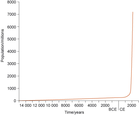
A graph is a way of showing how one set of data varies with another set of data, and it can be used to see whether the data is likely to be related to each other. For example, a graph is useful for seeing how something changes over time. Figure 5 shows the growth in the population of human beings over time. The graph has two axes: y and x. The y-axis runs vertically and typically shows the number of what is being measured. In this case, the y axis shows the population in millions of people. The x-axis runs horizontally and here has symbols representing different time periods or names of things being compared. Here the axis shows time in years.
‘BCE’ stands for ‘Before Common Era’ and CE for ‘Common Era’, and they sometimes replace ‘BC’ and ‘AD’.
Activity 5 Reading graphs
Look at Figure 5. Write a few words to describe how the population of human beings has increased over the time period shown in the graph.
Comment
Human population growth increased very slowly from 14 000 BCE until nearly 2000 CE when it rose very steeply.
If you would like to learn more about graphs and communicating information with numbers, you might want to study another free badged open course Succeed with maths – Part 2 [Tip: hold Ctrl and click a link to open it in a new tab. (Hide tip)] .