Week 3: Devising investment strategies – principles and practice
Use 'Print preview' to check the number of pages and printer settings.
Print functionality varies between browsers.
Printable page generated Thursday, 9 July 2026, 6:14 AM
Week 3: Devising investment strategies – principles and practice
Introduction
Welcome to Week 3 of Managing my investments – a week that explores the theories behind good investment management practices. Begin by watching the video to hear Martin Upton introduce this topic.

Transcript
This week, you’ll start by building on the work on investment management planning that you started in the later stages of Week 1. Armed with the knowledge gained in Week 2 about the range of personal investments available, you are now in a position to build and refine your approach to investment management.
To help understand the key principles of investment management, you will explore key underlying concepts like portfolio theory, the efficient markets hypothesis and the capital assets pricing model. You’ll look at how these theories are applied in the real world of investment management and what they tell us about how we should manage our investments and the decisions we should make.
You will also discuss tactics that we can use to manage our portfolios – like pound cost averaging.
There’s plenty to get through – but once you’ve completed the week you will have a robust understanding of the key theories about investment management and how to apply them in practice.
3.1 Time horizons and goals

Last week you spent time familiarising yourself with the assets you can invest in and the investment products (including funds) you can use to build up your portfolio.
Now you need to turn your knowledge of what you can invest in, to what you want to invest in. To do this requires a plan to be devised and more information to be gathered about the alternative strategies you may want to employ, including the mixture of assets you aim to hold in your portfolio. Devising strategies for the timing of investment activity – whether you’re buying or selling – is also important.
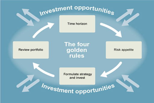
The first stage is to re-visit the core building blocks of investment management introduced in Week 1. This involves asking the questions of what you are investing for and over what time horizon? This analysis provides information about how much you need to accumulate and by when.
One item which all of us should be investing for is a pension. So, a key part of the exercise is to determine what retirement income, other than that provided by the state, you need.
The next stage is to work out when you want to retire, since this will set the time horizon for the compilation of the fund required to provide the income in retirement needed to support your desired lifestyle. Help in doing this analysis is provided by the pension planning tools provided by Age UK.
Why not access this now and work out how much you need to save to meet your pension objectives?
Once you have completed this ‘what’ and ‘when’ exercise for your pension planning then apply it to all the other things you invest money for – perhaps education costs, a new car or a wedding. In stages, you are building up a picture of how big an investment fund you need and the time horizons by which you need the funds to achieve defined volumes.
You also need to consider your risk appetite. This is crucial as, given the trade-off between risk and return, the greater risks you take the more quickly your fund might accumulate. Yet the higher risks associated with the (potentially) higher returns mean that such investments are not suited to building funds over the short-term: an adverse movement in the value of such investments during this period could leave you well short of the size of the fund you need. Rather higher-risk investments are more suited to a long-term investment horizon, over which adverse short-term moves in the value of such assets tend to be more than compensated for by the long-term trend to outperform safer investments.
Even with this maxim in mind, you do need to reflect on how comfortable you are with higher-risk investments. Ask yourself:
- are you sure that if you invest in higher risk investments, you won’t need to cash them in over the short-term?
- have you the capacity to bear financial losses if you do have to cash them in earlier than anticipated?
- is holding investments which may fall in value – sometimes sharply and perhaps only in the short-term – going to upset your life (for example, by keeping you awake at night)?
- finally, and critically, are you sufficiently knowledgeable about all the risks your investments are exposed too? Have you checked your investments off against the full range of risks that could apply to them?
Answering this last question requires you to know what this full range of risks is and see which apply to the assets you could invest in. So in the next section, you’ll look at the risk spectrum to make sure you know what to check for when investing.
3.1.1 Knowing the risks
You now turn to investment risks. Let’s start by hearing Anthony Nutt’s views on investment planning and managing the risks involved. Investment risk is the likelihood that the actual return from an investment will not turn out as expected. There are two dimensions to risk: amount and timing.

Transcript
In summary, risk is the chance that the actual return from an investment will:
- be more or less than expected. This is known as capital risk and, if part or all of the return is in the form of income, income risk.
- not be available when expected. This is an aspect of liquidity risk.
Capital risk, income risk and liquidity risk can therefore be viewed as the key ‘high-level’ risks affecting investments.
Note the assumption that risk is symmetrical: the probability of a gain is equal to the probability of a loss. Although investors typically want to avoid the downside risks of a lower return, they do want exposure to the chance (risk) of a higher return. You will follow the normal convention of describing different types of risk in terms of the bad outcomes that may result, but you should bear in mind that the risk–return trade-off means that the reward for running the risk of bad outcomes is the chance of superior returns.
Table 3.1 presents a summary of the ‘high-level’ and the ‘underlying’ investment risks that sit underneath these key risks.
| High-level investment risks | |
|---|---|
| Capital risk | The risk of loss of some or all of the original capital invested and returns made to date |
| Income risk | The risk that the income earned from an investment is lower than expected by the investor when the investment was made |
| Currency risk | Where an investment is denominated in a foreign currency, unexpected changes in the exchange rate may cause the sterling (or other home currency) value of the holding to be less than expected. Similarly, this can be a risk when a person borrows in one currency to purchase an investment or other asset in another currency (for example, borrowing in euros to buy a home in the UK). |
| Liquidity risk | The risk of being unable to sell or cash in an investment or being only able to cash it in at a prohibitively low price |
| Underlying investment risks | |
| Counterparty risk | The risk that an entity responsible for payments to an investor fails to meet its contractual obligations – for example by failing to pay interest when it is due |
| Default risk | The risk that the entity invested in becomes insolvent and fails to return the sum invested |
| Inflation risk | The risk that the return from an investment is reduced in real terms due to an unexpected rise in prices |
| Interest-rate risk | The risk of making an investment choice on a view of future interest rate movements that turns out to be incorrect |
| Shortfall risk | The risk that a pre-defined target return from an investment fails to be met |
These risks are, of course, interrelated. Can you identify some of these interrelationships?
3.1.2 Risk interrelationships

Arguably liquidity risk, counterparty risk, currency risk, default risk, inflation risk, interest-rate risk and shortfall risk are all examples of risks that underlie the capital risk and income risk.
Each of the underlying risks, if they materialise, can reduce the capital value of an investment, perhaps with extreme consequences in respect of default risk, and/or reduce the real value of the income stream from the investment.
Note that risks can be managed. The presence of risk is not an excuse for not investing in the future, as you then expose yourself to the biggest risk: that you have insufficient funds for later life.
Having examined your investment objectives and their time horizons; and ascertained the risks to which your investments are exposed, you now turn to the management strategies you can apply when investing.
3.1.3 Do we really understand our appetite for risk?
To complete your analysis of understanding risks, watch this video of Sharon Collard’s presentation on the extent to which personal investors really understand the subject when making investment decisions. The worrying evidence about a lack of true perception about risk supports the need for improved consumer education on the subject.

Transcript
Clearly, getting a sound understanding of risk and our true appetite for it is vital to ensure we have control of the second stage of the investment planning model. Only then can we move to third stage of investment decision-making.
3.2 Diversifying investments dilutes risk
In this and the next few sections, you will explore how the trade-off between risk and return can be improved by holding a mixture of shares or other investments in a portfolio. This can be viewed as part of the third stage of the investment planning model – the process of deciding on investment strategies that fit with our time horizons and risk appetites. Let’s look first at the subject of diversification.
The analysis you need to undertake here and in the next two sections is a little complex, so there will be animations to guide you.
Transcript
3.2.1 Understanding portfolio theory
The last section sets out the benefit of diversification when investing. You’ll now take this analysis further forward, by looking at how a portfolio can be constructed. This is called portfolio theory.
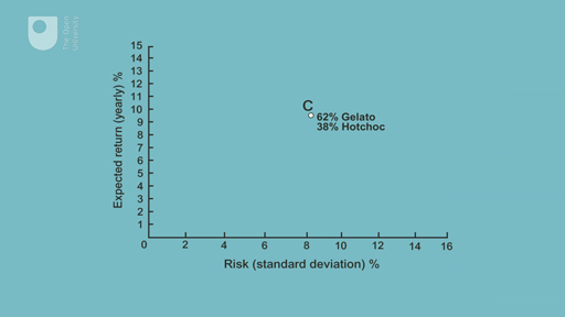
The animation introduces a key statistical concept which is important in investment management: ‘standard deviation’. This is a measure of the dispersion, or spread, of data around an average or mean number. The greater the standard deviation, the more varied or dispersed are the data around the average. The risk/return positions C & D shown at the end of this section’s animation will be explored further in the next section.

Transcript
Standard deviation can be calculated by following the steps below:
- Obtain the average (or mean) of all the (daily) share prices over the period in question. To do this, add up all the daily recordings of the share price and divide by the number of those daily recordings.
- For each share price, work out its difference from this mean and then square this difference. So if the difference is 4 pence, the square would be 16 and so on.
- Once you have done the second step for all the share prices, add up all these ‘squares’.
- Divide the total you get in the third step by the total number of share prices. So if the total of the ‘squares’ is 10000 and the number of share price recordings is 100, you end up with 10000/100 = 100.
- Find the square root of the outcome from the fourth step. So if the outcome from the fourth step is 100, then the square root of this is 10 pence. This is the Standard deviation and it can either be expressed as an absolute number (i.e. 10 pence) or as a % of the mean share price.
The statistical meaning of a (that is, one) standard deviation is that it captures 68% of the individual recorded prices. So if the standard deviation in the example above is 10 pence, then 68% of the share prices are within 10 pence of the average (or mean) share price (either higher or lower).
Thsi information can also be downloaded in the supporting document How to calculate standard deviation and what does it mean?
3.2.2 Applying portfolio theory
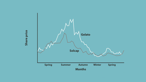
In the previous section, you looked at the risk–return trade-off between Gelato and Hotchoc. However, by combining the two shares in a portfolio, it is possible for the investor to reach a better outcome. Watch this short animation about portfolio theory.
Transcript
The conclusion of the animation is that by reaching the so-called ‘efficient frontier’, the investor is unable to improve their risk-return trade-off. The portfolios on the efficient frontier are said to be Markowitz efficient, named after Harry Markowitz (1959), who was the first person to work out the implications for the mathematics of combining shares into portfolios. By following a strategy to reach the efficient frontier, investors are said to employ Markowitz diversification.
This section concludes the analysis of portfolio theory and the rationale of investment diversification.
Further supporting information the topics below is provided in the document Understanding risk versus return in portfolio theory.
3.2.3 The relevance of the size of the portfolio
The previous section looked at diversification of a portfolio through investing in three shares. In practice, many more than three shares could be chosen: let’s call the number n. What should n be? The investor should diversify to improve the balance between risk and return, but to what extent?
Suppose that we adopt a simple investment strategy to find out. We invest equal amounts in randomly chosen portfolios that consist of two, three, four, five and more shares. This type of diversification is less efficient than choosing portfolios on the efficient frontier. Indeed, it is an example of naïve diversification: simply choosing to expand the number of shares in the portfolio without examining their risk–return characteristics. The portfolio will not necessarily be Markowitz efficient (see the previous section), but there are still benefits to naïve diversification.
The benefits of naïve diversification can be seen in Figure 4, which plots the typical risk for holding portfolios of one, two, ten, or even up to hundreds of shares, in equal proportions. For example, portfolios consisting of, say, ten shares have less risk than portfolios consisting of one share. Portfolios consisting of thirty shares have less risk than portfolios consisting of ten shares but, beyond that, the benefits to diversification taper off. Why is that? This is because there are common factors affecting all shares that cannot be diversified away: interest rates, economic conditions, tax rates, inflation and so on. Indeed, the benefits of diversification come from diversifying away what is known as specific risk (risk specific to individual companies). A limit is then reached beyond which risk cannot be reduced further. This undiversifiable risk is called systematic risk – risk that is endemic to the stock market and cannot be diversified away, no matter how many shares are included in a portfolio.
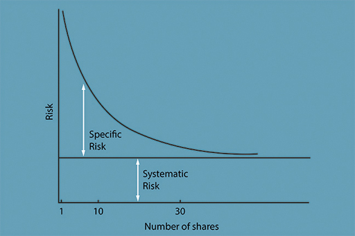
The figure has two major implications for investors. First, small investors need only diversify by holding 10 to 15 shares to have substantially reduced the risk from holding just one share. Second, institutional investors do not need to hold vast numbers of shares to be diversified. The extra reduction in risk gained by holding 100 rather than 30 different shares is very small, and may well be more than outweighed by the additional transaction and monitoring costs involved in holding the extra 70 shares.
3.2.4 Share diversification in practice

Investment trusts and unit trusts were designed to allow small investors the benefits of diversification, when the amounts that they had to invest did not allow them to buy, for example, ten different shares in reasonable quantities.
The earliest British investment trust, the Foreign & Colonial Government Trust (F&C), was founded in 1868 with the declared investment strategy of buying 18 foreign government bonds, from Brazil to Turkey, Egypt to New South Wales, in amounts ranging from 3% to 20% of the value of the overall portfolio. The prospectus read:
The object of this Trust is to give the investor of moderate means the same advantages as the large Capitalists, in diminishing the risk of investing in Foreign and Colonial Government Stocks, by spreading the investment over a number of different Stocks.
It was such a success that it soon had many imitators, primarily investing in fixed-interest securities. Unit trusts, first launched in the UK in the early 1930s, based on a US idea, concentrated on shares rather than bonds, and overtook investment trusts in popularity during the 1960s.
Investment trusts are companies whose shares are traded on the stock market and can be bought and sold by investors. Investment trusts invest in shares whose total market value is called the net asset value of the trust. Interestingly, the market value of an investment trust company’s shares does not have to be the same as the net asset value of the underlying portfolio. The investment trust share price can be at a discount or premium to the net asset value per share.
Consider, for example, an investment trust with a market value of £100 million divided into 10 million shares priced at £10 each. It may, in fact, hold a portfolio worth £120 million, which represents £12 per share. In this case the shares would be trading at a discount of £2 to the net asset value of £12. The size of the discount or premium is what balances demand with supply. Although popular investment trusts may trade at a premium, typically investment trusts trade at a discount. This discount can vary, adding an additional risk to investment. Investment trusts, being companies, can also borrow, which also adds to investment risk.
Unit trusts are structures that hold shares in trust for the beneficiaries, the unit trust holders. Open-ended investment companies (OEICs – pronounced ‘oiks’) are similar but use a corporate rather than trust structure. The value of the underlying investment portfolio of a unit fund is also called the net asset value; but in this case the market price at which the units are bought or sold is the same as the net asset value (with a spread between the bid and the ask price). There is no discount or premium. The balance of supply and demand determines the number of units, so that popular unit trusts grow in size, and unpopular ones shrink. This is why unit trusts are sometimes called ‘open-ended’. In contrast, investment trusts are called ‘closed-end’ because they cannot create additional shares as can unit trusts – unless they make a new share issue in the stock market. Demand for investment trusts is reflected in the premium or discount to net asset value, whereas demand for unit trusts is reflected in the number of units. Unit trust managers have to keep a certain amount of the portfolio in very liquid assets to allow for possible redemptions. Unit trusts do not borrow money.
Life insurance company investment funds are run along the lines of unit trusts and are funds in which investors invest through the wrapper of a life insurance company policy.
Looking at the correlation between returns shows that there are different levels of portfolio diversification. The first is to spread the portfolio across a number of shares, say UK shares listed on the London Stock Exchange, typically spread across a number of different sectors. The next stage is to widen the portfolio to include overseas investments. The idea is that the US stock market is less correlated with the UK stock market than, for example, BP and Vodafone are in the UK. The final stage is to include emerging stock markets, which are even less likely to be highly correlated, for example, the Chinese and Indian stock markets can be argued to have ‘decoupled’ or disconnected from developed economy markets. In building portfolios of shares, fund managers work through these levels of portfolio diversification on behalf of their investors.
As of November 2014, F&C stated that it held shares in more than 500 companies across the globe. It also stated that it invested in another asset class, private equity funds – that is, funds that buy whole companies rather than just shares. International diversification will reduce risk by more than just diversifying across companies in the same country. However, 500-plus companies is a large number when it comes to management costs and monitoring, and it may be that these costs outweigh the diversification benefits of holding such a large number of shares.
3.3 Introducing the Capital Asset Pricing Model (CAPM)
So far you have looked at diversification across shares, and how this can be achieved by collecting shares in funds. But compared to other assets, shares can involve high levels of both risk and return. In this section, you will consider how a less risky portfolio can be put together by combining shares with a risk-free asset.
A key model in investment analysis is the Capital Asset Pricing Model (Sharpe, 1964), also called the CAPM. It makes three additional assumptions to those assumed thus far in our development of portfolio theory, and leads to some pretty startling conclusions for fund management. The additional assumptions are that:
- All investors are looking at the same risk–return diagram.
- There is a risk-free asset that is risk-free for us all. The closest we can get to a risk-free asset is a government bond (in the UK, gilts).
- Investors can borrow and lend at the same risk-free rate. We know that this has to be unrealistic, but allowance for differences in borrowing and lending rates makes the model that much more complicated.
These assumptions are captured in Figure 6. As before, this is a diagram showing combinations of risk and return associated with different portfolios. The risk-free rate of return is represented by R F. This could, for example, be a yield of 3% on a government bond. Note that there is no risk attached to this investment, hence its location on the vertical axis. An investor could choose to put their entire portfolio into the risk-free asset, yielding the return R F at no risk. Notice also that a straight line has been drawn on the figure above that starts at R F. This is called the capital market line. As we move along the line, risk-bearing shares (in proportions to be explained shortly) are added to the portfolio.
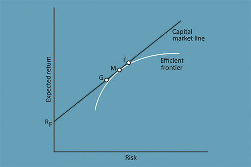
Assume that the investor has £100 to invest at the outset. At R F, the investor puts all of the £100 into a portfolio made up of only the risk-free asset. But at G, the investor holds only £20 in risk-free government bonds, and the other £80 in shares. This increases both the expected return and risk associated with the portfolio.
The investor could alternatively put all of the £100 into shares at M, which is a point on the efficient frontier that touches the capital market line in the figure above. Now, it has been assumed that all investors are looking at the same diagram, which leads them to reach the same conclusion: that the most efficient combination of shares is to hold M since it is a point on the efficient frontier.
Since all investors will hold M in some proportion in their portfolios and, for the economy as a whole, investors hold all shares in the stock market, the portfolio M must include all shares in the stock market in proportion to their market value. This is called the market portfolio. By choosing this efficient outcome the investor diversifies away all specific risk associated with the individual shares held in the portfolio. Only systematic (market) risk is incurred.
At M the investor does not hold any of the risk-free asset: all of the £100 is invested in a market portfolio of shares. Hence the line between R F and M represents combinations of the risk-free asset and the market portfolio of shares. Under the CAPM, investors choose the combination between these assets that most suits their appetite for risk and return. The choice is between zero risk at R F or full exposure to market risk at M.
It is important to emphasise that even at G, where only £80 is invested in shares, these shares will consist of the market portfolio (based on the stock market as a whole), in which there is only systematic risk. All that varies, at this stage in our analysis, is the amount of money invested in this market portfolio, and hence the amount of systematic risk.
The CAPM also allows for the investor to borrow. Assume that the investor could borrow £10 and use this to buy more shares: an expanded market portfolio of £110. Moving further along the capital market line to point F in the figure above, the investor has further increased expected return and risk. By borrowing money to invest in shares, the investor has taken on more systematic risk.
What the CAPM essentially says, is that investors get rewarded only for taking on systematic risk. So, provided that all the assumptions underlying the model hold, investors can only expect a return for bearing systematic risk. There is no point in taking on specific risk, as there is no expectation of any additional return for this. According to the CAPM, investors should hold efficient portfolios made up of M and the risk-free asset. Unlike the Markowitz approach, which leaves it open to each investor to hold their own tailor-made portfolio, the CAPM says that we should all hold different proportions of the risk-free asset and of the same risky portfolio of shares (that is, the market portfolio, M).
Activity 3.1 A portfolio example
a.
£62 to Gelato; £38 to Hotchoc
b.
£80 to Gelato; £20 to Hotchoc
c.
£30.40 to Gelato; £49.60 to Hotchoc
d.
£49.60 to Gelato; £30.40 to Hotchoc
The correct answer is d.
Discussion
The £80 invested in shares will consist of £49.60 allocated to Gelato (62% of £80) and £30.40 allocated to Hotchoc (38% of £80). This is the most efficient (optimal) combination of shares.
3.3.1 How fund managers apply CAPM
For fund managers there is a shorthand way of applying the principles of the CAPM. They can compare the risk of any share or portfolio to that of a benchmark that is represented by the market portfolio. This is achieved using a measure called beta.
Beta measures the sensitivity of returns on a share or portfolio to those of the market (or any other benchmark).
Figure 7 shows how beta is used in a simple example. At the market portfolio M, the value of beta is set equal to 1 by definition. But consider point F, in which beta is equal to 1.1. This portfolio will be more sensitive to market fluctuations than M. It will rise by 11% if the market rises by 10%, and fall by 11% if the market falls by 10%. When its beta is more than 1, a portfolio tends to outperform the market in both directions.
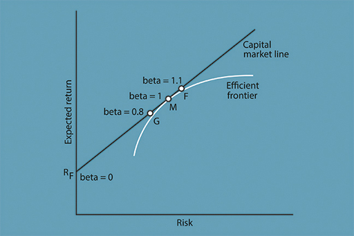
In the risk–return diagram in Figure 7, beta can be adjusted by varying the amount invested in the market portfolio. Consider again what happens if, instead of investing £100 in M, an investor borrows £100 and invests £200: an extra £100 worth of shares added in the same proportion to the portfolio. This will make their portfolio twice as sensitive to the market and so they will have a beta of 2 – taking on twice as much market risk but with twice the expected return. So if the market does well, then they will do very well. Alternatively if, for example, the market falls by 20%, their portfolio is likely to fall by 40%. These are the extreme highs and lows that are associated with leverage (borrowing).
Let’s examine in more detail how borrowing to invest can change your expected return and risk from investing, by considering four different scenarios:
Scenario A: You invest £100 of your money in the market portfolio and the market rises by 5%. You make £5 and your portfolio is now valued at £105.
Scenario B: You invest £200, but only £100 is yours and the other £100 borrowed. The market rises by 5%. You make £10. You repay the £100. So you’re left with £110. A 10% return.
Scenario C: Same as scenario as B but the market falls by 10%. You lose £20 and after repaying the money you are left with £80 – a 20% hit. Without borrowing and investing that extra £100 you would only have taken a hit of £10 (10%).
In Scenario D you borrow £1900 to add to your £100. The market falls by 10% (a hit of £200 on the total portfolio of £2000). So ahead of repaying the lender £1900 you are holding assets worth £1800. Not a good idea!
So gearing-up, by investing with borrowed money, increases the exposure you have to the risk on your portfolio.
Investors who believe in the CAPM and whose portfolios consist only of the market portfolio M and the risk-free asset, are called passive investors. Later this week, you will also be introduced to the Efficient Markets Hypothesis (EMH) that makes the same recommendation. Such investors do not believe that it is possible to consistently outperform the market and so do not try. Next week, you will consider how performance benchmarks can be established that may be tracked by passive investment.
Activity 3.2 Applying CAPM in reality
Look again at Figure 7. Now consider point G at which the beta is equal to 0.8. With a beta of 0.8, what is the likely impact on a portfolio if there is a 10% fall in the market?
Note your answer in the box below.
Answer
The portfolio is expected to fall back by 8%. This is calculated by multiplying 10% by 0.8. When a portfolio’s beta is less than 1, the portfolio will tend to underperform the market in both directions. If at the extreme the portfolio is all held in the risk-free asset, to give a return of Rf, the beta is equal to zero. This portfolio is not at all sensitive to market fluctuations.
3.3.2 What do we mean by ‘the market’?

The Capital Asset Pricing Model assumes that the market portfolio M includes all investible assets. This would include stocks, shares, works of art, commodities, property, and even our future earnings if these could be traded. This would be impossible to value in practice, so investment managers choose to represent the market by a stock-market index. Of course, different investors of different nationalities will look at different indices: the CAC40 for France, the S&P500 for the USA, for example. But even within countries there are a number of indices to choose from.
For example, in the UK, the index most cited on the news is the FTSE 100, which tracks the change in value of the top 100 shares listed on the London Stock Exchange weighted by market value. Every quarter, those companies that have fallen out of the top 100 are thrown out of the index and new large companies are included. In the USA, the most popular indices are the S&P500, a market-value-weighted index of 500 large US shares, and the NASDAQ Composite Index, a market-value-weighted index of all shares listed on the National Association of Securities Dealers Automated Quotation system, which consists primarily of shares in technology companies.
But the object of the CAPM is to represent the market as a whole and not the top 100 shares only. So, for our purposes, a more appropriate UK index would be the FTSE All Share Index, which in 2009 included 619 shares, weighted by market value, and these shares represented in value terms around 98 per cent of the value of all the shares listed on the market.
For a more global perspective, there is the MSCI World Index, but even this is designed to measure the equity market performance of only developed and not emerging markets. As of 2020, it consisted of the following 23 developed market indices, also weighted by market value: Australia, Austria, Belgium, Canada, Denmark, Finland, France, Germany, Hong Kong, Ireland, Israel, Italy, Japan, The Netherlands, New Zealand, Norway, Portugal, Singapore, Spain, Sweden, Switzerland, the UK and the USA. You can see how difficult it is to define ‘the market’.
3.3.3 To track or not to track?

You’ll now turn to the question of how to invest in the market portfolio.
In practice, investors tend to buy investment products linked to a stock market index, which represents an underlying market, through the medium of index funds. These have become widely used by investors partly due to the implications of the CAPM. Economic and financial theories do matter! These index funds are investment trusts or unit trusts designed to track an index as it moves from day to day. Index fund managers do so either by ‘full replication’, buying shares in proportion to their importance in an index, or by sampling, buying the larger shares and a sample of the smaller ones, to reduce transaction costs while still getting a close replication of the movements of the index. Exchange-traded funds (ETFs) are index funds that are listed on the stock exchange as shares but are essentially funds (note that the word ‘exchange’ here has nothing to do with currency exchange). ETFs allow low-cost investment in market portfolios.
Investing in index funds is a passive investment strategy aiming to track an index rather than outperform it, but what this has meant for traditional fund managers is that they now have a benchmark strategy against which they can be judged. They have to try to outperform the index by following an active investment strategy.
Investors who do not believe the assumptions underlying the CAPM and think that they have superior investment skills can take on specific risk in the hope of achieving positive returns that beat the market. This is called an alpha investment strategy. It is the holy grail for investors seeking to earn superior returns. And this type of investor is called an active investor.
Fund managers who are active investors can try to outperform the market portfolio, or an index, by one of two strategies. One is to take on more specific risk by selecting companies in different proportions to their weighting in the index, so that the portfolio will be overweight in those companies that are expected to do well and underweight in those that have poor prospects. This strategy is called stock selection. You will look at the second strategy in the next section.
3.3.4 Market timing: can you outperform the market?
The other way to try to outperform an index is to try to forecast the movement of the market by adjusting the beta of the portfolio. This can involve increasing the amount of shares in the portfolio when the market is expected to rise, and reverting to cash just before the market goes down. By varying beta, fund managers are trying to time their entry into the market, and their exit out of the market. They are indulging in market timing.
In fact, there are two ways in which active fund managers can attempt to time the market. The first is by varying the amount of leverage in a passive portfolio, moving up and down the capital market line and varying the beta of the portfolio according to whether they think the market will rise or fall. The second way is to alter the composition of the portfolio by increasing the proportion of shares that have high beta when the market is expected to rise, and increasing the proportion of low-beta shares when the market is expected to go down.
The investor can choose between different types of shares. An example of a cyclical, or aggressive, share is an airline – which does particularly well in a boom and particularly badly in a recession – giving it a beta of more than 1 (high beta). An example of a non-cyclical (defensive) share is a utility or food manufacturer – people use electricity, eat food and drink water regardless of the state of the economy – and these typically have a beta of less than 1 (low beta). Typically, low-beta shares do relatively well in a recession, and high-beta shares do relatively well in boom times. So shares can have high or low betas as well as portfolios, but, if the active fund manager buys a portfolio of shares selected for their high or low betas and not the market portfolio, M, they will no longer have a fully efficient portfolio, and will bear specific as well as systematic risk.
So, whether adopting a stock selection strategy or a market timing strategy, the active fund manager is taking on more risk than the passive fund manager, by varying share beta risk (market timing) and/or through taking on specific risk (stock selection). Active fund managers also reduce the net expected return by charging higher fees than do passive fund managers; the latter run index funds in a competitive market and charge low fees for the replication of indices (essentially because less work is required to seek information about future price changes). Proponents of the CAPM, which assumes no particular investment skill, believe that the active approach is doomed to failure. Active managers argue that since some of them make a good living, some of them must be successful some of the time.
There is little evidence of market timing skills. A few people have become famous for timing the market correctly – George Soros for selling sterling before sterling left the Exchange Rate Mechanism in 1992, and Jon Moulton of Alchemy Partners for selling securities linked to sub-prime mortgages before that market collapsed, but these are individual occurrences for two particular investors and do not reflect general market timing ability. Indeed, retail investors are often sellers in a bear market when prices have already fallen and buyers in a bull market, the exact opposite of ‘buying low and selling high’, which is effectively what a market timing strategy attempts to do.
A way to reduce mistakes of market timing is to invest on a regular basis, such as monthly, quarterly or yearly. This is called pound cost averaging, and reduces the risk of buying at the high and selling at the low. It also reduces the chance of getting market timing right – buying at the low and selling at the high. If someone invested, for example, £50 a month in a unit trust that invested in shares, then if the market fell they would buy more units and if the market rose they would buy fewer units, since they would be spending an equal amount each month on units that varied in price over time. It is also worth adopting a similar approach for selling. If someone wants to sell, it makes sense to sell holdings in regular amounts, since it is difficult to tell when the market has reached a peak. Using this technique may be preferable in order to receive a reasonable average return, rather than to hold on, possibly miss the height of the boom, and have to sell when prices have already fallen.
3.4 Understanding the efficient markets hypothesis
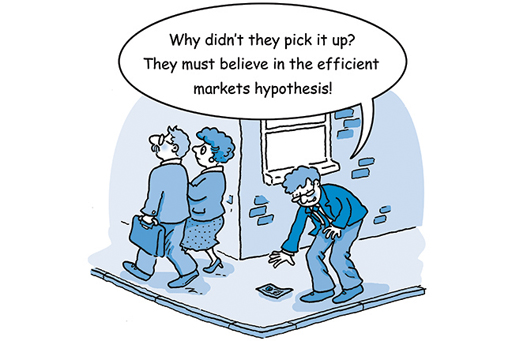
As financial markets have grown, and as regulatory and information barriers to arbitrage and short-selling have fallen away, economists have been more confident about the efficiency of markets. This greater informational efficiency has led some theorists to go as far as supporting the efficient markets hypothesis (EMH).
The EMH states that market outcomes (the prices set and the volumes traded) are efficient in the sense of immediately and accurately incorporating all relevant information. There are different versions of the EMH, each with striking implications for the behaviour of market prices and for appropriate investment strategy.
A weak form of the EMH acknowledges that traders may not be able to obtain or process all publicly available information, and that current prices only contain all the information conveyed by prices in the past. This form denies the effectiveness of technical analysis, by which some investors study past patterns of price movement and look for signs of their repetition that will indicate the next price movement. If all information from past prices is already priced-in, any apparent patterns will have arisen by chance and cannot be expected to recur.
The semi-strong form of the EMH holds that prices contain all relevant publicly available information, but leaves open the possibility of some traders gaining an advantage through inside information. This form denies the effectiveness of fundamental analysis, by which some investors study published information on the issuers of shares and bonds, and on commodities, to identify those that are underpriced and can be expected to rise in price. If the market price already reflects this publicly available information, there will not be undervalued or overvalued instruments as the fundamental analysts assume.
The strong form of the EMH holds that market prices contain all relevant information. This includes inside information held by a small number of market players, as well as information publicly available to all, such as business and economic news and published company accounts. It is assumed that people holding privileged information will, through their trading behaviour, cause it quickly to be captured in the price, which then transmits the information to everyone.
The type of information that is relevant to the EMH depends on what model of asset price determination is being used. For example, if this is the dividend valuation model, as used in fundamental analysis (see Shares – more on when they are good value ), the model will incorporate all relevant information regarding the expected earnings of a company. So prices will only move on the arrival of genuinely new information that changes the assessment of these earnings. The impact of this news and the direction of price movement will not be predictable, otherwise those who predicted it would already have carried out trades that incorporate the information into the price.
3.4.1 The random walk prediction

The EMH makes the powerful prediction that prices of shares and other financial assets will follow a random walk. The next price movement, up or down, will be unrelated to any of its previous movements. If the hypothesis is correct, there is little scope for investment experts to achieve better returns than others through stock picking and market timing.
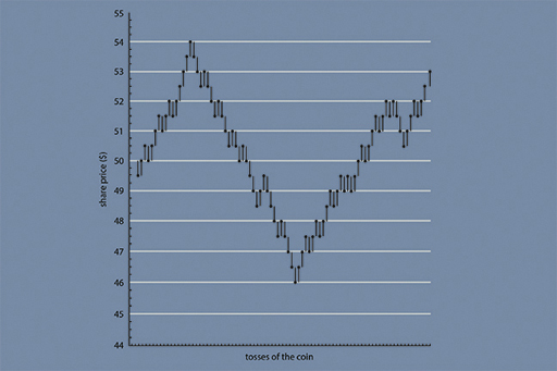
Malkiel (2007) carried out an experiment with his students in which they were asked to toss a coin. The experiment started with a share price of $50. If the coin came out as a head, they were told to add half a point to the share price; a tail would result in a half point cut in the price. Figure 14 is a chart of the stock price for one of these experiments. You can see that it looks like the type of cycle in share prices that we see all the time for companies and stock market indices. Yet this pattern is derived from a purely random event, the tossing of a coin. This argues against the use of technical analysis to look for patterns in stock-market data.
The EMH suggests that there is no reason for such expert investment strategies to work any better than buying stocks in proportion to their weighting in the market index, or even buying a random selection of stocks.
Activity 3.3 The random walk
Which of the following events would you expect to follow a random walk, and why?
- heads or tails when tossing a fair coin
- a football team’s pattern of wins and losses
- sunny or cloudy days during summer.
Answer
Tossing a coin is an example of a random walk – whether it turns up heads or tails next time, is in no way related to the result of the previous toss, or any that went before.
In contrast, a football team’s pattern of wins and losses need not be entirely random, as its chances of success in the next game may be related to its previous result. Several consecutive wins (or losses) may make another more likely, signalling the relative strength (or weakness) of the team, which could be self-sustaining because of soaring (or sagging) morale.
The summer weather is likely to be intermediate: many weather systems are durable enough for one sunny (or cloudy) day to raise the likelihood of another, but they change often enough (at least in the UK) for today’s weather to be a poor predictor of tomorrow’s, which is why weather forecasters remain in strong demand.
3.4.2 Technical analysis: reliable sat-nav or bogus science?
The EMH does not rule out the possibility of different traders working with different models, or inputting different data (especially on expected variables) into the same model. However, it does implicitly require traders to believe that assets have a value set by factors that are independent of other traders’ behaviour and beliefs.
Problems arise for market efficiency if there is momentum trading, with the expectation of asset prices based on recent movements in the price. Such traders use technical analysis of stock market charts to treat previous price movements as containing relevant information, which the EMH denies.
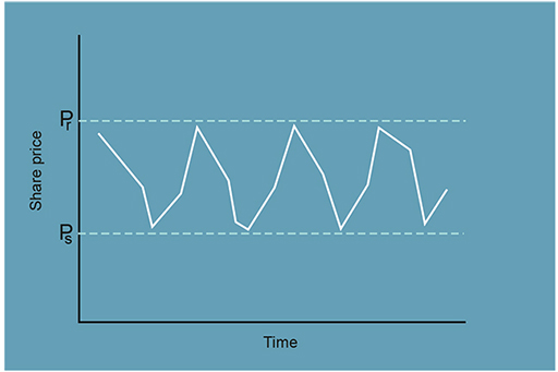
An example of how charts are analysed in technical analysis is provided in Figure 15. A trader might look at the cycle in share prices as taking place in a price channel, as shown by the two horizontal dashed lines. If enough traders believe that there is a support level for the share price, as represented by the price level P s, their belief in the support level price ensures that this price is supported in the market. Similarly, when the share price threatens to break through the resistance level P r, this will also lead to a reaction that pushes the price back into the price channel. Technical traders monitor the pattern of prices using this type of charting analysis.
Technical traders are anticipating that others will make the same trade later, and ‘because their speculation in the stock market is based on what they think other people wish to do, they are working from a slightly different set of information than those who buy or sell based on a firm’s long-term earnings prospects’ (Peters, 1999, p. 81). This potentially undermines the EMH assumption that everyone works from the same information. Although technical traders typically work on very short time-horizons, their behaviour can amplify price movements, causing these to overshoot beyond fundamental values even if they began with arbitrage correcting misalignment – sometimes contributing to ‘bubble’ episodes, which are examined in Week 4.
3.4.3 Technical analysis: some key features
While you can form your own views as to whether there is any substance to the predictive powers of technical analysis, this section looks at some of the key tenets of chartism.
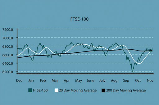
The first involves moving averages and an example is provided in Figure 16. Here chartists impose on top of the graph of the share price movement a series of moving averages – typically 5-day, 30-day and 90-day averages. If the share price moves upwards through these moving average lines then this is taken as a ‘buy’ signal for the share – the more so if the longer term (for example, 90-day) moving average is breached. The reverse applies if the share price moves downwards through the moving average lines: such moves are taken as ‘sell’ signals.
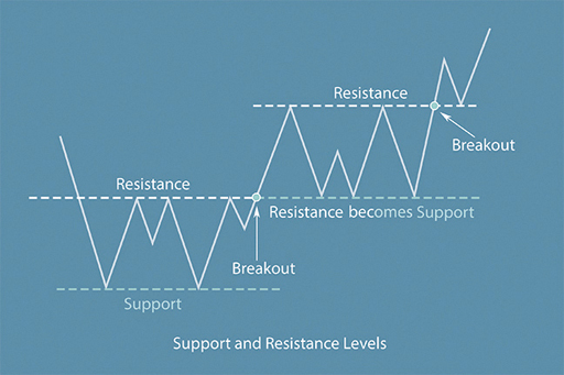
The notions of ‘support’ and ‘resistance’ lines are central to technical analysis. A support line is a straight line that links the low points of the series of movements in the share price over a period of time. A resistance line is a straight line that links the high points of the share price movements. Here, the rule is that a downward breach of the support line presages a further downward movement in the share price. An upward breach of the resistance line points to a further upward move in the share price in the near term.
Two of the many special chart features which hint at the future share price movements are ‘head-and-shoulders’ and ‘islands’. These are identified in the image above. A ‘head-and-shoulders’ is where you have a series of three up and down movements in the share price over a reasonably short time frame. The first of these three forms the left shoulder, the second the head (which must be higher than the left shoulder) and the third forms the right shoulder (and it must be lower than the head). This patter, particularly if the right shoulder is lower than the left shoulder, presages a fall in the share price in the near term.
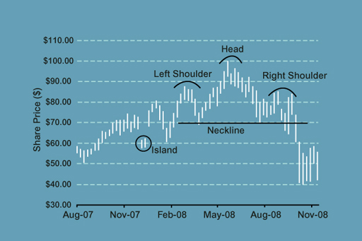
Islands (or island reversals) are where a high or low point of a share price cycle is detached from the rest of the chart movements. A clear gap exists between the previous day’s price range and the following day’s price range. In such circumstances, the island points to a reversal of the recent share price trend, for example, an island below the rest of the chart line presages a period of upswing in the share price. The reverse applies when the island is detached above the chart line.
Many technical analysts swear by the predictive powers of charts. But how can they be really predictive? A number of reasons can be postulated to support their predictive powers:
- Those trading shares have predictable behaviour which leads to repeated, and hence, predictable, trading patterns and price movements (we look at behaviour and investment management in Week 6).
- The traders themselves look at the charts, or are advised by those that do, with the result that the predictions made by the charts are fulfilled by subsequent trading decisions. In short, trading behaviour follows the predictions made by the charts!
- The charts are just a summary of market sentiment as reflected in trades undertaken – and sentiment goes through cycles that are sustained for periods, sometimes long periods.
Sophisticated technical analysis uses very detailed charts that incorporate intra-day price movements (as opposed to just end of day prices) and the volumes of trading business done each day (since what happens on a high volume day is usually more telling about market sentiment than what happens on low volume days).
The debate about the predictive powers of charts will go on. There are clear examples where the charts have been ‘right’, but others where a major future price movement has failed to be predicted. Whatever the case, though, many analysts majoring on fundamental analysis to assess the likely future movements in share prices also use technical analysis to provide a ‘second opinion’.
3.4.4 Can investors really beat the market?
To conclude the debate about whether we have the capability to predict future movements in shares and other assets, hear what some financial experts have to say on the matter.

Transcript
3.5 Week 3 quiz
Check what you’ve learned this week by taking the end-of-week quiz.
Open the quiz in a new window or tab then come back here when you’re done.
3.5.1 Monitoring shares, gilts and Bank Rate
You will recall that last week (in the section ‘Shares to follow’) you started to monitor the share prices of some selected companies listed on the London Stock Exchange and also the yields on UK Government bonds (gilts).
Let’s catch up with their movements over the past week.
Remember, you can follow these shares using the BBC Market Data tool, or by picking up a newspaper which focuses on financial markets.
What has happened to the prices of the shares and to the UK gilt yield curve?
Looking at the charts of the share prices, do you detect any features that a technical analyst (or ‘chartist’) would point to as providing a guide about the likely future direction movement of the price?
Share your findings and your thoughts about the factors that have driven these changes over the past week.
Week 3 round-up
It has been a very full week again and we’ve covered some difficult concepts, but these concepts are key to effective investment management.
Understanding portfolio theory, CAPM and the Efficient Markets Hypothesis, as well as concepts like Random Walk theory, pound cost averaging and chartism are all important component parts of a rounded knowledge about how investment markets work.
You’ll have seen as well how these theories apply in the practical world of investment management. All this helps to establish your own strategy for managing your investments.
Don’t forget to continue with Activity 2.4 and check the prices for the selected companies once a week and enter their level in the Market shares tracking worksheet. Remember, you can follow these shares using the BBC Market Data tool, or by picking up a newspaper which focuses on financial markets.
Next week, you’ll turn to the subjects of investment strategies in practice and how to judge the performance of investments – in particular, the performance of those managing investment funds. In moving to these subjects, we arrive at the fourth stage of our investment management model – the ‘review’ stage.
You can now go to Week 4.
Further reading
Senanedsch, J. (2012) ‘A General Methodology for Testing the Performance of Technical Analysis on Financial Markets’ Journal of Computations & Modelling, vol.2, no.2, pp. 79-94 The article examines the performance of technical analysis. The introduction to this article also explains efficient market hypothesis.
References
Acknowledgements
This free course was written by Martin Upton.
Except for third party materials and otherwise stated in the acknowledgements section, this content is made available under a Creative Commons Attribution-NonCommercial-ShareAlike 4.0 Licence.
The material acknowledged below is Proprietary and used under licence (not subject to Creative Commons Licence). Grateful acknowledgement is made to the following sources for permission to reproduce material in this unit:
Images
Figure 5 Yerpo via Wikimedia Commons (Creative Commons Attribution-Share Alike 3.0 license https://creativecommons.org/licenses/by-sa/3.0/deed.en)
Figure 9 © wdstock via iStockphoto.com
Figure 12 © Chris Ratcliffe/Bloomberg via Getty Images
Audio/Video
3.2.1 © The Open University
3.2.3 PUFin www.open.ac.uk/ pufin © The Open University
3.5.4: © The Open University
Every effort has been made to contact copyright owners. If any have been inadvertently overlooked, the publishers will be pleased to make the necessary arrangements at the first opportunity.
Don’t miss out:
1. Join over 200,000 students, currently studying with The Open University – http://www.open.ac.uk/ choose/ ou/ open-content
2. Enjoyed this? Find out more about this topic or browse all our free course materials on OpenLearn – http://www.open.edu/ openlearn/
3. Outside the UK? We have students in over a hundred countries studying online qualifications – http://www.openuniversity.edu/ – including an MBA at our triple accredited Business School.