Week 4: Investment in practice – practices, styles, history and performance
Use 'Print preview' to check the number of pages and printer settings.
Print functionality varies between browsers.
Printable page generated Sunday, 26 July 2026, 2:42 PM
Week 4: Investment in practice – practices, styles, history and performance
Introduction
Welcome to Week 4 of Managing my investments – a week that further explores investment management practices before moving on to the issue of how investment management performance can be measured. Watch the following video to hear Martin Upton introduce these topics.

Transcript
Assessing the performance of an investment, or a portfolio of investments, is part of the ‘review’ stage of the four stages model for investment management that you have been using during this course. Finding that your investments have been underperforming their target returns may be the trigger to revising your portfolio or seeking out a new investment manager.
You’ll also look at a number of high-profile investment management episodes in recent history. These are interesting stories in themselves but many also provide guidance or warnings about the pitfalls that can be encountered when investing.
4.1 Investor activity – evidence from the industry
Over the last three weeks you’ve looked at the range of investments and funds that you can invest in. You’ve also looked at the factors that influence how investment portfolios should be structured. You start this week by looking at the pattern of investment activity and the trends in investment behaviour in the UK.
Watch the following video, in which Victoria Nye of the Investment Management Association (IMA) gives a presentation titled ‘Investors’ fund choices: what do they tell us?’

Transcript
Activity 4.1 Investor activity
Having seen Victoria’s presentation, what do you think are the key current trends for investment fund activity by personal investors?
What do you think are the factors driving these trends?
Answer
The key trends are:
- a growth in money invested in funds following a dip in the wake of the 2007/08 financial crisis
- a shift to investing in mixed asset, or diversified, funds (such as bonds and property in addition to equities)
- a shift of investments from deposits paying interest into funds offering income (for example, from company dividends) as well as capital growth. An unsurprising development, perhaps, given the fall in interest rates after the financial crisis.
Victoria also points out the tendency for many investors to be over-cautious in their investments, with 40% opting for low-risk funds. She also stresses the benefits of starting to invest as early and as regularly as possible to benefit from the compounding of investment returns over time.
One other point – the term ‘fixed interest’ is one used in the investment industry when referring to bonds.
4.1.1 Age and lifestyling
There is a relationship between the age of an investor and the rational composition (or allocation) of investments. This factor relates to the investment principle of ‘lifestyling’.
Let’s look more closely at these influences on investment behaviour.
Age and asset allocation
An important factor when making decisions about the asset allocation is someone’s age.
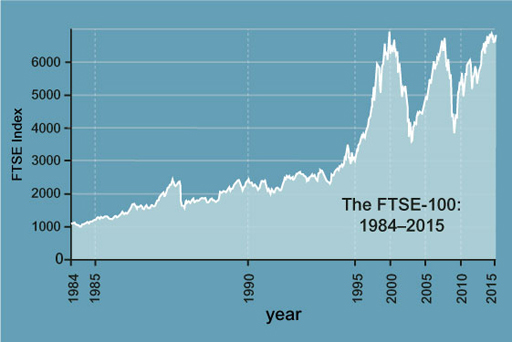
Investing solely in equities is more suited to long-term investment. If someone is retiring in a few years’ time, then investing solely in equities may be very risky. Looking at the graph in Figure 1 of the movement in the level of the FTSE 100, imagine what would have happened to the value of their investments if they were only holding shares and they retired in 2002/03 or 2008/09 – they would have seen the value of their fund severely hit. If, on the other hand, someone is 25, with 30 years or more to save, they can afford to invest more in equities. If not saving directly, but through a company pension fund, the pension fund managers will look at the age distribution of the members of the scheme when deciding on the asset allocation.
So, the asset allocation decision that may be appropriate when someone is relatively young may not be appropriate when close to retirement. This suggests that the pre-retirement years shouldn’t be entered into with too much risk. Indeed, asset allocation should be regularly revised and reviewed over the life-course.
Lifestyling
This kind of investment strategy takes age into account. It will automatically point an investor towards equities if they are under 30, and the cash/bond/equity mix will gradually be changed as someone gets older to put them into lower risk investments as they approach retirement.
Imagine if someone had 100% equities as they approached retirement. If the market did well, they might retire in splendour; if the market did badly, they might retire with little. In order to reduce this risk, an investor gradually sells equities and buys bonds over time, so that by the time the investor retires, their savings and investments are fully in cash and bonds and no longer bear stock market risk.
4.1.2 Cultural issues
Portfolio theory, which you may recall from last week, suggests that diversification is good for investors and it seems logical to suppose that investing internationally will improve the risk–return trade-off. Indeed, if we follow the Capital Asset Pricing Model (CAPM) to its logical conclusion, we should all be investing in the global equity markets in proportion to their market value.
Since the USA has by far the largest market capitalisation, investors, whatever their home country, should, in theory, be putting most of their money in the USA. However, in practice, there is home bias.
US investors tend to invest in US stocks, with very little invested overseas, and even the more internationally focused UK investor will typically invest the majority of their funds in UK equities. Part of the reason is that it is more difficult to invest overseas – some brokers will not let investors buy overseas stocks in small amounts, and information on shares is not so readily available, not to mention the fact that transaction costs are typically higher. An investor would also need a lot of money to gain exposure to all the major stock markets. As a result, small investors typically gain access to international markets through pooled funds, such as Open Ended Investment Companies (OEICs) or investment trusts.
Another difference is the span of investments that investment advisers typically cover. In the UK, investment advice is mostly on equities, pooled funds and some bonds. In France, however, the investment adviser will consider investment in property and stock-market investments as part of one portfolio – this is because tax advice is part of the investment adviser’s role and property can be a tax-efficient investment. In the UK, although tax advice is also important, stock market investment and property tend to be kept separate.
Some countries also have more of an ‘equity’ culture than others. British investors have been happily investing in global equities since well before the First World War. Bonds also fell out of fashion after the high inflation of the 1970s and 1980s. As a result, British investors have been relatively happier to invest in shares than other nationalities.
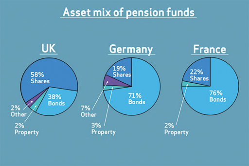
When comparing countries, there are important differences in how assets are combined into funds. Figure 2 shows the asset mix in 2008 for pension funds surveyed in the UK, Germany and France. Whereas, on average, pension funds in the UK had 58% of assets allocated to shares, in Germany only 19% had shares, and in France only 22% had shares. A much higher proportion was invested in bonds: 76% in France and 71% in Germany, compared to only 38% in the UK.
4.1.3 International diversification

Portfolio theory offers the investor the ability to create efficient portfolios from a selection of investment alternatives, ranging from choosing a portfolio of UK equities or a set of overseas markets in which to invest, to making an asset allocation choice between UK equities, overseas equities, cash and bonds, for example. In each case, a set of efficient portfolios can be created, provided that the investor has a database of the expected returns, risks and correlation coefficients.
In practice, investors tend to use historical data to estimate the risks and correlations, in particular. Expected returns chosen are more likely to be subjective estimates. The risks and measures of correlation might be calculated from, for example, the past 12 monthly periods, the past 20 quarters, or the past 10 annual periods.
The financial publication Money Management, for example, publishes the standard deviation from the most recent 36 monthly periods. Each choice of data will give a different answer and, to make matters worse, the efficient frontier portfolios that the analysis provides may be difficult to sell to investors in practice.
Suppose that an international equity market analysis suggested that US investors should place 50% in Belgian equities, 5% in the UK and the remainder in Chile. This might appear too different from a market-capitalisation-weighted global equity index to please investors. So analysts tend to play it safe and constrain their models to give answers that are not likely to change too much, and that are not that different from a popular benchmark index.
The Capital Asset Pricing Model (CAPM) is also based on assumptions that do not hold in practice. Investors based in different currencies will not all be looking at the same opportunities; investors cannot in practice both borrow and lend at the risk-free rate; and the market indices used to represent the market are not very good approximations to estimates of all marketable assets.
However, the conclusions that the CAPM reaches – that there is, for passive investors, an investment alternative based on index funds and cash, that active managers can be judged relative to that passive investment alternative, and that investors can analyse what kinds of risk investment funds are taking on – have meant that investment managers have to be very careful to implement the investment strategies that they put in their marketing literature.
These observations bring us to the next key aspect of investment management: how to judge investment performance – including the performance of fund managers who look after your investment portfolios.
4.2 Relative returns

The traditional way in which fund manager performance has tended to be judged is against the performance of other fund managers with similar investment objectives. This means that pension fund managers are judged against other pension fund managers, and unit trust managers investing in UK shares are judged against other fund managers investing in UK shares. The table set out at the top of Investment funds: alternative risk profiles shows how funds are grouped by the Investment Association (IA) to allow performance measures to be applied to peer groups of funds.
The IA maintains a system for classifying funds, as there are over 2000 investment funds. The classification system contains 30 sectors grouping similar funds together. The sectors are split into two categories, those designed to provide ‘income’ and those designed to provide ‘growth’. The sectors are designed to help investors to find the best fund(s) to meet their investment objectives and to compare how well their fund is performing against similar funds. Each sector is made up of funds investing in similar assets, in the same stock-market sectors or in the same geographical region.
Similar frameworks have been put in place by the Association of British Insurers for life company funds and other groups of investment funds. Whatever the framework, the aim of each fund manager is to be top of the league tables, so that new investors will choose them based on past performance. For such managers, success is about relative not absolute performance, and this can affect fund managers’ behaviour.
For example, suppose that you are trying to compare funds investing in cash and UK equities (shares). In a bull market, a top performer relative to the peer group is likely to be the fund most heavily invested in equities. Because of this, there will be a temptation on the part of all the fund managers in this peer group to increase their equity participation. So, over time, the typical fund’s equity exposure will rise, increasing its risk. When the bear market comes, the funds in the group will suffer more than if they had invested relative to a benchmark linked to cash and equity indices, say 50% in each. Staying close to this benchmark would have meant that their equity market risk stayed more or less the same over time.
Retail funds can also be judged against a suitable benchmark index, say an Indian stock market index for an Indian equity fund, or the MSCI global equity index for a global equities fund. This makes it easier to measure that all-elusive outperformance, as it is a specified, calculable benchmark return, and allows funds to be judged relative to an established alternative investment strategy.
The further away from the benchmark, therefore, the greater the risk taken on by the fund manager – individual funds deviate from the benchmark to try to outperform in different ways. As you have already seen, some take on more beta, others more specific risk, in order to earn what is called ‘positive alpha’. The next section shows which performance measures can be used when comparing performance against a peer group or when comparing against the performance of a benchmark index.
4.2.1 Alternative measures

Peer group performance measures
Peer group performance measures can be used when there is no benchmark index available and allow comparison of funds within an appropriate peer group. The key measures of peer group performance are:
- Sharpe Ratio This measures how much is earned per unit of total risk taken on by the fund (the standard deviation of its returns). The ratio consists of two elements. The first element (the numerator) is the excess return of the fund relative to the risk-free rate. So if the return is 13% and the return to the risk-free asset is 3%, this means that the excess return is 10%. The second element (the denominator) is the standard deviation of returns to the fund. If, for example, the standard deviation is 10%, then with an excess return of 10% this gives a Sharpe Ratio of 1, considered to be a good performance. If the excess return is only 2%, the Sharpe Ratio would be a less impressive 0.2. Earning less than the risk-free rate, as fund managers did in 2008, would give a negative Sharpe Ratio!
- R 2 (R-squared) This is the percentage of the total risk of a portfolio that can be explained by market risk. The remainder is the percentage represented by specific risk. A high R-squared, say 90% or more, means that the fund closely resembles an index fund and is not following an active outperformance strategy.
Index benchmark performance measures
Where an index or other benchmark is specified, the following measures are used to judge performance relative to that benchmark:
- Alpha The difference between the return on the portfolio and the return on the benchmark, positive or negative, that can be derived by taking on specific risk – for example through stock selection.
- Beta A measure of the fund’s sensitivity to market movements. Fund managers use beta to engage in market timing. In a bull market, a fund with a beta of more than 1 will be expected to do well relative to the market; in a bear market, a beta of less than 1 will be expected to do less badly than the market.
- Tracking error This measures the volatility or standard deviation of the alpha over time. The larger the tracking error, the more likely a high outperformance or underperformance relative to the benchmark in any one period.
- Information ratio This is a risk-adjusted performance measure, that is, the alpha divided by the tracking error. This measure prefers funds that earn consistent, positive alphas, rather than higher but more volatile alphas over time.
4.2.2 Analysing a fund’s performance
The fund is a strong long-term choice for investors seeking a balanced multi-asset fund with exposure to a variety of asset classes.
Using the internet, you can find performance measures based on portfolio theory and the CAPM to analyse funds such as the Newton Balanced Income Fund. This particular fund achieved a three year positive mean return and a positive Sharpe Ratio over three years, meaning that it returned more than the risk-free rate over the period. The beta is 0.93 compared to a benchmark index, which makes the fund slightly less exposed to market movements than its benchmark comparator. The negative alpha means that the fund’s return has been penalised for taking on specific risk through stock selection and not just mirroring the benchmark index (Table 4.1).
| Newton Balanced Income Fund | Performance and features |
|---|---|
| 3-year standard deviation | 7.19% |
| 3-year mean return | 5.64% |
| 3-year Sharpe Ratio | 0.69 |
| 3-year R-squared | 76.64% |
| 3-year beta | 0.93 |
| 3-year alpha | -5.41 |
| 10 years annualised return | 7.70% |
Figure 6 shows the ten-year performance of £1000 invested in the Newton Balanced Income relative to the chosen peer group and the chosen benchmark index. The peer group included several hundred other income funds with the same investment objectives. This shows the fund’s superior performance over the period until 2013 compared with both the index and the average performance of the peer group. Consequently the investment analyst firm Morningstar awarded it a 5-star rating for the 10-year performance – but a ‘below’ average 2-star rating for its 3-year and 5-year performances.
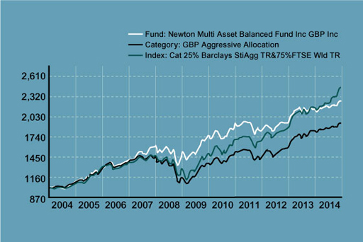
So, for the overall period from 2004 to 2014, we would have been happy to have invested in the Newton Balanced Income Fund instead of another fund in the same peer group. By contrast, over the 10-year period there was little to choose between this fund or the index fund tracking the chosen benchmark index. But the problem is how to identify the best performing funds before the event and not after. The figure above shows that the average peer group performance was worse over the 10-year period than that of the Newton Balanced Income Fund. Furthermore, some funds would have performed worse than the peer group since this is an indicator of average performance. So, only if we were very lucky, and had picked a fund manager who did well, would we have achieved our target return, as measured by the index, or more. Tracking the benchmark index therefore offers a strategy of avoiding investment in the weaker performing funds.
[Note that while the analysis above covers the performance of the fund between 2004 and 2014, the discussion of how to assess fund performance remains relevant today.]
By far the most common indicator of performance is simply returns over the past year, three years and five years. Since markets may well experience a bull or bear phase over more than five years, aggressive funds will look good in the good years and defensive funds will look good in the bad years. An example of an aggressive fund is a growth fund, a fund that looks for companies with growth potential but may be expensive in earnings terms (that is, have high price–earnings ratios, P/E – a measure you looked at in Week 2), as did internet companies in the late 1990s. An example of a defensive fund is a value fund, which invests in companies that look relatively cheap on fundamental ratios such as P/E, dividend yield or Tobin’s Q (which we also looked at in Week 2).
Indeed, some fund management groups make sure that they have a wide range of different types of fund to make sure that they always have at least one or two near the top of the league tables, whatever the state of the stock market. This is another example of how diversification informs investment strategy.
4.2.3 Absolute returns

The relative approach to peer groups or to benchmarks does not always work well.
In the dot-com crash of 2000, for example, when pension funds suffered badly as the equity market fell, pension fund managers argued that they had all lost money, so it didn’t really matter. This included even those who outperformed the benchmark (which in this case means that they lost less than the benchmark), but this was a matter of concern to company directors, who found that their company pension funds had to be topped up to cover the stock market losses. They decided to turn to fund managers who promised absolute returns, that is (hopefully), positive returns whatever the economic situation.
So, for example, the fund might promise not to outperform the FTSE All Share Index by 2% – a 10% fall in the index would still mean a loss of 8% – but rather to earn, say, 4% more than the risk-free rate. Two types of investment that promise absolute returns are some types of hedge fund and structured products.
Absolute return hedge funds
A hedge fund is a fund that is allowed to use aggressive investment strategies through high leverage (borrowing). This is different to the position of unit trusts and OEICs (who can only borrow to a very limited extent) and investment trusts (whose leverage is normally capped). Hedge funds are exempt from many of the rules and regulations governing unit trusts and investment trusts, which allows them to invest large amounts at any one time. Retail investors can invest in so-called ‘funds of funds’ that are unit trusts or OEICs investing in a number of hedge funds with varying investment strategies. As with traditional funds, investors in hedge funds pay a management fee, however, hedge funds also collect a percentage of the profits (usually 20%).
Unlike the managers of unit trusts and investment trusts, hedge fund managers can sell shares short. So, for example, managers of a ‘long/short’ hedge fund will buy shares that they like and sell those that they don’t, in equal amounts, so netting out the market exposure and keeping specific risk relatively low. In such a case, the risk of the hedge fund will be uncorrelated with market risk and will offer pension funds, and other investors seeking to diversify away from equities and bonds, a positive expected return. However, in practice, such hedge funds use a lot of leverage to enhance expected returns and many suffered from the lack of liquidity during the credit crunch and were forced to sell shares into a falling stock market. Their returns turned out to be more positively correlated with market returns than investors had anticipated.
Structured products
A typical capital structured product is one that will offer, as a minimum, return of the original capital invested at the end of a period of three years, for example, and any upside of, say, the FTSE 100 stock index. This would mean that if, at the end of three years, the FTSE 100 was lower than the index value at inception, customers would receive £100 per £100 invested. If, on the other hand, the FTSE 100 had risen by 20% by the end of the three-year period, the investor would receive £120 per £100 invested.
Guaranteed products are typically put together by investment banks or other investment institutions by using combinations of bonds, shares and derivatives. As a result, guaranteed products are called structured products. Structured products are exposed to the counterparty risk (see Week 3) of whichever banks or other institutions supply the underlying guarantees. Counterparty risk was not considered to be significant until 2008, when Lehman defaulted on a number of guarantees underpinning structured products, although some of these guaranteed products have since been honoured by the banks that had marketed them.
It is worth pausing to ask how the client is paying for having the best of two worlds – limited downside risk and yet upside potential. The answer in the case of capital-guaranteed products is in foregone income. For the whole of the three-year period, no interest is paid and the rise in the index excludes dividend income. Depending on the size of the dividend foregone, this can be equivalent to quite a high annual charge.
4.2.4 The reporting of performance
The reporting of performance measurement varies from cursory to detailed, depending on the size of the investment. Managers of large pension funds have to provide their clients with detailed breakdowns of the risk and-return characteristics of their portfolios, and there are a number of consultants who specialise in such analyses. They also use the key measures such as tracking error and alpha.
When it comes to funds, such as investment trusts, OEICs and life assurance funds, more complex measures tend to be combined into a star-rating or number-rating system. This allows investors to identify good recent performers and high- or low-risk funds relatively easily.
It is rare to find a fund that significantly outperforms an index benchmark over the long term. It is very difficult to spot future winners, and past performance is not a guarantee of future performance, but analysing performance can and does say something about how the performance was earned and what kinds of risk an investor in the fund is likely to be taking on. It can also force investors to face the truth of their investment performance.
To finish this section, watch the video and hear Anthony Nutt’s observations on fund management performance and on whether chartism (that you studied in Week 3) is an aid to good performance.

Transcript
[Laughs]
Activity 4.2 Assessing a portfolio’s performance
Suppose that you were asked to judge the performance of your share portfolio, which you have run with an internet broker for the past five years. How would you go about this?
4.2.5 Assessing a portfolio’s performance

Most retail investors or traders judge performance against the cost of the shares that they have bought, ignoring the opportunity cost of their money – what they would have got from investing in an equivalent-risk investment, including dividends, for the whole five-year period.
You can only really judge performance relative to a benchmark. This might be buying an index fund linked to the FTSE All Share index and holding it for five years untouched, but if you included non-UK shares in the portfolio, a more international benchmark would be appropriate. It is all too tempting to set yourself an easy benchmark and to forget the bad investments that you have made, concentrating only on the successes.
4.3 Historic returns from different asset classes
Tables 4.2 and 4.3 summarise the historical evidence of returns from different types of investment ‘asset classes’.
| 1899–2015 | 2005–2015 | |
|---|---|---|
| UK equities | 5.0% | 2.3% |
| Gilts | 1.3% | 3.0% |
| Savings accounts | 0.8% | −1.1% |
Footnotes
Note (1): ‘Real’ return is the return after adjusting for inflationFootnotes
Note (2): The returns for cash deposits are computed using the historic returns on short-term (typically 3-month) investments with the UK government (known as ‘Treasury Bills’)| Nominal | Real | |
|---|---|---|
| UK Equities | £2,265,437 | £28,232 |
| Gilts | £36,395 | £454 |
| Savngs accounts | £20,535 | £256 |
Footnotes
Note: ‘Nominal’ means before adjusting for price inflation. ‘Real’ is the return after adjusting for price inflation.While evidence suggests that there is no guarantee that what has happened in the past will happen in the future, historical performance of products is still informative. Table 4.2 shows the average annual returns on UK equities, gilts and cash deposits for the periods 1899–2015 and 2005–2015. Note that when we talk about ’cash deposits’, these are investments whose returns are akin to those on bank or building society savings accounts. They are similar to cash in that they are liquid assets, and ‘cash deposits’ is the term that you will come across in this kind of product analysis in advanced personal finance literature. Note that the table is looking at a portfolio of equities – in this case the performance of the FTSE All Share Index, which includes around 1000 companies’ shares listed on the London Stock Exchange. Note also that the table shows real returns – in other words, the return over and above the amount needed simply to keep pace with inflation in order to maintain the buying power of the capital.
Table 4.2 shows that, over both periods, a diversified portfolio of equities outperformed gilts, which in turn outperformed cash deposits on a yearly returns basis. This outperformance is reinforced by the data in the second table on the value at the end of 2015 of £100 invested at the end of 1899.
Compounded over a number of years, the differences in annual average returns between equities, bonds and cash can make a huge difference in money terms.
If investing in shares makes higher returns, why don’t people put all of their money in UK equities rather than in gilts or cash? One point to bear in mind is that such returns are only an average on a portfolio of shares, achieved over the period shown in the table. The actual return on a portfolio of shares in any one year has ranged from a staggering −51.7% (the loss of more than half of the capital) in 1975 to a rebound the following year of a 150.9% gain!
A person’s attitude to investment risk will determine how much someone invests in equities (shares), in bonds and in cash (or savings products). If someone is highly risk averse, they are more likely to stick to savings products and bonds – although the evidence here shows that they will be likely to lose out over the medium to long term by being under-invested in shares. If someone is less risk averse, they will be happy to focus more on shares when it comes to the composition of their investment portfolio – provided their investment time horizon is not too short.
4.3.1 Historic returns: proof that the time horizon is crucial
You have already learned that risk also relates to the length of time of any investment. Normally, the longer someone intends to invest without needing to sell, the more risk can be afforded. Table 4.4 uses past data to show how likely it is that the shares will beat cash deposits or gilts as an investment over two different time periods or horizons – five years and ten years, without withdrawing any money, that is, allowing for compounding of interest.
| Time period assets held | ||
|---|---|---|
| 5 years | 10 years | |
| Percentage of times equities outperformed gilts | 72% | 79% |
| Percentage of times equities outperformed savings accounts | 75% | 91% |
The probability (from 0–100%) is based on the number of periods in which equities outperformed either cash or gilts expressed as a percentage of the total number of periods between 1899 and 2015. Therefore, if we consider all possible five-year time periods between 1899 and 2015, there were 112 of them. For those 112 time periods, equities outperformed cash deposits 84 times, giving a probability of 84/112 × 100 = 75%. For the ten-year periods, the outperformance rate was even higher – 91% against cash deposits.
So, past evidence suggests that the longer the time period, the more likely it is that equities will outperform bonds and cash – assuming that past returns are good predictors of the future. Studying the past seems to say that, with as short a time horizon as five years, there is a three-in-four chance of doing better if you held all equities rather than all bonds or all cash deposits. With a ten-year time horizon, there is more than a nine-in-ten chance of doing better with equities than with cash deposits. Put another way, the risk of underperformance with an equity portfolio over ten years is less than 10%.
History would seem to suggest that someone is unlikely to lose when investing in equities compared with buying bonds or putting their money in a savings account. Nevertheless, the past would not have been a good forecast of the future if someone had been investing £1000 for ten years in 2000. This was the start of a bear market with share prices falling for a sustained period. The FTSE All Share Index started 2000 just below a value of 3000. By September 2010, the index stood some 100 points lower at just under 2900. The investor’s £1000 would have fallen to £967. This highlights that the probabilities in the table above are calculated over a very long time period and may not take into account more recent changes. Consequently, the past is not necessarily always a good indicator of a particular future.
Update to 2023
Sadly we cannot provide the findings from editions of the Barclays Equity Gilts Study for recent years. Despite requests Barclays state that the study is now only available to its ‘institutional clients’.
What we do know, however, is that after 2015 equities performed well until the global markets were hit by the COVID-19 pandemic in 2020. These years also saw bond yields and interest rates falling to historic lows in the UK. This was good news for bond investors given the inverse relationship between bond yields and bond prices. By contrast it was bad news for savers as interest rates on cash investments were very low.
After the pandemic and since 2021 interest rates and bond yields have increased in the UK – so good news for savers and bad news for those who bought bonds in the years immediately prior to 2022. By contrast, following a recovery after the pandemic, the UK equity market has been directionless with the FTSE 100 index largely remaining no higher than seen in the late 2010s.
Over the very long-term, though, equities are the winner with an average 5.1% compound annual rate of return in the 118 years after 1899.
4.3.2 Bubbles
Periodically, periods of manic buying affects financial markets – particularly share markets.
There have been many examples of share prices ballooning skywards on upbeat speculation about the prospects for certain companies, only to plummet on discovery that these prospects are more a mirage than a reality.
In these circumstances, the share price movement is like an expanding bubble that, at some point, will inevitably burst.
Watch the following video, in which a number of specialists in personal and corporate finance discuss what is meant by the term ‘bubble’.

Transcript
[Sound of bubbles]
[CRASH]
[Bubble sounds]
The origin of the term ‘bubble’ is thought to emanate from the fate of the South Sea Company. The saga of the South Sea Bubble in the eighteenth century has great similarities with other more contemporary bubbles, such as the so-called dot-com bubble in the early 2000s.
The South Sea Company was formed in 1711 and was given a monopoly to trade in Spain’s South American colonies. The overhyped prospects for this business in the New World built up a frenzy of speculation in the shares issued by the South Sea Company. This reached a head in 1719 and 1720. The company’s share price rose from £128 in January 1720 to £1000 by August, only to collapse to £150 in the subsequent month. The extent of involvement in this share price bubble, including members of the Government, and the sharp decline in the share price resulted in widespread bankruptcies and company failures. Curiously, the South Sea Company itself survived, albeit in a restructured form, and traded for another century.
Spotting bubbles is a crucial skill in investment management. If you have invested in a share whose price is rising rapidly, you need to determine whether this is because of the company’s performance or simply hype, based on unrealistic expectations about the company’s potential. If it is the latter, get out before the bubble bursts!
4.3.3 Google: success story or a bubble yet to burst?

The internet search engine company Google, established in 1998, adopted a very different approach to their IPO on the NASDAQ stock exchange in August 2004.
Controversy accompanied the run-up to the launch, with Google encountering problems with SEC regulations for public offerings by issuing shares to staff prematurely and by talking about the issue to Playboy magazine. The company also declined to market the issue of shares by road-showing it to potential investors – something that is commonplace when companies enter a market for the first time. The greatest interest, however, focused on Google’s approach to pricing their IPO: they decided to use a Dutch auction to allocate the shares. With this method, shares are distributed to investors whose bids are at or above the price that sells all the shares available. In effect, Google was asking investors to say what they thought was the right price for the shares, rather than vice versa. In theory, this method should mean that at launch the issuer extracts the maximum proceeds possible. Did this work?
After a late decision to cut the number of shares offered from 25.7 million to 19.6 million, Google set a price range of $85–95 (below the range previously indicated). The Dutch auction allocated the shares at $85 – the base of the indicated range, but once the shares started trading their price rose above $100 and after three months they were trading above $169. This was not entirely surprising since the Dutch auction appears to have been flawed: at $85 there was unmet demand for Google’s issue of shares, with one quarter of the bids for shares being unsuccessful. Despite the fact that equity markets were on the upturn in autumn 2004, it appears that Google underpriced its IPO. The complexity of the Dutch auction may have deterred investors from bidding for shares at the launch, thereby constraining the issue price.
The conventional process of marketing and book building would almost certainly have yielded the company more from its IPO, but Google is anything but a ‘conventional’ company. In addition to providing an interesting case study of an IPO, the subsequent sharp rise in Google’s share price prompted – not for the first time – interesting questions about the valuation of a technology company. Indeed, valuing young technology-based companies with a short financial history that operate in a rapidly changing business environment is always a challenge.
Shortly after the issue, Allan Sloan of the Washington Post wrote:
The stock market is valuing Google at almost $30 billion, or almost 87 times the $1.26 per share profit it reported for the 12 months ended June 30 [2004]. Google earned $7 million on $86 million in revenue in 2001, its first profitable year, and $191 million on revenue of $2.26 billion in the 12 months ended June 30. But the company’s not a small start-up anymore. To keep up this growth rate, Google will have to earn $5 billion on revenue of $60 billion in 2006. That’s clearly not going to happen.
Sloan’s prediction was proved correct: Google made $3.1 billion in net income on revenues of $10.6 billion in 2006. Despite this, Google has continued to be a high profile corporate success story. In July 2011, it announced net income of $4.3 billion on revenue of $17.6 billion for just the first six months of 2011. The surge in its share price had resulted in Google becoming the world’s largest media company.
At the time of writing (2020) the success story of Google is truly staggering. On 9 December 2020 its share price was $1778, having more than doubled since mid-2017 – and remember global stock markets were struggling in 2020 due to the COVID-19 pandemic! Note that the parent company of Google is now Alphabet following a company restructuring in 2015 – so search for Alphabet (on the Nasdaq exchange) rather than Google when tracking the company’s share price.
So, by 2020 the concerns being expressed about Google were about its global power rather than whether the company was a bubble.
4.3.4 Privatisations and demutualisations – easy money?

The 1980s and 1990s saw what came to be believed as sure-fire ways to make easy money from shares – privatisations and demutualisations.
Privatisations – the conversion of state-run utilities to private listed companies via a sale of shares to the public got underway in the UK in 1984 with the privatisation of British Telecom. This was followed by a succession of further privatisations in the following years including British Gas, British Airways, the regional water utilities (for example, Severn Trent) and the British Airports Authority. Additionally, the UK Government sold off its holdings in companies like BP and British Aerospace.
The rationale for the privatisations was a mixture of politics and economics. Getting more members of the public to become shareholders and to become actively engaged in a shareholding democracy fitted with the ethos of the Conservative Governments of the late 1970s and 1980s. Getting government out of business by selling off state utilities, which were simply businesses owned or part-owned by the state, also resonated with their economic philosophy.
The economics were compelling too. Privatisations raised huge amounts of money – some £50 billion between 1984 and 1996 – and hence reduced the need of the government to borrow.
For those who successfully received allocations of the new shares in the privatised utilities, the economics usually looked good too. In most cases, the share prices rose sharply immediately after flotation, with the result that instant profits could be made by a sale immediately after the launch date (a practice known as ‘stagging’). The reasons for this phenomenon are much debated. Suggestions include:
- the underestimation of demand from personal investors for the shares, with this demand being whipped up by extensive advertising campaigns
- the fact that institutional investors had to buy up large amounts of shares for funds that tracked the FTSE 100 – since in most cases the size of the privatised utilities meant that they joined the list of the 100 largest companies on the London Stock Exchange
- the desire of the investment banks (who arranged the privatisations) to see successful share issues. This meant that no risks were going to be taken by pitching the offer price of the shares at a level which left even a proportion unsold on the launch date.
The privatisation period came to an end with the arrival of the new Labour Government in 1997. In truth though, there was not much left at that point for the government to sell off!
How did shares in privatised companies perform?
The privatisation period created a new group of shareholders among the general public – although over time many sold their shares. Those who held onto them over the longer term had a mixed experience relative to investing in a FTSE 100 indexed fund – demonstrating what we learned earlier in the course about the specific risks associated with holding shares in individual companies. Those who did ‘stag’ the shares of the privatised utilities by selling soon after launch did, on the whole, make good profits thus underpinning the view that privatisations offered an easy way to make quick, risk-free money in the equity market.
Another way to make easy money in the late 1980s and 1990s came with the demutualisation of the larger building societies.
Building societies are mutual organisations owned by their members – their retail savers and their mortgagors. From the late 1980s though, most of the larger societies – starting with the Abbey National in 1989 and then, in quick succession in the mid-1990s, with the Halifax, the Alliance & Leicester, the Northern Rock, the Woolwich and the Bradford & Bingley – decided to convert to plc status (in effect to become banks rather than building societies). To do this, they floated on the London Stock Exchange and offered free shares to their personal customers – the savers and mortgagors. These shares could then be sold on or, after the demutualisations were completed, generated profits to these shareholding customers. Other societies became demutualised through agreeing to be acquired by banks (Birmingham Midshires, Bristol & West, Cheltenham & Gloucester, National & Provincial).
The recognition of this risk-free way to make money resulted in millions of members of the public opening savings accounts with any building society deemed a possibility for demutualisation. In some cases, these customers actively campaigned for their societies to demutualise by standing for board directorships and putting motions proposing demutualisation up for a vote at the societies’ AGMs.
This easy way to make money from shares came to a halt within a few years. The last to demutualise was the Bradford & Bingley in 2000. The remaining large building societies – the Nationwide, the Coventry and the Yorkshire – all made it clear that they supported mutuality and did not see the business case for demutualisation and conversion to banking status.
Subsequent events reinforced this viewpoint. Every one of the demutualised societies quickly lost their independent status either by being acquired by other banks (Santander acquired Abbey National and the Alliance and Leicester; Barclays bought the Woolwich), or by running into calamitous financial difficulties during the 2007/08 financial crisis (Northern Rock, Bradford & Bingley). Indeed, shareholders of the Northern Rock and the Bradford & Bingley found that their holdings became worthless.
The whole episode was a poor advertisement for the business strategy of demutualisation. For holders of shares in the Bradford & Bingley and the Northern Rock, it was an extreme and harsh lesson about the concept of specific risk when owning shares in individual companies.
4.3.5 Precipice bonds

Sometimes investors do experience outcomes from their investments that are both adverse and unexpected. In some cases, this arises from the mis-selling of products, in others it arises due to unrealistic expectations about the prospects for an investment’s performance or, simply, lack of attention to the detail of the risks involved. You saw aspects of these issues when you looked at the performance of endowment policies in Week 2.
A further case which demonstrates issues of both mis-selling and misinterpretation of investment risks came with the ‘precipice bonds’ in the 1990s and early 2000s.
The low rates of interest that prevailed in the UK from 1993 adversely impacted on the returns from interest-linked investments. Experiencing a fall in investment income on which they may have been reliant, perhaps made it inevitable that some investors would be tempted by investments where a high income was guaranteed by the product provider.
Such high-income bonds – latterly known as precipice bonds – became prevalent in the 1990s. Between 1997 and 2004, a total of some £7.4 billion was invested by over 250,000 people in these products.
These bonds were usually offered for specified periods – typically of 3 or 5 years. The bonds either offered higher annual interest than that available on conventional products or a high growth rate in the value of the investment made. These advertised rates were guaranteed. Additionally, the bonds were marketed as being tax-efficient because the returns were not subject to capital gains tax (CGT) – in contrast to the profits made on ordinary share dealings. However, this CGT exemption would have been irrelevant for the majority of investors because the capital gains, even on optimistic forecasts, would have fallen below the profits threshold at which CGT becomes payable.
But with these high returns came high risks – the amount of the original investment made by the customer that was returned to them on the maturity of the product was not guaranteed, and was dependent instead on the performance of specific shares or indices to which the product was structurally linked. Thus, although a high income might be achieved, the customer could easily end up getting back a much reduced amount of the original capital sum they had invested.
When the equity markets fell in value sharply in the early 2000s, the risk element of these precipice bonds was triggered, with thousands of investors losing significant amounts of their capital.
A number of regulatory issues arose from precipice bonds.
Regulatory issues
First, there was the issue of mis-selling. Did the firms selling the product explain the risks in a way that could be understood by their customers? Specifically, some products were sold without the risks being explained in the prospectuses advertising them. Elsewhere, even if the risks were stated, some intermediaries did not explain them to their customers.
Second, there were issues about the process of customer classification and the risk appetite of customers. Did the firms marketing the products make credible assessments of the financial sophistication of their customers? Were there appropriate determinations of their genuine desire to invest in products which exposed them to losses on the capital they invested? Were the investments sufficiently dissimilar to the other investments held by the customers as to send out warning signals?
Third, to what extent did the designers of precipice bonds anticipate the magnitude of the fall in the equity markets in their product design? There are strong parallels here with certain of the factors that contributed to the 2007–2008 financial crisis. Risk models, used in the product design, may not have looked back far enough in history to pick up previous dramatic shifts in the market, or such falls may have been considered unlikely to reoccur. In essence, those designing precipice bonds failed in the stress-testing of the risks associated with the product.
Fourth, how quickly and visibly did the Financial Services Authority (FSA) – the regulator of financial services in the UK at the time – alert the public to the risks associated with precipice bonds?
The Financial Ombudsman Service (FOS) unsurprisingly had to respond to a large number of customer complaints about the products.
The FOS response
Although the judgements made by the FOS were, as usual, on a case-by-case basis, it made two general observations about the products.
First, even if the marketing literature for a precipice bond did make it clear that the customer might not get back all the capital they invested, this warning could be undermined at the point of sale by the firm’s agent playing down the nature of this risk.
Second, the FOS observed that few customers really seemed to understand the concept of ‘attitude to risk’ – clearly a critical concept when judging whether to invest in a risky product. This is an issue you explored in Week 3. So even if customers committed to an appetite for ‘medium’ or ‘high’ risk during the fact-finding process ahead of sale, many did not appreciate the potential consequences of this judgement.
In assessing individual cases, the FOS therefore placed great reliance on the background and investment experience of the customers who lost money in the bonds. Those considered to be experienced were deemed to have been able to identify the risks in the products and to have been capable of properly determining their attitude to risk. Such complainants tended to have their complaints rejected, whereas compensation was awarded to those ostensibly inexperienced investors who had been lured into investments they neither understood nor really had an appetite for.
Activity 4.3 Precipice bonds – mis-selling or mis-buying?
The precipice bonds case study clearly highlights both issues of mis-selling and of regulatory weaknesses. Do you think any blame should be ascribed to the individuals buying the products?
4.3.6 Precipice bonds – mis-selling or mis-buying?
In an environment of lower investment returns, the high returns offered by precipice bonds were attractive to investors.
Arguably, even the most inexperienced investors should understand that there is a relationship between risk and return. High returns are usually associated with high risks. Investors should have been alive to this very simple fact of investment life when considering whether to invest in precipice bonds. The simple risk–return relationship is not rocket science!

4.4 Supermarkets – low betas but high risk?
For those seeking to invest cautiously in UK equities, the draw of buying shares in the major supermarket companies looked like a safe bet. With secure footholds in markets where consumer demand was guaranteed, the supermarkets looked like equity investments that would deliver steady dividends and few share price shocks. Their low betas pointed to their relatively low risk as equity investments.
Then came 2014 – as Table 4.5 shows, the UK supermarket groups belied their image as ‘boring’ stock – although not in the way that pleased those investing in them.
In a year which saw the FTSE 100 treading water, these ‘low risk’ stocks lost around half their value.
| 25/11/13 | 24/11/14 | Move in Year | Beta | |
|---|---|---|---|---|
| FTSE-100 Index | 6695 | 6727 | +0.5% | |
| Morrison | 276 | 151 | -45.3% | 0.36 |
| Sainsbury | 414 | 223 | -46.1% | 0.79 |
| Tesco | 358 | 164 | -54.2% | 0.79 |
So had supermarkets suddenly become high-risk stocks? Were their betas wrong?
The probable answer is that 2014 proved to be the ‘exception that proved the rule’ for supermarket stocks. They remain stocks which normally experience less volatility than the market as whole. In 2014, though, a major shift occurred to the expected profits of Sainsbury’s, Tesco and Morrisons due, primarily, to changes to the structure of the (food) supermarket industry in the UK. The growing market share of relative new entrants like Lidl and Aldi, as well as economy stores like Poundland, impacted on the market leaders.
Additionally, changes to shopping habits, which are seeing people move away from doing their entire weekly shop in one supermarket, are also hitting the market leaders.
Investors took this to be a realignment of medium to longer term profit expectations of the leading supermarkets and so priced their shares down accordingly.
So, supermarket shares are now still low volatility stocks albeit from a lower share price position. One-off quantum shifts do not make betas rise sharply. What makes a beta rise is when a share price is consistently more volatile than the market as a whole.
To understand more about what has happened to the UK supermarket industry in recent years let us look first at the financial environment within which these organisations conduct their business. To do this we will use ‘Porter’s five forces model’, a well-established model, first developed and published by Michael Porter in 1979 and developed further in 1996 and 2008 (Porter, 1979; 1996; 2008). This model, set out in Figure 13, identifies the five forces that will heavily influence an organisation’s financial strategy.
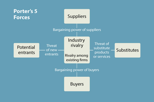
At the centre of the model is ’industry rivalry’. This relates to the extent of the existing competition in the markets in which the organisation conducts its business. At one extreme, markets can be very competitive – particularly when the products offered are identical (‘homogeneous’) in nature and when there are a large number of suppliers. In these circumstances, the organisation has little power to determine the market price of its products. The prices are set by the market as a whole and the organisation has to be a ‘price taker’, that is, accept the fact that it has to charge its customers the price currently prevailing in the market. Its ability to operate in this market, and to make sufficient profits to sustain it in business, will be dependent on its ability to contain business costs to a level below the income it receives from selling its products. Organisations operating in competitive markets cannot, therefore, be inefficient in managing their operations as there is no scope to pass on the cost of such inefficiencies to customers.
At the other extreme, the organisation may be a monopolist – the only supplier or one of only a very few suppliers (in that case: oligopolist) − of a particular product. Here, the organisation has considerable power in setting the market price of the product. Note, though, that in this environment the organisation’s power over the market is not total since, if it sets prices too high, some customers, at least, will forego the product as they may no longer be able to afford it.
So what has happened to the major UK supermarkets in recent years? Simply put, market entrants over the past decade have created more competition in the industry, resulting in lower profit margins for Tesco, Sainsbury’s and Morrisons.
4.4.1 Different decades, different returns
The past century has seen several dramatic changes in investment returns over medium- to long-term periods.
Set out in Table 4.6 are 11 periods going back over 100 years. For each of these, the average rate of price inflation for the period is provided and some details are given about the economic conditions prevailing together with other key developments affecting the financial markets.
| Period | Equities (shares) | Bonds (gilts) | Savings accounts | Price inflation (% per annum) | Events and economic background (primarily UK) |
|---|---|---|---|---|---|
| 1903–13 | 1.2 | Period of economic stability. | |||
| 1913–23 | 5.1 | First World War and post-war economic recovery. | |||
| 1923–33 | -2.1 | The 1920s boom followed by the Great Depression. | |||
| 1933–43 | 3.4 | Gradual economic recovery. Second World War and start of active government policies designed to manage economy. | |||
| 1943–53 | 3.6 | End of Second World War and post-war reconstruction. | |||
| 1953–63 | 3.0 | Post-war very steady (generally) economic recovery. | |||
| 1963–73 | 6.1 | ‘Stop-go’ economic policies. Inflation starts to climb. | |||
| 1973–83 | 13.3 | Economic chaos. High inflation, high unemployment, low economic growth. Oil prices surge. Industrial disputes. | |||
| 1983–93 | 5.0 | Inflation falls. Deregulation of financial markets. Privatisation of public utilities. House prices rise and then fall. | |||
| 1993–2003 | 2.6 | Dot-com bubble (and burst). Period of strong growth in economy in personal debt. | |||
| 2003–13 | 3.3 | 2000s boom ends in global financial crisis. Economies struggle to recover and government borrowing soars. |
Activity 4.4 Real investment returns
Have a go at completing the table. Alternatively you can download a PDF version . Using what you have learned so far about the drivers of investment returns, estimate, for each period, whether the real (post-inflation) return for each of the three categories of (UK) investments was positive (‘up’) or negative (‘down’). Note that in each period the direction of return was not always the same for each of the asset types.
Answer
What did you conclude?
The answers are in Table 4.7. Positive real returns are in italic, negative real returns are bold.
| Period | Equities (Shares) | Bonds (Gilts) | Savings Accounts | Price Inflation (% per annum) | Events and Economic Background (primarily UK) |
|---|---|---|---|---|---|
| 1903-13 | 3.3 | -0.2 | 1.5 | 1.2 | Period of economic stability. |
| 1913-23 | -1.3 | -3.1 | -1.5 | 5.1 | First World War and post-war economic recovery. |
| 1923-33 | 9.6 | 9.6 | 5.7 | -2.1 | The 1920s boom followed by the Great Depression. |
| 1933-43 | 3.2 | 0.5 | -2.4 | 3.4 | Gradual economic recovery. Second World War and start of active government policies designed to manage economy. |
| 1943-53 | 2.7 | -2.4 | -2.6 | 3.6 | End of Second World War and post-war reconstruction. |
| 1953-63 | 12.1 | -1.7 | 1.2 | 3.0 | Post-war very steady (generally) economic recovery. |
| 1963-73 | 1.5 | -3.7 | 0.5 | 6.1 | ‘Stop-go’ economic policies. Inflation starts to climb. |
| 1973-83 | 5.2 | 1.9 | -1.3 | 13.3 | Economic chaos. High inflation, high unemployment, low economic growth. Oil prices surge. Industrial disputes. |
| 1983-93 | 12.9 | 7.6 | 5.7 | 5.0 | Inflation falls. Deregulation of financial markets. Privatisation of public utilities. House prices rise and then fall. |
| 1993-2003 | 3.2 | 4.6 | 3.1 | 2.6 | Dot-com bubble (and burst). Period of strong growth in economy in personal debt. |
| 2003-13 | 5.0 | 2.5 | -0.5 | 3.3 | 2000s boom ends in global financial crisis. Economies struggle to recover and government borrowing soars. |
The answers are also in the table to download , colour coded in financial markets style. Positive real returns are blue, negative real returns are red.
Some of the key points that stand out from the data include:
- decades sometimes cover two major swings in economic activity – so it seems that returns are not aligned to the summaries in right hand column
- the reinforcement of the evidence on the outperformance of investments in shares over other asset classes
- the strong link between economic activity and returns on shares
- that shares look like the best bet to beat inflation.
One thing to note, though, is that some of the decades set out above covered periods when there were swings in the level of economic activity rather than one general trend. Consequently for these decades (for example, 1923–33, 2003–13), it may seem that the returns are not aligned to the summaries in the right hand column.
4.5 Week 4 quiz
Check what you’ve learned this week by taking the end-of-week quiz.
Open the quiz in a new window or tab then come back here when you’re done.
Week 4 round-up
We have once again covered a lot of ground this week, exploring investment practices, investment performance and lessons from recent investment history.
By examining the ways that investment performance is assessed we have seen what has to be done in the fourth ‘review’ stage of the investment management model.
Certainly the content of this week and last week constitute the most complex in this course. If you have got to grips with the array of theories and concepts presented and how these can be applied to investment management, you are now well positioned to make informed decisions about your own investments.
Don't forget to continue with Activity 2.4 and check the prices for the selected companies once a week and enter their level in the Market shares tracking worksheet. Remember, you can follow these shares using the BBC Market Data tool, or by picking up a newspaper which focuses on financial markets.
Next week, we focus on the key investment issue of pension planning. This is most important investment we make in life and understanding the pensions landscape is vital.
You can now go to Week 5.
Images
This free course was written by Martin Upton.
Except for third party materials and otherwise stated in the acknowledgements section, this content is made available under a Creative Commons Attribution-NonCommercial-ShareAlike 4.0 Licence .
The material acknowledged below is Proprietary and used under licence (not subject to Creative Commons Licence). Grateful acknowledgement is made to the following sources for permission to reproduce material in this unit:
Figure 3 © manley099 via iStockphoto.com
Figure 4 © scanrail via iStockphoto.com
Figure 5 © Biddiboo via Getty Images
Figure 7 All logos shown are Registered Trademarks or Trademarks of their respective companies
Figure 10 All logos shown are Registered Trademarks or Trademarks of their respective companies
Figure 14 © The Open University (Food rations and ration book - IWM/Three generations watching TV - GraphicaArtis/The Beatles - Bob Thomas/David Bowie as ‘Ziggy Stardust’ - Michael Ochs Archives/Duran Duran - Fin Costello/The Spice Girls - Photoshot – all via Getty Images
4.1 PUFin www.open.ac.uk/ pufin © The Open University
4.2.4 © The Open University
4.3.2 Bubbles video: contains licensed BBC and Getty clips
Every effort has been made to contact copyright owners. If any have been inadvertently overlooked, the publishers will be pleased to make the necessary arrangements at the first opportunity.
Don’t miss out:
1. Join over 200,000 students, currently studying with The Open University – http://www.open.ac.uk/ choose/ ou/ open-content
2. Enjoyed this? Find out more about this topic or browse all our free course materials on OpenLearn – http://www.open.edu/ openlearn/
3. Outside the UK? We have students in over a hundred countries studying online qualifications – http://www.openuniversity.edu/ – including an MBA at our triple accredited Business School.
References
Porter, M.E. (1979) ‘How competitive forces shape strategy’, Harvard Business Review , vol. 57, no. 2, pp. 137–45.
Porter, M.E. (1996) ‘What is strategy?, Harvard Business Review , vol. 74, no. 6, pp. 61–78.
Porter, M.E. (2008) ‘The five competitive forces that shape strategy’, Harvard Business Review , vol. 86, no. 1, pp. 78–93.
Sloan, A. (2004) IPO’s success doesn’t justify Google’s price [Online]. Available at www.washingtonpost.com/wp-dyn/articles/A27391-2004Aug23.html (Accessed 28 February 2005).