More working with charts, graphs and tables
Use 'Print preview' to check the number of pages and printer settings.
Print functionality varies between browsers.
Printable page generated Saturday, 20 April 2024, 12:22 PM
More working with charts, graphs and tables
Introduction
At some point in everyday life, it’s likely that you’ll come across information represented in charts, graphs and tables. It can be very useful to know how to interpret this information, and in other circumstances, to present your own findings in this way. This course will help you to develop the skills you need to do this, and gain the confidence to use them.
This course builds on our other course Working with charts, graphs and tables, but you are not required to study that one before this one.
Find out more about studying with The Open University by visiting our online prospectus.
Learning outcomes
After studying this course, you should be able to:
reflect on the reasons for needing to improve skills in using charts, graphs and tables
understand the following mathematical concepts and how to use them, through instruction, worked examples and practice activities: reflecting on mathematics; tables; line graphs; bar charts and histograms; pie charts; analysis
draw on a technical glossary, plus a a list of references to further reading and sources of help.
1 Getting the most from charts, graphs and tables
Do you sometimes feel confused about how to create a chart, graph or table?
Are you not always sure which of these to choose to illustrate your set of data?
Why do we produce charts, graphs and tables anyway?
Spend a few minutes writing down what you think are the reasons why we choose to present data in this way before you read on.
One student has said:
If an exam or assessment question asks me to draw a chart or a graph, my heart sinks. I don't like tackling tables either. I only ever draw a graph if I absolutely have to.
This course assumes that you have some experience in drawing conclusions from tables and graphs, understanding basic statistics and answering questions associated with charts, graphs and tables. The basics are covered in our other course, Working with charts, graphs and tables, but it is not essential to have read it before you start this course.
On any one day, if you look at a selection of newspaper or magazine articles, you will find that a number of them include a chart, graph or table. This is because a chart, graph or table is a way of making some information that the author wishes to convey to the reader more obvious. Charts and graphs are generally used to help illustrate the point that the article is trying to make, whereas a table is a useful way of presenting a lot of data in a clear and organised manner. All three can provide a summary of the situation under discussion so that even if the person looking at the article doesn't actually read all of it they can still get a feel for the argument that the author is presenting.
If you are a student, the number of charts, graphs and tables that you will be asked to create will depend on your course. Many courses do not require you to do this at all, but others will expect you to be able to produce a chart, graph or table if necessary. Some courses with little mathematical, scientific or technical content still require you to analyse data presented in one or other of these forms and draw conclusions from them. This course is primarily aimed at those who are not confident about their ability to do these tasks and who wish to develop these skills.
This is a practical course. Section 2 first asks you to reflect on why you decided to study this course and what you hope to gain from it, which may vary widely depending on your circumstances. Sections 3–6 respectively look at creating tables, line graphs, bar charts and histograms, and pie charts. Section 7 is on analysing data. There is a technical glossary, and also some suggestions for further sources of help.
We anticipate that after you have worked through this course you will feel more confident about your abilities to produce charts, graphs and tables and to analyse data. Remember, though, that things do not happen instantly and that, as with any skill, it often takes time and practice to master it completely. If this course gives you a better understanding of how to present data, then it will have achieved its aim.
2 Reflection on mathematics
You will have decided to study this course for your own reasons. We imagine that a common reason will be a lack of confidence in numerical work. However, we do not want to take this for granted. We have written this section to help you to look at your reasons, so that you can make plans to improve on one or more areas of mathematics and consider how you can work on the areas that you need to.
Activity 1
Before you start to work through the course itself, spend a few minutes thinking about why you felt that this course would be helpful. In particular, answer the following questions.
-
What made me decide to look for help?
-
Why did it sound as if it would be useful?
-
What do I hope to gain by studying this course?
Don't spend too long on answering these questions. We suggest that you write down your answers before you look at our suggestions, and keep your answers to return to later, after you have done some work on the course. Brief notes are enough. It should take you no more than 15–20 minutes at most.
Discussion
The ideas below may be similar to yours or you may find them useful to add to your own. Your answers may be completely different, of course, and we are not suggesting that these are the ‘right’ ones – but we hope that they might act as a trigger for you to think about other things.
-
What made me decide to look for help?
There are, of course, many reasons why people decide to look for help. It depends on your ability and confidence in numerical work. We have spoken to some OU students and asked them this question, and some of their responses are given below.
I am constantly worried about the use of maths – I always presume that I will get simple problems wrong if numbers are involved.
I am aware that presumed difficulties with maths prevent me from attempting certain aspects of the course. Basic skills could help my confidence, though I feel it may be too late to start.
I am aware of an in-built resistance to doing anything involving figures!
-
Why did it sound as if it would be useful?
This may be more difficult to answer. It may be that you have studied our other course on charts and found it helpful. It may be that you feel that you understand a little about analysing and presenting data, but you are concerned that this may not be enough for your needs.
You may feel that you need all the help that you can get and simply hope that this will be useful in some way that you can't yet define. We believe that the more you can decide on this sort of question at this stage, the more likely you will be to gain from studying this course.
-
What do I hope to gain by studying this course?
This depends very much on the reasons why you chose to study this course. However, you might have included things like the students quoted below.
I can't draw graphs at all and this material looks as if I will need to do this. I want to improve my confidence, and feel that I am doing it right, instead of worrying about it.
I am not very confident with drawing graphs and pie charts, and I have a presentation to do soon.
I can handle tables, graphs, and bar charts and analyse them – I am just not interested in producing them. That must go back to early home background, I think. I am coming up to a section of my course where we are doing this, though, and I know that I need to learn.
I am not very confident with statistics, and I know that I will need this for the next TMA.
If you're a student, one reason that you are likely to be interested in this course is that you realise your modules will require you to carry out some calculations and you don't feel very confident about this. The next activity asks you to think about the use of mathematics in your current module. If you haven't started this yet, skip Activity 2 for the moment and come back to it once you have made a start on your course.
Likewise, if you are not a student, you can simply skip this activity completely.
Activity 2 (Part 1)
Courses vary enormously in terms of their mathematical content and in this activity we suggest that you spend some time looking at your own course to gain an idea of the sort of mathematical knowledge needed.
To begin with, look at a course or block of your course and try to identify what the outcomes of that part of the course are. Different courses have different layouts: you may find the outcomes at the end of units, or in an Assignment Booklet, the Course Guide or separate block guides. Once you have found the outcomes, decide which of them are to do with mathematical understanding, knowledge or skills. For example: they may say that you will be able to understand a particular concept, that you will be able to read and understand mathematics from tables, or that you will be able produce graphs and/or tables. Now make a list of the mathematics that you are being asked to learn. (You might need to clarify this with your tutor if you aren't sure about what is required or if numerical work is not mentioned. It may be that the ability to draw charts or graphs is assumed by the Course Team, but your tutor will know this.)
Next, look at the assessment for that part of the course. It may include a tutor marked assignment (TMA), computer marked assignment (CMA), an examinable component or a specimen exam paper, depending on what stage you have reached in the course. Identify what specific mathematical understanding, knowledge or skills form part of the assessment. For example, your course may include project work as part of the assessment. This might include some form of quantitative assessment, perhaps presenting figures in charts or graphs once you have collected them.
Discussion
You should now have two lists, one of mathematical topics that are covered in that part of the course, and one of mathematical skills that are assessed. If you aren't sure about these, then you may need to either look at the block or course in more detail, or talk to your tutor or other students.
Activity 2 (Part 2)
Once you have made your lists, you need to decide on priorities. We suggest that you:
-
decide on the areas that you need to learn;
-
make a list of these areas in order of priority (the areas may be, for example, mathematical concepts that you need to learn because they are needed for the course assessment);
-
decide to tackle the one that you need to do in the short term as the first priority, then move on to others;
-
check the rest of this course, to see if what you need is covered directly;
-
identify any areas not covered in this course.
Discussion
Once you have made a list of those mathematical aspects that you need to learn and listed them according to priority, don't be discouraged if there seems to be quite a lot that you need to do. This can be off putting, and you might feel that you want to give up, but by preparing a prioritised list you should be able to see what you need to tackle most urgently, and make a plan for that first. Then you can come back to the rest when you need to.
This course may directly cover your priority areas. If it does, then we suggest that you turn first to the relevant part or parts in Sections 3–7. If it doesn't, try the list in Section 9 ‘Further reading and sources of help’.
What we have asked you to do in this section is to look at your experience of numerical work in the context of your current circumstances, as well as in the past. As you can see from the quotes we have given, other people feel unsure about their use of mathematics. But now you are ready to look at the rest of the course and to move on to some practical work on your areas of concern.
3 Tables
3.1 What is a table?
A table should provide a clear summary record of a collection of data. Tables have a number of columns and rows, depending on the amount of data and the detail shown.
Tables are a very common way of putting information across to people, so common that we probably don't notice that they are there most of the time. On the other hand, they can look quite formidable when there is a lot of information presented at once, and finding your way around them can be hard. To be easy to read, all tables must have a title and sub-headings. Often, the text around the table will have details of where the information in the table has come from.
3.1.1 When are tables used?
Within your course, tables are likely to be used as a particular structured format to summarise numerical information. They tend to be used to present data as a summary and as a starting point for discussion. But someone always prepares tables. So always be aware of where the table that you are looking at has come from. Could the source be trying to tell you something in particular? For example, if a table were summarising the costs of running a hospital, would you expect figures from the government or the local administrators to be more accurate? Why is that?
3.1.2 When is a table not a good format to use?
There are very few cases where a table will be the worst format to use. However, when you have a huge amount of data, you may wish to present some of it in a different format. Other formats for presenting data are explained in Sections 4–6.
3.1.3 How do I design a table?
If you're a student, you are likely to present data in a table after you have carried out an investigation, particularly when you are writing up the report. Some courses include a small-scale project and this is likely to be the point at which knowledge of how to design a table will be useful. The following steps form a reliable guide.
-
Collect the data.
In the case of a project, you are likely to collect the data yourself, possibly from other written sources (in which case, these should be acknowledged). Alternatively, you may have been presented with data and asked to design a table.
-
Decide on a clear title.
As with all forms of representation, a clear title is crucial in representing your work accurately. It should be decided on early so that you remain clear about the information you wish to show.
-
Decide on the data to be presented.
You need to be able to present data so that there is a helpful amount for someone to follow. More than about eight columns is likely to be rather overwhelming and make it difficult to reach conclusions from the figures.
-
Decide on the number of rows and columns.
This depends on what you are trying to show in the table. Generally, the more columns there are, the fewer rows; and vice versa. Otherwise, the table may be unwieldy.
-
Decide on the row and column headings.
Do not be afraid to use simple headings that follow from the nature of your data and what your table is showing. Titles for column and row headings should be clear and unambiguous (like the title).
-
Draw the table outline.
3.2 Tables: Activities
Activity 3
Imagine that you have been asked to investigate population growth in the EU. You might be considering the details of population growth or you may be thinking about representing the reasons for population growth.
Follow the steps in Section 3.1 to design and draw a table outline. Try to think briefly about aspects of population growth that might be represented before you follow the example in the discussion below. Remember that you are thinking about the design of a table here, you do not need to complete the table with data.
Discussion
-
Collect the data.
You would probably want to find data on population numbers, perhaps over a five- or ten-year period. You might also consider numbers of children that women in each country might have, and information about mortality rates either among children or across all age ranges. You might consider emigration, immigration and population growth estimates. You may have thought of other things as well; these are only a guide.
-
Decide on a clear title.
In this case, it could be either ‘Population growth in the EU’ or ‘Reasons for population growth in the EU’, depending on the approach that you wish to take.
-
Decide on the data to be presented.
What do you want the table to represent? How complex does it need to be in the context of your imaginary investigation?
You might decide, for example, that a simple table of data about the population size ten years ago, today and an estimate for ten years’ time (for each EU country) would be enough.
Alternatively, you might decide on something much more complex and look at all of the issues suggested above. If you do this, you need to decide on the format of the data. You would want something that makes comparisons easy, so you could think about using information in a ‘rate per 1000’ format. For example, the number of children who die before the age of three, per 1000 born.
-
Decide on the total number of rows and columns.
There will be sixteen rows (one for the headings and one for each of the fifteen EU countries at the time of writing). There will be four columns (one for the list of countries and one for each set of population figures).
-
Decide on the row and column headings.
For the simple table ‘Population growth in the EU’, the EU countries column can be headed ‘Country’, the ten-year-old data column headed ‘Population in 1989 (thousands)’, the current data column headed ‘Population in 1999 (thousands)’ and the predicted data column headed ‘Population in 2009 (thousands) (Estimated)’. Each row starts with the name of an EU country.
-
Draw the table outline.
| Country | Population in 1989 (thousands) | Population in 1999 (thousands) | Population in 2009 (thousands) (Estimated) |
|---|---|---|---|
| Austria | |||
| Belgium | |||
| Denmark | |||
| Finland | |||
| France | |||
| Germany | |||
| Greece | |||
| Irish Republic | |||
| Italy | |||
| Luxembourg | |||
| Netherlands | |||
| Portugal | |||
| Spain | |||
| Sweden | |||
| United Kingdom |
This table design is easy to understand and clearly labelled. If it were in a project, it would be easy to see whether or not you had carried out the investigation that you were asked for.
Activity 4
Now try an example of your own. Imagine that you have been asked to measure the pulse rates of three volunteers on ten occasions, at five-minute intervals and design a table to show the results. As with the example above, you aren't expected to find the data that would go into the table, just to design an appropriate table in outline. Use the same six steps again.
Discussion
-
Decide on a clear title.
‘Measurement of pulse rates for three volunteers on (date)’.
-
Collect the data.
You will have three sets often measurements, one each for Person A, Person B and Person C.
-
Decide on the data to be presented.
You will be able to present all the data here, as there will be enough space.
-
Decide on the total number of rows and columns.
There will be eleven rows, one for the column headings and ten for the measurements. There will be a column for the number of the measurement, and then one each for Persons A, B and C. Therefore, there will be four columns in all.
-
Decide on the row and column headings.
Column headings: ‘Measurement number’, ‘Person A’, ‘Person B’, and ‘Person C'; rows will be numbered from 1 to 10.
-
Draw the table outline.
| Measurement number | Person A | Person B | Person C |
|---|---|---|---|
| 1 | |||
| 2 | |||
| 3 | |||
| 4 | |||
| 5 | |||
| 6 | |||
| 7 | |||
| 8 | |||
| 9 | |||
| 10 |
4 Line graphs
4.1 What is a line graph?
This section covers line graphs. We define the format, give some ideas about when it should be used, and draw some graphs. You can have a go at drawing a line graph in Activity 6, based on data that we supply.
A line graph, at its simplest, is a diagram that shows a line joining several points, or a line that shows the best possible relationship between the points. Sometimes the line will go through all of the points, and sometimes it will show the best possible fit. The line does not have to be a straight one; it can be a curve, though the techniques for drawing curved line graphs are beyond the scope of this course.
4.1.1 When are line graphs used?
A line graph shows a relationship between two variables. In other words, it shows how one thing varies by comparison to another. For example, a distance-time graph shows distance varying against the time of day, or the start time of a journey. The distance increases when a vehicle is moving but remains the same when the vehicle is stationary.
4.1.2 When is a line graph not a good format to use?
When you have a large amount of data without an obvious link. For example, when your data shows shares of a whole, in which case, you would use a pie chart.
4.1.3 How do I draw a line graph?
The process is as the steps below outline.
-
Collect the data.
In other words, decide on the data that you wish to represent and collect it in a format that shows one value being compared with another.
-
Decide on a clear title.
You may be able to use the heading of a table from which you are getting data. Alternatively, you may need to define the title yourself.
-
Decide on the values that you wish to show on the horizontal axis and on the vertical axis.
When you are showing a relationship between two sets of values, one set always depends on the other and is called the dependent data. The set of values that is depended on is called the independent data. Line graphs are drawn so that the independent data are on the horizontal axis and the dependent data are on the vertical axis.
Consider, for example, the growth (i.e. increase in height) of a tree over time or sales of washing powder over time. In these cases, both growth and sales depend on time. So, in both cases, time is the independent data and would be plotted on the horizontal axis; tree height or sales figures would be plotted on the vertical axis.
Axes must always be clearly labelled.
-
Decide on the scale.
This can make a surprising difference to the way that the data looks. Normally, you should begin the vertical axis from zero.
-
Plot the graph.
It is most usual to use graph paper to do this; although you may decide to use a computer. The level of accuracy depends on what is required. A sketch needs to be much less accurate, although it will still need a title and labels for the axes.
4.2 Line graphs: Activities
Activity 5
Line graphs are commonly used to show a direct relationship between data. For example, graphs for conversions between one amount and another, such as degrees Celsius and degrees Fahrenheit.
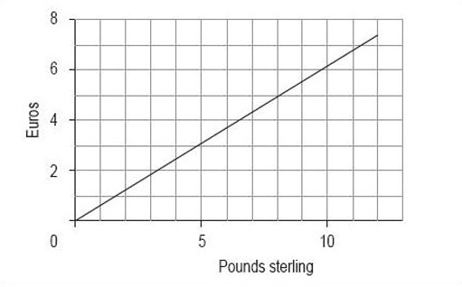
You should now follow our calculation of a line graph from the information in Table 1.
| Currency | Equivalent units | ||||||
|---|---|---|---|---|---|---|---|
| £ | 1 | 2.5 | 4 | 7 | 8.6 | 10 | 12 |
| euro (to 3 d.p) | 0.623 | 1.555 | 2.488 | 4.354 | 5.349 | 6.220 | 7.464 |
-
Collect the data.
The data is given in Table 1.
-
Decide on a clear title.
Conversion of pounds sterling to euros (February 2000).
-
Decide on the values that you wish to show on the horizontal axis and the vertical axis.
As this is a conversion from pounds to euros, the number of euros is dependent on the number of pounds. Therefore, euros are the dependent values and pounds are the independent values, so you should plot pounds on the horizontal axis and euros on the vertical axis. Remember to label the axes clearly.
-
Decide on the scale.
Given the data, it looks sensible to begin both axes from zero. The horizontal axis needs to go up to at least 12, so a sensible scale is 0 to 13 in steps of one. The vertical axis needs to go up to almost 8, so a likely scale is 0 to 8 in steps of one.
-
Plot the graph (Figure 1).
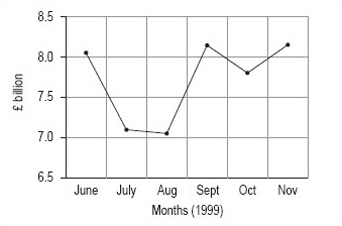
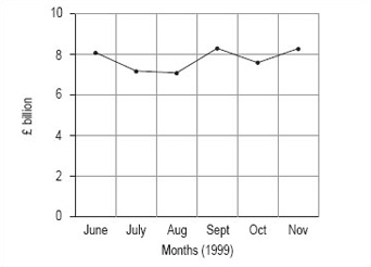
Activity 6
When line graphs are drawn, the scale can often be misleading. Sometimes the graph seems to show something rather different from the data. This may be deliberate, to make a point, but sometimes it is accidental, perhaps because the author does not understand the best way to draw a graph.
To show you what we mean, we would like you to use the data in Table 2 to draw two line graphs – both for the total turnover from June to November 1999, but one with the vertical axis starting at £6.5 billion and the other with it starting at zero.
| 1999 | Total turnover (£ billion) | Home turnover (£ billion) | Export turnover (£ billion) |
|---|---|---|---|
| June | 8.1 | 4.6 | 3.5 |
| July | 7.2 | 4.2 | 3.0 |
| August | 7.1 | 4.2 | 2.8 |
| September | 8.3 | 4.8 | 3.5 |
| October | 7.6 | 4.4 | 3.2 |
| November | 8.3 | 4.9 | 3.5 |
Discussion
-
Collect the data.
You have the data in the table, and you wish to show total turnover against time.
-
Decide on a clear title.
In this case, the heading of Table 2 seems to be suitable.
-
Decide on the values that you wish to show on the horizontal axis and the vertical axis.
The independent variable in this case is time, so you need to plot it on the horizontal axis. As the data in Table 2 is in months, use these for the graph. The dependent value is the total turnover, so you need to plot it on the vertical axis, in £ billion. Remember to label the axes.
-
Decide on the scale.
You should use months on the horizontal axis in both line graphs. In the first line graph, you should start the vertical axis at 6.5, just below the minimum value; in the second line graph, you should start the vertical axis at zero.
-
Plot the graph.
Using 6.5 as the starting point on the vertical axis, your graph should look like Figure 2.
Using zero as the starting point on the vertical axis, your graph should look like Figure 3.
Activity 7
What difference can you see between the two graphs you drew in Activity 6?
Discussion
The obvious difference is that change between the months seems to be much greater in the graph where the vertical axis starts at £6.5 billion. This is because the total scale on the vertical axis is much smaller than in the second graph, where the vertical axis starts at 0. If you wished to use the line graph to show that turnover is fluctuating strongly, you might prefer to use the first graph, whereas if you wished to suggest that the fluctuations were not overly strong, you might prefer the second graph.
Take a look around you at the line graphs (and other graphs and diagrams) that you see, and notice how many of them have a particular emphasis because of a misleading use of scale.
5 Bar charts and histograms
5.1 Bar charts
5.1.1 What is a bar chart?
A bar chart is a diagram in which the numerical values of the different variables are represented by the height or length of lines or rectangles of equal width. The bars or lines can be drawn vertically or horizontally.
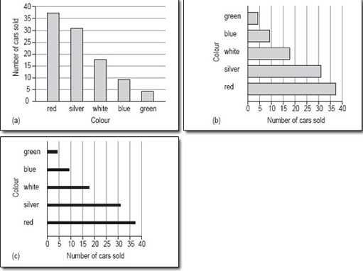
Figure 4 shows three bar charts illustrating the same data: the first has vertical bars, the second horizontal bars and the third has lines instead of bars.
5.1.2 When are bar charts used?
A bar chart is a good method of representation if you want to illustrate a set of data in a way that is as easy to understand as it is simple to read. In general, a bar chart should be used for data that can be counted so, for example, we could use a bar chart to show the number of families with 0, 1, 2 or more children. A bar chart could also be used to show how many people in one area use each of the different modes of transport to get to work.
Bar charts are very useful for comparing two or more sets of data, as you will see later. For example, the popularity of different modes of transport in two cities, or from one year to the next.
5.1.3 When is a bar chart not a good format to use?
A bar chart is not the best way to show the link or mathematical relationship between two sets of data, for this you would use a line graph.
5.1.4 How do I draw a bar chart?
First, you need to decide what it is you want your chart to illustrate. This may be governed by the data you have access to or you might need to collect the data yourself. Then the process is as below.
-
Decide on a clear title.
The title should be a brief description of the data that you want to show.
-
Identify how many bars are needed.
The bars correspond to the number of categories you have. For instance, if you are looking at modes of transport then you might need six bars covering car, bus, train, motorbike, cycle or walk. A chart about the number of children per family might have eight bars for 0, 1,2, 3, 4, 5, 6 and 7 or more.
Bar charts can be drawn using either horizontal or vertical rectangles or lines. There are no rules governing which to use, but if the labels for the categories are quite long, they will be easier to read if the bars are on the vertical axis.
-
Identify the scale you need for the other axis.
Look at each category and decide which is the largest; the other axis has to go up to at least this value. You might also find it useful to check the value of the smallest category, so that you choose a scale to accommodate all the values. The scale should start at zero.
-
Draw and label the two axes.
The labels should be simple and as clear as possible. The units should also be shown, if appropriate.
-
Add the bars.
In a bar chart, strictly speaking, the bars should not touch; each one should be a separate rectangle. The gap between the rectangles or lines serves to show that the categories are distinct. You can use a solid line instead of a rectangle or bar, but you will not see this type of bar chart very often.
Activity 8
You should now follow our calculation of a bar chart from the information in Table 3.
| Mode of transport | Km |
|---|---|
| walk | 244 |
| local bus | 297 |
| rail | 336 |
| cycle | 44 |
-
Decide on a clear title.
The title of Table 3 is appropriate.
-
Identify how many bars are needed.
There are four categories here, so you need four bars covering local bus, rail, cycle and walk.
Given the short labels that will be needed for the bars, they could easily go on the horizontal axis.
-
Identify the scale you need for the other axis.
The scale to cover the distances is quite considerable: its highest value must be at least 336 and if possible, it should start at zero. If the bars are on the horizontal axis, the distance scale will be on the vertical axis.
-
Draw and label the two axes.
The labels are simply ‘Kilometres’ or ‘Km’ for the vertical axis and ‘Mode of transport’ for the horizontal axis.
-
Add the bars.
Remember to keep the bars separate and to label each one clearly (Figure 5).
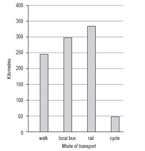
Discussion
This bar chart has been drawn using vertical bars or rectangles and with a vertical scale of 0–400 in steps of 50. The order of the bars reflects the order in which the categories were given in the data table, but many people would have chosen to put the bars in order of size, either descending or ascending. Generally speaking, unless the order is obvious from the categories, for example different years, it doesn't matter what order you use.
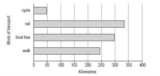
This bar chart could also be drawn with horizontal bars as in Figure 6.
As you can see, it is not possible to use either of these charts to read off accurate figures for the number of miles travelled per person per year using any of the modes of transport shown. However, both charts give a good idea of the approximate number of miles travelled using each mode of transport and show how each of the modes of transport compare.
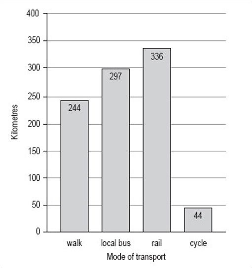
If it is important that the reader knows exactly what the distances are, either the scale should be such that the values can be read off accurately (this is not always practical or possible) or the values should be inserted at the end of each of the bars (Figure 7).
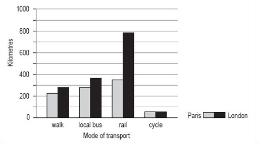
Bar charts can be used to compare two sets of data. Suppose you wanted to compare the data for average distances travelled per person per year in Paris with similar data for London (shown in Table 4).
| Mode of transport | Km |
|---|---|
| walk | 281 |
| local bus | 353 |
| rail | 784 |
| cycle | 45 |
By following the same steps with the London data as with the Paris data, you could put both sets of bars on the same graph, but note that you would need to change the scale on the vertical axis to accommodate the much greater distance travelled by rail in London. The bar chart comparing the two sets of data looks like Figure 8.
Activity 9
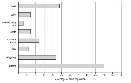
Now try drawing a bar chart using the same steps and the information in Table 5.
| Cultural event | percentage of the adult population (attending regularly or occasionally) |
|---|---|
| plays | 24 |
| ballet | 7 |
| contemporary dance | 3 |
| opera | 7 |
| classical music | 12 |
| jazz | 6 |
| art gallery | 22 |
| cinema | 50 |
The most popular activity is going to the cinema; going to a play and visiting an art gallery are the next most popular activities.
Discussion
-
Decide on a clear title.
The title of this bar chart can be the same as that of Table 5 ‘Attendance at cultural events in Great Britain, 1993–94’.
-
Identify how many bars are needed.
There are eight categories listed in Table 5, so you need eight bars. We have chosen to draw this bar chart with horizontal bars as this makes it easier to read the different types of cultural event.
-
Identify the scale you need for the other axis.
The largest percentage is 50% and the smallest is 3%, so the scale on the horizontal axis could go from 0 to 60 in steps of 5.
-
Draw and label the two axes.
The horizontal axis should be labelled ‘Percentage of adult population’ but the vertical axis probably doesn't need a label, as the categories are self-explanatory.
-
Add the bars.
The bars for the categories can be given in the order listed or you could put them in order of popularity.
Your bar chart should look like Figure 9.
5.2 Discrete and continuous variables
You may have been wondering why bar charts are generally drawn with separate bars. There is a reason for this and to discover what it is, you need to look at the nature of the categories of data being used.
5.2.1 Discrete variables
The charts about different modes of transport and that on attendance figures at a range of cultural events all use what might be called ‘word categories’. Each category (e.g. bus, rail, cycle, and walk) is quite distinct from any other in the set of categories. Such distinct categories are known in mathematics as ‘discrete variables’.
Word categories are not the only type of variable that is discrete; numbers can also be discrete. For example, at the beginning of this section, we mentioned that you could use a bar chart to plot the number of families with 0, 1, 2 or more children. Here, the number of children in a family is a discrete variable. So too are the number of goals scored per match by a football team, and the number of bedrooms in a house. Bar charts are normally drawn with separate bars in order to emphasise the discrete nature of the data.
Discrete variables often relate to counted items.
5.2.2 Continuous variables
Not all numbers are discrete. Consider the following measurements:
-
times to run a marathon
-
temperatures recorded at intervals during a day
-
weight of each bunch of grapes sold at a supermarket yesterday.
Time, temperature and weight are all examples of numerical data, but there is not a restricted set of values that they can take. Whereas you can have 2 or 3 children in a family but not 2.5, with temperature it is possible to have not only 22 °C and 23 °C but also 22.1 °C, 22.25 °C, 22.97 °C as well. This type of variable is restricted only by the accuracy with which the measurement can be made. Such variables are known as ‘continuous variables’.
Continuous variables often relate to measured items.
Activity 10
Consider a randomly selected group of students living in the UK and continental Western Europe. You could collect information about, say, their hair colour and their occupation. What other characteristics of this group could you collect information about?
Discussion
Here is our list, you may be able to think of others: sex, age, height, number of children, weight, shoe size, year of birth, nearest city, colour of eyes, first language, country of birth. Each of these characteristics or variables will produce different sets of data, and each member of the group of students is likely to be different from at least one other member of the group for each of these variables. Some variables will have very few categories (e.g. sex has only two: male and female) and others too many to list (e.g. nearest city could include any city in Europe).
Activity 11
Now look at your list of variables for the students living in the UK and continental Western Europe and decide which are discrete and which are continuous.
Discussion
Here is our list:
-
discrete variables
-
sex
-
number of children
-
shoe size
-
nearest city
-
colour of eyes
-
first language
-
country of birth
-
year of birth
-
-
continuous variables
-
age
-
height
-
weight.
-
You might have found it difficult to decide where to put the variable ‘year of birth’. A year is a measurement of time and could be considered as a continuous variable. However, it is usual to consider a year as a whole number and record information relating to a complete year, which is why we have listed ‘year of birth’ as a discrete variable. There are no hard and fast rules about this; you will find the variables ‘year’ and ‘year of birth’ considered as both discrete and continuous variables.
5.3 Histograms
5.3.1 What is a histogram?
The simplest definition of a histogram is that it is a bar chart with the adjacent bars touching each other. Unlike a bar chart, histograms are usually drawn only with vertical bars. Generally, histograms are used to illustrate continuous data whereas bar charts are used to illustrate discrete data (distinct categories).
5.3.2 When are histograms used?
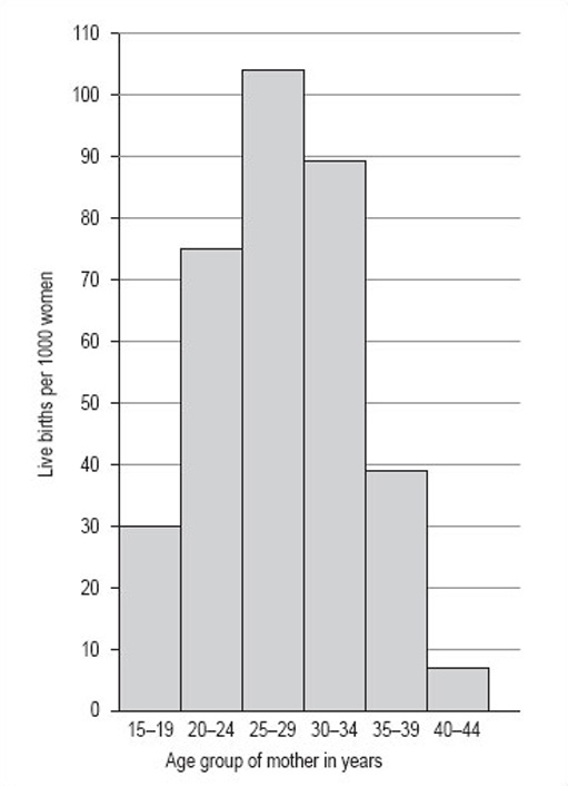
A histogram is also a good method of representation if you want to illustrate a set of data in a way that is as easy to understand as it is simple to read. A histogram should be used for data that is continuous or has been measured on a continuous number scale. For example, you could use a histogram to show the number of live births by age of the mother or the pulse-rates of a group of 100 students (Figure 10). The pulse-rates have been grouped into intervals of 5 and represent values from 55 to 104 beats per minute.

5.3.3 When is a histogram not a good format to use?
A histogram is not the best way to show a link or mathematical relationship between two different sets of data.
5.3.4 How do I draw a histogram?
The method for drawing a histogram is very similar to that for a bar chart, but with the important difference that the bars or rectangles touch.
-
Decide on a clear title.
The title should describe the data you want to illustrate.
-
Identify how many bars are needed along the horizontal axis.
The bars correspond to the number of categories you have. Most histograms have intervals that are the same size but occasionally you may be asked to draw one with intervals of differing sizes. It is very important that you always check the size of each interval, as the width of each rectangle should correspond to its interval size. The histogram showing pulse rates (above) has equal intervals of 5.
-
Identify the scale you need for the vertical axis.
The size of the largest category determines what value the vertical scale needs to go up to. It is usual to then mark off intervening values at regular intervals on the vertical axis. However, the size of these regular intervals will probably be determined by the sizes of the other categories. The scale should start from zero.
-
Draw and label the two axes.
The labels should be simple and as clear as possible. The units should be shown, if appropriate.
-
Add the bars.
The bars of a histogram touch each other but should be visually distinct. This serves to illustrate that the data is continuous and is divided into a number of related categories.
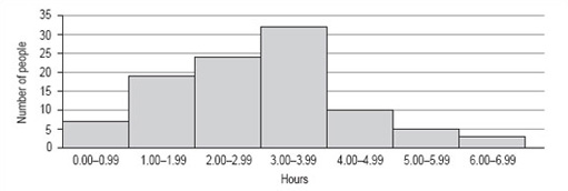
Activity 12
You should now follow our calculation of a histogram from the information in Table 6.
100 people were asked to record exactly how much time they spent watching television during one particular weekend in June. The results are given in Table 6, which is untitled.
| Hours | Number of people |
|---|---|
| 0.00–0.99 | 7 |
| 1.00–1.99 | 19 |
| 2.00–2.99 | 24 |
| 3.00–3.99 | 32 |
| 4.00–4.99 | 10 |
| 5.00–5.99 | 5 |
| 6.00–6.99 | 3 |
-
As the title should describe the data, we chose ‘Number of hours of television watched by 100 people’. This title would fit both Table 6 and the histogram we want to draw.
-
There are seven categories, so we need seven bars along the horizontal axis. The intervals are all the same size.
-
The scale for the vertical axis depends on the number of people in each category: the smallest number is 3, the largest is 32, so the scale can run from 0 to 35 in intervals of 5.
-
The vertical axis should be labelled ‘Number of people’ and the horizontal axis ‘Hours’.
-
The bars are all the same width (because the intervals on the horizontal axis are all the same) and should touch each other (Figure 11).
Activity 13
Now try drawing a histogram using the same steps and the information in Table 7 (untitled). The data in Table 7 is from 1997 and gives the number of live births per 1000 women in the UK.
| Age group of mother in years | Live births per 1000 women |
|---|---|
| 15–19 | 30 |
| 20–24 | 75 |
| 25–29 | 104 |
| 30–34 | 89 |
| 35–39 | 39 |
| 40–44 | 7 |
Discussion
The title of this histogram is not as obvious as you might think. You could go for ‘Number of live births by age of the mother in the UK in 1997’ or ‘Age-specific birth rates in the UK in 1997’. We chose ‘Live birth rates in the UK in 1997’.
There are six intervals, each spanning 5 years, which means that each of the six necessary rectangles should be the same width. Note, for example, that the 15–19 interval includes those mothers who have just turned 15 up to those who are about to turn 20.
The largest number of live births per 1000 women is 104 and the smallest is 7. This would suggest a scale that goes from 0 to 110 in steps of 10.
The axes should both be long enough for the chart to be easily read. The longer the vertical axis, the more accurately the height of the rectangles can be judged. The horizontal axis should be labelled ‘Age group of mother in years’ and the vertical axis, ‘Live births per 1000 women’.
The bars should be in order of ascending age. Your histogram should look like Figure 12.
6 Pie charts
6.1 What is a pie chart?
A pie chart is a circular chart (pie-shaped); it is split into segments to show percentages or the relative contributions of categories of data.
6.1.1 When are pie charts used?
A pie chart gives an immediate visual idea of the relative sizes of the shares of a whole. It is a good method of representation if you wish to compare a part of a group with the whole group. You could use a pie chart to show, say, advertising income, or market shares for different brands, or different types of sandwiches sold by a store. Pie charts don't give very detailed information, but they do give a quick overall impression of your results. You can add more information into pie charts by inserting figures into each segment of the chart, or by giving a separate table as a reference. Pie charts are also useful for comparing two different things. For example, the share of goods that different supermarkets sell.
6.1.2 When is a pie chart not a good format to use?
A pie chart is not a good format for showing increases and decreases, numbers in each category, or direct relationships between numbers where one set of numbers depend on another. In the last case, a line graph would be a better format to use.
6.1.3 How do I draw a pie chart?
You must have data for which you need to show the proportion of each category as a part of the whole. Then the process is as below.
-
Collect the data so the number per category can be counted.
In other words, decide on the data that you wish to represent and collect it all together in a format that shows shares of the whole.
-
Decide on a clear title.
The title should be a brief description of the data that you wish to show. For example, if you wish to show market share of brands of washing powder, you could call the pie chart ‘Percentage market share of named brands of washing powder in the UK in (date)’.
-
Decide on the total number of categories.
In other words, identify the categories that you will use. For example, with washing powder, there may be dozens of brands on the market, but most of the share of the market will be held by, say, half a dozen brands. Therefore, you might decide on those six along with a category called other. It depends very much on what you are trying to show, but pie charts are likely to be clearest with no more than eight categories.
-
Calculate the degree share in each category.
First, add up the total number of instances that you have. For example, in the case of washing powders, the total number of instances might be the number of units sold in a year, so the share of the whole for each category would be the number of units sold in that category. To calculate degree share, you need to divide the share that the category has by the total units and then multiply by 360 (there are 360 degrees (°) in a circle).
So, if there are 200 units in all, and:
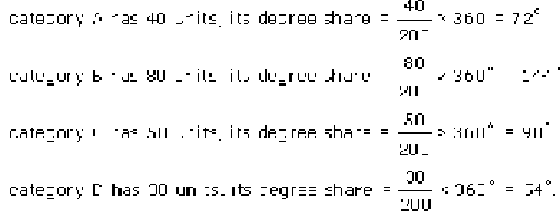
-
Make a final check that the number of degrees adds up to 360, then draw the pie chart.
6.2 Pie charts: Activities
Activity 14
To see what we mean, you should follow our calculation of a pie chart using the data in Table 8.
| Race | Number of people (thousands) |
|---|---|
| African–American | 1756 |
| Asian, Pacific Islander | 322 |
| Caucasian | 9511 |
| Native American | 25 |
| total population | 11614 |
-
Collect the data so the number per category can be counted. Table 8 shows the data.
-
Decide on a clear title.
Title: ‘1992 Illinois population by race (thousands)’.
-
Decide on the total number of responses.
The number of categories is four (the four races).
-
Calculate the degree share in each category.
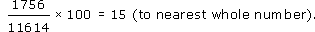
As an example, here is the calculation of the degree share for African-Americans:
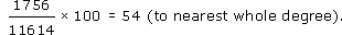
The degree share for each category is shown in Table 9.
Alternatively, you could calculate the percentage share of each category. Percentage share is calculated as follows (for the share of African-Americans):
| Race | Number of people (thousands) | Degrees (to nearest degree) |
|---|---|---|
| African–American | 1756 | 54 |
| Asian, Pacific Islander | 322 | 10 |
| Caucasian | 9511 | 295 |
| Native American | 25 | 1 |
| total population | 11614 | 360 |
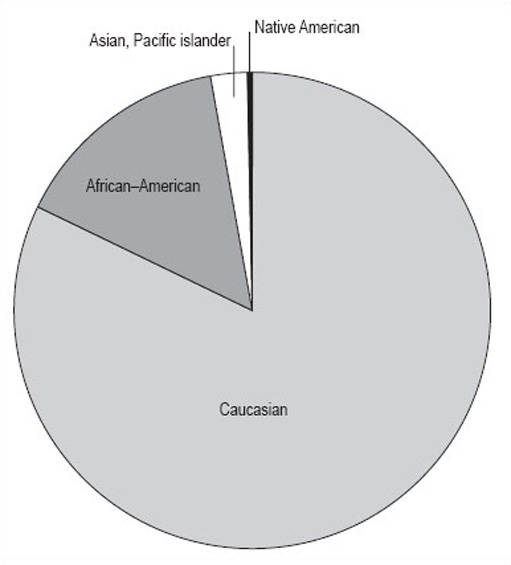
If you are working by hand, it is best to work to the nearest whole number because it is hard to be more accurate than this when drawing. Make a final check that the number of degrees adds up to 360, then draw the pie chart (Figure 13). If you are using a computer to draw the chart, the raw data will be enough and the computer will do the calculation for you.
Activity 15
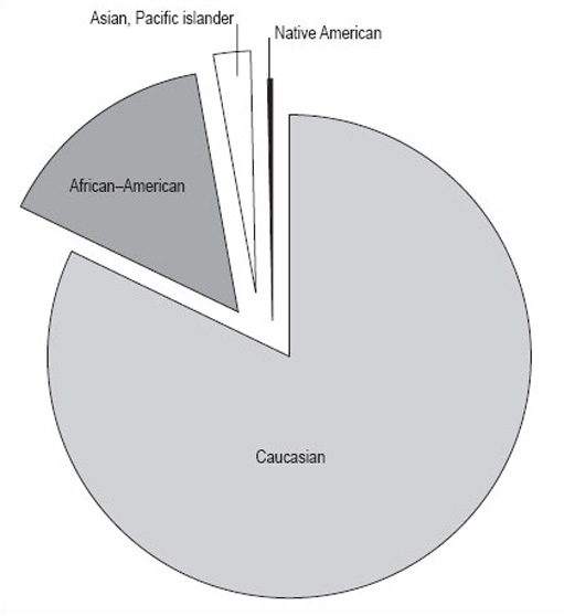
What do you think Figure 14 shows us?
Discussion
It shows the proportions of the population of Illinois by four different races. It gives a clear picture that the biggest racial group is Caucasian, and that there were only relatively small numbers of Native Americans in Illinois in 1992. However, remember that this data is in thousands of people, and the total population is 11 614 000 people. The actual number of Native Americans is 25 000; don't be misled by the fact that the number looks small in comparison to the others in the pie chart.
Activity 16
Now you can try drawing up a pie chart for yourself from the information below.
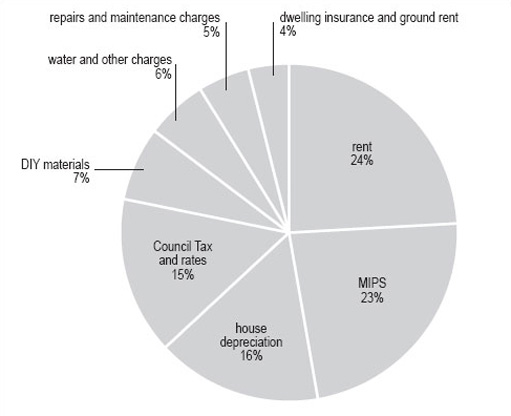
The Retail Price Index (RPI) is a UK index that looks at the expenditure habits and costs in the UK of a ‘basket’ of goods. The basket contains all the consumer goods that an ‘average’ household can expect to buy over time, 600 in total. Two groups of households are excluded from this, to make it more representative: pensioners and the high earners. 120 000 measurements are taken each month. The index is calculated monthly, and you may be aware of it as the basis for the monthly headline inflation rate.
The 600 consumer goods are split into areas of general consumption, such as food or housing. Table 10 shows some data on the relative expenditure of an ‘average’ household on goods in the housing sector of the basket. The relative expenditure on each of these goods is expressed in terms of a weight. So, for example, Table 10 shows that in 1998, in the ‘average’ household, three times as much was spent on council tax and rates as was spent on repairs and maintenance. As can be seen from the table, these weights change from year to year as expenditure changes. This is just a part of the data from the RPI.
| Consumer price index | Weight 1998 | Weight 1999 |
|---|---|---|
| housing | 197 | 193 |
| rent | 47 | 47 |
| MIPS | 45 | 42 |
| Council Tax and rates | 30 | 33 |
| water and other charges | 12 | 12 |
| repairs and maintenance charges | 10 | 10 |
| DIY materials | 14 | 12 |
| dwelling insurance and ground rent | 7 | 7 |
| house depreciation | 32 | 30 |
Using the steps we have shown you, try to draw a pie chart using the 1998 data.
Discussion
-
Collect the data so the number per category can be counted. The 1998 data are shown in Table 11.
-
Decide on a clear title.
The title can be derived from the heading of Table 11 and the question. Hence, ‘Consumer price indices housing 1998 weights’.
-
Decide on the total number of categories.
There are eight categories (the ‘housing’ row shows the total of the categories). This is a good number of groups for a pie chart as too many groups make the chart hard to follow.
-
Calculate the degree share in each category.
-
Table 12 shows degree share in each category (the row ‘housing’ has been removed as it is not a category).
For clarity, we have given the degree share to the nearest whole number, but you may, on occasion, be required to use greater accuracy and give the figures to a number of decimal places.
-
Make a final check that the number of degrees adds up to 360, then draw the pie chart.
Your pie chart should look like Figure 15 . Note that the inclusion of percentages by each segment makes the pie chart clearer for the reader.
| Consumer price index | Weight 1998 |
|---|---|
| housing | 197 |
| rent | 47 |
| MIPS | 45 |
| Council Tax and rates | 30 |
| water and other charges | 12 |
| repairs and maintenance charges | 10 |
| DIY materials | 14 |
| dwelling insurance and ground rent | 7 |
| house depreciation | 32 |
| Consumer price index | Weight 1998 | Degree(to nearest whole number) |
|---|---|---|
| rent | 47 | 86 |
| MIPS | 45 | 82 |
| Council Tax and rates | 30 | 55 |
| water and other charges | 12 | 22 |
| repairs and maintenance charges | 10 | 18 |
| DIY materials | 14 | 26 |
| dwelling insurance and ground rent | 7 | 13 |
| house depreciation | 32 | 58 |
| total degrees | — | 360 |
7 Analysis
7.1 Introduction
Charts, graphs and tables are all very helpful ways of representing a set of data. However, they are not the only ways of passing on information about data. This section looks at how you can analyse a set of data to summarise the given information as briefly and simply as possible.
Essentially, there are two features of a set of data that enable summarising: the average and the spread. This section starts by looking at what is meant by ‘average’. If you have already studied Working with charts, graphs and tables, this will be familiar to you. However, we recommend that even if you do not closely read this part, you do try Activity 17. The section then considers frequency tables before moving on to look at spread.
7.2 Averages
7.2.1 Mean, median and mode
The mean, median and mode are all types of average and are typical of the data they represent. Each has advantages and disadvantages, and can be used in different situations, but they all give us an idea of the general size of the values involved. Here we provide brief definitions, and some idea of when each should be used.
The following set of data is the number of miles (to the nearest mile) walked in a week by a group of students. You are going to look at how to calculate the mean, median and mode of these values.
Data set A: 1, 2, 2, 3, 4, 5, 5, 6, 6, 6, 6, 9, 11, 12, 14, 15
Mean
The mean is found by adding up all the values in a set of numbers and dividing that total by the number of values in the set.
For data set A, the total is 107. There are 16 values, so you need to divide 107 by 16. This gives 6.6875. So, the mean of this set of data is 6.6875 miles.
You also need to consider to how many decimal places you should quote. It is unlikely that the distance walked by each of the students would have been a complete number of miles, but the actual values have been rounded to the nearest whole number. As a result, you can only give the mean correct to one decimal place, or even to the nearest mile. Rounding 6.6875 to one decimal place gives 6.7 miles. If you look at the data, you will see that 6.7 seems to be quite a good average measure of these values.
Many people would choose to calculate the mean of a set of data if they wanted to get an idea of a typical value of the set, but there are times when the mean isn't as representative as you would like. For instance, if one of these students were a very keen walker, the largest value could have been, say, 50 miles not 15. If you replace the 15 by 50 and then recalculate the mean, the answer you get is 8.875 or 8.9 correct to one decimal place. Thus, the one value of 50 has significantly increased the value of the mean such that it is now less representative of the group of data as a whole.
Another problem with using the mean is that sometimes when you calculate the mean of a set of data, the value you get is difficult to interpret. For example, if you calculate the mean number of children in a group of families, you could get a value like 2.1 or 2.3. Of course, it is not possible to have 2.3 children.
Median
The median is the middle value of a set of numbers arranged in ascending (or descending) order. If the set has an even number of values, then the median is the mean of the two middle numbers.
Data set A is already in ascending order: 1, 2, 2, 3, 4, 5, 5, 6, 6, 6, 6, 9, 11, 12, 13, 16
This is a set of 16 numbers, so the median is the mean of the two middle numbers, which are shown in bold (8th and 9th data values) the median is:
(6 + 6) ÷ 2 = 6
In some ways, this value is more representative of the group. For data set A, the median tells us that half the group walk 6 miles or less and half the group walk 6 miles or more. Here it doesn't matter what the largest (or the smallest) value is; if the largest value were 50, the median would still be 6.
Mode
The mode (or modal value) is the most popular value in a set of numbers, that is the one that occurs most often.
Looking at data set A, you can see that the mode is 6. In other words, more people walked 6 miles than any other distance.
The value of the mode, like the median, is not affected by any particularly large or small values in the set.
While every set of data has a mean and a median, it is not always possible to find a mode. Some sets of data have only single instances of each value, other sets of data have more than one value that occurs equally often.
Activity 17
The following set of data is the number of hours (to the nearest hour) of television watched by a group of students in a week.
8, 6, 2, 3, 6, 0, 5, 7, 3, 9, 1, 0, 5, 12, 6
Calculate the mean, median and mode.
Discussion
Arranging the 15 values in ascending order gives:
0, 0, 1, 2, 3, 3, 5, 5, 6, 6, 6, 7, 8, 9, 12
The mean (total of all the hours divided by 15) = 72 + 15 = 4.9 hours.
The median (here the median is the 8th value) = 5 hours.
The mode (the value which appears most frequently in the set of numbers) = 6 hours.
In Section 5.2, you looked at discrete and continuous variables. Table 13 summarises which of the types of average can be used with which type of variable.
| Variable | Mean | Median | Mode |
|---|---|---|---|
| Discrete – word category | not possible | only if you can order the data | works for most types of category data |
| Discrete – numerical | OK but answer may be difficult to interpret (e.g. 2.3 children) | OK | OK if at least one of the values occurs more than once |
| Continuous | OK | OK | data needs to be grouped |
7.3 Frequency tables
So far you have looked at small sets of data, which are relatively easy to analyse. Naturally, this is not always the case and you need to consider how to work with a larger set of data. Data set B shows 30 TMA scores recorded by a tutor in the order that the scripts were marked.
Data set B:
| 86 | 78 | 93 | 89 | 65 | 92 | 84 | 66 | 91 | 90 |
| 85 | 87 | 92 | 73 | 90 | 84 | 79 | 60 | 87 | 96 |
| 81 | 42 | 56 | 84 | 92 | 53 | 85 | 88 | 74 | 77 |
An array of scores, presented like this is hard to read and to interpret, so you need to rewrite the information in a way that makes it easier to understand.
First, arrange the 30 scores in (ascending) order of size:
| 42 | 53 | 56 | 60 | 65 | 66 | 73 | 74 | 77 | 78 |
| 79 | 81 | 84 | 84 | 84 | 85 | 85 | 86 | 87 | 87 |
| 88 | 89 | 90 | 90 | 91 | 92 | 92 | 92 | 93 | 96 |
Now that the data has been arranged in order it is called a distribution.
If you look at this distribution, you can see that all the scores lie between 42 and 96, and you can find the median. In this case, the median is the mean of the 15th and 16th scores (underlined above):
(84 + 85) ÷ 2 = 84.5
In order to find the mean score, you need to add up all the scores and divide by 30. This is a fairly laborious task so you don't have to do this unless you want to check our answer. The total of all the scores is 2399 and, as there are 30 scores, the mean for this set of data is 80 (to the nearest whole number).
It is not possible to find the modal score for this set of data as there are two scores that occur three times, 84 and 92.
Even with the mean and the median for data set B, it is still quite difficult to get a feel for the distribution of these scores. There is one further thing that you can do and that is to group the data into 10-mark intervals.
| Score | Number of students (frequency) |
|---|---|
| 40–49 | 1 |
| 50–59 | 2 |
| 60–69 | 3 |
| 70–79 | 5 |
| 80–89 | 11 |
| 90–99 | 8 |
This is called a grouped frequency distribution. It makes the overall pattern of the data more clear but you have now lost information about the individual scores.
If you now draw a graph using this information, the pattern will be even clearer. Note that, as this data has been grouped into intervals of 10, you should use a histogram to illustrate this data (Figure 16 ).
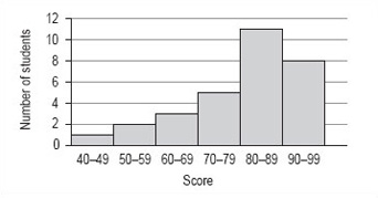
Although there is no modal value for the individual values of data set B, you can now see that there is a modal group or class. This is the group of scores 80–89.
It is not possible to find the precise value of the median from the frequency distribution or histogram. The best you can do is to identify the group that contains the median by adding up the frequencies of each of the groups until you have included the 15th and 16th score. The total of the first four groups is 11 and for the first five groups is 22 so that the 15th and 16th scores must fall within the fifth group, which is the modal group 80–89.
From the histogram and frequency distribution, you can see that most of scores fall in the upper two groups, 80–89 and 90–99. However, the value of the mean was 80, which is at the lower end of these groups. This set of values has a small number of rather low scores and these have the effect of pulling down the mean as compared to the median. This effect is similar to that of the large distance walked by one of the group of students affecting the value of the mean in data set A.
7.4 Spread
7.4.1 Range and inter-quartile range
So far in this section, you have seen that the mean, median and mode can all give a useful typical value of a set of data. However, there is further information that you can get from a set of data which can help to complete the picture.
Consider the following two sets of data.
Data set C: 113, 48, 26, 99, 64 The number of runs scored by a cricket batsman in a 5-week period.
Data set D: 72, 69, 74, 71, 70 A person's pulse first thing in the morning, measured over 5 days.
The mean for data set C is 70 and the mean for the data set D is 71.2.
Activity 18
What do you think is the most striking difference between these two sets of data?
Discussion
You might have said that the values in the first set are quite varied but the values in the second set are all very similar to one another. This is an important difference between the two sets of data.
It is useful to calculate the range of a set of values.
The smallest value in data set C is 26 and the largest is 113, so the range is
113 – 26 = 87.
The smallest value in data set D is 69 and the largest is 74, so the range is
74 – 69 = 5.
The range is easy to calculate and gives you a rough idea of how spread out the values in a set of data are. However, it does need to be treated with caution. The range depends on the two extreme values in a set of data and it is quite possible that one or both of them is untypical of the set.
Activity 19
Here are two sets of data. Which would you say was the more spread out?
Data set E: 1, 3, 4, 4, 7, 8, 10, 14, 15, 17, 17, 20
Data set F: 1, 8, 8, 8, 9, 9, 9, 10, 11, 11, 11, 20
Discussion
The range of both these sets of data is 20 − 1 = 19. However, data set E is more spread out than the data set F. Clearly, you need some way of spotting this, especially if you have a large number of values in your set of data.
In order to get a more accurate picture, you need to calculate a smaller range, nearer to the middle of the distribution, which avoids the extreme values.
The range to use is based on the quartiles of the distribution and is called the interquartile range. You already know how to find the median, which divides the set of values into two equal parts, so you now need to divide each of these two parts into two equal parts to get the quartiles. You might like to think of the quartiles dividing the range into quarters or four parts.
Consider data set E again:
1, 3, 4, 4, 7, 8, 10, 14, 15, 17, 17, 20
The median of this set of data is the mean of the two underlined numbers:
(8 + 10) ÷ 2 = 9
You now need to find the median of the first 6 values in the set; this value is (4 + 4) ÷ 2 = 4. The median of the second 6 values is (15 + 17) ÷ 2 = 16.
Thus, data set E can be divided into four parts by the three quartiles, Q1, Q2 and Q3with the second, Q2, having the same value as the median. The values used to calculate the quartiles are underlined.

Note that medians and quartiles may or may not be equal to one of the data values. You can now calculate the inter-quartile range, Q3 − Q1: 16 − 4 = 12. This gives a measure of the spread of the middle 50% of the data values.
Activity 20
Using data set F, calculate the quartiles and the inter-quartile range.
Data set F: 1, 8, 8, 8, 9, 9, 9, 10, 11, 11, 11, 20
Discussion
The median is (9 + 9) ÷ 2 = 9. The first quartile Q1 is (8 + 8) ÷ 2 = 8. The third quartile Q3 is (11 + 11) ÷ 2 = 11. The inter-quartile range forthis set of data is 11 – 8 = 3. Again, the values used to calculate the quartiles are underlined.

The inter-quartile range is Q3 − Q1: 11 − 8 = 3.
Although both sets of data have a range of 19, you now know that data set E has an inter-quartile range of 12 and data set F has an inter-quartile range of 3. Since half of the values lie within the inter-quartile range, a value of 12 suggests that the values of data set E might be quite spread out whereas a value of 3 suggests that while half the values of data set F are very close together, some values in this data set are not typical of all the data.
8 Technical glossary
This glossary is intended to provide a basic explanation of how a number of common mathematical terms are used. Definitions can be very slippery and confusing and at worst can replace one difficult term with a large number of other puzzling concepts. Therefore, where an easy definition is available it is provided here, where this has not been possible an example is used. If you require more detailed or complete definitions, you should refer to one of the very good mathematical dictionaries that are available, or to one or more books listed in the bibliography.
Approximation: A numerical result given to a required level of accuracy, for example, to the nearest metre.
Average: The word ‘average’ is often used instead of the word ‘mean’ but it can have other interpretations so it is best to use the appropriate correct term; this is usually ‘mean’, but may be ‘median’ or ‘mode’ (see below).
Chart: Pictorial representation of data, e.g. pie chart, bar chart.
Continuous data: Values that cannot be given exactly. This data is usually a measurement like time, height or temperature.
Data: Items of numerical information, raw facts or statistics collected together for analysis.
Decimals: A way of expressing numbers using place value, e.g. ![]() ,
, ![]()
Discrete data: Values that are clearly separated from one another, e.g. shoe sizes or modes of transport.
Fractions: Parts of a whole number, e.g. ![]() ,
, ![]() ,
, ![]() , etc.
, etc.
Graph: A drawing which depicts the relationship between data or values.
Inter-quartile range: The range of the values between the first and third quartile.
Mean: A typical value of a set of data, which is equal to the sum of the values in the set divided by the number of values in the set.
Median: The middle point of a set of values arranged in ascending or descending order.
Mode: The most common value in a set of data.
Percentage: A proportion of a hundred parts, e.g. ![]()
Quartile: Each of the three values that divide a set of data into four equal groups.
Ratio: A comparison of one quantity with another.
Scale: A series of marks at regular intervals on a line used for measuring, e.g. the divisions on the axis of a graph or the degree markings on a thermometer.
Value: A numerical amount.
Further reading and sources of help
Further reading
-
*The Good Study Guide by Andrew Northedge, published by The Open University, 1990, ISBN 0 7492 00448.
Chapter 4 is entitled ‘Working with numbers’
Other chapters are entitled: ‘Reading and note taking’, ‘Other ways of studying’, ‘What is good writing?’, ‘How to write essays’, ‘Preparing for examinations’.
-
The Sciences Good Study Guide by Andrew Northedge, Jeff Thomas, Andrew Lane, Alice Peasgood, published by The Open University, 1997, ISBN 0 7492 3411 3.
-
More mathematical and science-based than The Good Study Guide. Chapter titles are: ‘Getting started’, ‘Reading and making notes’, ‘Working with diagrams’, ‘Learning and using mathematics’, ‘Working with numbers and symbols’, ‘Different ways of studying’, ‘Studying with a computer’, ‘Observing and experimenting’, ‘Writing and tackling examinations’.
-
There are also 100 pages of Maths Help on: calculations; negative numbers; fractions; decimals; percentages, approximations and uncertainties; powers and roots; scientific notation; formulas and algebra; interpreting and drawing graphs; perimeters, areas and volumes.
-
*Breakthrough to Mathematics, Science and Technology (K507) – only available from the Open University. Each module refers to The Sciences Good Study Guide.
-
Module 1, entitled ‘Thinking about measurement’, looks at mathematics in a variety of contexts, e.g. in the kitchen, on the road, in the factory, in the natural world. Module 4, entitled ‘Exploring pattern’, looks at geometrical and numerical patterns using everyday examples.
-
The other four modules in the series have a greater emphasis on science or technology than on mathematics.
-
*Openings (Y003) – a pre-university course of two modules, ‘Our living environment’ and ‘Thinking about measurement’, from the Breakthrough series.
-
The course lasts for 14 weeks and involves 6–8 hours study per week. There are no tutorials but your tutor is available to provide feedback by phone. The course is presented four times a year.
-
*Teach yourself basic mathematics by Alan Graham, published by Hodder and Stoughton, London, 1995, ISBN 0 340 64418 4.
-
A book aimed at a more general (i.e. non-OU) audience in two parts entitled ‘Understanding the basics’ and ‘Maths in action’.
-
Countdown to mathematics Volume 1 by Lynne Graham and David Sargent, published by Addison-Wesley, Slough, 1981, ISBN 0 201 13730 5.
-
This is a useful next stage after any of the above and includes an introduction to algebra.
-
Investigating Statistics: A Beginner's Guide by Alan Graham, published by Hodder and Stoughton, London, 1990, ISBN 0 340 4931 1 9.
-
This is a more thorough introduction to dealing with data and statistics.
-
Teach Yourself Statistics by Alan Graham, published by Hodder and Stoughton, London, 1999, ISBN 0 340 75358 7.
-
This book presents the basic ideas and techniques of this branch of mathematics clearly and simply.
-
Statistics without tears by Derek Rowntree, published by Penguin, Harmondsworth, 1981, ISBN 0 14 013632 0.
-
This book is intended to support those people with no previous background in statistics, who need statistical understanding for part of a course that they are studying.
-
The MBA Handbook, Study Skills for Managers by Sheila Cameron, 3rd edition, published by Pitman Publishing, 1997, ISBN 0 273 62812 7.
-
Chapter 13, ‘Using numbers’ introduces the use of number in a management context.
-
Open Mathematics (MU120) – Open University course that comprehensively covers mathematics topics.
-
This course assumes you are already reasonably confident with the material covered by any of the books marked * or by Module 1 of Breakthrough to Mathematics, Science and Technology. The course has been studied successfully by many students whose primary interest lies in the humanities or social sciences.
Sources of help
Local colleges and schools
The local newspaper or your local library are your sources of reference here. Nowadays, most schools and colleges have evening or daytime courses that are open to adult learners. Many of them will have an advice point, so that you can telephone or drop in to discuss what you are looking for. Many will have an open learning centre where self-assessment tests and open learning materials are available.
Learndirect
Learndirect was set up in the middle of 1998, to help adults to find out about local provision in learning new skills. They are reachable online at www.learndirect.com, by email at contactus@learndirect.com, and by phone at 0800 101 901.
The University for Industry has a website at www.ufi.com/, but this is now largely merged with the Learn Direct work.
Scottish Learning Network
The Scottish Learning Network at www.globalweb.co.uk/sln.html is a gateway to information, guidance, assessment and on-line education and training opportunities in Scotland.
Conclusion
This free course provided an introduction to studying Mathematics and Statistics. It took you through a series of exercises designed to develop your approach to study and learning at a distance, and helped to improve your confidence as an independent learner.
Acknowledgements
Course image: Simon Law in Flickr made available under Creative Commons Attribution-NonCommercial-ShareAlike 2.0 Licence.
All materials included in this course are derived from content originated at the Open University.
Don't miss out:
If reading this text has inspired you to learn more, you may be interested in joining the millions of people who discover our free learning resources and qualifications by visiting The Open University - www.open.edu/ openlearn/ free-courses