

3.2 Creating the charts
Once you have your results from Activity 2, you need to display them in some way.
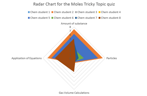
As you saw in Section 3.1, one of the best ways of displaying these results is as a radar or spider chart which is a visual representation used to organise the results data from your quiz in a logical way. It should have one stumbling block displayed on each axis so that you can clearly see the results for each stumbling block.
Creating a radar or spider diagram can be made very simply with the right software. Here it explained here how to create a chart in Microsoft Excel but other software is also available.
Activity 3 radar (spider) diagram
1. Input data into the Excel spreadsheet.
Table 2, below, is a simplified version of the data from the moles tricky topic quiz (note that in reality these numbers may not be whole, as the marks for each stumbling block will be split appropriately):
| Student | Amount of substance | Gas volume calculations | Application of equations | Particles |
|---|---|---|---|---|
| chem 1 | 6 | 0 | 4 | 6 |
| chem 2 | 7 | 2 | 5 | 7 |
| chem 3 | 5 | 1 | 3 | 6 |
2. Click Insert > Other Charts > Radar, and select the radar chart type you like. A simple radar has been selected here as an example. See Figure 6:
Plot the results from your quiz
Now, try plotting the results from Activity 2 onto a chart, by following the instructions below.
Insert your data into Excel (or similar) and plot your results onto a radar (spider) diagram. The results for each Stumbling Block being mapped separately on each axis.
Show your results to each student (or colleagues, friends and family) in both forms. That is, the numerical score (e.g. 10 out of 20) and then the results plotted onto a spider diagram.
Gather their responses. Are the visual results easier to read? Is it easier to identify gaps in knowledge? Why is that? Write down your findings.
Feedback your findings to the tricky topics team on IRIS Connect. You can find the discussion board on the Activities tab – Week 7, Activity 3.