

5 Bar charts
Another way of presenting information would be in a bar chart.
Bar charts are useful because they show data clearly. They must contain the following information:
- A title explaining what the bar chart means.
- Labels that tell you what each bar means. This could be a key or just a label underneath the line that runs along the bottom of the bar graph (the horizontal axis).
- The line going up the left-hand side of the bar graph (the vertical axis) must have numbers at equal intervals. This tells you how big the bars are so that your reader can read the data.
Example: A traffic survey
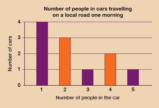
Let’s have a look at the data from a traffic survey displayed in a table:
| Number of people in a car | Number of cars |
|---|---|
| 1 | 4 |
| 2 | 3 |
| 3 | 1 |
| 4 | 2 |
| 5+ | 1 |
This data could be presented in a bar chart, as follows:
Method
Before you start to draw your bar chart, you need to decide what your labels will be and what number intervals you are going to use – that is, how ‘tall’ your bars are going to be.
To do this you need to look at your data and find the biggest number of occurrences (that is, the largest category). In this traffic survey this is not too difficult: the most cars in one category was ‘cars with one person in’, which had four cars.
This means that the highest number on the vertical axis is 4. The numbers in the survey are discrete data – you can’t have half a car! – so the numbers on this axis will be 0, 1, 2, 3 and 4. The vertical axis should always start at 0 and go up by the same number each time. We can take the label for this axis from the table: ‘Number of cars’.
Hint: Discrete data is data made up of things that are separate and can be counted.
You now need to decide on how many bars you are going to draw. This is already decided for because there are five categories in the survey:
- cars with one person in
- cars with two people in
- cars with three people in
- cars with four people in
- cars with five or more people in.
So there will be five bars along the horizontal axis of the bar chart, which should be labelled ‘Number of people in a car’.
Once you have drawn the axes and labels, you can draw the bars as follows:
- Use a ruler.
- The height of each bar is the number you have for that category.
- The width of the bars must be equal.
- When you have finished drawing your bar chart, don’t forget to give it a title.
Method summary
- Find out what the highest number of items is. This will give you the biggest number on the vertical axis (the one on the left-hand side). This will be the size of the tallest bar.
- Decide how many bars to draw: this is the number of categories you are dealing with. The bars should be equal in width.
- Draw and label your axes.
- Use a ruler to draw your bars.
- Make up a title for your bar chart.
Now try the following activity. Remember to check your answers once you have completed the questions.
Activity 9: Creating a bar chart
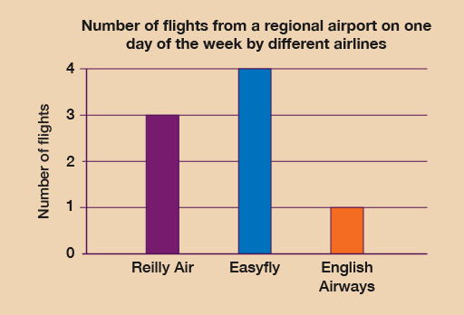
The following table shows the number of flights from a regional airport on one day of the week made by different airlines.
| Airline | Number of flights |
|---|---|
| Reilly Air | 3 |
| Easyfly | 4 |
| English Airways | 1 |
Draw a bar chart to display this data. Remember to label your axis and give your chart a title.
Answer
Check with the following suggestions before continuing;
The most flights on one day is four, so you must ensure that the vertical axis should start at 0 and go up to 4.
You must label the horizontal axis with the names of the airlines and the vertical axis with the number of flights.
The title must clearly state what data the bar chart is showing.
Your graph should look something like the following:
Summary
In this section you have learned about how to present data in bar charts.