

2.1 Scatterplots
Statistics can be misleading. A coefficient of zero only states there is no ranking relation between the indicators, but there might be some other relationship.
In the next example, the correlation between x and y is zero, but they are clearly related (y is the square of x).
In []:
table = [ [-2,4], [-1,1], [0,0], [1,1], [2,4] ]
data = DataFrame(columns=['x', 'y'], data=table)
(correlation, pValue) = spearmanr(data['x'], data['y'])
print('The correlation is', correlation)
data
Out[]:
The correlation is 0.0
| x | y | |
|---|---|---|
| 0 | -2 | 4 |
| 1 | -1 | 1 |
| 2 | 0 | 0 |
| 3 | 1 | 1 |
| 4 | 2 | 4 |
It’s therefore best to complement the quantitative analysis with a more qualitative view provided by a chart. In the case of correlations, scatterplots will do very nicely. Each country is a dot plotted at the x and y coordinates corresponding to the GDP and life expectancy values.
In []:
%matplotlib inline
gdpVsLife.plot(x=GDP, y=LIFE, kind='scatter', grid=True)
Out[]:
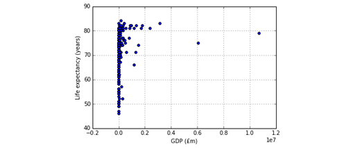
This graph is not very useful. The GDP difference between the poorest and richest countries is so vast that the whole chart is squashed to fit all GDP values on the x-axis. It is best to use a logarithmic scale , where the axis values don’t increase by a constant interval (10, 20, 30, for example), but by a multiplicative factor (10, 100, 1000, 10000, etc.). The parameter logx has to be set to True to get a logarithmic scale on the x-axis. Moreover, let’s make the chart a bit wider, by using the figsize parameter you saw last week.
In []:
gdpVsLife.plot(x=GDP, y=LIFE, kind='scatter', grid=True,
logx=True, figsize = (10, 4))
Out[]:
>matplotlib.axes._subplots.AxesSubplot at 0x10e400588>
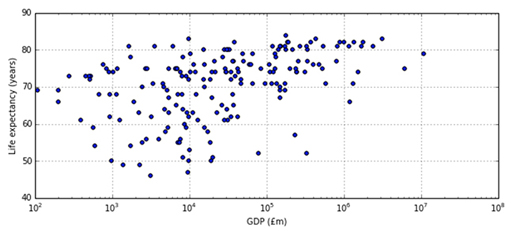
The major tick marks in the x-axis go from 10 2 (that’s a one followed by two zeros, hence 100) to 10 8 (that’s a one followed by eight zeros, hence 100,000,000) million pounds, with the minor ticks marking the numbers in between. For example, the eight minor ticks between 10 2 and 10 3 represent the values 200 (2 × 10 2 ), 300 (3 × 10 2 ), and so on until 900 (9 × 10 2 ). As a further example, the country with the lowest life expectancy is on the second minor tick to the right of 10 3 , which means its GDP is about 3 × 10 3 (three thousand) million pounds.
Countries with a GDP around 10 thousand (10 4 ) millions of pounds have a wide range of life expectancies, from under 50 to over 80, but the range tends to shrink both for poorer and for richer countries. Countries with the lowest life expectancy are neither the poorest nor the richest, but those with highest expectancy are among the richer countries.
Exercise 11 Scatterplots
Practise using Scatterplots in Exercise11 in the Exercise notebook 3.