

3.2 Interpreting bar charts
If you see a bar chart that is showing you information, it’s useful to know how to interpret the information given. The most important thing you need to read to understand a bar chart correctly is the scale on the vertical axis.
As you know from drawing bar charts yourself, the numbers on the vertical axis can go up in steps of any size. You therefore need to work out what each of the smaller divisions is worth before you can use the information. The best way for you to learn is to practise looking at, and reading from, different bar charts.
Have a go at the activity below and see how you get on.
Activity 4: Interpreting a bar chart
The chart below shows the average daily viewing figures for Sky Cinema channels during 11–17 March 2019. Answer the questions that follow. Choose the correct answer in each case.
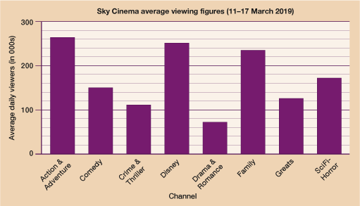
Which was the most popular channel?
- a.Action & Adventure
- b.Disney
- c.Family
Answer
- a.Action & Adventure
Approximately how many viewers tuned in to Sky Cinema Disney?
- a.250 viewers
- b.25 000 viewers
- c.250 000 viewers
Answer
c.250 000 viewers – note how the vertical axis label states that the figures are in 000s (thousands) which means that the scale goes up in intervals of 20 000. This means the Disney bar goes up to 250 000.
Approximately how many more viewers watched Sky Cinema SciFi-Horror than Sky Cinema Drama & Romance?
a.100 000
b.80 000
c.100
Answer
a.100 000 – Sky Cinema SciFi-Horror had appoximately 175 000 viewers whilst Sky Cinema Drama & Romance had approximately 75 000 viewers, making a difference of 100 000 viewers.
Activity 5: Interpreting a comparative bar chart
The chart below shows the average house prices by local authority in Wales for 2017 and 2018. Answer the questions that follow.
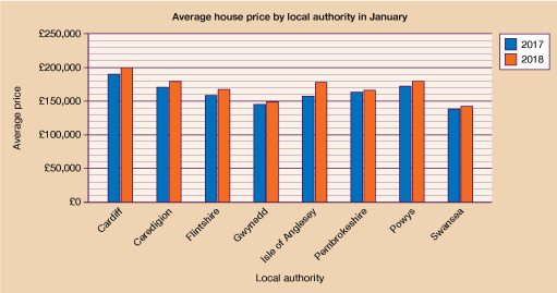
- Which local authority had the biggest average house price increase between 2017 and 2018?
Answer
- Isle of Anglesey
Which of the following is the best estimate of the difference between Cardiff and Swansea’s 2018 average house prices?
- a.£50 000
- b.£60 000
- c.£120 000
Answer
- b.£60 000 – note how the scale goes up in intervals of £10 000. In 2018 Cardiff’s average house price was approximately £200 000 compared to Swansea’s average house price of approximately £140 000, making a difference of £60 000.
Activity 6: Interpreting a component bar chart
The following chart shows the number of enrolments for different college courses. Answer the questions that follow.
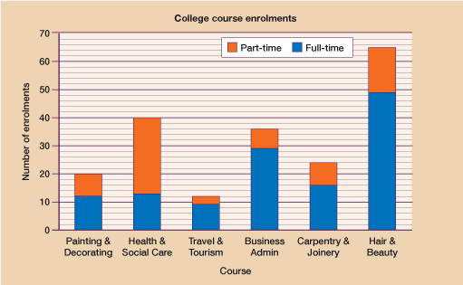
- Which course had the fewest number of part-time enrolments?
Answer
- Travel & Tourism
- Which course had more part-time than full-time enrolments?
Answer
- Health & Social Care
- How many full-time enrolments did Hair & Beauty have?
Answer
49.
Note how the scale goes up in 2s and the full-time component of the Hair & Beauty bar goes up to halfway between 48 and 50.
- How many part-time enrolments did Business Admin have?
Answer
- 7
- Approximately how many course enrolments were there in total?
Answer
197 – You need to count the total enrolments for all of the separate courses and then add them together:
Painting & Decorating = 20
Health & Social Care = 40
Travel & Tourism = 12
Business Admin = 36
Carpentry & Joinery = 24
Hair & Beauty = 65
20 + 40 + 12 + 36 + 24 + 65 = 197
You should now be feeling confident with both drawing and interpreting bar charts so it’s time to move on to look at another type of chart – pie charts.
Summary
In this section you have learned:
- about the different features of a bar chart
- to use single and comparative bar charts to present data
- to interpret the information shown on different types of bar chart.