4 Pie charts
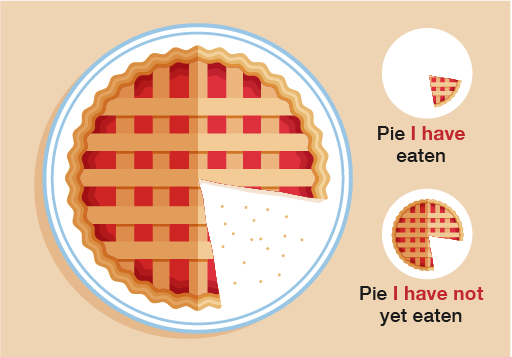
A pie chart is the best way of showing the proportion (or fraction) of the data that is in each category. It is very easy to visually see the largest and smallest sections of the chart and how they compare to the other sections.
This section will help you to understand when a pie chart should be used over other presentation methods. In the first part of this section you’ll learn how to draw and then move on to interpreting pie charts.

In the first part of this section you’ll learn how to draw and then move on to interpreting pie charts.
