

5 Line graphs
Line graphs are a very useful way to spot patterns or trends over time. You will have looked at how to plot and interpret single line graphs from single data sources in Everyday maths 1. Now you will be looking at line graphs that show the results of two data sources.
The example below shows the monthly foreign exchange rate of £1 against the US dollar and the euro. You can clearly see how the pound was dropping in value against the euro and US dollar up to October 2016. Now that you understand how line graphs can be used and why they are useful, next you’ll learn how to draw and interpret them.
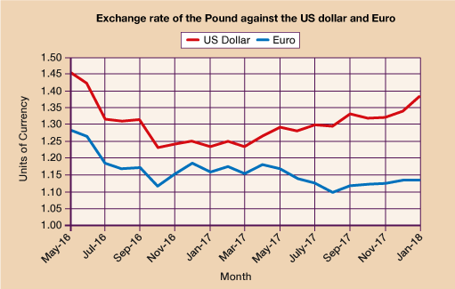
Figure 19 Monthly foreign exchange rate of £1 against the US dollar and the euro from May 2016 to January 2018.
Now that you understand how useful line graphs can be and how they can be used, next you’ll learn how to draw and interpret them.