

5.2 Interpreting line graphs
Interpreting line graphs is also very similar to the way you interpret bar charts; it’s just about using the scales shown on the graph to find out information.
Given that you’ve already learned and practised interpreting bar charts, you can jump straight into an activity on interpreting line graphs.
Activity 10: A population line graph
The graph shows information about the population of a village in thousands over a period of time.
a.What was the population of the village in 1991?
b.What was the increase in population from 1981 to 2011?
c.By how much did the population drop between 1991 and 2001?
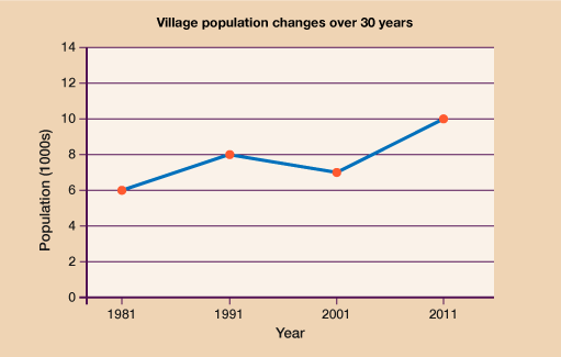
Answer
- a.In 1991 the population was 8000.
- b.In 1981 the population was 6000, in 2011 the population was 10 000. This is an increase of 10 000 − 6000 = 4000.
- c.In 1991 the population was 8000 and by 2001 it was 7000. 8000 − 7000 = 1000. So the population dropped by 1000.
- Jen’s Gym kept a record of member numbers during 2018.
The graph below shows information about the results.
- a.Which was the only month when there were more female members than male members?
- b.Estimate the difference in membership numbers for October.
- c.In what month was the difference between male and female members smallest?
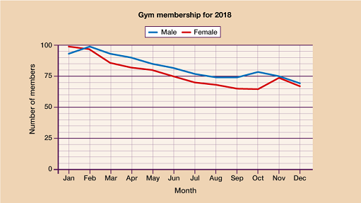
Answer
- a.January
- b.13 (+/− 1) allowed as this question is estimation
- c.November
How did you get on? Hopefully you were able to answer all the questions without too much difficulty. As long as you have worked out the scale correctly and read the question carefully, there’s nothing too tricky involved.
You have now covered each drawing and interpreted each different type of chart and graph so it’s time to move on to look at other uses for data: averages and range.
Summary
In this section you have learned:
- which types of data can be suitably represented by a line graph and which are best suited to other types of charts.
- how to interpret the information shown on a line graph
- how to draw an accurate line graph for a given set of data.