Energy in buildings
Use 'Print preview' to check the number of pages and printer settings.
Print functionality varies between browsers.
Printable page generated Thursday, 2 May 2024, 12:21 PM
Energy in buildings
Introduction
This free course, Energy in buildings, looks at the importance of energy in buildings in the UK, particularly housing. Topics covered include reducing the heating demand of houses, improving their heating systems and reducing the electricity used by appliances and lighting. These are all methods of reducing their overall CO2 emissions.
This OpenLearn course is an adapted extract from the Open University courses T213 Energy and sustainability and T313 Renewable energy. It should take about 10 hours study time.
You will need a calculator handy (perhaps within your computer) to answer some of the course questions.
Learning outcomes
After studying this course, you should be able to:
understand the main ways in which a house loses heat energy
carry out basic U-value calculations for windows and insulation materials
understand the factors influencing heating system efficiency
carry out basic calculations concerning the efficiencies and CO2 emissions of different heating systems
carry out basic calculations concerning lighting.
1 The importance of energy use in buildings
Appreciating the importance of energy use in buildings requires a look at UK national energy statistics. These use two categories of energy:
- Primary energy − this is essentially energy in its ‘raw’ form. Examples include crude oil before it is refined and the fuels used to generate electricity: coal, natural gas and nuclear heat.
- Delivered (or final) energy − this is the energy that the consumer actually receives (and pays for): refined petrol and diesel, mains electricity, piped natural gas.
The statistics also split energy use into different sectors: the domestic sector − people’s homes; the services sector – shops, offices, schools, etc.; transport and, finally, industry.
Box 1 Energy units
Perhaps the most familiar energy unit is the kilowatt-hour (kWh). Household gas and electricity bills are normally expressed in these. In electrical terms this is the amount of energy used by a 1 kilowatt (kW) appliance, such as a small electric fire, in one hour.
The prefix ‘kilo’ means 1000 and is shortened to ‘k’. 1 kW = 1000 watts.
Most of the energy calculations in this course are in watts, kilowatts and kilowatt-hours.
Energy statistics may use a ‘scientific’ unit of the ‘joule’ (J). This is the (tiny) amount of energy used by a 1 watt device in 1 second. 1 kilowatt-hour = 3.6 million joules.
Larger energy units use other prefixes. Those used in this course are:
mega – shortened to ‘M’. 1 MJ = 1 million joules and 1 kWh = 3.6 MJ
giga – shortened to ‘G’. 1 GJ = 1000 MJ
tera – shortened to ‘T’. 1 TJ = 1000 GJ
peta – shortened to ‘P’. 1 PJ = 1000 TJ
Figure 1 shows the breakdown of UK primary and delivered energy for 2015 in different ways. The top bar shows the actually primary fuels used. The three bars below show the delivered energy use expressed in three ways: by fuel, by energy sector and by end use.
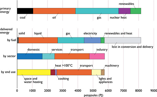
Note that although UK primary energy consumption in 2015 was about 8200 PJ, the delivered energy use was less than 6000 PJ. As shown in the second bar of Figure 1, there were losses of about 2500 PJ ‘in conversion and delivery’. Most of this is waste heat rejected from power stations in cooling towers or into the sea. Typically generating 1 kWh of electricity in a conventional thermal power station requires between 2 and 3 kWh of primary energy input.
It can be seen in the third bar that the delivered energy use in the domestic and services sector is about 2500 PJ. This is almost entirely consumed within buildings. Adding the fraction of industrial energy use that is also used in buildings means that ‘energy in buildings’ makes up almost half of the UK’s delivered energy use. The domestic and services sectors also account for over 60% of the UK’s electricity use. When this and its attendant generation energy losses are taken into account, buildings are responsible for nearly half of UK primary energy use and about 30% of national greenhouse gas emissions (CCC, 2017).
Energy use is, of course, only the means to provide various energy services. The real task is to provide these at a lower energy and environmental cost. The energy services in buildings include:
- the provision of comfortable homes and working environments
- hot water for washing
- cooking food
- safe chilled food storage
- adequate lighting for homes and offices
- the ability to use electronic equipment for communication and entertainment (and producing and studying material such as this course).
The fourth bar of Figure 1 shows that over 2000 PJ of delivered energy were used for space heating (i.e. warming the internal spaces of buildings) and water heating. These applications only require low temperature heat (i.e. less than 70°C). Space heating is a prime target for energy efficiency programmes.
There is a considerable potential for using some of the low temperature waste heat from power stations for heating buildings using combined heat and power generation (CHP), as is widely done in countries such as Denmark.
Of the energy use in buildings about two-thirds was used in the domestic sector and about a further 20% in the services sector.
Within the domestic sector there is a familiar range of energy uses (see Figure 2).
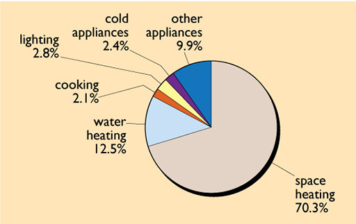
In 2016 about 70% of the delivered energy was used for space heating and 13% for hot water. While these particular figures have only changed slowly over the past 40 years, the amount of electricity for ‘other appliances’ (e.g. radios, TVs, computers and other electronic devices) has increased by a factor of more than five. Given that the domestic sector accounts for 30% of UK electricity demand this is a matter of concern and is discussed in Section 4.1.
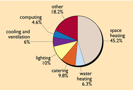
The services sector contains a wide range of different buildings such as offices, schools, shops and hospitals. Although just over half of the delivered energy was used for space heating, this sector uses large amounts of electricity, about 30% of UK demand. A large amount of this is for lighting (see Figure 3) – in retail premises (i.e. shops) about 20% of the energy use in 2016 was for lighting.
Activity 1
In 2016 which sector used more electricity for lighting: the domestic sector or services sector?
Answer
In the domestic sector lighting made up 2.8% of 1730 PJ total energy use, i.e. 48.4 PJ.
In the services sector it made up 10% of 810 PJ, i.e. 81 PJ, over 50% more than in the domestic sector.
2 Reducing space heating demand
Heat energy is used in houses and offices to provide the energy service of ‘comfort’. This means providing space heating in winter with some kind of heating system and possibly cooling in summer. The heating system will usually also provide hot water, discussed in Section 3.
A little history
Life indoors in the UK was very cold in winter in the past. Houses in the nineteenth and early twentieth centuries had a central fire (usually fuelled by coal), often also used for cooking and water heating, and were lit with either oil or gas lamps. They had to be well ventilated both to supply the combustion air for the fire and to get rid of the fumes from the lamps. The basic principle of keeping warm was to wear lots of clothes, sit as close as possible to the fire during the day and retreat under a thick pile of blankets in bed at night. In the nineteenth century, offices did introduce the relative luxury of central heating, fed from large coal-fired boilers.
Most pre-1918 buildings in the UK have solid brick walls, usually two bricks thick, though they may be three or more bricks thick in taller buildings. Buildings of this age still make up about 20% of the housing stock.
UK building standards improved slowly throughout the twentieth century. In the 1920s cavity walls (with an air gap between two separate skins of brick) were introduced, largely as a method of preventing damp penetration. The coal fire remained the normal mode of heating in UK homes well into the 1960s. These homes weren’t very warm – a survey in 1949–50 showed average whole-house temperatures ranging from 12.4°C to 14.2°C (Danter, 1951).
With the introduction of North Sea gas in the 1970s there also came gas-fired central heating. The proportion of the housing stock with central heating rose from 31% in 1970 to over 97% in 2014 (BEIS, 2018c). It also became expected that houses should be fully heated to an acceptable comfort temperature.
Concerns about death rates, particularly of the very young and the elderly, have given rise to the concept of fuel poverty.
The definition of fuel poverty is slightly different in England, Scotland and Wales. In England the Government introduced a new definition of fuel poverty in 2021. This is the ‘Low Income Low Energy Efficiency’ (LILEE) definition of fuel poverty. A household is fuel poor if:
- They are living in a property with an energy efficiency rating of band D, E, F or G [i.e. that is poorly insulated].
- Their disposable income (income after housing costs and energy needs) would be below the poverty line.
Under this definition it was estimated that in 2020 there were over 3 million households (13% of the total) in fuel poverty (BEIS, 2022a).
Loft insulation was only introduced into the building regulations for new UK houses in 1974 and then only to a thickness of 25 mm. Since then standards for new buildings have steadily improved and government campaigns have encouraged householders to install insulation. However, there is still a considerable proportion of the existing housing stock that is relatively poorly insulated.
The picture for the services sector is not much better. The 1960s saw a fashion for ‘curtain wall’ office construction where a steel or concrete frame was used to provide the structure and the walls were largely made of thin concrete panels and large sheets of single-glazing. These offices were hard to heat in winter and often overheated in summer. Fortunately office buildings tend to be regularly refurbished as new occupants come and go, but even so, making major improvements to the thermal performance can be difficult.
The insulation standards of new and refurbished buildings are covered by Building Regulations. The responsibility for these in the UK is devolved to the regions, i.e. Scotland has slightly different regulations from those of England and Wales and Northern Ireland. The regulations for the Republic of Ireland tend to follow a similar pattern to those in the UK. Where references are made to ‘the Building Regulations’ in this course they refer to those for England and Wales.
Since 2006, the regulations covering the thermal performance of buildings have been mainly worded in terms of ‘target CO2 emissions’ rather than specific insulation levels. There may, however, be specified minimum standards for windows and suggested insulation levels for other parts of the building fabric and guidance for heating and ventilating systems.
2.1 Heating a house
Although it is common to think of a house being heated solely by some form of heating system, in practice it is likely to be warmed by energy from three sources:
- the heating system
- ‘free heat’ gains − from occupants, lights, appliances and from hot water use
- passive solar gains from solar energy penetrating the windows.
In a really low-energy house design, free heat and solar gains may provide more useful heating than the heating system itself.
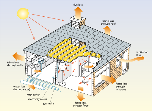
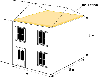
Obviously in order to achieve a low overall space heating demand it is necessary to reduce the heat losses. Figure 4 shows a small house and illustrates the ways in which heat flows into and out of a house. The losses are particularly important. There are:
- fabric heat losses − those through the building fabric itself, i.e. the walls, roof, floor and windows
- ventilation losses − due to air moving through the building
- flue heat losses − since the heating system is not 100% efficient.
These basic losses also apply to larger buildings.
There are three ways of reducing the space heating energy use discussed in this course:
- cutting the fabric heat losses by the use of insulation (Section 2.2)
- cutting the ventilation loss by making the building more airtight and possibly using mechanical ventilation with heat recovery (Section 2.3)
- installing a more efficient heating system (Section 3).
2.2 Cutting building fabric heat losses
Heat loss mechanisms
Heat energy will flow through any object when the temperature on the two sides is different.
The rate of this energy flow (i.e. the number of watts) depends on:
- the temperature difference between the two sides
- the total area available for the flow
- the insulating qualities of the material.
It is obvious that more heat is lost through a large area of wall or window than a small one, and on a cold day than a warm one. In order to understand how this heat loss occurs, and how it can be minimised, it is necessary to look at the three mechanisms involved in the transmission of heat: conduction, convection and radiation. While conduction is the main mechanism in insulated walls and roofs, all three play an important role in windows.
This section discusses ways of reducing heat loss through windows and walls, and introduces some of the parameters used to describe how well (or badly) objects conduct heat.
2.2.1 Insulated windows
Figure 5 shows a cutaway diagram of a double-glazed window. This may take the form of a single-glazed window plus a separate extra pane of secondary glazing or, more commonly, a sealed double-glazing unit, usually with a space between the panes of about 16 mm. However, the basic principles are the same.
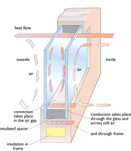
Conduction
In any material, heat energy will flow by this mechanism from hotter to colder regions. The rate of flow will depend on the area and temperature difference, and on the thermal conductivity of the material, a topic that will be discussed in more detail later.
Generally, metals have very high thermal conductivities and can transmit large amounts of heat for small temperature differences. In a window, heat conduction takes place through the frame, which may be made of wood, plastic or metal. In high-quality windows, frames often include an insulated thermal break to minimise heat loss. Further heat conduction takes place through still air within the window but this is limited because still air is a good thermal insulator. Insulators require a large temperature differential to conduct a relatively small amount of heat.
Most practical forms of insulation rely on very small pockets of trapped air, for example between the panes of glazing, as bubbles in a plastic medium, or between the fibres of mineral wool.
Convection
While still air is a good insulator, moving air can carry heat from a warm surface to a cooler one. A warmed fluid, such as air, will expand as it warms, becoming less dense and rising as a result, creating a fluid flow known as convection. This is one of the principal modes of heat transfer through windows. It occurs between the air and the glass on the inside and outside surfaces, and, in double-glazing, in the gas trapped between the panes. The convection effects can be reduced by filling double-glazing with heavier, less mobile gas molecules. Argon is most commonly used; the heavier gases krypton and xenon give better performance but are more expensive. These gases are all by-products of the industrial liquefaction of air to produce oxygen.
Convection can also be reduced by limiting the space available for gas movement. This is the principle used in most insulation materials.
Various forms of transparent insulation have been developed that use a transparent plastic medium containing bubbles of trapped insulating gas. These materials could eventually revolutionise the construction of windows and walls, but at present the materials are expensive, not robust and need protection from the rigours of weather and ultraviolet light.
Alternatively the glazing can be evacuated. Convection currents cannot flow in a vacuum. However, a very high vacuum is required and it needs to last for the whole life of the window, which may be 50 years or more. Also the window will need internal structural spacers to stop it collapsing inwards under the air pressure on the outside. These spacers conduct heat across the gap, slightly reducing the overall performance. The vacuum gap does not need to be very thick and is only 0.2 mm wide in commercial vacuum double-glazing units.
Note that these convection currents are only concerned with what happens inside a double-glazing unit. There are also likely to be movements of air through the seals around the edges of windows, but that is a matter of ventilation and infiltration (see Section 2.3).
A simpler way to reduce the convection effects is to insert extra panes of glass or transparent plastic film between the panes of double-glazing turning it into triple- or quadruple-glazing.
Radiation
Heat energy can be radiated, in the same manner as it is radiated from the sun to the earth. The quantity of radiation is highly dependent on the temperature difference between the radiating body and its surroundings. The roof of a building, for example, will radiate heat away at night to the cold atmosphere. In a double-glazed window heat will be directly radiated from the inner pane across the gap to the outer one.
The amount of radiation also depends on the surface’s emissivity. Most materials used in buildings have high emissivities of approximately 0.9, that is, they radiate 90% of the theoretical maximum for a given temperature. Other surfaces can be produced that have low emissivities. This means that although they may be hot, they will radiate little heat outwards. ‘Low-e’ coatings are now normally used inside double-glazing to cut radiated heat losses from the inner pane to the outer one across the air gap. There are two basic types. ‘Hard coat’ uses a thin layer of tin oxide, giving an emissivity of 0.15–0.2. ‘Soft coat’ uses very thin layers of optically transparent silver sandwiched between layers of metal oxide and gives an emissivity of 0.05 or better.
2.2.2 U-Values
Conduction, convection and radiation all contribute to the complex process of heat loss through a wall, window, roof, etc. In practice, the actual thermal performance of any particular building element is usually specified by a U-value, defined so that:
- heat flow through one square metre = U-value × temperature difference.
The U-value is thus the heat flow per square metre divided by the temperature difference. The heat flow has units of watts (W) and the temperature difference has units of kelvins (K). The U-value thus has the units of watts per square metre kelvin - W / m2 K. In this course we have used the convention that units in a divisor are given a negative power, so this becomes W m-2 K-1. The lower the U-value, the better the insulation performance.
Box 2 Degrees Celsius or kelvins?
Temperatures can be measured in degrees Celsius (°C) or kelvins (K). Kelvins are more likely to be used in official documents and scientific papers. The ‘size’ of a degree is the same on both scales, so temperature differences are identical in °C and K. The Kelvin scale is used to measure the absolute temperature, that is the temperature above absolute zero. Absolute zero has been measured as about –273°C, so 0°C is 273 K, and the temperature in kelvins can be obtained simply by adding 273 to the Celsius temperature.
Note that a temperature expressed in kelvins doesn't need a degree sign.
Current UK building regulations use the kelvin in specifying U-values and other thermal quantities, and it is used in this section. In practice, U-values are widely quoted as W m-2 °C –1 in architectural literature and the trade press, simply because the degree Celsius is more familiar. Technical literature can use a range of different presentations of the units of U-values: W m-2 K−1, W/m2 K, W m-2 °C−1 and W/m2 °C. These are all identical.
Window U-values
Table 2 gives some indicative U-values for different glazing options. Note that these are only ‘indicative’ and better U-values for double and triple glazing are commercially available. By way of comparison, a solid brick wall has a U-value of 1.5 - 2 W m2 K-1, and 10 cm of opaque fibreglass insulation one of about 0.4 W m–2 K–1.
| Glazing type | U-value/ W m–2 K–1 |
|---|---|
| Single-glazing | 4.8 |
| Double-glazing (normal glass, air-filled) | 2.7 |
| Double-glazing (hard coat low-e, emissivity = 0.15, air-filled) | 2.0 |
| Double-glazing (hard coat low-e, emissivity = 0.2, argon-filled) | 2.0 |
| Double-glazing (soft coat low-e, emissivity = 0.05, argon-filled) | 1.7 |
| Triple glazing (soft coat low-e, emissivity = 0.05, argon-filled) | 1.3 |
UK buildings have traditionally used single-glazing. It has been estimated that in 1974 less than 10% of British housing had any form of double-glazing (BEIS, 2013). It was only made mandatory for new houses in England and Wales in 2002 and this was extended to replacement windows for all existing houses in 2005.
There has been continuing improvement in U-values for double-glazing through the use of soft-coat low-e glass, insulated spacers at the edge of the panes and better insulated frames. Currently commercially available double glazed windows may have U-values of 1.5 W m-2 K-1 or better, far lower than the U-value of 4.8 W m-2 K-1 shown for single glazing above.
It is also important that windows have a good transparency to let in light and solar gains and are airtight when closed. Currently windows in the UK are sold with a Window Energy Rating on a scale A – G which takes into account the U-value, airtightness and transparency. A reasonably airtight double glazed window with a U-value of 1.6 W m-2 K-1 and a solar transparency of 50% would get a ‘C’ rating. Under the 2013 UK building regulations this rating is now the minimum acceptable for new and replacement windows and even this standard may be tightened in the next few years. Essentially to get a good rating a double-glazed window must have a good low-e coating and use insulating spacers around the edges of the glass and have a good transparency.
Argon-filled double-glazed units require a relatively thick gap of 12–16 mm between the panes. This makes their use difficult in retrofitting older timber sash windows, for example in historic listed buildings. For these, slimmer double-glazing units can be used to meet the required UK window regulation U-values, using a krypton/xenon filling in an 8 mm gap or alternatively vacuum glazing with only a 0.2 mm gap.
By 2015 it was estimated that 80% of the UK housing stock had full whole-house double-glazing (BEIS, 2018c).
Activity 2
Table 2 gives typical U-values of various types of window glazing system.
What is the rate of heat loss in watts through a large single-glazed window with an area of 2 m2, on a day when the outdoor and indoor temperatures are 5°C and 20°C respectively?
Answer
Table 2 shows that the U-value for this window is 4.8 W m–2 K–1 − The heat loss heat flow through one square metre = U-value × temperature difference.
The total loss rate is thus 2 × 4.8 × (20 − 5) = 144 watts
Activity 3
If the temperature difference remained the same throughout 24 hours, what would be the total heat loss in kilowatt-hours over the day? What would it have been using the best of the glazing types shown in Table 2?
Answer
For a single glazed window the heat loss over 24 hours will be 144 watts × 24 hours = 3456 watt-hours or just over 3.4 kilowatt-hours.
For a triple-glazed window with a U-value of 1.3 W m–2 K–1 the heat loss rate would be 2 × 1.3 × (20 − 5) = 39 W and the total heat loss over 24 hours would be 39 × 24 = 936 Wh, or under 1 kWh.
2.2.3 Insulation materials and their properties
The heat flow through walls, roofs and floors can be reduced by incorporating one or more of a range of insulating materials. In these conduction is the main mechanism of heat flow.
In order to understand the insulation thickness required to achieve a given thermal performance for a building, it is necessary to look at heat flow in more numerical detail.
As described above, heat energy will flow through any substance where the temperature on the two sides is different, and the rate of this energy flow depends on:
- the temperature difference, Tin − Tout, between the two sides (often written as ΔT)
- the total area available for the flow
- the insulating qualities of the material – its thickness and its thermal conductivity.
The thermal conductivity is denoted by the symbol ‘λ’ (Greek lambda), although you will also find the symbol ‘k’ used. In this course we have used λ. Its units require a little explanation. It is usually expressed in terms of the rate of heat flow in watts that would flow across a one metre cube of the material with a temperature difference of one degree (kelvin or Celsius) across it (see Figure 6):
λ = heat flow per square metre of area divided by temperature difference per metre of thickness.
The heat flow per square metre has units of W / m2. Temperature difference per metre of thickness has units of K / m. Heat flow per square metre divided by temperature difference per metre has units of:
(W / m2) / (K / m) or
(W / m2) × (m / K) or
W m / m2 K or
W / m K
Thermal conductivity, λ, thus has units of watts per metre kelvin, W / m K or W m-1 K-1.
The lower the conductivity the better the level of insulation.
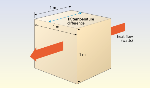
Table 3 gives thermal conductivities for some common building materials, together with their densities; generally the higher the density, the higher the thermal conductivity.
| Material | Density/ kg m–3 |
Thermal conductivity/ W m–1 K–1 |
|---|---|---|
| Aluminium (window frames) | 2727 | 220 |
| Steel wall ties | 7900 | 17 |
| Reinforced concrete (2% steel) | 2400 | 2.5 |
| Window glass | 2600 | 1.05 |
| Brickwork (outer leaf) | 1700 | 0.77 |
| Plaster (dense) | 1300 | 0.57 |
| Lightweight aggregate concrete | 1400 | 0.57 |
| Aerated concrete | 600 | 0.18 |
| Aerated concrete (lower density) | 460 | 0.11 |
| Timber (softwood) | 500 | 0.13 |
Metals have very high thermal conductivities and can transmit large amounts of heat for small temperature differences. Metal window frames, lintels over windows and fixings used for insulation can transmit considerable amounts of heat even though they only have a small total area. These are often referred to as ‘thermal bridges’ or ‘cold bridges’. Window glass has a high conductivity, so using thicker glass will have almost no effect on their overall U-value. Structural building materials such as brick and concrete have lower conductivities but the potential heat losses are still considerable due to the large surface areas of walls and roofs.
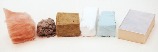
Insulation materials make use of the fact that still air, or other gases with a reasonably large molecular weight, are good thermal insulators. Most practical forms of insulation rely on using very small pockets of these gases. There are four kinds of commercial insulation material:
- various grades of aerated concrete containing small bubbles of air
- foamed glass containing small bubbles of air
- various forms of wool made up of fibres with air held trapped between them
- plastic foams containing small bubbles of gas.
Vacuum insulated panels (VIPs) using plastic foams with ‘bubbles’ of a vacuum have considerably better performance. They are becoming increasingly available, but are very expensive. Their application for refrigerators is described later in Section 4.1.2.
Aerated concrete, whose thermal properties are listed in Table 3, is not as physically strong as its dense counterpart. There is a trade-off of compressive strength against thermal insulation performance. In practical construction this material can be used to form the inner leaf of a cavity wall supplementing the main insulation, which is likely to be some form of mineral wool or plastic foam within the cavity. Figure 7 shows samples of these commonly used insulation materials.
Wool and plastic foam insulation materials are very light; their densities are typically only 15–30 kg m–3. Table 4 below gives some sample conductivity values for them, taken from manufacturers’ literature.
| Insulation material | Thermal conductivity/ W m–1 K–1 |
|---|---|
| Foamed glass | 0.045–0.055 |
| Mineral or glass fibre wool, sheep's wool, cellulose or hemp fibre | 0.032–0.040 |
| Expanded and extruded polystyrene foam | 0.030–0.040 |
| Polyurethane foam | 0.025 |
| Polyisocyanurate (PIR) foam | 0.023 |
| Phenolic foam | 0.022 |
Footnotes
Note: Specialist vacuum insulation is described later in Section 4.1.2.The most commonly available forms of insulation material are mineral wool (often called ‘rockwool’ or ‘earth wool’) and glass fibre wool.
Modern manufactured rock wool is the result of discoveries made in Hawaii of the effects of superheated steam on molten rock during volcanic eruptions. In the manufacturing process a suitable rock is melted at over 1500°C. It is then spun out through small holes on the perimeter of a centrifuge to produce long, thin fibres. Glass fibre manufacture is similar. The fibres may then be coated in a plastic resin and sold either as thick rolls or formed into flat square batts of insulation.
Plastic foam insulation materials are made by blowing a gas into molten plastic. Expanded polystyrene is a very familiar example widely used for packaging; other plastics used include urea formaldehyde, polyurethane, polyisocyanurate and phenolic resin. Their foams have different properties. Polystyrene foam, for example, can be made extremely strong and rigid. It is water-resistant and sufficiently strong to carry the weight of vehicles and so it can be used under factory floors. It can also be produced in blocks that can be quickly clipped together to build insulating shuttering into which concrete can be poured (see Figure 8).
Insulation materials can also be made from natural materials such as sheep's wool, cellulose fibre, wood fibre and hemp fibre.
Any practical insulation choice must take into account:
- thermal insulation performance
- cost
- ease and safety of handling
- compression resistance
- life expectancy
- water resistance
- fire resistance
- any possibility of producing dangerous fumes
Typically, plastic foam insulation materials have only two-thirds of the conductivity of wool or fibre materials, so the same insulating performance can be achieved with a smaller thickness.
There is considerable debate on the relative environmental friendliness of different materials.
The naturally occurring rock fibre, asbestos, is now banned because of associated health problems (the fibres are fine and brittle and break down into a fine dust that can be breathed in). Modern mineral and glass fibre wool are safer, though it is advisable to wear a face mask when using them in confined spaces.
Plastic foams use oil-based chemicals and, being plastic, are inflammable and can produce toxic smoke when burning. Urea formaldehyde foams, widely used in the 1980s, have now been largely replaced because of the slow leakage of low levels of toxic formaldehyde into the interior spaces of buildings.
Also, until the 1990s, the gases used to 'blow' many of these foams, creating bubbles, were chlorofluorocarbons (CFCs). However, these were found to be damaging the ozone layer in the upper atmosphere. They are also strong greenhouse gases, contributing to global warming. As a result of these environmental concerns, they have been replaced with other gases. Pentane has been widely used, but this increases the flammability of the insulation and suitable precautions must be taken with its use. More recently, hydrofluoroolefins (HFOs) have been introduced by some insulation manufacturers. These have a lower flammability and global warming potential.
In comparison, mineral wool and glass wool are relatively inert materials. However, their manufacture requires energy to produce the high temperatures to melt the materials. Even so, the manufacture of glass fibre or rockwool insulation only uses about a third of the primary energy of plastic foam insulation.
The energy used to manufacture insulation materials can be reduced through recycling. Recycled materials can be used in glass fibre insulation and some plastic foams. Recycled newspaper is the main ingredient of cellulose fibre insulation.
The overall energy used in manufacture sets limits to the maximum economic thickness that is worth using. For example, a domestic roof space in the UK might have 80 mm of existing insulation. Adding a further layer of 200 mm of glass wool will save heating energy, but it is likely to take between two and three years to recoup the energy used to make the insulation.
2.2.4 Conductivity and U-values – the basics
U-values are used, as with windows, to describe the overall thermal performance of a building element such as a wall or roof. However these are likely to be made up of multiple layers of different materials (plaster, brick, insulation, etc.) each of which will have different thermal properties.
Thermal conductivities are useful for comparing the thermal properties of different materials (Tables 3 and 4), but for practical purposes we need to know the precise thermal resistance of a particular thickness of insulation material. This thermal resistance is analogous to electrical resistance using heat flow as current and temperature difference as voltage. The higher the resistance the greater the reduction in heat flow for a given temperature difference.
Consider a slab of a particular material t metres thick, with temperatures Tin and Tout on the two sides and a heat flow Q watts through each square metre (see Figure 9).
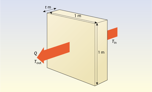
The temperature difference per metre of thickness for this slab is (Tin – Tout) / t, so it follows from the definition of thermal conductivity (λ) that the heat flow per square metre is:
- Q = (Tin – Tout) × λ / t watts
The thermal resistance (R) of the slab is defined as the temperature difference divided by the heat flow per square metre:
- R = (Tin – Tout) / Q m2 K W–1
- = t / λ m2 K W–1
The thicker the insulation, the greater the value of R.
Thus for a layer of insulation 100 mm (0.100 m) thick, with a thermal conductivity of 0.040 W m–1 K–1 the thermal resistance of the 100 mm layer will be:
- R = t / λ = 0.1 / 0.04 = 2.5 m2 K W-1
Finally, since the U-value of a slab is the heat flow divided by the temperature difference, R = 1 / U (and U = 1 / R).
Thus the U-value of this slab of insulation on its own is 1 / 2.5 = 0.4 W m-2 K−1.
An alternative way of looking at this problem is to say that a 1 metre-thick slab of this insulation will have a U-value on its own of 0.04 W m-2 K−1. Reducing the thickness by a factor of 10 to 100 mm will increase the heat flow and give a U-value of 0.4 W m-2 K−1.
Remember:
- U-values and thermal resistances are usually properties of whole building elements, while λ-values are properties of particular materials
- A good insulation material will have a low λ value
- A well insulated piece of building fabric will have a low U-value and a high thermal resistance.
Activity 4
Just considering the materials alone, which has a higher thermal resistance: a piece of solid brick wall 250 mm thick with a conductivity of 0.77 W m−1 K−1 or 25 mm (one inch) of insulation with a conductivity of 0.040 W m−1 K−1?
Answer
A 250 mm thick piece of solid brick wall has a thermal resistance of t/λ = 0.25 / 0.77 = 0.325 m2 K W-1.
A 25 mm (one inch) thickness of insulation has a thermal resistance of t/λ = 0.025 / 0.04 = 0.625 m2 K W-1.
The insulation wins!
2.2.5 Using insulation
Loft insulation
The most familiar use of wool-type insulation is in loft insulation. Since its first introduction into the UK Building Regulations for housing, the recommended thickness has increased from 25 mm in 1974 to 270 mm at present (2023) for both new build and for existing houses. Figure 10 shows the U-values resulting from different thicknesses.
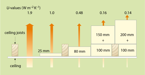
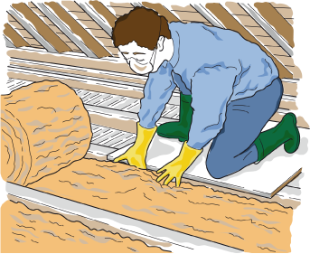
Loft insulation is usually sold in rolls. A ‘base layer’ of 100 thickness is rolled out between the wooden ceiling joists (Figure 11) and then a further layer 170 mm thick is added over the top, blocking the upward heat loss through the ceiling joists. This is likely to achieve a U-value of about 0.15 W m-2 K−1, a twelve-fold improvement compared to an uninsulated loft.
It is important to make sure that any insulation does not block gaps at the roof eaves, to allow air movement within the loft space (see Section 2.3). Insulation should be omitted under any water tanks in the loft space to allow heat from the house to reach them. They, and any water pipes in the loft space, should be properly insulated to make sure they don’t freeze in winter.
Cavity wall insulation in existing buildings
The walls of buildings can be insulated in many ways. In existing buildings with cavity walls insulation can be inserted into the cavity as long as the building isn’t exposed to high winds with driving rain, since the main function of the cavity is to stop damp penetration through the wall.
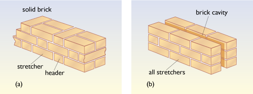
All brick walls may at first sight look the same, but on closer inspection the outer skin of a cavity wall, as shown in Figure 12, will be seen to be made up of bricks all laid side-on (stretchers). A solid brick wall will also include bricks laid end-on at right angles (headers).
Holes can be drilled in the outer brick skin and foam insulation can be injected into the gap, or rock wool or polystyrene beads can be blown into it. Typically this will improve the U-value from about 1.5 W m–2 K–1 to about 0.6 W m–2 K–1.
Internal insulation of existing solid walls
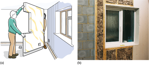
A typical solid brick wall two bricks (about 230 mm or 9 inches) thick has a relatively poor U-value of 1.4 – 2 W m-2 K-1. Such solid walls can be ‘dry lined’. This involves putting a layer of insulation on the inside faced with plasterboard. This is fairly simple to do (as long as the occupants don’t mind the disturbance to the interior of the house). Sheets of foam-backed plasterboard can be glued to the wall (Figure 13(a)), or alternatively insulated battens can be screwed to the wall with a layer of insulation between them and covered with a surface layer of plasterboard screwed to the battens (Figure 13(b)).
The U-values that can be achieved are mainly dependent on how much reduction in the interior room sizes can be tolerated. For example the 2013 UK Building Regulations suggest a target value of 0.3 W m-2 K-1. This would require the use of 75 mm of polyisocyanurate foam.
External insulation of solid walls
Alternatively solid walls can be externally insulated, usually with a thick layer of polystyrene foam which is then either covered with a layer of cement render or a special cladding layer (see Figures 14(a) and 14(b)).
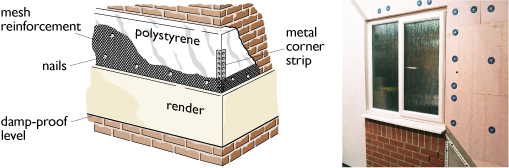
External insulation is commonly used in the refurbishment of tower blocks of flats. Although it is relatively expensive, it is possible to achieve good U-values of better than 0.3 W m–2 K–1 with 100 mm or more of insulation. The disastrous fire in the Grenfell Tower block in London, in summer 2017, has stressed the need for the overall design of such external insulation arrangements to be properly fireproof. Also, insulation materials should not give off toxic fumes when burning or in normal use (see Latif, E. et al., 2019).
New buildings
In new construction, brick walls can be built with cavities and insulation batts built in. If the building is in an area of driving rain then an air gap may also have to be included. Insulating aerated concrete blockwork can also be used to build the inner leaf (see Figure 15).
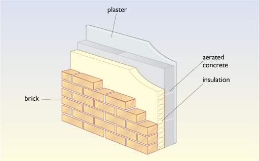
A wall U-value of 0.26 W m-2 K-1 is currently (2023) suggested by the UK Building Regulations. This can be bettered by making the cavity as wide as necessary (200 mm to 300 mm) to incorporate more insulation and, if necessary, to retain an air gap to prevent damp penetrating the wall. Timber frame construction can also use considerable thicknesses of insulation; 200 mm or more of wall insulation is commonly used in Scandinavia and Germany.
Floors
The floors of buildings can also be well insulated. Modern UK construction often uses thick sheets of polystyrene or polyurethane foam. In older buildings with suspended timber floors, sheets of insulation material can be inserted under the floorboards between the joists. The Building Regulations for England (HM Gov, 2021) suggest a floor U-value of 0.18 W m-2 K-1 for new buildings and for refurbishment projects. This is likely to require the use of polystyrene insulation more than 100 mm thick.
2.2.6 Calculating U-values of multiple layers of materials
Any thorough analysis of the thickness of insulation required to meet a specified U-value will require some detailed calculations. The earlier discussion of the basics of U-values only considered the thermal resistance of a single slab of a building material.
In any practical building element there will be extra thermal resistances, particularly those of the thin layers of air adhering to the outermost and innermost layers of the material, and the air in any substantial gap between the layers. Table 5 gives standard thermal values used for these. Note that the outside surface resistance is much lower than the value used for the inside surface. This is because the air is less likely to be still on the outside and will thus provide a relatively poorer insulation performance.
| Layer | Resistance / m2 K W–1 |
|---|---|
| Inside surface (Rsi) | 0.13 |
| Air gap | 0.18 |
| Outside surface (Rso) | 0.04 |
The thermal resistances of the components of a building element can be added in series as in Figure 16, to give a total thermal resistance (rather like adding electrical resistances in series). The total thermal resistance of a practical building element will thus consist of the sum of those of all its layers plus the inside and outside surface resistances.
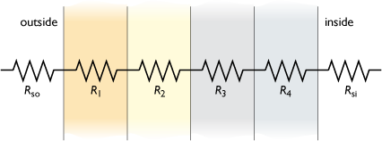
Taking, for example, a wall construction with four layers, the total thermal resistance, RT , will be:
- RT = Rso + R1 + R2 + R3 + R4 + Rsi m2 K W–1
The U-value of this wall is its inverse = 1/RT W m–2 K–1
For example the wall shown in Figure 15 consists of the following layers: 115 mm common brick, a 115 mm cavity filled with mineral wool (conductivity 0.035 W m–1 K–1), 115 mm of aerated concrete blockwork (density 460 kg m–3) and a 13 mm layer of plaster on the inside. Using the conductivity values in Table 4 we can calculate its U-value by summing the various thermal resistances as shown in Table 6.
| Layer | Thickness /m |
Conductivity/ W m–1 K–1 |
Resistance/ m2 K W–1 |
|---|---|---|---|
| Outside thermal resistance | 0.04 | ||
| Brick | 115 mm | 0.77 | 0.115/0.77 = 0.15 |
| Mineral wool | 115 mm | 0.035 | 0.115/0.035 = 3.29 |
| Aerated concrete block | 115 mm | 0.11 | 0.115/0.11 = 1.05 |
| Dense plaster | 13 mm | 0.57 | 0.013/0.57 = 0.02 |
| Inside thermal resistance | 0.13 | ||
| Total thermal resistance | 4.67 |
The overall U-value is then:
- U = 1 / R = 1 / 4.67 = 0.21 W m–2 K–1
In practice, building elements do not simply consist of flat layers. The wall construction above is likely to use thin metal wall ties securing the outer brickwork to the inner leaf of blockwork. This will create a ‘thermal bridge’ bypassing the insulation and reducing its performance. Depending on the details a more realistic U-value for this sort of construction might be about 0.25 W m–2 K–1.
Similarly, in Figure 10, the base layer of loft insulation only blocks the flow of heat over a certain area. There is a parallel heat-flow path through the wood of the joists supporting the ceiling. This flow is blocked by the top insulation layer. A certain allowance always has to be made for thermal bridges, but the mathematics is not simple.
Activity 5
Ignoring the thermal resistance of the panes of glass, use the data in Table 5 to estimate the U-value of a double-glazed window.
Answer
The total thermal resistance of the window is the sum of the resistances of the inside layer, the air gap between the panes and the outside surface layer.
- Total resistance = 0.13 + 0.18 + 0.04 = 0.35 m2 K W–1
- U = 1/R = 1/0.35 = 2.86 W m–2 K–1
This answer is very close to the value of 2.7 W m–2 K–1 given in Table 2 for air-filled double-glazing, though this also takes the heat loss through the window frame into account.
Activity 6
What is the thermal resistance of a 4 mm thick sheet of window glass? (You will need to look back to Table 3 in Section 2.2.3.) Is doubling the thickness of the glass likely to improve significantly the overall U-value of a double-glazed window?
Answer
Table 3 gives the conductivity of glass as 1.05 W m−1 K−1. The thermal resistance of a 4 mm thickness will thus be only 0.004/1.05 = 0.0038 m2 K W−1. This is only about 1% of the calculated total thermal resistance of the window in Activity 5. Doubling the thickness of the glass will double its thermal resistance but won’t make much difference to the overall window U-value.
Activity 7
(a) Exploring the improvement in U-value resulting from the introduction of cavity wall construction
Table 6 above shows a calculation of the U-value of a modern multi-layer wall. A normal pre-1919 UK house is likely to have solid walls two bricks thick, with each brick being 115 mm thick (see Figure 12(a)). Later construction used cavity walls with an air gap between the two skins of brick as illustrated in Figure 12(b).
Table 7 is interactive and allows you to change the wall construction in the third layer giving three options:
- a solid brick wall two bricks thick
- a cavity wall
- a solid brick wall three bricks thick.
The overall calculated U-value appears at the bottom.
Which of the following gives the lower U-value?
- i.adding a cavity to a two-brick solid wall
or
- ii.increasing the thickness of the solid wall to three bricks thickness?
Table 7
(b) Exploring the benefits of cavity wall insulation and the thickness of insulation needed to meet future UK U-value standards
The interactive Table 8 allows you to calculate the U-value of a cavity wall filled with insulation (as shown in Figure 15). It also allows you to change the inner leaf between brick and aerated concrete. (Note that you will need to click on the ‘calculate’ button to produce the answer at the bottom.)
Table 8
- i.Start by calculating the U-value of a cavity wall with a brick outer skin in layer 2, a brick inner skin in layer 4 and insulation in a 50 mm cavity. A typical conductivity value to use for blown mineral wool cavity insulation might be 0.035 W m−1 K−1. The properties of other types of insulation have been given in Table 4. This should give a U-value of 0.52 W m-2 K−1. How does this compare to the U-value of the uninsulated cavity wall in part (a) of this activity?
- ii.Next explore the improvement in U-value by changing the inner leaf of the wall to insulating aerated concrete in layer 4. Remember to click on ‘calculate’ to produce the final U-value.
- iii.Increase the thickness of the insulated cavity to 100 mm or 150 mm. What is the U-value now?
- iv.Future UK houses may need walls with a U-value of 0.15 W m-2 K−1 or better. What is the minimum insulation thickness they will need using mineral wool? What is the answer if they used polyisocyanurate foam with a conductivity of 0.023 W m−1 K−1?
Answer
(a)
- i.Adding an air gap to produce a cavity wall decreases the U-value from 2.03 W m-2 K−1 to 1.49 W m-2 K−1.
- ii.Increasing the thickness of the solid wall to three bricks thickness reduces the U-value to 1.56 W m-2 K−1.
The cavity wall gives the greater decrease in U-value.
(b)
- i.Filling the cavity with mineral wool insulation reduces the U-value from 1.49 to 0.52 W m-2 K−1, almost a three-fold improvement.
- ii.Changing the inner leaf from brick to aerated concrete improves it further to 0.36 W m-2 K−1.
- iii.Increasing the insulation thickness to 100 mm improves the U-value to 0.24 W m-2 K−1 and 150 mm gives 0.18 W m-2 K−1.
- iv.The minimum cavity thickness to achieve a U-value of 0.15 W m-2 K−1 with mineral wool is 180 mm. This figure comes down to only 120 mm if polyisocyanurate foam is used.
2.3 Cutting ventilation losses
Buildings also lose heat by ventilation, i.e., the passage of air through them. In houses this normally means the controllable air movement through openable windows, extractor fans, or, in the case of larger buildings, a mechanical ventilation system. However there is also an uncontrolled component called infiltration. This is the air flow through gaps in the fabric of the building – cracks around windows, doors and electrical or plumbing outlets, or between skirting boards and floors. In common use, the term infiltration is used as a component of ventilation rather than something completely different.
Some form of ventilation in a building is essential. For example in a house it is needed in living spaces:
- to provide combustion air in winter for boilers, fires and gas cookers, although it is not necessary for heating systems with balanced flues (see Section 3.1) or for electric fires
- to remove moisture from kitchens, toilets and bathrooms, which should be equipped with controllable ventilation openings and/or their own extractor fans
- to provide fresh air for occupants and to keep them cool in summer.
Ventilation is also needed in other areas of the house, to remove moisture in the roof space or loft above the insulation, or under suspended ground floors (which are usually of wood, but in more recent construction can be made of concrete). Figure 17 illustrates the ventilation and infiltration air paths through a normal house and also where it is important to maintain essential ventilation. Note that an air flow must be maintained through the loft space and not be blocked by insulation pushed into the eaves of the roof.
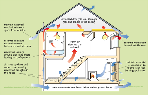
The main driving forces for this air movement are the buoyancy (or stack) effect of warm air and the wind pressure on a building. Warm air inside a building in winter is less dense than cold air outside and, like a hot air balloon, will tend to rise. This has the effect of sucking in cold air from outside into the rooms on the ground floor. Wind pressure will attempt to force air through gaps in the walls on the windward side of the building and out again on the leeward side. Wind speeds increase with height above the ground, so wind-driven infiltration in high-rise buildings can be a major problem.
Houses are normally naturally ventilated, i.e. they are dependent mainly on the stack effect to provide adequate air movement.
In larger buildings mechanical ventilation is often used. This is often also the means of space heating, with air being centrally preheated (or cooled in summer) before being distributed throughout the building and extracted again through more ductwork. The term ‘air conditioning’ normally implies the use of mechanical ventilation with central air cooling.
The key factor in determining the ventilation heat loss in a building is the ventilation rate, i.e. the average rate at which air flows through it. Any warm air that escapes through the windows, doors and various gaps in the outer fabric is immediately replaced by a new supply of fresh cold air from outside. We may be unaware of how substantial this ‘invisible’ air really is – an average house contains about a quarter of a tonne of it!
The ventilation rate is normally specified as the number of complete air changes that take place per hour (ACH). Actually measuring this scientifically is a fairly complex process. Typically, in a new, well-built, naturally ventilated house where windows are closed, and with few gaps in the building fabric, it might take two hours for the air to be completely replaced by new, incoming air. We would say that the ventilation rate of this house was 0.5 ACH.
If the volume of a house is V m3, and the air change rate is n ACH, then the total amount of air passing through it per hour will be n × V m3. This air needs to be heated up through the temperature difference ΔT between the external temperature and the internal temperature. The energy required to raise one cubic metre of air through one kelvin is 0.33 watt-hours, i.e. its heat capacity per cubic metre is 0.33 Wh m–3 K−1. Thus the total ventilation heat loss, Qv , will be:
- Qv = 0.33 × n × V × ΔT watts
For any given building, the actual ventilation rate will depend on its age and location. Many buildings built before 1918 had an open coal fire and chimney for almost every room. They are also likely to have been designed for gas lighting, with high ceilings and air bricks in the walls to remove the combustion fumes. Draughty wooden ground floors are also common. Since the pressure of the wind on a house has a great influence, buildings in sheltered locations are likely to have a lower air change rate than those in exposed positions. For example, a house built before 1918 might have an average ventilation rate of over 2 ACH in an exposed location.
After 1920, houses and offices were designed for electric lighting and had lower ceilings. It was only in the 1970s, with the advent of cheaper electricity and gas central heating, that houses began to be built without open fireplaces. They could then (theoretically at least) be designed to be reasonably airtight. Section 2.3.1 looks at how to reduce heat loss by improving the airtightness of buildings.
Heat loss can also be reduced by recovering some of the heat from ventilation air before it is released. This is the topic of Section 2.3.2.
2.3.1 Airtightness
Proper airtightness is the key to minimising air infiltration. In existing housing this means using draught-proof strips, replacing leaky windows and blocking unused chimneys. The latter may be difficult since it is often necessary to maintain a small air-flow through them to remove any moisture penetrating into them. It means paying careful attention to blocking all the unwanted air leakage paths shown in Figure 17, while maintaining the essential ones.
In new construction attention to detail is important. It is easy to leave air gaps around windows and where pipes penetrate walls. Sheet plastic vapour barriers are often built into walls, especially in timber-framed construction. For really good airtightness these vapour barriers must be taped together where they join, so that they cover the whole building envelope. This is a highly skilled job.
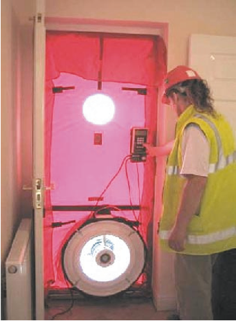
The overall airtightness of a building can be assessed with a pressure test. Usually one of the external doors is replaced with a frame carrying a calibrated electric fan (see Figure 18). This blows a large amount of air into the building at a known rate, in order to set up a standard pressure difference between the inside and outside of 50 Pascals. This is roughly equivalent to the effects of a gale-force wind. The overall air leakage rate of the building at this pressure difference can be worked out and is usually expressed in cubic metres per hour per square metre of building envelope area (i.e. area of walls, roof, etc.). The lower the figure, the more airtight the construction. Problem areas can be identified and investigated using a small smoke generator allowing the air leakage to be clearly seen.
2.3.2 Ventilation heat recovery
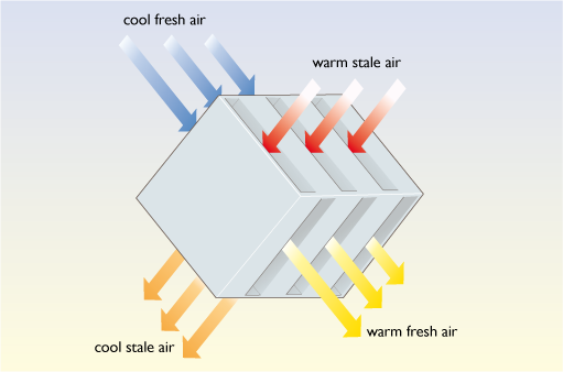
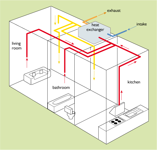
Many office buildings use mechanical ventilation driven by electric fans. One way of reducing ventilation heat loss is to use mechanical ventilation with heat recovery (MVHR), which involves allowing warm outgoing air to preheat cold incoming air. This can be done by passing both air streams through a heat exchanger (see Figure 19), consisting of multiple layers of thin, flat, metal or plastic plates with incoming and outgoing air passing through alternate layers. This gives a large area through which heat can flow. Obviously such a system can be used only if the inlet and outlet ducts are adjacent to each other.
MVHR is a mixed blessing. On the one hand it gives controllable ventilation adjustable to almost every room. On the other it requires complex ductwork and air pumping, which can consume considerable amounts of electricity.
MVHR systems are available for domestic applications (see Figure 20) but it is essential that they are installed in buildings that are airtight to start with, otherwise any attempt to pump air around the system may just increase the flow of air through unwanted air infiltration paths. However, once the fabric heat losses of a building have been tackled with thick insulation and high-performance windows, this may be the only satisfactory way to deal with the remaining major heat loss, that from ventilation.
Activity 8
What is the difference between ventilation and infiltration?
Answer
Ventilation is air movement that is considered essential and may be deliberately encouraged by opening windows or using mechanical ventilation. Infiltration is uncontrolled air movement through various cracks in the building fabric or through air paths such as chimneys.
Activity 9
A small 19th century terraced house has a volume of 240 m3, an air change rate of 2 ACH and an inside–outside temperature difference, ΔT of 20 K. What is its ventilation heat loss rate in kilowatts?
Answer
Using the equation given above:
- Qv = 0.33 × n × V × ΔT watts
and taking n = 2 ACH, V = 240 m3 and ΔT = 20 K
- Qv = 0.33 × 2 × 240 × 20 watts = 3.17 kW
(i.e. rather a lot).
2.4 How much insulation does a building need?
A further related question is ‘how large a heating system will it need?’ Obviously the severity of the winters at the building location is a key factor. There are two measures for this: the winter design temperature and the number of degree days.
The winter design temperature is that of the coldest weather likely to occur on the worst winter days at a particular location. It is used to size the heating system. For example the design temperature for London is –2°C, while for Berlin it is –11°C.
The number of degree days is a measure of the average external temperature over the winter months and can be used to estimate the heating fuel bills.
2.4.1 Calculating the total heat loss of a house
If we know the U-values of all the elements of the external fabric of a building, its volume and its average ventilation rate, then we can calculate its overall heat loss coefficient (or heat transfer coefficient). We can define this as the total space heating energy flow rate in watts divided by the temperature difference between the inside and outside air.
Let us take a reasonably modern end-of-terrace house insulated to standards suggested in the 2002 Building Regulations for England and Wales. Its dimensions are shown in Figure 21 and its total floor area (upstairs and downstairs) is 96 m2.
The total fabric heat loss flow rate, Qf, will be the sum of all the U-values of the individual elements of the external fabric, walls, roof, floor, windows and doors multiplied by their respective areas multiplied by the inside–outside temperature difference, ΔT.
- Qf = (ΣUxAx ) × ΔT watts - (note: the Σ symbol means ‘sum of’)
The total fabric contribution to the overall heat loss coefficient is then:
- Qf/ ΔT = ΣUxAx W K−1
This is calculated in Table 7.
| Element | Area / m2 |
U-value / W m–2 K–1 |
Contribution to heat loss coefficient /W K–1 |
|---|---|---|---|
| Floor | 48 | 0.25 | 48 × 0.25 = 12 |
| Roof | 48 | 0.16 | 48 × 0.16 = 7.7 |
| Walls | 80 | 0.35 | 80 × 0.35 = 28 |
| Windows and doors | 20 | 2.00 | 20 × 2.00 = 40 |
| Total | 87.7 |
Note that we assume that the adjacent house will be at the same internal temperature, so that there will be no heat loss through the (uninsulated) party wall between them. Also, in practice there will be extra conduction heat losses called ‘cold bridges’ through items such as pipework running through walls and the metal lintels over windows, but we will ignore these here.
We must also include the ventilation heat loss, which is:
- Qv = 0.33 × n × V × ΔT watts
where n is the number of air changes per hour (ACH) and V is the volume of the house (m3).
The ventilation contribution to the overall heat loss coefficient is then:
- Qv / ΔT = 0.33 × n × V W K−1
Assuming an air change rate of 0.5 ACH (which requires reasonably airtight construction) and taking the volume of the house as 240 m3:
- Qv / ΔT = 0.33 × 0.5 × 240 = 39.6 W K–1
Summing the fabric and ventilation contributions gives a total whole-house heat loss coefficient of:
- (Qf + Qv)/ΔT = 87.7 + 39.6 = 127.3 W K–1
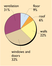
Figure 22 gives the percentage breakdown of these losses, which shows their relative importance and gives a clue as to where to look for further improvements.
We can use this whole house heat loss coefficient to estimate a suitable size for the heating system. If we assume an internal temperature of 20°C and site the house in London, for example, which has a winter design external temperature of –2°C, then the heating system must be able to maintain a temperature difference of 22 K. An estimate of the necessary heating system size, Qh, would thus be:
- Qh = 22 × 127.3 = 2800 W
In practice there is always an extra allowance to cope with warming up a house if it has been left empty for a few days.
If the house were situated in Berlin, which has much colder weather and a design temperature of –11°C, then the heating system would have to maintain a worst-case temperature difference of 31°C and would have to be rated at 31 × 127.3 = 3950 W.
Obviously the more insulation and the better the airtightness, the smaller (and hopefully cheaper) the heating system can be.
2.4.2 Degree days
We can also use this heat loss coefficient together with the number of degree days to understand how much space heating energy a building might use in different locations. Over a long period, such as a day or so, the heat loss from a building will be proportional to the average temperature difference between the interior and the outside air. If on a given day the average internal temperature was 20°C and the average external temperature was 10°C, then the difference would be 10°C. We would describe that particular day as having ‘10 degree days’. If on another day the average internal temperature was the same and the external temperature was zero, 0°C, i.e. an average difference of 20°C, we would describe that day as having 20 degree days and expect the building to lose twice as much heat as on the first day.
However if the average external temperature was higher than the interior, then there would not be any heating requirement, and the number of degree days would be zero (rather than a negative number). The total heating requirement over a month will be proportional to the sum of all the degree days of the individual days.
Table 8 gives some long-term averages for sample UK locations. Given their long history of use, it is not surprising that they are normally produced in the UK with a standard indoor base temperature of 60°F, equivalent to 15.5°C.
| South Western | London (Thames Valley) | Midlands | Northern Ireland | Borders | North-East Scotland | |
|---|---|---|---|---|---|---|
| January | 281 | 319 | 356 | 343 | 345 | 367 |
| February | 257 | 282 | 314 | 305 | 304 | 327 |
| March | 239 | 242 | 278 | 286 | 295 | 313 |
| April | 193 | 180 | 220 | 227 | 248 | 255 |
| May | 112 | 97 | 136 | 150 | 180 | 183 |
| June | 58 | 44 | 72 | 85 | 106 | 110 |
| July | 25 | 18 | 36 | 46 | 57 | 62 |
| August | 23 | 19 | 37 | 53 | 55 | 66 |
| September | 50 | 48 | 76 | 92 | 95 | 112 |
| October | 111 | 120 | 167 | 174 | 171 | 200 |
| November | 193 | 227 | 264 | 258 | 260 | 285 |
| December | 252 | 293 | 334 | 323 | 327 | 358 |
| Total | 1794 | 1889 | 2290 | 2342 | 2443 | 2638 |
Table 8 gives an annual total of 1889 degree days for the London area. A first estimate of an annual heating energy consumption of our house in watt-hours would be the heat loss coefficient, 127.3 W K–1, multiplied by the number of degree days multiplied by 24 (to convert from days to hours). Dividing by 1000 then gives the result in kilowatt-hours (kWh).
- Annual consumption = 127.3 × 1889 × 24/1000 = 5771 kWh
If the house had been located in Berlin, instead, which has 2600 degree days, then the heating load would have been much higher:
- Annual consumption = 127.3 × 2600 × 24/1000 = 7944 kWh
Put another way, it would have to be better insulated to achieve the same heating demand.
We can go further and say that if we managed to trim 1 W K–1 off the heat loss coefficient by better insulation or airtightness, then the marginal saving in space heating demand would be 1889 × 24 = 45.3 kWh in London or 2600 × 24 = 62.4 kWh in Berlin. This could then be used to analyse the relative cost effectiveness of further energy-saving investments.
Activity 10
Based on the degree day data, is our sample house likely to have a higher heating demand in Berlin or north-east Scotland?
Answer
The more degree-days, the higher the likely heating demand. North-east Scotland has slightly more degree days, 2638, than Berlin with 2600, so our sample house is likely to have the highest heating demand in Scotland.
2.4.3 Balance point temperature
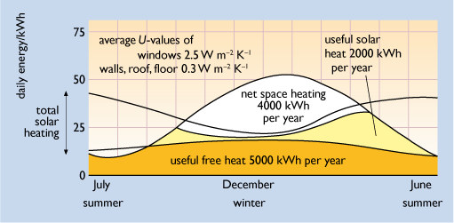
In practice, the degree day concept should be treated with caution when dealing with well-insulated buildings. It may seem strange that degree days are to a base of 15.5°C and not the actual internal temperature of the building. The degree day base temperature is assumed to be that below which the heating system is likely to be needed. This is in fact likely to be a function of the level of insulation. This problem is explored in Figure 23 which shows the estimated daily heating requirements for a 1970s house, with and without extra insulation.
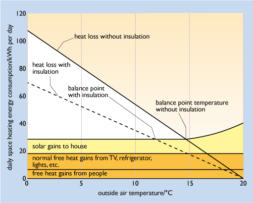
On any given day the gross space heating will depend on the external temperature; the colder it is, the more heating energy will be required. However, there will always be a certain amount of internal free heat and solar gains. The space heating system itself will only need to supply heat if these are not sufficient to keep the house warm enough. We can describe this as the net space heating demand.
This will only be required if the external temperature falls below a certain ‘balance point temperature’. Below this the free heat gains cease to be sufficient to keep the house at the chosen internal temperature, assumed to be 20°C in Figure 23. In this particular house in its uninsulated state the balance point appears to be just under 15°C; it is certainly considerably lower than 20°C. We could say that the heating demand of this house requires degree days to the base 14.5°C rather than 15.5°C.
In fact the degree day concept is very old and predates any notion of insulation in the UK building stock. An assumption of a ‘balance point temperature’ of 15.5°C was quite appropriate for estimating the space heating consumption of the buildings of the 1950s and 1960s. However, it is still useful in basic energy monitoring and targeting in buildings today.
2.4.4 Improving insulation standards
By the standards of the whole British housing stock the heat loss coefficient for the sample house of 127 W K–1 calculated above is quite good. In 2011, the average British dwelling had an estimated heat loss of about 290 W K–1 down nearly a quarter on the figure of 376 W K–1 for 1970 (BEIS, 2013).
How do these improving insulation standards affect the total amount of heat that a space heating system must supply?
Figure 24 shows the estimated gross heating demand of a poorly insulated 1970s UK house (similar houses will be found right across Northern and Central Europe). This peaks at nearly 100 kWh per day in midwinter.
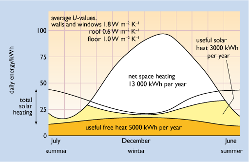
This heating demand will be higher in the cold midwinter months than in the warmer spring and autumn ones. In summer, when the outside air temperature is high, this gross heating requirement falls to under 20 kWh per day. Free heat gains are likely to contribute throughout the year, peaking slightly in midwinter when there is most artificial lighting use. Solar gains are likely to give most contribution in autumn and spring. Not all of the solar gains will be useful in heating the house; some are likely to cause overheating and the occupants may open the windows to dissipate any surplus gains.
For this particular house, over a whole year, out of a total gross heating demand of 21 000 kWh, 5000 kWh have come from free heat gains and 3000 kWh from solar gains. Put another way, in this perfectly ordinary house 14% of the gross heating demand is supplied by solar gains. The net space heating demand, to be supplied by the normal heating system, is the remaining heat requirement, 13 000 kWh. This will have to be supplied over a ‘heating season’ from mid-September to the end of May.
Figure 25 shows the gross and net space heating demands over the year for a more modern house with a better standard of insulation, including double-glazing and insulated walls, floor and roof. The gross heating demand now peaks at just over 50 kWh per day in midwinter. Over the whole year it has been roughly halved to about 11 000 kWh, but now the free heat and solar gains are sufficient to keep the house at a comfortable temperature for more of the year. The heating season is now shorter, only from October to April and the net space heating demand has fallen to only 4000 kWh, a reduction of 70%.
Passivhaus design
If a house were sufficiently well-insulated – super-insulated – the free heat and solar gains alone should be sufficient to keep the internal spaces warm in all except the very coldest weather. A ‘space heating system’ as such might be very small, or even unnecessary.
It might be thought that as energy efficiency standards improve the level of free heat gains in houses might be likely to fall. However, over the past 40 years the delivered energy per UK household for cooking, lights and appliances has actually risen by about 30%. This trend is discussed later in Section 4.
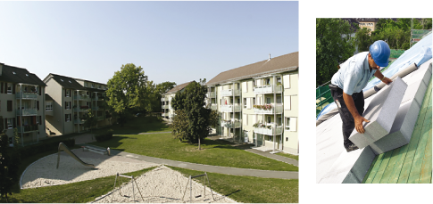
Super-insulated building design has been heavily promoted in Germany, both for new construction and, most important, the refurbishment of existing buildings. In the late 1990s an estate of apartment blocks in Ludwigshafen in south-west Germany, originally constructed in the 1950s, was given a thorough thermal modernisation (see Figure 26(a)) including:
- at least 200 mm of foam insulation on the roof and in the walls (see Figure 26(b))
- triple-glazed windows with low-e glass with a U-value of 0.8 W m–2 K–1
- mechanical ventilation with heat recovery
- a combined heat and power (CHP) unit (effectively a small power station) using a fuel cell. This technology is described later in section 3.4.
Monitoring showed that the net space heating energy use fell by a factor of seven from 210 kWh per square metre of floor area per year to only 30 kWh m2 yr–1. This is equivalent to 3 litres of heating oil – hence the project name, the ‘3-Liter-Haus’ (IKZ, 2014). Subsequent projects have used even thicker insulation.
The German Passivhaus programme has halved this energy target to 15 kWh m–2 yr-1 using fabric U-values of approximately 0.1 W m–2 K–1. The German climate is colder than that of most of the UK. The house is considered ‘passive’ in the sense that it does not need substantial heating. Such a target would mean a net space heating demand of under 1500 kWh yr−1 for our sample house with a 96 m2 floor area.
In the UK Passivhaus design is being promoted by Passivhaus Trust and their introductory guide includes various housing examples.
Activity 11
In 2015 there were 27 million homes in the UK and their average space heating demand was about 9 000 kWh yr-1. In a home insulated to a Passivhaus standard this could be reduced to only 1500 kWh yr-1.
- a.Calculate the total 2015 UK domestic space heating demand in petajoules (you will need to look back to Box 1 in Section 1 for the conversion factors).
- b.What would the national domestic space heating demand become, in petajoules, if the whole UK housing stock were insulated to a Passivhaus standard. Would you consider the potential energy saving significant given the overall national energy use shown in Figure 1 in Section 1?
Answer
- a.From Box 1, 1 kWh = 3.6 MJ
For each home, annual space heating demand
= 9000 kWh = 3.6 × 9000 MJ = 32 400 MJ = 32.4 GJ
National domestic space heating demand = 32.4 × 27 000 000 GJ
= 874 800 000 GJ = 874.8 PJ
- b.For a Passivhaus home, annual space heating demand
= 1500 kWh = 3.6 × 1500 = 5400 MJ = 5.4 GJ
National domestic space heating demand = 5.4 × 27 000 000 GJ
= 145 800 000 GJ = 145.8 PJ
Saving = 874.8 – 145.8 PJ = 729 PJ
Figure 1 shows a total delivered energy consumption of about 5700 PJ of which over 2000 PJ are devoted to space and water heating. So a saving of over 700 PJ would indeed be significant.
3 Improving heating system efficiency
Over the past 60 years the UK has been transformed from a country where the majority of homes were heated with individual coal fires to one where central heating is almost universal. In 2014, an estimated 97% of British homes were centrally heated.
An open coal fire may seem very cosy and traditional, but in practice most of the heat disappears up the chimney. The thermal efficiency of a heating system = useful heat output / fuel energy input. That of a coal fire is particularly low.
Table 9 illustrates the enormous variation in thermal efficiencies of different space heating systems.
| Heating system | Seasonal average efficiency |
|---|---|
| Open coal fire | approx. 32% |
| New coal boiler | approx. 70% |
| Electric fire | 100% |
| Older gas fire | approx. 50% |
| Typical 1980s wall-hung gas boiler | approx. 65% |
| Gas condensing boiler | >85% |
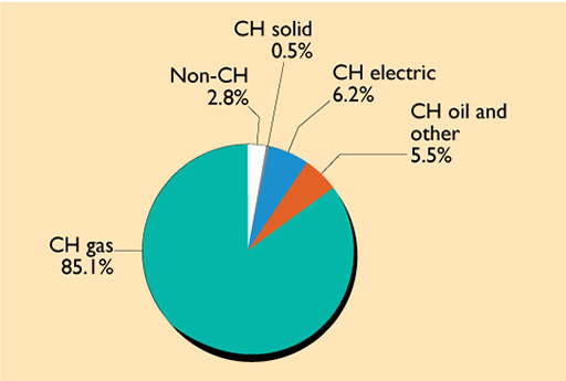
In the UK, gas is the dominant central heating fuel (see Figure 27) and it also supplies half of non-centrally heated homes. Renewable energy and energy from waste meet about 1% of domestic heating energy demand.
This growth of central heating use has been a mixed blessing for overall energy demand. The average UK dwelling today is better insulated than its 1970 counterpart, and space heating system efficiencies have increased, from an average of about 50% in 1970 to over 80% in 2011 (BEIS, 2013). It might therefore be thought that the space heating demand of the average UK home would have fallen dramatically. However, much of the potential energy saving has been taken up as increased internal temperatures. Homes are now better heated and estimated average internal temperatures have risen from about 12°C to 18°C over the same period, increasing the heat losses. It is even possible that this temperature trend will continue in the future to levels of 22°C or more found in housing in Germany and Scandinavia.
Figure 28 shows the layout of a typical domestic wet central heating system. Water is circulated through a boiler, which may be fuelled by gas, oil or solid fuel (or even an electric heat pump). The heated water flows through the radiators as well as through a heat exchanger in a hot water storage cylinder, which holds the domestic hot water used for washing, etc. The storage cylinder (if present) should be well-insulated – most are now supplied with a sprayed layer of foam insulation.
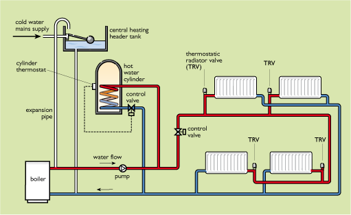
There are many variants of this basic system. The most common one is the combination or ‘combi’ boiler. This supplies heat to radiators but dispenses with the hot water cylinder, acting as an instantaneous heater for domestic hot water.
Such a system should obviously be properly controlled for maximum efficiency. A good system is likely to be controlled by:
- preset time switches, or a timing programmer
- a room thermostat that senses the air temperature, usually somewhere in the middle of the house
- a hot water cylinder thermostat that senses the requirement for domestic hot water.
In addition individual radiators should be equipped with thermostatic radiator valves (TRVs) that provide extra local control in individual rooms.
Systems for larger buildings are likely to follow a similar pattern, but may have multiple zones that can be separately controlled. Large buildings such as hospitals are likely to use ‘warm air’ heating. Air is centrally heated (or cooled) and then blown through ducts to individual rooms.
3.1 Gas boilers
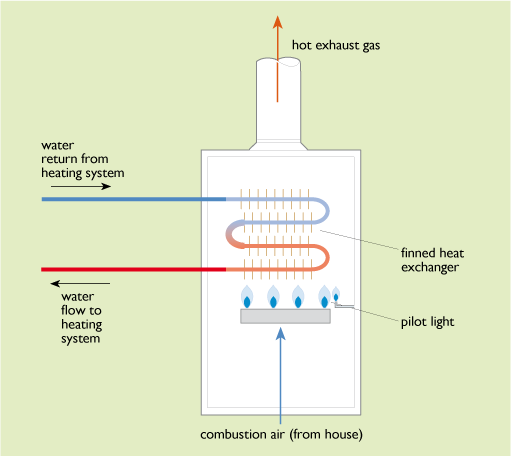
Figure 29 shows a simplified diagram of a typical 1980s domestic boiler. Combustion air enters at the bottom from the interior of the house to feed a large gas burner heating a set of finned heat exchangers. Water is pumped through these and circulated out to the heating system. The burnt gases exit at the top into a flue to the outside air. Such a boiler might have an output of 15 kW and an overall thermal efficiency of 65%.
More recent gas boiler designs have incorporated a number of improvements:
1 Balanced flues
Here the burner and heat exchanger are totally sealed off from the interior air of the building and the combustion air is blown through the boiler using an electric fan. Air is drawn in from the outside and the burnt gases are blown out again using a pair of concentric pipes via a single flue terminal on the outside of the building (Figure 30). Although this design does require a certain consumption of electricity, it allows the building to be made more airtight.
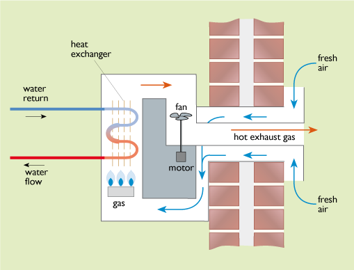
2 Electronic spark ignition
This has replaced the permanently burning pilot light used in many older boiler designs which could consume 10% of the total gas used.
3 Condensing gas boilers (see Figure 31)
The main component of natural gas is methane, CH4. When this burns it produces a large amount of water vapour:
- CH4 + 2 O2 → CO2 + 2 H2O
methane + oxygen → carbon dioxide + water vapour
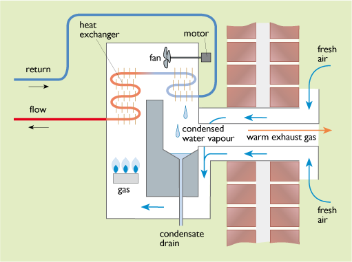
In a non-condensing boiler this water vapour is lost with the flue gases. In a condensing boiler the heat exchanger is made sufficiently large so that the return water from the heating system, which may be at about 50°C or lower, can cool the flue gas sufficiently to enable the water vapour to be condensed out recovering its latent heat of vaporization. The energy content of a fuel can be quoted as ‘higher’ or ‘lower’ values, depending on whether or not this latent heat of vaporization is recovered. The potential energy savings in using a condensing boiler depend on the difference between the gross and net calorific values for the fuel burned (also called the higher and lower heating values, HHV and LHV). Table 10 gives sample figures.
| Higher heating value/ MJ kg–1 |
Lower heating value/ MJ kg–1 |
Ratio | |
|---|---|---|---|
| Natural gas | 53.1 | 47.8 | 1.11 |
| Liquefied petroleum gas (LPG) | 49.2 | 46.0 | 1.07 |
| Light heating oil | 45.3 | 42.6 | 1.06 |
Where natural gas is the fuel, using a condensing boiler can increase the amount of heat extracted from the gas by up to 11% and the overall boiler efficiency to 90% or more.
3.2 Oil-fired boilers
Oil-fired boilers are usually similar in design to gas boilers but need to incorporate a device to vaporize the heating oil before combustion. Condensing boilers are available for use with light heating oil, but the potential efficiency improvements are slightly lower, about 6%, because of the lower proportion of hydrogen, burning to water vapour, in the fuel.
Depending on its age and design, a gas or oil-fired boiler can have an efficiency from 55% to over 90%. This can obviously have a profound effect on the energy consumption of a building. In order to simplify things for purchasers, boilers have been given an Energy Rating Label. Those with a seasonal efficiency of more than 90% are ‘A’ rated, while those with an efficiency between 86% and 90% are ‘B’ rated. Those with an efficiency of below 70% would get a ‘G’ rating.
From 2005 the UK Building Regulations have allowed only A and B rated boilers to be sold.
Although average heating efficiencies have improved over the years – to over 80% in 2011 for space heating – there is still room for further improvement.
Activity 12
How does a balanced flue boiler save heating energy compared to an older type of boiler?
Answer
A balanced flue boiler does not need to draw its combustion air from inside the building. As a result the building can be made more airtight.
Activity 13
Why is a condensing boiler more efficient than a non-condensing one, and what is the margin of improvement that might be expected with natural gas as fuel?
Answer
A condensing gas boiler contains an extra heat exchanger that allows the flue gases to be cooled enough to condense the water vapour in them. This allows the latent heat of vaporization of the water to be recovered. For natural gas this can represent an increase in efficiency of up to 11%.
3.3 Electric heating
On-peak electric resistance heating
In the UK, electricity has always been considerably more expensive than gas or solid fuel. Its use for heating has thus been rather restricted. It wasn’t until the 1960s that electricity prices had fallen sufficiently against gas and coal that the idea of ‘all-electric’ homes could be promoted.
Resistance heating using a radiant ‘electric fire’ or an immersion heater for domestic hot water has been widely promoted as a ‘clean’ form of heating. Indeed it is very efficient and clean at the point of use, and especially so compared to the dirt and air pollution of coal fires. However, the inefficiency and pollution is effectively transferred to a remote power station. This has been reflected in higher CO2 emission figures compared to gas heating. However, since 2013, the increasing proportion of low carbon electricity generation from renewable energy and nuclear power has made electric heating more attractive, as discussed later in Section 3.5.
While water heating is needed year-round, space heating is something required only for a part of the year (and possibly only a few winter months in a really well-insulated building). Thus, although an on-peak electric fire is cheap for the consumer to buy, it may be expensive for the industry to supply, requiring a power plant that sits idle from spring to autumn.
Off-peak storage heating
The use of off-peak night-time electricity goes some way to reducing the problems of on-peak electric heating use, allowing a daytime load to be shifted to the night. It allowed the demand on the National Grid to be smoothed out and was heavily promoted in the 1960s and 1970s. Night-time electricity could be sold at a special low rate that could compete with gas and coal. Domestic hot water could be heated with an immersion heater in a hot water cylinder, but space heating required ‘storage heaters’. Figure 32 shows a typical design.
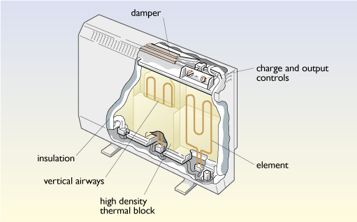
It is basically a set of high-density blocks (similar to bricks) threaded with resistance heating elements inside an insulated casing. The electricity supply is remotely turned on and off by a time switch. The storage heater itself usually has two manual controls (often poorly understood):
- an ‘input’ control that sets how much energy needs to be stored overnight according to the weather
- an ‘output’ control that allows air to circulate through the blocks and into the room.
The relative lack of control compared to the simple thermostat of a central heating system has long been a source of dissatisfaction with this type of heating. Competition from cheap North Sea gas from the 1970s onwards effectively stopped the spread of electric space heating. It became largely confined to rural areas beyond the gas grid and urban tower blocks. However, the need to find alternative forms of heating in the face of climate change and falling UK gas reserves has led to a renewed interest in electric heating, particularly using heat pumps.
3.3.1 Heat pumps
Instead of generating heat by burning a fuel, a heating system can use heat drawn from the outside environment, the air or the ground, using a heat pump.
Small heat pumps are actually familiar objects. Every domestic refrigerator uses one.
Figure 33 shows the key elements of the most basic type of heat pump.
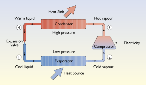
The heat pumping process is made possible by the use of a special refrigerant liquid that boils at a low temperature at atmospheric pressure (typically about –15 ºC).
- a) At point (1) in Figure 33 this starts as a cool liquid. In order to convert a liquid to a vapour, it must be given energy – the so-called latent heat of evaporation. The refrigerant absorbs heat in a heat exchanger called the evaporator and vaporizes.
- b) At point (2) the vapour enters an electrically driven compressor that raises its pressure and temperature.
- c) At point (3) the hot vapour then enters another heat exchanger, the condenser where it condenses to a warm liquid and gives up its latent heat of vaporization.
- d) At point (4)) it is forced through a fine expansion valve or throttle where it loses pressure and drops in temperature.
It then repeats the cycle.
Overall, heat is ‘pumped’ from a low temperature in the evaporator to a higher one in the condenser. In a domestic refrigerator, the heat is absorbed in an evaporator inside the refrigerated compartment, thus lowering its temperature, to a condenser on the back of the refrigerator, where the heat is released, warming one’s kitchen in the process.
The choice of refrigerant is very important. The ‘traditional’ refrigerant, Freon-12 – developed in the 1930s and also used for blowing foam insulation – has had a devastating effect on the world’s ozone layer as well as it being a powerful greenhouse gas. Its use was banned worldwide in the early 1990s. Even the ‘replacements’ for Freon-12, hydrofluorocarbons (HFCs), introduced in the 1990s, are themselves now being replaced with alternatives, hydrofluoroolefins (HFOs) that are much less likely to contribute to global warming.
In buildings a heat pump may be used for heating or cooling (more commonly known as air conditioning). When used for heating the evaporator is located somewhere in the external environment. An air source heat pump is likely to have a fan coil unit such as that shown in Figure 34(b). A ground source heat pump uses pipes buried in the soil. These may be laid in a shallow trench, as in Figure 34(c) or in a deep vertical borehole that may be 10 metres or more deep.
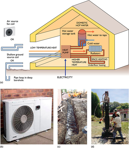
Heat is then pumped from the outside environment to a condenser inside the building, normally connected to a normal central heating system, as previously shown in Figure 28. The temperature of the heat is sufficient to be useful for heating purposes. Energy (usually electrical) is, of course, required to operate the compressor.
A key performance parameter is the coefficient of performance (COP).
- COP = heat output from condenser / electrical work input
Typically 1 kWh of electricity can be used to produce 3 or more kWh of heat. This might seem to defy the law of conservation of energy, but the maximum COP is limited by the laws of thermodynamics. It is possible to have a high COP if the temperature difference through which the heat is raised is small, but the value may drop significantly if the temperature difference is large. This may be particularly true where domestic hot water has to be heated to 60 ºC in midwinter.
In order to function in midwinter, the evaporator has to be able to absorb heat from the external environment even though the external temperature may be very low (down to below –5 ºC in the UK). This requirement potentially limits the performance of air-source heat pumps. Burying the evaporator coil in the ground (or in a lake or river) provides a more stable temperature environment in extreme winter conditions and can result in higher COPs.
In an air source heat pump, the heat that is drawn from the external environment is taken immediately from the outside air, cooling it in the process. In a ground source heat pump, the same process takes place but by cooling the ground (by only a degree or two) so that heat flows down into it from the air over a large area and a long time period.
A heating system using a heat pump is likely to include fans and pumps and may require top-up direct electric heating in mid-winter. A more accurate measure of the overall performance is thus the seasonal or system performance factor (SPF). This is the ratio of the annual heat produced by the heating system to the electricity consumed. Measured SPF values in the UK have ranged from 2.2 to 4.0, with ground source heat pumps performing better than air source ones (EST, 2013). Put simply:
- Useful heating energy produced = electricity consumed × SPF
Although heat pumps driven by gas engines or absorption heat cycles have been produced, this is essentially an electric heating technology. It can be thought of as reclaiming some of the primary energy losses at the power station.
A modern gas fuelled combined cycle gas turbine (CCGT) power station can have an efficiency of 50%. It thus takes 2 kWh of gas to produce 1 kWh of electricity. However, the heat pump can turn this back into 2.5 kWh of heat.
- overall thermal efficiency = 2.5 kWh / 2 kWh = 125%
This makes it an attractive alternative to gas heating, although the total capital costs of heat pump and power station are considerable.
The heat gains from heat pumps, i.e. the difference between the heat output and the electricity input, have now been classified as a form of ‘renewable energy’ under the 2009 EU Renewable Energy Directive (CEC, 2009).
Where a ground source heat pump is being considered for a house, it is essential that the heat losses are reduced as far as possible with insulation first. Ground source coils may require as much land area as the total floor area of a house, and they can make up over half of the total installation costs.
3.4 Combined Heat and Power Generation
An alternative to using individual boilers and electric heaters in buildings is combined heat and power generation (CHP). This uses the waste heat from power stations, of many possible sizes, which has great efficiency benefits. The technical potential for this is enormous.
Figure 1 in Section 1 shows about 2400 PJ of energy ‘lost in conversion and delivery’. The bulk of this, about 1600 PJ, was lost as low-grade waste heat from power stations. This figure should be compared with the 2200 PJ, shown in the bottom bar of Figure 1, of low temperature heat used for space and water heating.
Denmark in particular has adopted a national policy of widespread use of CHP with district heating (DH), also called community heating, which involves distributing heat through large insulated pipes under the streets. By 2007 over 60% of Danish homes were fed by DH and 80% of the DH plants were fed by CHP (DEA, 2011). By comparison, DH supplied only about 2% of the national heat demand in the UK in 2009 (Pöyry, 2009).
District heating does not necessarily need to be linked to power stations. It can be supplied from heat-only boilers. It does allow the use of a wide range of fuels, such as energy from waste, biomass, or even solar energy.
In the UK in 2017 there was nearly 6.0 gigawatts of CHP electricity generation capacity (usually written 6.0 GWe). The bulk of this was large gas or steam turbine plant in industry. In buildings in 2017 there was nearly 600 MWe of CHP plant spread over more than 1600 separate installations (BEIS, 2018a). About a third were in hospitals. Most of these were spark-ignition gas engines, like the example shown in Figure 35.
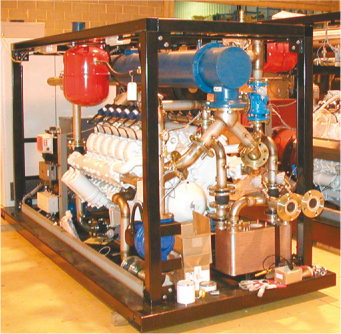
Such units are essentially heavy-duty lorry engines fuelled by gas and driving a generator. Natural gas is a very clean fuel, so units can be designed to run for 5000 hours a year or more with minimal maintenance, equivalent to a quarter of a million miles for a lorry. Such units normally run in conjunction with an extra gas boiler which can provide more heat at times of peak demand. Typically units would range in size from about 50 kWe up to 1 MWe, with electrical efficiencies of 25% up to 40%, large units being more efficient.
Prime users are buildings with large heat and electricity loads such as hospitals and hotels. Leisure centres with swimming pools are particularly appropriate because of the very large low-temperature heat requirements of the pools, which allow CHP units to be run in a condensing mode with an almost 90% overall fuel efficiency. Other schemes have been set up specifically for large blocks of flats, such as the Pimlico scheme in central London which supplies over 3000 homes.
3.4.1 Fuel cell CHP
Fuel cells can produce electricity and heat without combustion. They can be thought of as large batteries which only work when supplied with a stream of hydrogen gas as fuel, which ends up being oxidised to water. CHP units using fuel cells are now becoming commercially available and are widely used in the USA and Japan.
In 2014, a small 1.5 kWe CHP unit was installed at the headquarters of the Chartered Institute of Building Engineers (CIBSE) in London. The hydrogen to run the fuel cell was produced by reacting natural gas with steam, also producing carbon dioxide. Performance monitoring showed an electricity generation efficiency of about 60% (i.e., higher than most combined cycle gas turbine (CCGT) power stations). The recovered heat raised the overall efficiency to 85% (Tesfai, 2015).
At present, capital costs and maintenance costs are higher than for gas engines, but these could fall. Fuel cell CHP has two main advantages over engine-driven CHP: the units are almost silent, with no moving parts, and they have high electrical efficiencies, which in the longer term could reach 50%, i.e. competitive with large combined cycle gas turbine (CCGT) power stations (IEA, 2005).
In the longer term, towards 2035, it is possible that natural gas could be replaced by hydrogen as a common heating fuel distributed through the existing pipe network.
3.4.2 Using waste heat from large power stations
This option is little-used in the UK, since the trend has been to build large coal-fired power stations well away from major built-up areas. However, many gas-fired power stations are close to major urban centres. For example, the 1 GWe Barking Combined Cycle Gas Turbine (CCGT) station is less than 20 km from central London and pumps hundreds of megawatts of waste heat into the Thames.
There is obviously enormous potential for using waste heat from such large power stations, but it comes at a cost of reduced electricity generation efficiency.
Typically there will be a loss of one kWh of electricity generated for every six kWh of useful heat produced. However, in a purpose built CCGT power station specifically designed for combined heat and power operation, this could be improved to a loss of one kWh of electricity for every 10 kWh of heat produced (Pöyry, 2009).
3.4.3 Which form of CHP is best?
There are many possibilities for CHP. Which is best is a matter of location and trade-offs of cost and performance. Generally, the larger the CHP unit, the higher the electricity generation efficiency, the lower the capital costs per kW of capacity and the lower the maintenance costs per kWh of electricity produced.
The distribution of heat from larger CHP units and large power stations requires extensive networks of district heating pipes (Figure 36).
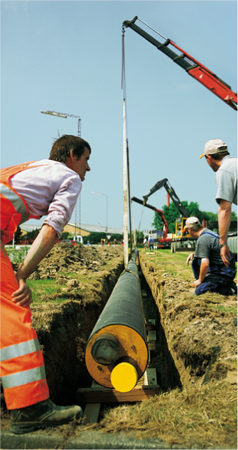
The technical potential for CHP with district heating in the UK is large, but it has had to compete with rival cheap natural gas. However by 2050 the twin problems of declining North Sea gas production and of reducing national CO2 emissions will mean that the use of natural gas boilers will have been phased out. Alternative methods of heating buildings will have to be found, either through the use of heat pumps or a gas grid based on hydrogen.
A 2005 International Energy Agency report (IEA, 2005) modelled the heating needs of a European city of about 250 000 inhabitants (based on Leicester). It compared different forms of CHP with a base case of using individual condensing gas boilers and electricity from new, high-efficiency CCGT plant. It concluded that the least-cost solution, and the one with the largest CO2 emission savings, was city-wide CHP using heat and electricity from a CCGT power station. However, this leaves many buildings in suburban areas for which individual small CHP units (or possibly electric heat pumps) may well be the best solution. If small fuel cell CHP units can be produced with high efficiencies and low maintenance costs then these could become serious challengers to city-wide CHP.
The costs of district heating networks are high, but then so are those of rival technologies such as heat pumps. If suitable low interest finance were available it could be economic to extend district heating to between 3.3 and 7.9 million UK households (mainly in dense urban areas), including 16–26 million m2 of commercial floor space. This would represent between 6% and 14% of the UK heat demand (Pöyry, 2009)
3.5 Heating systems and CO2 emissions
In assessing any particular building we are likely to be interested in its total fuel consumption and its CO2 emissions. The previous sections have given some guidance on estimating the likely net space heating demand. Adding an allowance for water heating, the total annual fuel use for heating can thus be calculated as:
- annual fuel use = annual heat demand / heating system thermal efficiency
Not all heating fuels produce the same amount of CO2 for a given amount of heat produced. Table 11 gives the emission factors for the main UK heating fuels. Note that natural gas is considerably better than heating oil or coal.
| Emissions CO2 / kg kWh–1 |
|
|---|---|
| Natural gas | 0.21 |
| Liquefied petroleum gas (LPG) | 0.24 |
| Heating oil (gas oil) | 0.30 |
| House coal | 0.40 |
| Electricity (2020 generation mix) | 0.18 |
The figures are from SAP 10 (BRE, 2022) and they may not agree exactly with those from other sources.
Back in 1960, when UK electricity generation was almost all coal-fuelled, producing a kilowatt hour of electricity involved the emission of 1 kg of CO2. Increased use of nuclear power and gas fired generation reduced this figure down to about 0.5 kg kWh-1 in 1998 where it remained until 2013. Since then, the rising proportion of electricity from renewable sources (particularly wind power) has reduced the figure further to only 0.18 kg kWh-1 in 2020 and it is likely to fall even further in the future.
Using these emission figures and likely heating system efficiencies we can calculate the total annual CO2 production.
As described at the beginning of Section 3 the thermal efficiency of a heating system = useful heat output / fuel input.
So annual fuel use = useful heat demand / thermal efficiency
annual CO2 production = annual fuel use × CO2 emission factor
Consider, for example, a house with a total estimated net space heating demand of 10 000 kWh yr–1 plus a water heating demand of 5000 kWh yr–1.
What are its likely annual CO2 emissions if it is heated (a) by a condensing natural gas boiler with a thermal efficiency of 90% or (b) using off-peak storage heating with an assumed efficiency of 100% and a 2020 CO2 emission factor?
- a.Using a condensing gas boiler:
- total annual fuel use = (10 000 + 5000)/0.90 = 16 667 kWh yr–1
- CO2 emission factor = 0.21 kg kWh-1
CO2 emissions = 16 667 × 0.21 = 3500 kg yr–1
- b.Using off-peak electric storage heaters:
- total annual fuel use = (10 000 + 5000) / 1.0 = 15 000 kWh yr–1
- electricity CO2 emission factor = 0.18 kg kWh-1
- annual CO2 emissions = 15 000 × 0.18 = 2700 kg yr–1
Thus, the electric heating option produces about 20% less CO2 than the gas heating. If we had used the higher 1998 emission factor for electricity, then the answer would have been completely different, with the electric heating option producing more than twice as much CO2 as gas heating. This change has had a major impact on the past policy of switching from electricity to gas as a way of reducing overall CO2 emissions.
Activity 14
Supposing the house described above is in a rural location and doesn’t have access to mains natural gas. What are the likely annual CO2 emissions if it is heated:
- a.by a condensing liquefied petroleum gas (LPG) boiler with a thermal efficiency of 93%?
- b.by a ground source heat pump with a system performance factor (SPF) of 2.80?
Which has the lower annual CO2 emissions?
Answer
- a.Using a LPG condensing gas boiler:
total annual fuel use = (10 000 + 5000) / 0.93 = 16 129 kWh yr-1
From Table 11, the emission factor for LPG is 0.24 kg CO2 per kWh
So annual CO2 emissions = 16 129 × 0.24 = 3871 kg yr-1
- b.Using a heat pump:
The useful heat produced by the heat pump = SPF × electricity used.
So electricity used = useful heat / SPF
= (10 000 + 5000) / 2.80 = 5357 kWh yr-1
Annual CO2 emissions = 5357 × 0.18 = 964 kg yr-1
The heat pump wins with only one quarter of the CO2 emissions!
4 Saving electricity
In 2019, the UK domestic and services sectors each used roughly 100 TWh of electricity, making up nearly 60% of the total national electricity consumption of 325 TWh. Nearly all of this was electricity was used for non-heating purposes (BEIS, 2021c).
Cutting electrical demand in buildings requires tackling a whole range of uses including the lifestyle changes that increased electricity use has brought to our society.
Mains electricity started as a lighting technology, but then rapidly diversified into motive power and then a host of electrical appliances. Many ‘labour-saving’ devices like vacuum cleaners and washing machines were introduced in the 1920s and 1930s to cope with a ‘servant shortage’ after World War I. Refrigerators and freezers have allowed shopping to be done once a week rather than daily and allowed the storage of pre-packaged convenience foods.
In parallel there has been a growth of ‘electronic entertainment’, for example radio, television, hi-fi, and the computers and internet for fun rather than work (see Energy Saving Trust, 2006, Rise of the Machines. This is a ‘technology snapshot’ from 2006 and you may like to reflect on how things have changed since then).
It raises questions of what exactly is the modern ‘good life’? Is it just one of owning lots of appliances to make our life easier so that we can slump in a chair and be entertained by the latest electronic gadgets (Figure 37)?
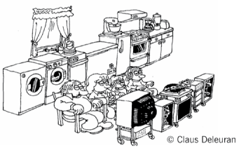
Figure 38 shows the growth in UK ownership of some of these appliances since 1970. Given that the number of UK households grew from 19 million in 1970 to nearly 28 million in 2016, the average 2016 household would appear to have owned 1.4 home computers and 2.4 televisions.
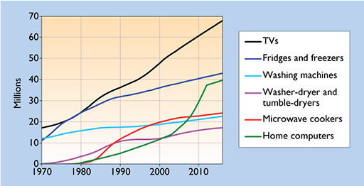
Looking to the future, the UK population is likely to increase from its 2017 value of 67 million. The average household size is also falling. In 2010, it was about 2.3 persons per household, but this is likely to fall to 2.1 persons by 2050. The total number of households could thus rise to well over 32 million by 2050 (Boardman et al., 2005). Into every extra household goes another set of appliances.
In 2019 electricity use by domestic cooking, appliances and lighting amounted to nearly a third of national electricity demand. Figure 39 shows the trends in consumption since 1970 for different categories. Although programmes of promoting energy efficient fridges and lighting have had an effect since 1990, the gains have been offset by the growth in consumption of a host of electronic devices: TV’s, mobile phones, home computers, etc. The energy use of these may have been brought under control since 2007 by EU standards for the maximum energy consumption of small appliances.

4.1 Electrical appliances
Standby power
Perhaps the most disturbing waste of electricity is that from millions of small so-called ‘vampire’ devices that are not fully switched off but are left on ‘standby’. In 2019 in the UK domestic sector, these consumed an estimated 2.5 TWh of electricity (about 2.5% of the domestic total). Fortunately this figure has been falling from a peak of 7.5 TWh in 2009.
The worst offenders have been televisions and video players that have been designed for ‘convenience’, with little regard to energy use. To allow the TV to be turned on by a remote control from an armchair, the power supply is left running permanently, just to power a small infrared sensor and a mains switch. The situation has not improved with the development of ‘computer hubs’ each containing a small ‘wi-fi’ transmitter, and ‘smart meter’ displays, both of which are usually left on permanently.
A major problem also arises with ‘mains adapters’ and various battery and mobile phone chargers. Electronic devices are sold worldwide. In order to simplify compliance with safety regulations about high voltages in appliances, they are often designed to be run from low-voltage supplies. A separate adaptor is then supplied to provide the required voltage (6V or 12V) from the local mains supply, 120 volts AC or 230 volts AC. Thus although the actual electronic device may be switched on and off, the mains adaptor or charger often remains plugged in and permanently switched on. The result is a continual dissipation of heat.
The solution is better design and enforced international standards, such as the 2005 European Energy-using Products (EuPs) Directive. The regulation for standby power says quite simply ‘As a general principle, the energy consumption of EuPs in stand-by or off-mode should be reduced to the minimum necessary for their proper functioning’. A long-term target for a maximum standby power is 1 watt. This Directive became law in the UK in 2007 and seems to be having some effect.
4.1.1 Televisions and consumer electronics
In the 1980s, a large cathode ray tube (CRT) colour television using valves would have consumed about 500 watts. The transistor equivalent of the 1990s (with the same screen size) consumed only about 100 watts. The more recent development of flat-screen TVs with LED lighting has allowed larger screen sizes (Figure 40) and pushed the power consumption back up. It is estimated that UK electricity consumption by televisions increased by a factor of four between 2007 and 2017 (BEIS, 2021c).

These, and other electronic devices, represent an increasing use of electricity in the home. In the office, the increased use of electronic equipment is a source of excess heat that may promote the installation of air conditioning.
Yet the electronics industry is capable of great feats of energy efficiency if pressed. The modern laptop computer is carefully designed to eke out the maximum period of operation for the minimum battery capacity.
4.1.2 Refrigerators
In domestic use a refrigerator usually has a main cabinet with a temperature of around +5°C and may have an icebox (freezer compartment) maintained at –5°C. A freezer has a lower internal temperature of around –18°C. Combinations, known as fridge-freezers, have become increasingly common in recent years.
In 2019 domestic refrigeration in the UK used an estimated 11 TWh of electricity per year, about 3% of total national demand (BEIS, 2021c). This figure is down from a peak of about 17 TWh around 1990 due to the improved energy efficiency of fridges on sale. However these figures have to be compared with the 2.5 TWh used for refrigeration by the food processing industry. This presumably handles exactly the same food and stores it for longer periods, but it does so in physically larger and more energy-efficient cold stores.
Until the 1980s there was little interest in the UK in producing ‘energy efficient’ fridges. It paid designers to maximise the internal storage space even if that meant cutting down on insulation thickness. Electricity bills were a secondary consideration. Yet the potential for saving was enormous. The average consumption for a European 200-litre larder fridge (i.e. one without a freezer compartment) in 1973 was 550 kWh yr–1. A Danish unit produced in 1988 showed that electricity consumption could be cut to 90 kWh y−1. Better insulation reduced the heat loss and an improved COP (coefficient of performance) was achieved by fitting a larger evaporator and condenser (Nørgård, 1989).
In 1994, a European energy labelling scheme was set up in part to promote low-energy fridges. The ratings of this scheme were not very ambitious and the best fridges only used half of the electricity of the worst. By 2019 it was proving easy to exceed the original ‘A’ rating and almost all manufacturers were offering A+ and even A++ models. In 2020 a new labelling scheme was introduced with ratings to match the improved energy performance expectations (see sample label in Figure 41).
The best performing fridge designs use about 25 mm of insulation thickness, while freezers use about 50 mm. Improved efficiency can always be achieved with thicker insulation. However, the external dimensions are fixed in practice by the standard units of width and height of fitted kitchens, so improved efficiency will usually mean less internal storage space. The way forward may be through the use of innovative insulation, such as vacuum insulation panels.
Vacuum insulated panels (VIP)
Sir James Dewar, a scientist at Oxford University, invented a ‘vacuum flask’ in 1892, as a container for low-temperature liquefied gases. This consisted of two glass flasks one inside the other with a vacuum in between ensuring that no heat could flow by conduction across the gap. The glass surfaces were also given a low-emissivity coating of silver to prevent heat radiating across it.
This was turned into a commercial product, the Thermos flask, in 1904 by two German glass-blowers. It has been the standard receptacle for carrying hot drinks to picnics ever since. Large flasks of up to 125 litres capacity were developed for cold food storage in the late 1920s, but were overtaken by the rise of the modern refrigerator.
The development of flat vacuum panel insulation, like that of vacuum double-glazing, is fraught with many difficulties. The most basic is that of resisting the pressure of the air. A panel one square metre in size would have to resist a force equivalent to about 10 tonnes. One approach is to take a plastic foam or an ‘aerogel’ made from silica, wrap it in a thick airtight plastic cover and pump any air or gases out. As long as the foam has sufficient strength not to collapse under the atmospheric pressure, thermal conductivities of under 0.005 W m−1 K–1 can be achieved at pressures of around 1 thousandth of an atmosphere. This represents a four-fold improvement over the best non-evacuated plastic foam insulation. There are still many problems to be solved to maintain this performance over a long period of time since any pinholes in the outer layer could destroy the vacuum. Although VIPs are now commercially available, they are expensive and there are likely to be trade-offs of production cost against life expectancy.
If this can be developed and the manufacturers’ reluctance to trade storage volume for insulation thickness can be overcome, then the fridges of 2050 could each use under 100 kWh yr–1. UK domestic total electricity use by ‘cold’ appliances could have fallen by a factor of five from its peak 1990 level to only 3.5 TWh yr–1 (Boardman et al., 2005).
Activity 15
Given that insulation is cheap, why might refrigerator manufacturers be reluctant to use thicker insulation in their designs?
Answer
Because the external dimensions of fridges are limited by the standard heights and widths of fitted kitchens. Thicker insulation will thus mean less storage space inside.
4.1.3 Washing machines and ‘wet appliances’
In 2019 washing machines and heated dryers, together with dishwashers, accounted for 14 TWh of electricity, about 4% of national consumption. Few dramatic improvements seem to be expected. The energy use is mainly dependent on the amount of hot water used and need for tumble drying.
Most washers already have an ‘economy cycle’, which uses lower temperatures and less hot water but more agitation over a longer period. The use of high-speed spin dryers reduces the need for heat energy in tumble drying.
Like refrigerators these have an energy rating scale and the energy labels (Figure 41) also specify the water consumption.
Similarly, energy-efficiency improvement in dishwashers has concentrated on using less water, since heating the water is where most of the energy is used. Although ownership is expected to increase, UK domestic energy use in wet appliances may reduce by 20% by 2050 (Boardman et al., 2005).
4.1.4 Cooking
In 2019 electric cooking consumed about 13 TWh or 4% of national electricity demand (and gas cooking a similar amount of energy). Total gas and electric domestic cooking energy has been declining since the 1970s, in part due to the increased use of microwave ovens. These are more efficient than conventional ovens since the microwaves heat the water molecules within the food rather than merely raising the temperature of the outside. With them has come an increased use of pre-prepared meals. This raises the question of the total energy used in producing these. A 2005 report estimated that the total energy input for a ‘chicken ready meal’ to the dinner plate was 9.7 kWh kg–1, including only about 1 kWh for the final reheating. The alternative of buying and cooking a whole chicken would have a higher overall energy input, 13.2 kWh kg–1, of which over 6 kWh would be the final cooking in the home (AEA Technology, 2005).
As with wet appliances, few breakthroughs in cooking technology seem likely in the foreseeable future.
4.2 Energy-efficient lighting
In 2019 lighting in buildings accounted for about 12% of UK electricity use. The domestic sector used approximately 14 TWh and the services sector a further 23 TWh, of which a third was used in retail premises. Put another way, we use about half as much electricity lighting our shops as we do our homes!
As shown earlier in Figure SGB.39, the promotion of low energy lighting has produced a dramatic reduction in domestic electricity use for this application.
4.2.1 Lamp types
Although traditional incandescent electric light bulbs (also known as ‘General Lighting Service’ or GLS lamps) have been sold by wattage as ‘60 watt’ or ‘100 watt’ lamps, what actually counts is the amount of light they produce. This is measured in units of lumens (lm). For example a 100 watt GLS lamp produces about 1200 lumens. Modern lamp packaging now clearly states the light output allowing a clear comparison between the wide range of lamp technologies now on sale.
Table 12 gives a brief summary of different types of lamps. The sale of conventional incandescent and many types of halogen lamps is now being phased out almost worldwide, since they can be conveniently replaced with lower energy LED and compact fluorescent alternatives.
| Lamp type | Details |
|---|---|
| General lighting service (GLS) | The traditional incandescent light bulb |
| Tungsten halogen | Miniature incandescent lamps. Substitutes for conventional GLS lamps use minature halogen bulbs inside a GLS-sized casing |
| Fluorescent high-pressure mercury discharge lamp (MBF) | Bluish white light, often used for shop lighting |
| Metal halide high-pressure mercury discharge lamp (MBIF) | Bluish white light, used for street lighting |
| Compact fluorescent lamp (CFL) | Replacement for normal incandescent light bulbs |
| Tri-phosphor tubular fluorescent | Standard type for office and shop lighting |
| High-pressure sodium discharge lamp (SON) | Orange-white light, used for street lighting |
| Low-pressure sodium discharge lamp (SOX) and higher-efficacy version (SOX-E) | Pure orange light, used for street lighting |
| Light-emitting diode (LED) | Available in white and a range of colours Replacement for normal incandescent light bulbs and now widely used for street lighting |
An important factor in choosing a lamp is its luminous efficacy , the amount of light emitted in lumens per watt of electricity used (lumens W-1). This figure is also likely to be found on modern lamp packaging. Another important factor is the colour rendering index (CRI), which measures how well the light from a lamp imitates the broad spectrum of white light from the sun. GLS and tungsten halogen lamps have very good colour rendering while that from orange sodium street lamps is very poor.
Figure 42 shows the efficacies of the different lamp types listed in Table 12 and how, for a given type, the efficacy increases with power.
Very high efficacies are available for street lighting, but most domestic applications require lamps of under 1000 lumens output. Until the appearance of CFLs in the 1980s there were no high-efficacy low-powered lamps, yet this is where most domestic lighting applications lie. There was a large gap at the left side of Figure 42 that needed filling by new technologies. For domestic use the ‘standard’ light bulb (for over 70 years) has been the 800 lumen 60 watt GLS incandescent lamp. Its attractions were its familiarity and its good colour rendering, yet it only had an efficacy of 13 lumens W−1.
Its rivals, the compact fluorescent lamp (CFL) and new white LED lamps are considerably more efficient and have a longer life expectancy but do not have the same quality of colour rendering. LED lamps give full brightness when switched on unlike CFLs which may take several minutes to warm up. The sale of conventional GLS incandescent lamps has largely been phased out in Europe and many other countries as an energy efficiency measure. Small halogen incandescent lamps remain on sale. These are 30% more efficient than GLS lamps and have a good colour rendering index. However the sale of even these is currently (2023) being phased out, since they can be replaced with LEDs.
4.2.2 LED development
The development of LED lighting has progressed very rapidly. They were originally introduced as small low power indicator lamps originally in red but progressing through orange and green to blue. The basic white lamp is in fact a blue LED coated with a phosphor based on cerium and yttrium that converts some of the blue light to a broad yellow spectrum. Since 2005 commercial lamps have progressed from a bluish white to a warm white and the efficacy has improved from 25 lumens W−1 to over 100 lumens W−1 making them competitive with fluorescent lamps.
Their life expectancy (at least 15 000 hours) is 15 times that of a GLS lamp and twice that of a CFL. There has been a rapid deployment for street lighting projects where the cost of physical replacement is high.
Although they are currently mass-produced as small lights of usually of under 1 watt output, these can be built up into larger modules. Initially these were only available in low wattages but at the time of writing (2023) LED replacements for 60 watt and 100 watt GLS lamps are widely available and heavily promoted.
4.2.3 Lighting and illuminance
Efficient lighting isn’t just about using high-efficacy lamps. It is also about properly illuminating the things that we want to see, such as a book. LED lamps have an advantage over traditional lamps in that they are directional, the light only emerges from one side of the semiconductor chip. This is one reason that they have been so successful when used in torches.
A typical incandescent light bulb emits light in all directions. We talk of this ‘flow’ of light as the luminous flux emitted by the lamp. When a lamp is mounted in a ‘light fitting’ or luminaire, the flow of luminous flux will be concentrated in one particular direction (e.g. downwards in the case of a normal ceiling luminaire). A certain number of lumens are therefore concentrated in a particular direction.
When we come to the practical aspects of ‘seeing what we are doing’ we need to know about the amount of light falling on a given surface. This is known as the illuminance and has the SI unit, the lux. One lux is defined as a luminous flux of 1 lumen falling on an area of 1 m2.
For example, the diners (circa 1910) in Figure 43(a) may be enjoying their electric light. They are also being energy-efficient. Hanging the bulb close over the table may have been necessary, not just because of the low efficacy of incandescent lamps, but also because they were probably paying, in real terms, about four times more than today’s price for electricity.
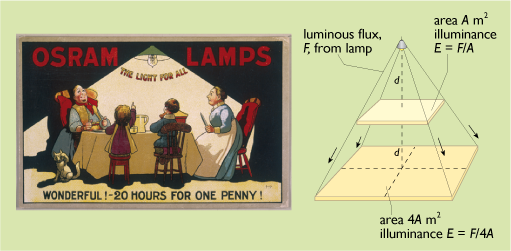
Are they likely to be getting an adequate illuminance on their table? The energy radiated by the lamp spreads out over a larger area as the distance from the lamp increases (Figure 43(b)). Suppose that the table, with an area A square metres, receives the full beam when the lamp is at a distance d from it. If the lamp was at a distance 2d, the beam would spread over four times the original area. At this distance the table would only receive a quarter of the full beam. In other words, doubling the distance has reduced the illuminance by a factor of four.
This inverse square law applies to any simple light source (except where the beam is focused by lenses or mirrors).
If we assume in Figure 43(b) that the lamp is rated at 40 watts and has an efficacy of 5 lm W–1 (a typical figure for 1910), then it will be producing 200 lumens. The luminaire (the lampshade) may be only 75% efficient, so a total of only 150 lumens will be projected downwards. If we assume that half of this, 75 lumens, actually shines on the table, and that this has an area of 1 m2, then the illuminance is 75 lm m–2 or lux.
Artificial lighting schemes are usually specified as being capable of supplying a specified number of lux on a horizontal surface – the ‘working plane’. Generally the more demanding the work, the higher the required level of illuminance. Table 13 gives some recommended values.
| Task | Recommended illuminance /lux |
|---|---|
| Circulation areas (stairs, corridors) | 150 |
| Classroom desk | 300 |
| Office desk, laboratory bench | 500 |
| Electronics assembly | 1000 |
| Hospital operating theatre | 2000 |
The danger of a list like this is that it can be taken as a specification for a whole building and result in permanently overlit spaces in shops and offices. This is one reason why the services sector uses so much electricity for lighting.
A more energy efficient approach is to employ ‘task lighting’ – individual controllable lighting where it is actually needed. This is where the directional properties of LEDs give them a significant advantage. Although white LEDs may produce fewer lumens per watt than a sodium street lamp, they can direct that light more efficiently to where it is actually needed.
Also, the best use should be made of daylight. Sunlight is extremely bright and its illuminance can reach 100 000 lux on the ground. However as a light source it suffers from rapid fluctuations caused by passing clouds. Under overcast sky conditions normal daylight has an illuminance of at least 5000 lux and is more constant. Daylight penetrating windows into a building can provide illuminance levels of around 200–300 lux in typical naturally lit offices for most of the day. The difficulty is in persuading occupants to turn off the artificial lights.
Activity 16
Calculate the new illuminance level (in lux) on the dinner table of Figure 43(a) in each of the following cases:
- a.the lamp power remains the same but its efficacy is doubled to 10 lumens W−1.
- b.the lamp is unchanged but its distance from the table is halved.
Answer
- a.If the efficacy of the lamp is doubled, then it will produce 400 lumens instead of only 200 and the illuminance on the table will also double from 75 lux to 150 lux.
- b.If the distance between the lamp and the table is halved, then the illuminance on the table will increase by a factor of four, from 75 lux to 300 lux (i.e. adequate for a ‘classroom desk’ in Table 13.
Activity 17
Why did some nineteenth century hospitals site their operating theatres on the top floor of the building?
Answer
Table 13 recommends that an illuminance of 2000 lux should be used in operating theatres. Before the advent of modern high-intensity electric light, the only way to get this was to perform operations in bright daylight.
5 Home energy assessment
So far this course has described a wide range of different technologies. But how do you assess what makes a really energy efficient home without actually reading the fuel bills? Which retrofit measures are likely to be most cost-effective or produce the largest reduction in CO2 emissions? Fortunately home energy rating computer models can help.
The need for an energy model to assess housing energy use was identified in the UK in the 1980s. The Building Research Establishment developed a domestic energy model (BREDEM) in the 1990s. This forms the core of the Standard Assessment Procedure (SAP). Since 2006 this has been the key calculation tool to show compliance with the Building Regulations for houses and flats.
It has been through several revisions and the current (2023) version is SAP 2012 (BRE, 2022). Although the actual calculation procedure only covers about six pages, the need to deal with all possible types of houses and flats and their heating systems requires a large amount of explanatory tables.
Its use in setting the UK Building Regulations has been a little controversial. From a point of view of setting enforceable standards, it would be simplest to say that the elements of buildings should use a given thickness of insulation or achieve a given U-value. This is known as the ‘elemental’ approach. If the requirement is to set the overall fuel cost or CO2 emissions, then a more complicated calculation is required to take into account the different sizes of buildings, the heating system efficiency, etc. Finally, there is the problem of what to do about the different climates across the country. A house on a hilltop in Cumbria is likely to have a colder climate than one on the coast of Cornwall. Should it be required to have better insulation standards? Although the 2009 version of the SAP methodology did not distinguish between different climate zones, the revised 2012 version has now taken this into consideration.
Then there is the question of how much of house energy use should be ‘regulated’. The choice of a gas or electric cooker obviously influences energy use and carbon dioxide emissions, but is a matter of choice for the occupant, not the builder. As a result this is left out of the SAP calculations.
The full version of SAP is used in assessing new buildings, but for assessing existing homes a ‘reduced’ version, know as ‘RdSAP’ is used. This is used in ‘home energy audits’, particularly to produce Energy Performance Certificates (EPCs). These have been required for homes for sale in the UK since 2007 and newly rented properties since 2008. They can only be issued by qualified energy auditors.
In its original form the SAP assessment was only concerned with the cost of energy for space and water heating, ventilation and lighting. It is adjusted for floor area. It is expressed on a scale of 1 to 100, the higher the number the lower the running costs.
For example a pre-1919 house with solid walls, no loft insulation and no central heating would have a SAP rating of just over 20. This was about the average rating for the UK housing stock in 1973 (BEIS, 2021c). A newer house meeting the 2006 Building Regulations for England and Wales would have a SAP rating of about 85. Its fuel costs per square metre of floor area would be about a fifth of those for the older uninsulated house. Since the rating is cost based, electrically heated houses tend to have worse SAP ratings than gas-heated ones.
The rating also allows for houses to have their own generation technologies such as solar water heaters, PV panels or micro-CHP units.
However, the need to reduce overall CO2 emissions has now become the main driving force of the Building Regulations. An Environmental Impact Rating (EIR), based on CO2 emissions per square metre of floor area, was added. This, like SAP, is expressed on a scale of 1-100. The higher the number the better the standard.
In order to make things easier to understand for the consumer, the scales have been simplified into A-G bands (as shown in Table 14).
| SAP or EIR rating | Label band |
| ≥ 92 | A |
| 81 – 91 | B |
| 69 – 80 | C |
| 55 – 68 | D |
| 39 – 54 | E |
| 21 – 38 | F |
| 1 –20 | G |
The sample energy performance certificate shown below in Figure 44 gives an ‘Energy Efficiency’ (SAP) rating of 55 (a D rating) with a potential to increase it to 85 (B rating). The house was also given an Environmental Impact Rating (EIR) of only an ‘F’ (not shown in the figure). This was mainly due to its high CO2 emissions because it was totally electrically heated.
It is estimated that the average SAP rating of the UK housing stock has improved from about 18 in 1970 to about 60 in 2017.
A thorough assessment of the potential savings in a home is likely to require a careful energy audit. This video shows how one set of homeowners in Oxford made changes to the energy efficiency of their home. It also shows that home energy efficiency is only one factor in a wider appreciation of a low carbon lifestyle.

Transcript: 1 The eco-house video
Conclusion
This free course, Energy in buildings, has described a wealth of opportunities for saving energy in domestic buildings. The bulk of this potential lies in heat energy savings through the large-scale application of very ordinary technologies: thicker insulation, double- or triple- glazing and condensing gas boilers.
To achieve large CO2 emissions cuts from the UK building stock we will need further steps. The existing building stock will certainly need further insulation. It may also include digging up the streets to distribute waste heat from power stations to most city-centre buildings and the deployment of millions of electric heat pumps.
The technical potential for cutting electricity use is enormous. The promotion of low-energy refrigerators and lighting has been reducing domestic energy demand since the 1990s. Yet it does seem an uphill struggle against a tide of new electronic devices that are designed to be attractive and convenient rather than energy efficient.
Most importantly, we live in a culture where the provision of energy services, i.e. buildings that are warm in winter and adequately lit, has been seen largely as a matter of supplying cheap gas and electricity. The needs of facing up to climate change and diminishing North Sea gas supplies will require changing attitudes to energy saving.
Further information
Further information on low energy housing and saving energy in the home can be found at the following web sites (all accessed 7 June 2023):
Association of Environment Conscious Builders (AECB) http://www.aecb.net/
Building Research Establishment (BRE) https://bregroup.com
Centre for Alternative Technology https://cat.org.uk
Energy Saving Trust https://energysavingtrust.org.uk
National Energy Foundation https://nef.org.uk
Passivhaus Trust https://www.passivhaustrust.org.uk/
Superhomes https://www.passivhaustrust.org.uk/
End-of-course quiz
Finally check your understanding of the course material with this quiz of twelve short questions:
Question 1
What are the three main modes of heat loss from a house?
Answer
As described in Section 2.1 they are:
- fabric heat losses – those through the building fabric itself, i.e. the walls, roof, floor and windows
- ventilation losses due to air moving through the building
- flue heat losses since the heating system is not 100% efficient
Question 2
What can be done to cut each of these three heat losses?
Answer
As described in Section 2.1:
- Fabric losses can be cut by the use of insulation
- Ventilation losses can be cut by making the building more airtight (and possibly using mechanical ventilation with heat recovery)
- Flue losses can be cut by installing a more efficient heating system
Question 3
What are the three important mechanisms involved in the transmission of heat, particularly in windows?
Answer
As described in Section 2.2 they are:
- Conduction
- Convection
- Radiation
Question 4
Why are low-e coatings used in double and triple glazed windows?
Answer
As described in Section 2.2.1 they are used to reduce the heat radiated from an inner pane to an outer one.
Question 5
Which building element is likely to have the best insulation performance – one with a high U-value or one with a low U-value?
Answer
As described in Section 2.2.2, the lower the U-value, the better the insulation performance.
Question 6
Which type of insulation is strong enough to be used for shuttering for making concrete buildings?
Answer
As described in Section 2.2.3 and shown in Figure 8, polystyrene insulation can be used for making concrete buildings.
Question 7
Briefly describe two ways of internally insulating or ‘dry lining’ a solid brick wall.
Answer
As described in Section 2.2.5 and shown in Figure 13:
- Sheets of foam-backed plasterboard can be glued to the wall
- Insulated battens can be screwed to the wall with a layer of insulation between them and covered with a surface layer of plasterboard.
Question 8
Give three reasons why ventilation is needed in a building.
Answer
As described in Section 2.3 ventilation is needed
- to provide combustion air in winter for boilers, fires and gas cookers (although it is not necessary for heating systems with balanced flues or for electric fires)
- to remove moisture from kitchens, toilets and bathrooms
- to provide fresh air for occupants and to keep them cool in summer.
Question 9
Why is a condensing gas boiler more efficient than a non-condensing one?
Answer
As described in Section 3.2 a condensing gas boiler recovers the latent heat of vaporization of the water vapour produced when natural gas burns.
Question 10
Explain why in the past the use of electricity as a heating fuel has involved far higher CO2 emissions than using natural gas in a efficient boiler, but this isn’t true now.
Answer
As explained in Section 3.5, and shown in Table 11, the CO2 emission factor for electricity has been particularly high because of the large heat losses that take place at conventional fossil fuel power stations. However, the increasing proportion of UK electricity coming from renewable energy since 2013 has dramatically reduced the emission factor.
Question 11
Light emitting diode (LED) lamps have been heavily promoted in the UK since 2015. What other low energy lighting technologies do they compete with?
Answer
As described in Section 4.2.1 low energy compact fluorescent lamps (CFLs) have been available for domestic use. Tungsten halogen lamps are also available but these are only 30% more efficient than conventional incandescent lamps, and their sale is now being phased out.
Question 12
What two ratings appear on a home Energy Performance Certificate?
Answer
As described in Section 5:
- An Energy Efficiency or SAP rating concerned with energy costs
- An Environment Impact Rating (EIR) concerned with CO2 emissions
Glossary
- ACH
- Air changes per hour – a measure of ventilation rate.
- coefficient of performance
- The ratio of electricity used to the heat or cooling delivered by a heat pump or refrigerator.
- colour rendering index (CRI)
- An index of lighting quality that is applied to lamps, indicating how wide and even a spectrum of visible light they produce.
- community heating
- Another term for district heating.
- degree day
- A unit of ‘heating requirement’ calculated from the outside/inside temperature difference and used in designing heating systems.
- district heating
- The large-scale distribution of heat, sometimes called community heating.
- energy services
- The ultimate aims for which energy systems are built: warm homes, cooked food, illumination, mobility and manufactured articles.
- fuel cells
- A device for producing an electric current by means of what is essentially the reverse process to electrolysis – combining two gases (typically hydrogen and oxygen) to produce electricity.
- fuel poverty
- A household is considered to be in fuel poverty if in order to achieve an acceptable degree of comfort: (a) they have required fuel costs that are above average level and (b) were they to spend that amount, they would be left with a residual income below the official poverty line.
- geothermal energy
- Heat drawn from the Earth’s internal heat.
- gross space heating
- The total heat lost by a building, measured in kilowatt-hours per day.
- heat loss coefficient
- Total fabric and ventilation heat loss of a building; the sum of the products of the U-values of all of the elements of the external fabric (walls, roof, floor, windows, doors) and their respective areas, plus the ventilation heat loss. It may also be called ‘heat transfer coefficient’. It has units of W K-1.
- infiltration
- Unplanned and unwanted ventilation.
- latent heat of vaporization
- The energy absorbed by a liquid when it evaporates (or released when it condenses).
- lumen
- The SI unit of perceived light intensity.
- luminaire
- Technical term for what is more informally called a ‘light fitting’.
- luminous efficacy
- the amount of light emitted in lumens by a lamp per watt of electricity used. It has units of lumens per watt (lm W-1).
- mechanical ventilation with heat recovery
- A method of reducing the heat loss due to ventilation in buildings. The system allows the warm outgoing air to pre-heat the cold incoming air by passing both streams through a heat exchanger. This requires a properly airtight building to work effectively.
- net space heating demand
- The amount of energy needed to be supplied by a heating system to maintain the internal temperature.
- pressure test
- A method for testing the airtightness of a building.
- seasonal or system performance factor (SPF)
- the ratio of the useful heat produced by a heat pump heating system to its total electricity consumption (including pumps, fans and top-up heating).
- thermal conductivity (λ or k)
- A material property defined as the rate of heat flow (in watts) across a one-metre cube of the material with a temperature difference of one degree (K or °C). Thermal conductivity is usually expressed in units of W m−1 K−1. A good thermal insulator has a low thermal conductivity.
- thermal efficiency
- the ratio of the useful heat produced to the fuel energy input for a heating device such as a gas boiler.
- thermal insulator
- a material with a low thermal conductivity which does not allow heat to flow easily.
- thermal resistance
- The amount of resistance to heat transfer offered by a particular slab of building material. It has the unit m2 K W-1.
- ventilation
- The flow of air through a building, both planned and unplanned.
- ventilation rate
- The average rate at which air flows through a building, usually specified as air changes per hour (ACH).
- window energy rating
- Windows are now sold with an energy rating on a scale ‘A’ to ‘G’ in a similar manner to domestic appliances. The rating takes into account the thermal heat loss, transparency to solar gains and air leakage.
- winter design temperature
- The air temperature for the coldest weather likely to occur on the worst days at a given location.
References
Acknowledgements
This free course was written by Bob Everett. Thanks are also due to Professor Robert Lowe of the Bartlett School of Architecture, University College London for his detailed comments. The course was updated in June 2023.
Except for third party materials and otherwise stated (see terms and conditions), this content is made available under a Creative Commons Attribution-NonCommercial-ShareAlike 4.0 Licence.
The material acknowledged below is Proprietary and used under licence (not subject to Creative Commons Licence). Grateful acknowledgement is made to the following sources for permission to reproduce material in this free course:
Every effort has been made to contact copyright owners. If any have been inadvertently overlooked, the publishers will be pleased to make the necessary arrangements at the first opportunity.
Images
Course image: © PARETO/iStockphoto.com
Figure 2 Department of Energy and Climate Change;
Figure 3 Department of Energy and Climate Change;
Figure 18 J.Wingfield;
Figure 26 BASF;
Figure 34a Energy Saving Trust;
Figure 34b National Energy Foundation;
Figure 35 Cogenco Limited;
Figure 36 Logstore Ror Pipe Company;
Figure 37 Claus Deleuran;
Figure 41 UK energy labels: GOV.UK (2023) Regulations: energy information https://www.gov.uk/ guidance/ the-energy-labelling-of-products;
Figure 43a Mary Evans Picture Library.
A-V
The Eco House: © The Open University.
Don't miss out
If reading this text has inspired you to learn more, you may be interested in joining the millions of people who discover our free learning resources and qualifications by visiting The Open University – www.open.edu/ openlearn/ free-courses.