Diagrams, charts and graphs
Use 'Print preview' to check the number of pages and printer settings.
Print functionality varies between browsers.
Printable page generated Friday, 19 April 2024, 8:45 AM
Diagrams, charts and graphs
Introduction
This free course has two aims: firstly, to help you read and interpret information in the form of diagrams, charts and graphs, and secondly, to give you practice in producing such diagrams yourself.
To start you will deal with interpreting and drawing diagrams to a particular scale. You will then learn to extract information from tables and charts. Finally you will learn to draw graphs using coordinate axes, which is a very important mathematical technique.
This OpenLearn course provides a sample of level 1 study in Mathematics.
Learning outcomes
After studying this course, you should be able to:
draw and interpret scale diagrams
extract information from tables
draw, interpret and compare pie charts, bar charts and frequency diagrams
use and interpret coordinates
plot points and draw graphs, using suitable axes and scales.
1 Scale diagrams
1.1 Understanding scale diagrams
Plans of houses and instructions for assembling shelves, etc., often come in the form of scale diagrams. Each length on the diagram represents a length relating to the real house, the real shelves, etc. Often a scale is given on the diagram so that you can see which length on the diagram represents a standard length, such as a metre, on the real object. This length always represents the same standard length, wherever it is on the diagram and in whatever direction.
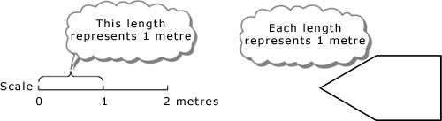
Other lengths may represent fractions or multiples of this standard length. Thus, lengths which are half as long on the diagram represent lengths which are half as long in reality; lengths which are twice as long on the diagram represent lengths which are twice as long in reality; and so on.
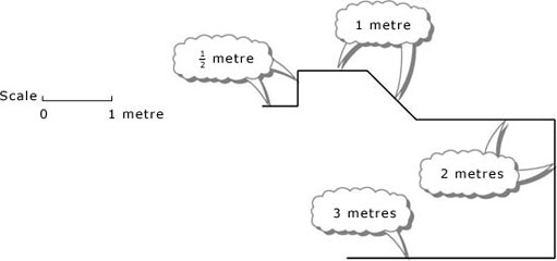
Scale diagrams are often drawn on a square grid. It is then possible to count squares on the grid rather than measure lengths on the diagram. Care must be taken with either method: the ends of a length may fall between the marks on the ruler, or the grid lines may not be equally spaced.
Example 1
Below is a scale plan of a bathroom. Answer the questions listed below the plan. You might want to show the ruler and then drag it to make your measurements.
The background squares show the length representing 1 m.
Click on 'Reveal answer' for a detailed solution.
Answer
On the plan, the top and bottom walls are 3 squares wide, and so the bathroom is 3 m wide. The side walls in the diagram are 3 and a bit squares long. If you measure the ‘bit’, you will find that it is one-fifth of the length representing 1 m, and therefore it represents ![]() or 0.2 m. It follows that the total length of each side wall is 3.2 m. Hence the bathroom measures 3 m by 3.2 m.
or 0.2 m. It follows that the total length of each side wall is 3.2 m. Hence the bathroom measures 3 m by 3.2 m.
The shower in the plan is 1 square in each direction, so in reality it is 1 m by 1 m.
The bath in the plan is nearly 2 squares long. If you measure it on the plan, you will find it is 1 square plus ![]() (or 0.8) of a square long. It is also
(or 0.8) of a square long. It is also ![]() or 0.8 of a square wide on the plan. This means that in reality its dimensions are 1.8 m by 0.8 m.
or 0.8 of a square wide on the plan. This means that in reality its dimensions are 1.8 m by 0.8 m.
As the doorframe is about 1 square wide on the plan, the actual door is about 1 m wide.
Example 2
(a) The scale on a diagram is such that 2 cm represent 1 m. What lengths do 6 cm, 0.2 cm, 3 cm, 3.6 cm and 0.5 cm represent?
(b) A window is 2.3 m wide and 1.4 m high. Draw a scale diagram of the window, using a scale in which 2 cm represent 1 m.
Answer
(a) Because you are being asked to convert lengths on the diagram into real lengths, it is easiest to work with a diagram length of 1 cm. As 2 cm represent 1 m, 1 cm will represent 0.5 m. Then
6 cm represent 0.5 × 6 m = 3 m,
0.2 cm represent 0.5 × 0.2 m = 0.1 m,
3 cm represent 0.5 × 3 m = 1.5 m,
3.6 cm represent 0.5 × 3.6 m = 1.8 m,
0.5 cm represent 0.5 × 0.5 m = 0.25 m.
(b) Here 1 m in reality is represented by 2 cm on the diagram. So
2.3 m are represented by 2.3 × 2 cm = 4.6 cm,
1.4 m are represented by 1.4 × 2 cm = 2.8 cm.
The rectangle should be 4.6 cm by 2.8 cm and the 1 metre scale should be represented by 2 cm.
1.1.1 Try some yourself
Activity 1
On the plan of the bathroom in Example 1, what is the width of the window and what are the dimensions of the wash basin?
Answer
The window in the diagram is 1.1 squares wide, so in reality it is 1.1 m wide.
The wash basin in the diagram is ![]() of a square deep by
of a square deep by ![]() of a square wide, so in reality it is 0.7 m by 0.9 m.
of a square wide, so in reality it is 0.7 m by 0.9 m.
Activity 2
On a scale diagram, 5 cm represent 1 m. What lengths do the following represent: 10 cm, 20 cm, 1 cm?
Answer
On the diagram, 5 cm represent 1 m.
As 10 cm are 2 × 5 cm, they represent 2 m.
As 20 cm are 4 × 5 cm, they represent 4 m.
As 1 cm is ![]() , it represents
, it represents ![]() m or 0.2 m.
m or 0.2 m.
Activity 3
On a map of a new town, 2 cm represent 1 km. What lengths on the map represent the distances of 10 km, 5 km and 0.5 km in the town?
Answer
On the map, 1 km is represented by 2 cm.
Thus:
10 km are represented by 10 × 2 cm = 20 cm;
5 km are represented by 5 × 2 cm = 10 cm;
0.5 km is represented by 0.5 × 2 cm = 1 cm.
Activity 4
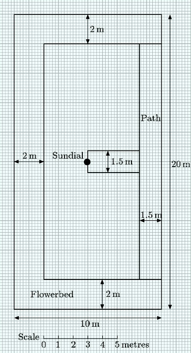
Draw a scale plan of the garden described below, using a scale in which 0.5 cm represents 1 m.
The garden is rectangular and measures 10 m by 20 m. It has flowerbeds that are 2 m wide along the whole of one of the long sides and along both of the short sides. A 1.5-m-wide path occupies the rest of the other long side. Another path, also 1.5 m in width, makes a T-junction with this path and leads straight to a sundial at the centre of the garden.
Answer
Your scale plan should look something like this:
Activity 5
Below is a scale plan of a new bungalow and its garden. Use the ruler to answer these questions. The scale is measured in metres.
(a) How wide is the back garden?
(b) What are the dimensions of the lounge?
(c) Wall units (of full room height) come in sections 1 m wide and 0.3 m deep. How many units can be fitted round the walls of the lounge without blocking the windows or door? Draw a larger scale plan of the lounge to show how these wall units can be arranged.
(d) Is the bathroom big enough for a 1.8 m by 0.8 m bath?
Now click on 'Reveal answer' for a more detailed solution.
Answer
(a) The side of 1 big square on the plan represents 2 m. The garden is 6 big squares wide on the plan. This means it is actually 12 m wide.
(b) The lounge is 19 small squares by 24 small squares on the plan. Each small square represents 0.2 m. So the lounge is 3.8 m by 4.8 m.
(c) There is room for a maximum of seven wall units: one on either side of the side window; none on the front wall; three on the wall next to the hall; and two on the wall adjoining bedroom 1. One possible arrangement is shown below.
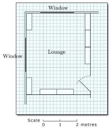
(d) There is room for the bath. It can be placed along the back wall, next to the shower.
2 Tables and charts
2.1 Tables
Experiments or surveys usually generate a lot of information from which it is possible to draw conclusions. Such information is called data. Data are often presented in newspapers or books.
One convenient way to present data is in a table. For instance, the nutrition panel on the back of a food packet:
| Nutrient Per 100g | Per 400g | |
|---|---|---|
| Energy | 404.6KJ/97Kcal | 1618.4KJ/388Kcal |
| Protein | 61.0g | 244g |
| Carbohydrate | 8.6g | 34.4g |
| of which sugars | 2.0g | 8.0g |
| starch | 6.2g | 24.8g |
| Fat | 3.8g | 15.2g |
| of which saturates | 1.1g | 4.4g |
| mono-saturates | 1.2g | 4.8g |
| polysaturates | 0.5g | 2.0g |
| fibre | 1.8g | 7.2g |
| sodium | 0.2g | 0.8g |
| salt | 0.6g | 2.4g |
Scientific experiments often require a series of measurements taken at regular intervals. Information can be recorded as it is collected. For example, the table below resulted from an experiment to determine how quickly a cup of tea cooled down.
| Time/mins | 0 | 5 | 10 | 15 | 20 | 25 | 30 | 35 | 40 | 45 | 50 |
| Temperature/°C | 85 | 78 | 55 | 50 | 46 | 40 | 35 | 30 | 25 | 24 | 23 |
Tables can be laid out vertically (as in the nutrition panel) or horizontally (as in the tea experiment). Each column or row heading should indicate what is being measured and the unit of measurement. (Columns are vertical; rows are horizontal.)
A table is not merely a convenient way of presenting data. It can often facilitate comparisons and can lead to conclusions that would have been difficult to deduce from the separate data, as the next example shows.
Example 3
| Home | Away | |||||||||||||
|---|---|---|---|---|---|---|---|---|---|---|---|---|---|---|
| Position | Team | Games played | Games won | Games drawn | Games lost | Goals for | Goals against | Games won | Games drawn | Games lost | Goals for | Goals against | Goal difference | Points |
| 1 | Nottingham Forest | 42 | 15 | 6 | 0 | 37 | 8 | 10 | 8 | 3 | 32 | 16 | 45 | 64 |
| 2 | Liverpool | 42 | 15 | 4 | 2 | 37 | 11 | 9 | 5 | 7 | 28 | 23 | 31 | 57 |
| 3 | Everton | 42 | 14 | 4 | 3 | 47 | 22 | 8 | 7 | 6 | 29 | 23 | 31 | 55 |
| 4 | Manchester City | 42 | 14 | 4 | 3 | 46 | 21 | 6 | 8 | 7 | 28 | 30 | 23 | 52 |
| 5 | Arsenal | 42 | 14 | 5 | 2 | 38 | 12 | 7 | 5 | 9 | 22 | 25 | 23 | 52 |
| 6 | West Bromwich Albion | 42 | 13 | 5 | 3 | 35 | 18 | 5 | 9 | 7 | 27 | 35 | 9 | 50 |
| 7 | Coventry City | 42 | 13 | 5 | 3 | 48 | 23 | 5 | 7 | 9 | 27 | 39 | 13 | 48 |
| 8 | Aston Villa | 42 | 11 | 4 | 6 | 33 | 18 | 7 | 6 | 8 | 24 | 24 | 15 | 46 |
| 9 | Leeds United | 42 | 12 | 4 | 5 | 39 | 21 | 6 | 6 | 9 | 24 | 32 | 10 | 46 |
| 10 | Manchester United | 42 | 9 | 6 | 6 | 32 | 23 | 7 | 4 | 10 | 35 | 40 | 4 | 42 |
| 11 | Birmingham City | 42 | 8 | 5 | 8 | 32 | 30 | 8 | 4 | 9 | 23 | 30 | −5 | 41 |
| 12 | Derby County | 42 | 10 | 7 | 4 | 37 | 24 | 4 | 6 | 11 | 17 | 35 | −5 | 41 |
| 13 | Norwich City | 42 | 10 | 8 | 3 | 28 | 20 | 1 | 10 | 10 | 24 | 46 | −14 | 40 |
| 14 | Middlesbrough | 42 | 8 | 8 | 5 | 25 | 19 | 4 | 7 | 10 | 17 | 35 | −12 | 39 |
| 15 | Wolverhampton Wanderers | 42 | 7 | 8 | 6 | 30 | 27 | 5 | 4 | 12 | 21 | 37 | −13 | 36 |
| 16 | Chelsea | 42 | 7 | 11 | 3 | 28 | 20 | 4 | 3 | 14 | 18 | 49 | −23 | 36 |
| 17 | Bristol City | 42 | 9 | 6 | 6 | 37 | 26 | 2 | 7 | 12 | 12 | 27 | −4 | 35 |
| 18 | Ipswich Town | 42 | 10 | 5 | 6 | 32 | 24 | 1 | 8 | 12 | 15 | 37 | −14 | 35 |
| 19 | Queens Park Rangers | 42 | 8 | 8 | 5 | 27 | 26 | 1 | 7 | 13 | 20 | 38 | −17 | 33 |
| 20 | West Ham United | 42 | 8 | 6 | 7 | 31 | 28 | 4 | 2 | 15 | 21 | 41 | −17 | 32 |
| 21 | Newcastle United | 42 | 4 | 6 | 11 | 26 | 37 | 2 | 4 | 15 | 16 | 41 | −36 | 22 |
| 22 | Leicester City | 42 | 4 | 7 | 10 | 16 | 32 | 1 | 5 | 15 | 10 | 38 | −44 | 22 |
| Total goals | — | — | — | — | 741 | 490 | — | — | — | 490 | 741 | — | — | |
(a) How many goals did Liverpool score at home and how many did they score away?
(b) Which team scored the most goals away from their home ground?
(c) Which was the worst team defensively away from their home gound, i.e. the team with the highest number of goals scored against them when playing away?
(d) Suggest reasons for the discrepancy between the total number of goals scored at home and the total number of goals scored away.
Answer
(a) Home – 37, Away – 28.
(b) Manchester United scored the most goals away from their home ground, 35.
(c) Chelsea let in 49 goals when away from their home ground.
(d) Possible reasons for the discrepancy could include: familiarity with the pitch, travel discomfort.
It is important to appreciate that, although you can state factual conclusions, you can often only suggest reasons. In many cases, interpretation of data depends on your own experience or on some other information not included in the table.
Example 4
Use the table below to answer the following questions:
(a) What is the Body Mass Index (BMI) of a person who is 5’7” and who weighs 170 lbs?
(b) What category are they in?
(c) How much weight does a person who is 6’0” tall and who currently weighs 250 lbs have to lose in order to be in the low risk category?
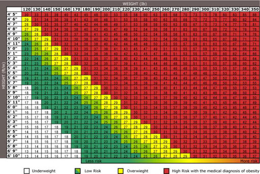
Answer
(a) 27.
(b) They are overweight.
(c) You cannot answer this question exactly using the table given. You can see from the table that a person who is 6’0” tall, weighing 190 lbs has a BMI of 26 and is low risk. So losing 60 lbs is sufficient. You also know that a weight of 200 lbs is too much to be classified as low risk, so losing 50 lbs is not sufficient. The table does not allow you to answer this question more accurately.
2.1.1 Try some yourself
Activity 6
The table below indicates the cooling rate of tea in a teapot.
| Time/mins | 0 | 5 | 10 | 15 | 20 | 25 | 30 | 35 | 40 | 45 | 50 |
| Temperature/°C | 90 | 65 | 60 | 50 | 36 | 35 | 30 | 26 | 25 | 22 | 20 |
(a) How long does it take for the tea to cool to 50°C?
(b) By how much does the temperature drop in the first 20 minutes? By how much does it drop in the second 20 minutes?
(c) How would you describe the pattern of cooling?
Answer
(a) 15 minutes.
(b) The temperature drops from 90°C to 36°C in the first 20 minutes, a total of 54 degrees. In the second 20 minutes, the temperature drops from 36°C to 25°C, a total of 11 degrees.
(c) The tea cools quickly at the beginning when it is hot, then cools more slowly when it is cooler.
2.2 Tables and percentages
Tables often give information in percentages. The table below indicates how the size of households in Great Britain changed over a period of nearly 30 years.
| Number of people in household | 1961 (%) | 1971 (%) | 1981 (%) | 1991 (%) |
|---|---|---|---|---|
| 1 | 14 | 18 | 22 | 27 |
| 2 | 30 | 32 | 32 | 34 |
| 3 | 23 | 19 | 17 | 16 |
| 4 | 18 | 17 | 18 | 16 |
| 5 | 9 | 8 | 7 | 5 |
| 6 or more | 7 | 6 | 4 | 2 |
| Number of households surveyed/millions | 16.3 | 18.6 | 20.2 | 22.4 |
| Average household size (number of people) | 3.1 | 2.9 | 2.7 | 2.5 |
Thus, in 1961, 14% of households consisted of only one person, compared with 27% in 1991. You can see a steady rise in the percentage of smaller families and a decline in the percentage of larger families over the 30-year period.
Other information can be extracted from the table by doing simple calculations. For example, in 1991, the total number of households surveyed was 22.4 million, so the actual number of four-person households surveyed is found by calculating 16% of 22.4 million, which is 3584 000 households. (Because 22.4 million is a rounded figure, this number of households will not be exact.)
Since each column in the table should include all the households surveyed, the total of all the entries in a column should be 100; indeed, for 1991,
27 + 34 + 16 + 16 + 5 + 2 = 100
However, the column total is not always exactly equal to 100. All the entries have been rounded to whole numbers, and this can sometimes introduce rounding errors. For instance, the total of the 1961 column is
14 + 30 + 23 + 18 + 9 + 7 = 101
Rounding errors are usually very small, so the total should always be very close to 100.
Sometimes the total percentages for both rows and columns are indicated, as in the table below which shows the percentages of families in Great Britain with different numbers of dependent children (at Spring 1998).
| Type of family | Number of dependent children | Total (%) | ||
|---|---|---|---|---|
| 1 (%) | 2 (%) | 3 or more (%) | ||
| Couple | 17 | 37 | 25 | 79 |
| Lone mother | 6 | 7 | 6 | 19 |
| Lone father | 1 | 1* | – | 2 |
| Total | 24 | 45 | 31 | 100 |
Footnotes
In tables like this, the row totals and the column totals should always add up to the same number. For example, in the table above,
total in row 4 = 24 + 45 + 31 = 100,
and
total in column 4 = 79 + 19 + 2 = 100.
Here, the row totals and the column totals both add up to 100, but in other tables rounding errors might mean that the two totals are not exactly 100 (though they should both be the same).
2.2.1 Try some yourself
Activity 7
Consider the table about household sizes.
(a) What was the total number of households surveyed in 1971?
(b) How many of the households surveyed in 1991 consisted of three people?
(c) What is the total for the 1981 column?
Answer
(a) The total number of households surveyed in 1971 was 18.6 million.
(b) The table shows that 16% of the households surveyed in 1991 consisted of three people. The actual number of such households was 16% of 22.4 million, which is 3.584 million.
(c) The total for the 1981 column is 22 + 32 + 17 + 18 + 7 + 4 = 100.
Activity 8
Consider the table about families with dependent children.
(a) What percentage of families have a single parent?
(b) What percentage of families are couples with 2 or more dependent children?
Answer
(a) The percentage of families with a lone mother is 19%
The percentage of families with a lone father is 2%
Hence the percentage of families with a singleparent is 19% + 2% = 21%
(b) The percentage of families that are couples with 2 dependent children is 37% and
The percentage of families that are couples with 3 or more dependent children is 25%.
Hence the percentage of families that are couples with 2 or more dependent children is 37% + 25% = 62%.
Activity 9
Below is a table summarising the cigarette-smoking habits of a sample of men in various age groups.
| Number of cigarettes | Percentage of each age group | |||||
|---|---|---|---|---|---|---|
| smoked per day | 16–24 | 25–34 | 35–49 | 50–59 | 60 or over | All aged over 16 |
| None | 62 | 52 | 52 | 50 | 60 | 55 |
| 1–20 | 18 | 19 | 20 | 21 | 24 | 22 |
| Over 20 | 19 | 29 | 28 | 28 | 16 | 23 |
| Number of men surveyed | 1850 | 2560 | 2470 | 1960 | 2150 | 10 990 |
(a) Write down the percentage of men aged between 25 and 34 who smoke over 20 cigarettes a day.
(b) How many of the men aged 60 or over are non-smokers?
(c) Which age group has the highest percentage of heavy smokers?
Answer
(a) Find ‘25–34’ in the column headings; then look down this column to the ‘Over 20’ row. This gives 29%.
(b) The ‘60 or over’ column shows that 60% of men aged 60 or over do not smoke, and that the total number of men aged 60 or over in the sample is 2150. So 60% of 2150 = 1290 of the men aged 60 or over are non-smokers.
(c) Suppose a ‘heavy smoker’ is defined as one who smokes more than 20 cigarettes per day. Then, less than 20% of men in the 16–24 age group and the 60 and over group are heavy smokers. In the 25–34, 35–49 and 50–59 age groups, well over 20% are heavy smokers. So these are the age groups with the higher percentages of heavy smokers, with the age range 25–34 having marginally the highest.
2.3 Pie charts
Pie charts are representations that make it easy to compare proportions: in particular, they allow quick identification of very large proportions and very small proportions. They are generally based on large sets of data.
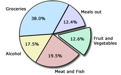
The pie chart below summarises the average weekly expenditure by a sample of families on food and drink. The whole circle represents 100% of the expenditure. The circle is then divided into ‘segments’, and the area of each segment represents a fraction or percentage of the total expenditure. For instance, groceries account for 38.0% of the total expenditure. The area of this slice is 38/100 of the total area.
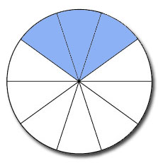
Pie charts can be constructed by dividing a circle into equal slices and then shading in the appropriate fractions. For example, the circle below is divided into 10 equal slices. The shaded area is ![]() or 30% of the total.
or 30% of the total.
Often, pie charts do not have the actual percentages or fractions marked on them, so it is difficult to glean any precise information. However, the percentages and fractions can be estimated.
Example 5
This pie chart shows how a sample of people first heard about their present jobs. Interpret the pie chart by estimating the percentage of people in each category.
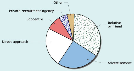
Answer
The percentages can be estimated by eye. Thus the largest proportion (about ![]() of the circle or 33%) heard about their jobs from a relative or a friend. About
of the circle or 33%) heard about their jobs from a relative or a friend. About ![]() or 25% took the initiative from an advertisement, and a slightly smaller proportion than that, perhaps 22%, followed a direct approach. The three smaller slices are more difficult to estimate: those hearing about their jobs through a Jobcentre correspond to about 10%, while the slices for the private recruitment agency and ‘other’ are each perhaps half of that, and so individually correspond to about 5% of the total.
or 25% took the initiative from an advertisement, and a slightly smaller proportion than that, perhaps 22%, followed a direct approach. The three smaller slices are more difficult to estimate: those hearing about their jobs through a Jobcentre correspond to about 10%, while the slices for the private recruitment agency and ‘other’ are each perhaps half of that, and so individually correspond to about 5% of the total.
To check these estimates, add the percentages. The total should be close to 100%:
33 + 25 + 22 + 10 + 5 + 5 = 100%
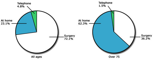
Pie charts can also provide a good visual comparison of proportions arising from different sets of similar data. The pie charts below summarise the methods used by people to consult their doctors. Here the actual percentages are quoted on the slices of the pies. The pie chart on the left presents information relating to people of all ages; the pie chart on the right presents information relating to elderly people. It can be seen that in the population as a whole, most people (72.1%) consult their doctors at the surgery; by contrast, most elderly people (62.3%) are likely to be visited by their doctors at home.
Example 6
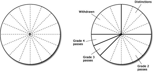
In one year a mathematics tutor found that four of her students gained distinctions, six gained Grade 2 passes, one a Grade 3 pass, one a Grade 4 pass and the other four students withdrew during the course. Draw a pie chart to represent these data.
Answer
First, calculate how many students there were altogether:
4 + 6 + 1 + 1 + 4 = 16 students.
Divide the pie into 16 equal slices and mark the correct number of slices for each category of students. The slices should then be labelled appropriately.
2.3.1 Try some yourself
Activity 10
This table categorises Tom's activities for the day.
| Activity | Time/hours |
|---|---|
| Sleeping | 8 |
| Working | 7 |
| Eating | 3 |
| Travelling | 2 |
| Watching TV | 3 |
| Other | 1 |
| Total | 24 |
Shade in the pie chart below to illustrate how Tom's day is broken up. Click on a colour in the list on the right, then click the segment you want to shade.
Activity 11
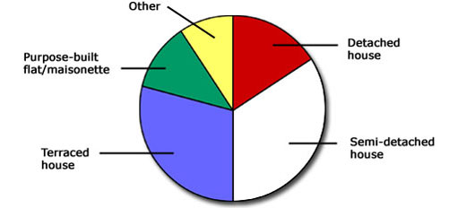
The pie chart below shows the proportions of people living in different kinds of accommodation in a particular town. Interpret what the pie chart indicates by estimating the percentage of people in each category.
Answer
The largest proportion of people (about 33%) live in semi-detached houses. About 30% live in terraced houses, and about 17% live in detached houses. About 10% live in flats or maisonettes, and about 10% live in some other type of accommodation.
Activity 12
These pie charts represent the proportions of the world's land area and population for various regions at the end of the twentieth century.

Make rough estimates of the fraction of the land area and the fraction of the population that are in each of the following regions:
(a) North America
(b) Asia and Oceania
(c) Europe
(d) Africa.
Answer
(a) North America has approximately a sixth of the land area and about a twentieth of the population.
(b) Asia and Oceania take up a little more than one third of the land area and have almost two thirds of the population.
(c) Europe has approximately a twelfth of the land area and an eighth of the population.
(d) Africa has a quarter of the land area and just over an eighth of the population.
(Note: Your answers may differ slightly as these are only rough estimates.)
2.4 Bar charts and frequency diagrams
Pie charts are useful for showing proportions, but different types of chart have to be used for representing other kinds of data. A number of these charts are described in this section. The most well known is the bar chart.
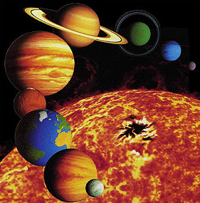
A bar chart can be seen below. The length of each bar represents the diameter of the planet. Among other things, the chart shows that the diameter of the Earth is about 13 000 km.
The bars on a bar chart are usually drawn not touching one another. Furthermore, to prevent a bar chart giving a misleading representation of the data, the bars should be the same width, and the scale (in this case, the diameter of the planet) should start from zero and be clearly labelled.

In the bar chart above, a numerical value is associated with each planet. In a similar way, a bar chart could be drawn representing, for example, the distances travelled in one hour by different modes of transport: on foot, by bicycle, etc. Again, a numerical value (distance travelled) would be associated with each category (foot, bicycle, etc.). For data of this kind, bar charts are usually the most suitable form of representation.
Another kind of data relates to how many items there are in a particular category. Such information is often presented in tables that are known as frequency tables – the frequencies are the number of times that each possibility occurred.
In some cases, the information given in a frequency table can be represented by a bar chart, but in other cases the nature of the data means that another kind of chart (as described later in this section) is required. For convenience, diagrams produced from frequency tables, whether bar charts or some other kind of chart, are all called frequency diagrams. Bar charts can be drawn with either horizontal or vertical bars but frequency diagrams often have vertical bars.
Example 7
This frequency table shows the number of children per household in a sample of 30 households. Draw a frequency diagram in the form of a bar chart to illustrate the information.
| Number | Number |
|---|---|
| of children | of households |
| 1 | 4 |
| 2 | 7 |
| 3 | 11 |
| 4 | 4 |
| 5 | 3 |
| 6 | 0 |
| 7 | 1 |
| Total | 30 |
Answer
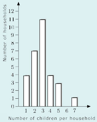
The number of children per household has been represented along the horizontal axis, and the number of households up the vertical axis. The height of each bar represents the number of households containing that number of children.
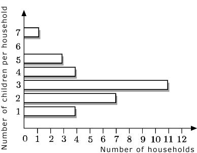
The bars in a bar chart can be drawn either horizontally or vertically. For example, the bar chart in Example 7 could have been drawn as follows:
It is important to appreciate that frequency diagrams in the form of bar charts are used only when data are collected in separate categories. Such data, called discrete data, are gathered by counting things. They include data that can only take certain values and cannot have intermediate values (for example, family size, which can only take whole numbers, or shoe size, which can only take whole and half numbers).
A different kind of frequency diagram is used to represent continuous data – data that are measured rather than counted (for instance, people's heights and weights, times taken for journeys or phone-calls). The distinction between discrete and continuous data shows up visually in frequency diagrams according to whether or not there are gaps between adjacent bars: thus, a frequency diagram for discrete data (that is, a bar chart) should have these gaps (to emphasise that the data are in separate categories), but a frequency diagram for continuous data should be drawn with a continuous scale and with adjacent bars touching (to emphasise the continuous nature of the data). Note that not all charts published adhere to this rule. You will meet the term ‘histogram’ for some kinds of frequency diagram used to represent continuous data.
Below is an example of a frequency diagram for continuous data. It represents the birthweights of 23 babies, as given in the table.
| Birthweight/grams | Number of babies |
|---|---|
| Above 1750 up to and including 2250 | 1 |
| Above 2250 up to and including 2750 | 0 |
| Above 2750 up to and including 3250 | 5 |
| Above 3250 up to and including 3750 | 12 |
| Above 3750 up to and including 4250 | 4 |
| Above 4250 up to and including 4750 | 1 |
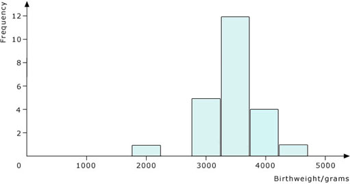
Notice that frequency diagrams for continuous data always have the frequencies shown vertically, while the horizontal scale is continuous. Also notice how the bars are drawn: the lines showing the divisions between each bar are at the boundaries between the groups of data (that is, at 2250 g, 2750 g, 3250 g, etc.). The height of each column shows the number of babies whose weights are in each group.
Sometimes you may want to compare the data given in two or more frequency diagrams. The two frequency diagrams for continuous data that are set out below show the waiting time until the first clinical assessment at the A&E departments of two hospitals, A and B. The waiting times of 300 people were surveyed for each hospital.
Click on ‘Hospital A’ or ‘Hospital B’ to see the respective frequency diagrams.
These frequency diagrams show that for Hospital A, the most often reported time waiting was between 30 and 35 minutes, while for Hospital B it was between 10 and 15 minutes.
2.4.1 Try some yourself
Activity 13
The frequency diagram below shows the numbers of people in different age groups in a sample of the UK population.
(a) What is the width of each age group?
(b) Which age group contains the largest number of people?
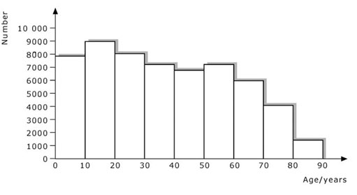
Answer
(a) The width of each age group is 10 years. For example, the ten ages 0, 1, 2, 3, 4, 5, 6, 7, 8 and 9 years make up the first age group.
(b) The largest number of people are in the age group 10 and above but less than 20 years.
Activity 14
The bar chart below represents the numbers of cars predicted to be sold by one company in nine successive years.
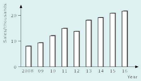
(a) How many cars were predicted to be sold in 2010?
(b) How many cars were predicted to be sold in 2015?
(c) What does the bar chart suggest about the pattern of predicted sales?
Answer
(a) About 12 000.
(b) About 21 000.
(c) Generally the sales figures are increasing, although there was a slight fall in 2012.
Activity 15
This table summarises the results of a survey of 300 people who were asked how long it took them to get from Central London to Heathrow Airport.
| Time/mins | Number of people |
|---|---|
| 30–35 | 30 |
| 35–40 | 60 |
| 40–45 | 110 |
| 45–50 | 50 |
| 50–55 | 30 |
| 55–60 | 10 |
| 60–65 | 10 |
| Total | 300 |
(a) Illustrate the information by means of a frequency diagram. (You may find it easiest to draw your frequency diagram on graph paper.)
(b) What does the width of each interval represent?
Answer
(a)
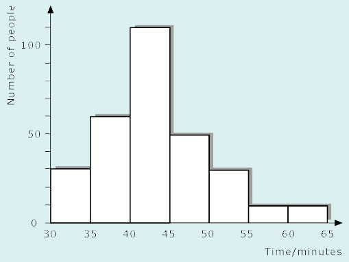
(b) The width of each interval represents 5 minutes of journey time.
3 Coordinates and graphs
3.1 Positive coordinates
For many towns and cities, an individual book of street maps called an A to Z has been produced. You can look up the name of a street in the index, and it will give you the page number of the map that contains the street, plus the grid reference square for the street. There are different conventions for these grid references. You may have met several of these.
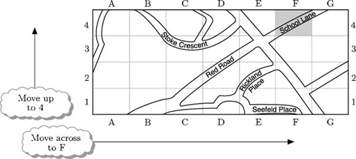
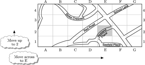
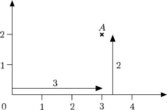
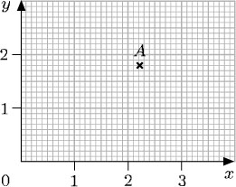
In mathematics, locating points on a grid is similar to finding a place on a map by means of grid references. However, the grid lines themselves are labelled, rather than the squares. For example, on the grid below, the point A is located by moving across 3 and then up 2.
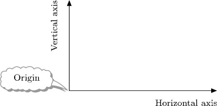
In the same way that the grid references on a map are based on a starting point – in Example 8 the starting point was the bottom left corner of the map (column A, row 1) – a starting point is needed to locate points on a mathematical grid. This starting point is called the origin. From the origin you can move horizontally across and vertically up: the line across is called the horizontal axis, and the line going up is called the vertical axis.
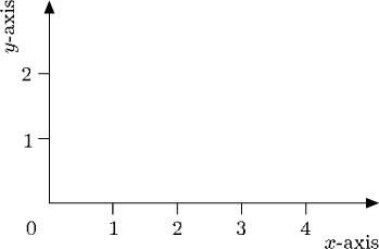
On a mathematical grid, the horizontal axis is often labelled the x-axis, and the vertical axis is labelled the y-axis. Scales are indicated on the axes to aid the location of points, and the origin is usually labelled 0.
The distance across to a point is called the x-coordinate of the point, and the distance up to a point is called the y-coordinate of the point. So, in the example below, A is located at the point with x-coordinate 3 and y-coordinate 2.
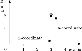
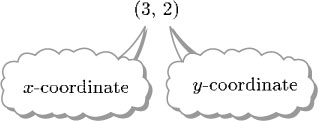
The coordinates of a point are written in brackets, with the x-coordinate followed by the y-coordinate, separated by a comma. Thus the coordinates of the point A above are written:
Example 9
Write down the coordinates of the points A and B.
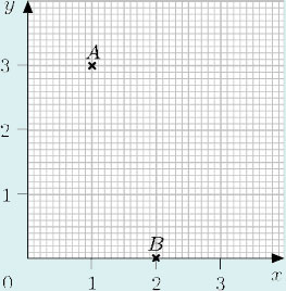
Answer
To locate A:
start at the origin;
move across 1 unit;
move up 3 units.
The coordinates of A are (1, 3).
To locate B:
start at the origin;
move across 2 units;
move up 0 units.
The coordinates of B are (2, 0).
3.1.1 Try some yourself
Activity 16
Write down the coordinates of A and B.
Answer
A (3, 1)
B (1, 4)
Activity 17
Draw an x-axis and a y-axis on graph paper. Plot the following points on your graph.
A (0, 0) B (0, 3) C (2, 0)
D (3, 3) E (2, 4) F (4, 2)
Click on the link below for a graph paper PDF to print and use.
Answer
3.2 Negative coordinates
Up to now only those points with positive or zero coordinates have been considered. But the system can be made to cope with points involving negative coordinates, such as (−2, 3) or (−2, −3). Just as a number line can be extended to deal with negative numbers, the x-axis and y-axis can be extended to deal with negative coordinates.
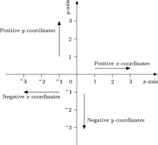
In this way, if a point is to the left of the origin, its x-coordinate is negative, and if it is below the origin, its y-coordinate is negative. The origin itself is (0, 0).
Example 10
Write down the coordinates of the points B, C and D. Remember that the x-coordinate is given first, and the y-coordinate is given second.
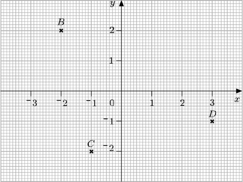
Answer
The point B is located 2 units to the left of the origin, so the x-coordinate is −2. The point is 2 units up from the origin, so the y-coordinate is 2. The coordinates of B are written (−2, 2).
The point C is located 1 unit to the left of the origin and 2 units below it. Therefore the coordinates of C are (−1, −2).
The point D is located 3 units to the right of the origin and 1 unit below it. Therefore the coordinates of D are (3, −1).
3.2.1 Try some yourself
Activity 18
Write down the coordinates of the points A, B, C, D and E.
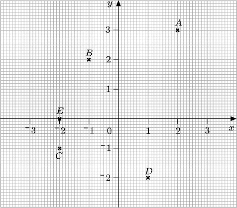
Answer
The coordinates of A are (2, 3).
The coordinates of B are (−1, 2).
The coordinates of C are (−2, −1).
The coordinates of D are (1, −2).
The coordinates of E are (−2, 0).
Activity 19
Plot these points on the grid provided below by dragging and dropping them in the correct place:
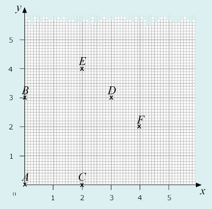
P(2, 3) Q(−2, 1) R(−3, 3) S(−1, −2) T(0, −3) U(3, −1)
3.3 Decimal and fraction coordinates
Where necessary, the coordinates of a point can be specified by using decimals or fractions. However, locating points whose coordinates are not whole numbers requires more precision when reading along the axes. For example, here the coordinates of the point A are (2.2, 1.8).
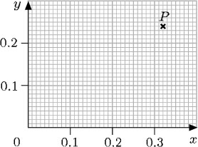
A point P with coordinates (0.32, 0.24) would be particularly difficult to plot accurately on the axes above because of the scales used. You can only plot the point approximately. But, if a larger scale were used for the axes, it would be quite easy to plot P with reasonable accuracy, as shown below.
Similarly, to plot points with very large coordinates, such as a point Q with coordinates (3020, −1450), a very different scale would be needed.
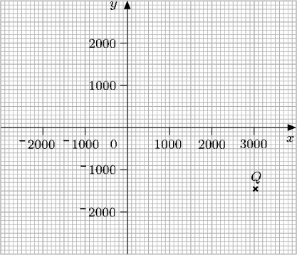
Notice that, even using scales like these, it is impossible to plot points such as Q exactly.
Mathematical coordinate grids are used for maps, plans, geometric diagrams and also for graphs. For the first three of these, the scales on the axes of the grid must be the same (otherwise shapes would be distorted and diagonal distances would be incorrect). For graphs, the scales on the axes need not be the same – in fact, often the two scales represent very different things.
3.3.1 Try some yourself
Activity 20
Look at the diagram below and answer the following questions:
(a) Write down the coordinates of the points P, Q, R, S and T.
(b) On this diagram, plot B (−1.5, 1.2), C (−2.8, −1.8) and D (0, 2.2) by dragging and dropping them in the correct place.
Answer
(a) P (2, 2), Q (1, −2), R (−2, −1), S (−3, 1), T (2, 0).
Activity 21
Plot these points on the grid provided below by dragging and dropping them in the correct place.
3.4 Drawing and interpreting graphs
A graph shows the relationship between two quantities. These quantities may be very different: for instance, the price of coffee in relation to different years, or the braking distance of a car in relation to different speeds, or the height of a child at different ages. Because the quantities are different, there is no need to have equal scales on the graph, and it is often impractical to do so. However, it is essential that the scales are shown on the axes: they should indicate exactly what is being measured and the units of measurement used.
Example 11
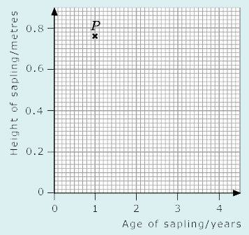
Write down the coordinates of the point P, and interpret those coordinates in terms of the labelling on the axes.
Answer
Here the horizontal axis represents the age of the sapling in years and the vertical axis represents the height of the sapling in metres. The coordinates of P are (1, 0.76), so the sapling was 0.76 m tall when it was one year old.
If you gather data yourself (perhaps by conducting an experiment or carrying out a survey) and want to represent that data graphically, you will probably have to decide what the axes should denote and what scales to use. This is often the hardest part of plotting a graph, and it is easy to go wrong at first. Ideally, the choices should be such that the points can be plotted and read off easily, and they should fill the available space sensibly.
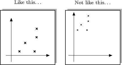
Because graph paper is usually marked off in squares of 5 units or 10 units, it makes sense to use scales such as
1 large square: 1 unit
1 large square: 5 units
1 large square: 10 units.
Sometimes other choices of scale may be sensible. For example, if you are plotting times, you might choose 1 square to represent 6 seconds, and 10 squares to represent 60 seconds or 1 minute.
Example 12
Which of the axes below are the most suitable to plot the data (11, 42), (15, 68), (3, 59) and (5, 72)? Select a graph using the corresponding check mark, then plot the points. Note that the origin, (0, 0), does not necessarily have to be included. As long as the axes are clearly labelled, there will be no confusion.
Answer
First, look at the range of the data. The x-coordinates range from 3 to 15: the smallest is 3, and the largest is 15. This suggests that the x-axis should range from 0 to 15. When the range of coordinates is compared with the size of the graph paper, a suitable scale for the x-axis seems to be 2 large squares to 5 units.
The y-coordinates range from 42 to 72. You could start at 0 and use a scale of 5 small squares to 10 units. But it is probably more practical to start the scale at 40 since all the y-coordinates are greater than 40, and use a scale of 1 large square to 10 units. Hence the axes below are the most suitable on which to plot the data.
When plotting the data, look at the first of the points, (11, 42). On the horizontal axis, 20 small squares represent 5 units, so 4 small squares represent 1 unit. Therefore, 11 is 4 small squares to the right of the point labelled ‘10’. On the vertical axis, 10 small squares represent 10 units, so 42 is 2 small squares above the point labelled ‘40’. The other points can be plotted in a similar way.
A set of plotted points can be joined up by a line or a curve. The resulting graph provides more information than the isolated points. It gives a better picture of a relationship and sometimes allows you to predict values in between the given points.
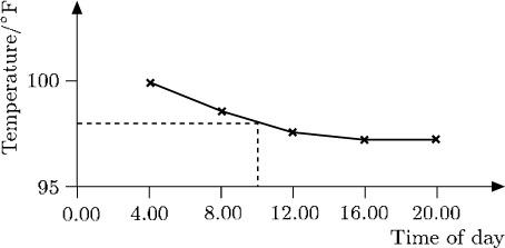
For example, the temperature chart below indicates the hourly progress of a patient. Experience suggests that there should not be any major fluctuations between the points marked, so it is reasonable to join up these points. You can then see clearly how the patient's temperature dropped and approached a normal value. Although the temperature was not taken at, say, 10.00, the graph indicates that it was about 98°F at that time.
In this case, the points have been joined up using straight lines. In other cases, points may be joined to give a smooth curve.
It is often easier to visualise relationships by using a graph rather than a table of data, as the following example shows. The data in this table shows the reported cases of a particular strain of the influenza virus over a 12-week period.
| Week number | Number of reported cases of influenza |
|---|---|
| 1 | 14 |
| 2 | 19 |
| 3 | 21 |
| 4 | 39 |
| 5 | 72 |
| 6 | 70 |
| 7 | 125 |
| 8 | 176 |
| 9 | 170 |
| 10 | 291 |
| 11 | 331 |
| 12 | 437 |
When plotted, the data produced these points:
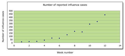
The points almost lie on a smooth curve – but not exactly. In such cases the graph is completed by drawing the smoothest curve possible. The graph illustrating the number of cases of influenza can therefore be completed as follows:
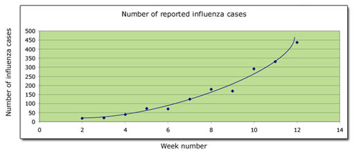
You can see at a glance that the number of cases increases slowly at first, and subsequently its rate of increase speeds up.
The number of influenza cases and time are the variables in the graph above. The number of cases is measured up the vertical axis, and time is measured along the horizontal axis. It is not always obvious which variable should be measured along which axis (though it is usual to measure time along the horizontal axis). It often does not matter: the important thing is that the axes are labelled and the units of measurement are clearly indicated, making it possible to interpret the graph correctly.
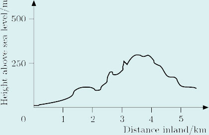
Example 13
In this graph, ground height above sea level is plotted against distance from the coast measured along a straight line running inland in an east-west direction. Interpret the graph.
Answer
The graph shows that, starting at sea level, the height rises gently at first, so initially the terrain is quite flat; then, after about 1 km, it rises irregularly, eventually reaching about 300 m after approximately 3.5 km, before falling again.
Sometimes several graphs are plotted together on the same axes so that the reader can compare the information. For example, the figure below shows graphs of the percentages of men in a certain community with various qualifications relative to age.
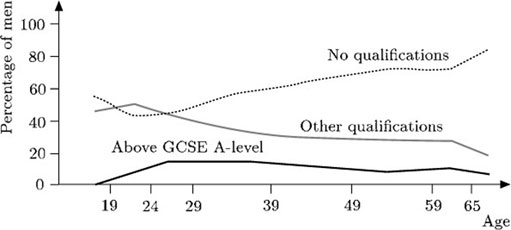
These graphs can be analysed separately. But it is also possible to compare the information from them, as the following observations indicate:
At the age of 49,
about 10% of the men have qualifications above A-level,
about 30% have some other qualification,
about 65% have no qualifications.
Notice that the total percentage is about 10 + 30 + 65 = 105%. The discrepancy arises because percentages can only be read approximately from the graph.
A higher percentage of younger men (aged over 20) have some form of qualification compared with older men.
The percentage of men with qualifications above A-level remains fairly constant for men aged over 26.
3.4.1 Try some yourself
Activity 22
Write down the coordinates of the point P on each of the graphs below and interpret these coordinates in terms of the labels on the axes.


Answer
(a) (12.00, 30). This means that the temperature at midday was 30°C.
(b) (9.5, 10). At 9.30 a.m. the temperature was 10°C.
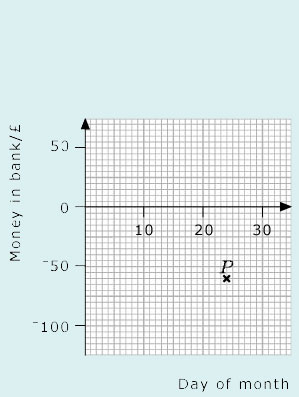
(c) (24, −60). On the 24th of the month there was −£60 in the bank (that is, the account was overdrawn by £60).
Activity 23
Choose the most suitable axes and plot the following sets of points:
(a) (2, 10), (4, 38), (7, 26), (5, 23);
(b) (350, 150), (420, 168), (630, 172), (570, 159);
(c) (140, 6), (−100, 30), (60, 13), (−60, 22).
Activity 24
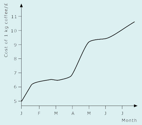
Summarise the information given by the graph below.
Answer
The cost of coffee increased over the period from £5 per kilogram to over £10 per kilogram. It remained more or less steady between February and April, rose significantly during the month of April, then increased slowly but steadily until July.
Activity 25
Draw a graph on graph paper based on the data in this table. What shape is your graph?
Click on the link below for a graph paper PDF to print and use.
| Length of bus journey/km | 0.5 | 1 | 1.5 | 2 | 2.5 | 3 | 3.5 | 4 |
| Cost/£ | 1.20 | 1.28 | 1.32 | 1.42 | 1.50 | 1.62 | 1.69 | 1.86 |
Answer
Again, the size of the graph paper and the scales used will have an effect, but your graph should resemble the one below. The graph is approximately a straight line.

4 Open Mark quiz
Now try the quiz and see if there are any areas you need to work on.
Conclusion
This free course provided an introduction to studying Mathematics. It took you through a series of exercises designed to develop your approach to study and learning at a distance and helped to improve your confidence as an independent learner.
Acknowledgements
The content acknowledged below is Proprietary (see terms and conditions) and is made available under a Creative Commons Attribution-NonCommercial-ShareAlike 4.0 Licence
Grateful acknowledgement is made to the following sources for permission to reproduce material in this course:
Course image: Alan O'Rourke in Flickr made available under Creative Commons Attribution 2.0 Licence.
Example 3 Table: Copyright © East Midlands Football (adapted);
Example 4 Table: Body Mass Index (BMI) chart
Size of Households Table: Office for National Statistics, Social Trends 29, 1999, Crown copyright material is reproduced under Class Licence Number C01W0000065 with permission of the Controller of HMSO and the Queen’s Printer for Scotland.
Don't miss out:
If reading this text has inspired you to learn more, you may be interested in joining the millions of people who discover our free learning resources and qualifications by visiting The Open University - www.open.edu/ openlearn/ free-courses