

1.3.5 Using colour to represent information
All UIs need to communicate information. Colour can be particularly effective for this. Table 4 summarises some of the techniques that are available.
| Technique | Description | Example |
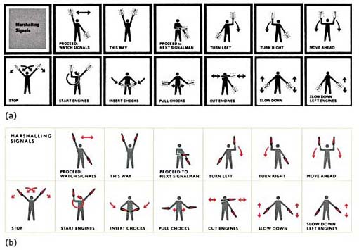
| Colour for emphasis | Colour can be used to emphasise the important areas of the screen or the key parts of a diagram. | Figure 4 shows two contrasting representations of marshalling signals. Part (b) uses colour to emphasise the lights; it is much easier to understand than part (a). |
| Colour for grouping | Colour can be used to organise the screen. | Areas of the screen containing different types of information may have a different background colour. |
| Colour coding | Colour can be used to represent a particular object or status; this is known as colour coding. | In an accounts package, the overdue accounts could be indicated by a red symbol. |
| Perspective | Colour can be used to reinforce perspective on the screen. | You should use dark or dim colours for the background and brighter colours for the foreground. Thus, the title bar of an active window is usually a brighter colour than that of an inactive window. |
| Layering | Related to the use of perspective is the use of colour to represent different layers within a diagram. | In an air traffic control system, high-flying planes could be a different colour to low-flying planes. The colours should be naturally related to each other, such as different shades of blue. |
Box 1 discusses an interesting use of colour.
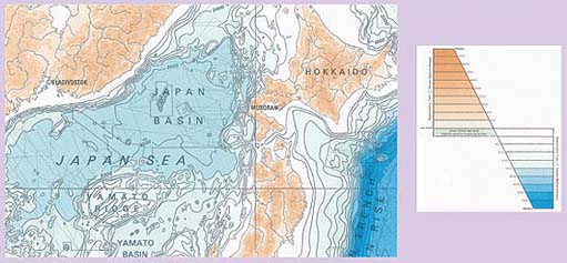
Box 1: Colour in the general bathymetric chart of the oceans
Figure 5 is part of the General Bathymetric Chart of the Oceans (International Hydrographic Organisation, Ottawa, Canada, 5th edition 1984, 5.06). The map shows the ocean trenches of the western Pacific and Japan Sea. It uses colour in an interesting and powerful way.
There are two distinct colour groups: different shades of green/brown and different shades of blue. We naturally associate these colours with land and sea, so there is no need to memorise their meaning. The colours are graded according to height (or depth), so the deeper the blue, the deeper the sea.
The colours are not used in isolation, as the contour lines also indicate the gradations.
The colours have been chosen so that they are clear to colour-blind users.
None of the colours are bright.
The contrast between the background colour and the text colour is good, so the text is legible.
Thus each point on the map signals four variables: latitude, longitude, sea/land, depth/altitude measured in metres. This would be very difficult to achieve without the use of colour.
Exercise 1
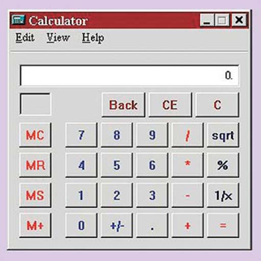
How effectively is colour used in Figure 6? (Or your own online calculator?) Take into account the following points:
Number of colours.
Colour perception.
Colour for reinforcement.
Intrinsic brightness.
Colour for emphasis.
Colour for grouping.
Perspective.
Discussion
Number of colours. Eight different colours are used, which is rather a lot. The colours appear to have been chosen arbitrarily. Each colour is used to help identify a group of buttons.
Colour perception. The colour combination is acceptable for most users with impaired colour vision.
Colour for reinforcement. Colour is used to help identify different groups of buttons. This grouping is reinforced by the numbers and letters on the buttons. Thus colour is not used in isolation.
Intrinsic brightness and colour for emphasis. The red and blue are both bright mixtures of the colour and this makes them stand out. For example, MC and 9. This makes them rather tiring to look at. It is not clear why some of the red buttons need to stand out as much as they do, but the blue buttons (the numbers) do need to be obvious. The grey background means the contrast between the text colour and the background is not that great, so flickering is not a problem.
Colour for grouping. The buttons are grouped together according to function: the buttons with blue text are numbers, the buttons with red control the memory, and so on.
Perspective. The buttons are bordered with darker grey to make them look as though they are raised from the screen and afford pressing.
It is important to consult users about their colour preferences from the start of the UI development process. Many designers will seek views at the first meeting with users, often employing coloured sketches to gain ideas, opinions and suggestions. They will then continue to evaluate the colours during each iteration of the design. Many systems give users the option to change colours to meet their personal tastes.
Activity 2
Microsoft Windows allows users to customise their systems to suit their personal preferences. Browser home pages can also be personalised. Observe five or six users’ selections of colour. Ideally, walk across a large open-plan office and simply take notice of the different choices people have made.
Discussion
When I crossed my open-plan office, I noticed the following.
A wide range of options had been selected, some of which did not meet my own ideas of good colour combinations.
A few users had done little beyond accepting the system defaults.
This demonstrates that people have many different colour preferences, which are probably impossible to predict without testing, including a willingness to accept the designer's selections – or an inability to change the defaults!