
The rise of texting and messaging
You might wonder about how these technologies change the way we live, work and relax, but sometimes it works the other way round. Unintended uses sometimes develop alongside the intended uses of emerging technologies in our information society. A classic example is the text-messaging facility on mobile phones, often referred to as SMS (which stands for short message service). This was originally a minor feature designed to be used by engineers testing equipment – it was not expected to be used by phone owners at all. Yet in the first decade of the twenty-first century, SMS messages were one of the most profitable parts of the mobile phone business (International Telecommunication Union, 2006). SMS resulted in a whole new method of communication and form of popular culture, different ways of interacting with radio and TV, and even a new language form: texting. Income from SMS messages peaked at around US$104 billion in 2011 (Associated Press, 2012).
In more recent times, instant messaging (IM) ‘apps’ used on smartphones, such as WhatsApp, Snapchat and Telegram, have overtaken SMS in popularity. By 2015, the IM company WhatsApp was handling 30 billion messages every day, compared with the 20 billion SMS messages sent daily (Evans, 2015). This difference in usage is partly because there is no extra cost involved in using IM services. SMS messages can be expensive on some contracts and require a mobile phone signal, but they are still in use. Multimedia messaging services (MMS) allow for text, audio and images to be sent via the mobile phone signal, The total number of SMS and MMS messages sent in the first three months of 2016 was 24.1 billion, a decrease of 1.8 billion messages (6.8%) compared to a year previously (Ofcom, 2016). These services and applications are blurring the boundaries between texting and online communication.
Note: ‘billion’ is a word that in the past had different meanings in the UK and the USA. However, the two countries now agree that a billion is one thousand million (1000 000 000) and this course will follow that convention.
Now read Box 2 before attempting the next activity.
Box 2 Interpreting charts
A bar chart is a way of representing numbers pictorially and can illustrate patterns or trends in the data. In a bar chart, the numerical values are represented by the height or length of the rectangles. Their particular strength is enabling us to make comparisons.
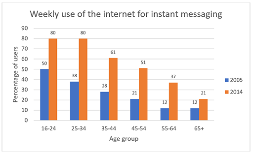
The chart in Figure 4 represents the percentage of internet users who used instant messaging in 2005 and in 2014 according to age group. All charts and graphs follow a set of conventions. The charts should include a title explaining what is shown or being represented. The two values being described in Figure 4 are the percentage of internet users and the age group. Each axis should be labelled clearly to indicate what units are being used and have a marked scale.
In this example, the vertical axis represents percentage of internet users on a scale of 0% to 90% and the horizontal axis shows the age group. As with all types of graph, it does not offer any explanations about why the data is how it is. You will have noticed that use varies by age group and that there has been a considerable increase in use over time across all age groups.
Activity 3 (self-assessment) Interpreting a chart about internet use
Study the chart in Figure 4 and then answer the following questions.
- a.Which age group shows the smallest increase in the percentage of internet users who instant messaged between 2005 and 2014?
- b.Which age group shows the biggest increase in the percentage of users between 2005 and 2014?
- c.Can you offer any explanation for the increase in use among all of the age groups?
Discussion
(a) The 65+ age group shows the smallest increase in the use of instant messaging, that is 9 percentage points.
(b) The 25–34 age group shows the largest increase in the use of instant messaging, that is 42 percentage points.
(c) One reason for the increase in use is that smartphones have become much more ubiquitous. While they are still expensive, the handsets are cheaper and more intuitive to use and the ‘bundles’ of telephone and internet access have become more affordable.