3.1.4 Proportion
There are many factors guiding a designer’s judgement of proportion. For an architect the proportion of a house doorway is guided by the height and width of the people who will pass through it. Similarly with knives and forks – their proportion is guided by the various sizes of the human hand. Some products are guided by technological factors, for example the ratio of height to width on a TV or computer screen. But what about graphic design where there are no physical human limitations or technological norms to conform to?
Most famously, the ‘Golden Ratio’ offers a solution. The ancient Greeks were the first to observe this phenomenon and to describe it mathematically. They saw this particular proportion in the structure of shells, horns, flower heads and many other examples of nature. Since this time it has been used as a guiding principle for establishing proportion. Let’s look at its characteristics.

The rectangle on the left of Figure 15 consists of a square that has been extended on one side in the ratio 1 to 1.618. That is, if the square is 1 unit high the width is changed to 1.618 units.
The new smaller rectangle can be similarly divided in the ratio 1:1.618. And you can continue until the working area becomes too small.
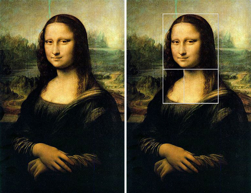
The artists in the Renaissance believed that if you arrange elements in the proportions of the Golden Ratio, the outcome would be visually pleasing. In retrospective analysis, proportions in Leonardo Da Vinci’s painting of the Mona Lisa seem to be based on the Golden Ratio (Figure 16, left). Another example of the application of the Golden Ratio can be seen in the proportions of the head and chest of Mona Lisa (Figure 16, right).

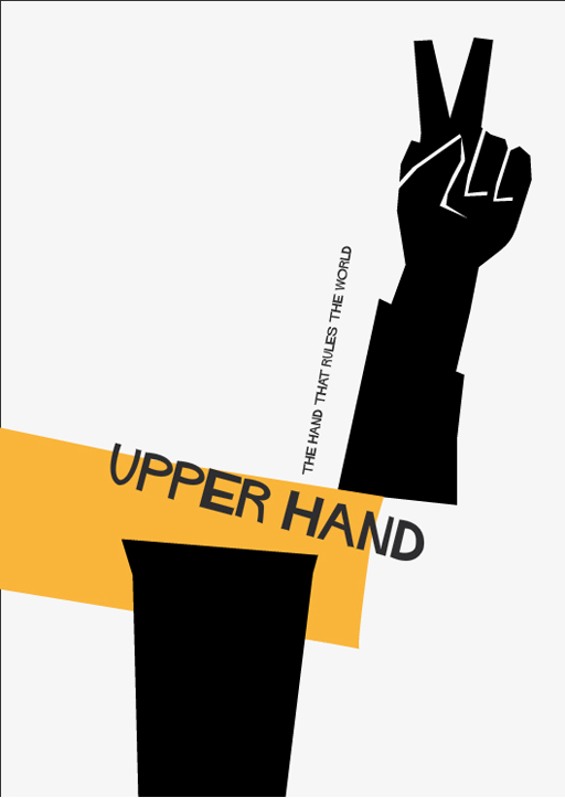
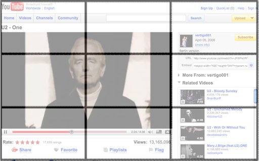
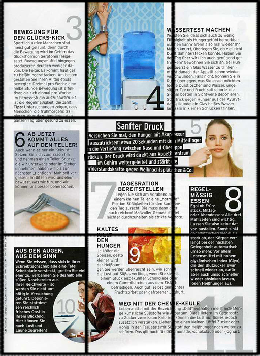
A simplified version of the Golden Ratio is expressed in the ‘rule of thirds’. This rule has already formed the structure for the Make a paper composition exercise. It says that if you divide your picture frame into thirds, that is, divide your total workspace into nine equal parts, this provides the necessary guidelines for placing text or images into a picture. Figures 17a and 17b illustrate this.
These two examples of modern graphic design exploit the rule of thirds. See how important parts of the composition start or finish on one of the guidelines. This rule has been widely used in photography but its direct and indirect influence can also be seen in the layouts of magazines, posters and web sites.
It has also been used to define the fronts of buildings such as office blocks. However, while the rules may provide a visually attractive facade to the building, the windows and doors might not end up in the appropriate places. Perhaps the requirements of the internal rooms, the circulation of people or safety should be considered first.
Even in graphic design these rules are really only guidelines. They provide pointers to help you achieve your design intention.
Activity 13 Rule of thirds
Now it is your turn to create a composition using the rule of thirds. Create a layout for a poster using the elements given in the interactive activity below. Simply click on an item to select it, e.g. a hand or a piece of text, then use the blue ‘action’ buttons to position and manipulate the items. You can scale and rotate each item, position items over one another, and also toggle the grid on and off.
Click on the link below to start the activity (open the link in a new tab or window by holding down Ctrl [or Cmd on a Mac] when you click on the link).
Rule of thirds interactive [Tip: hold Ctrl and click a link to open it in a new tab. (Hide tip)]
When you feel you have achieved a satisfying composition based on the rule of thirds click on ‘save’. This will allow you to save your design to your computer as a jpeg file. Use the title ‘Rule of Thirds’.
Discussion


