

3.4 Drawing and interpreting graphs
A graph shows the relationship between two quantities. These quantities may be very different: for instance, the price of coffee in relation to different years, or the braking distance of a car in relation to different speeds, or the height of a child at different ages. Because the quantities are different, there is no need to have equal scales on the graph, and it is often impractical to do so. However, it is essential that the scales are shown on the axes: they should indicate exactly what is being measured and the units of measurement used.
Example 11
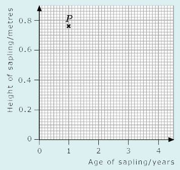
Write down the coordinates of the point P, and interpret those coordinates in terms of the labelling on the axes.
Answer
Here the horizontal axis represents the age of the sapling in years and the vertical axis represents the height of the sapling in metres. The coordinates of P are (1, 0.76), so the sapling was 0.76 m tall when it was one year old.
If you gather data yourself (perhaps by conducting an experiment or carrying out a survey) and want to represent that data graphically, you will probably have to decide what the axes should denote and what scales to use. This is often the hardest part of plotting a graph, and it is easy to go wrong at first. Ideally, the choices should be such that the points can be plotted and read off easily, and they should fill the available space sensibly.
Because graph paper is usually marked off in squares of 5 units or 10 units, it makes sense to use scales such as
1 large square: 1 unit
1 large square: 5 units
1 large square: 10 units.
Sometimes other choices of scale may be sensible. For example, if you are plotting times, you might choose 1 square to represent 6 seconds, and 10 squares to represent 60 seconds or 1 minute.
Example 12
Which of the axes below are the most suitable to plot the data (11, 42), (15, 68), (3, 59) and (5, 72)? Select a graph using the corresponding check mark, then plot the points. Note that the origin, (0, 0), does not necessarily have to be included. As long as the axes are clearly labelled, there will be no confusion.
Answer
First, look at the range of the data. The x-coordinates range from 3 to 15: the smallest is 3, and the largest is 15. This suggests that the x-axis should range from 0 to 15. When the range of coordinates is compared with the size of the graph paper, a suitable scale for the x-axis seems to be 2 large squares to 5 units.
The y-coordinates range from 42 to 72. You could start at 0 and use a scale of 5 small squares to 10 units. But it is probably more practical to start the scale at 40 since all the y-coordinates are greater than 40, and use a scale of 1 large square to 10 units. Hence the axes below are the most suitable on which to plot the data.
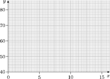
When plotting the data, look at the first of the points, (11, 42). On the horizontal axis, 20 small squares represent 5 units, so 4 small squares represent 1 unit. Therefore, 11 is 4 small squares to the right of the point labelled ‘10’. On the vertical axis, 10 small squares represent 10 units, so 42 is 2 small squares above the point labelled ‘40’. The other points can be plotted in a similar way.
A set of plotted points can be joined up by a line or a curve. The resulting graph provides more information than the isolated points. It gives a better picture of a relationship and sometimes allows you to predict values in between the given points.
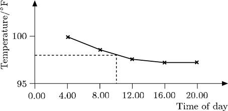
For example, the temperature chart below indicates the hourly progress of a patient. Experience suggests that there should not be any major fluctuations between the points marked, so it is reasonable to join up these points. You can then see clearly how the patient's temperature dropped and approached a normal value. Although the temperature was not taken at, say, 10.00, the graph indicates that it was about 98°F at that time.
In this case, the points have been joined up using straight lines. In other cases, points may be joined to give a smooth curve.
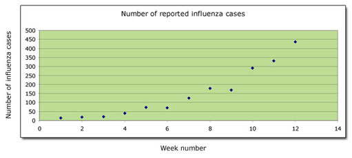
It is often easier to visualise relationships by using a graph rather than a table of data, as the following example shows. The data in this table shows the reported cases of a particular strain of the influenza virus over a 12-week period.
| Week number | Number of reported cases of influenza |
|---|---|
| 1 | 14 |
| 2 | 19 |
| 3 | 21 |
| 4 | 39 |
| 5 | 72 |
| 6 | 70 |
| 7 | 125 |
| 8 | 176 |
| 9 | 170 |
| 10 | 291 |
| 11 | 331 |
| 12 | 437 |
When plotted, the data produced these points:
The points almost lie on a smooth curve – but not exactly. In such cases the graph is completed by drawing the smoothest curve possible. The graph illustrating the number of cases of influenza can therefore be completed as follows:
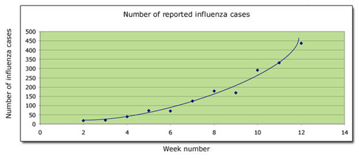
You can see at a glance that the number of cases increases slowly at first, and subsequently its rate of increase speeds up.
The number of influenza cases and time are the variables in the graph above. The number of cases is measured up the vertical axis, and time is measured along the horizontal axis. It is not always obvious which variable should be measured along which axis (though it is usual to measure time along the horizontal axis). It often does not matter: the important thing is that the axes are labelled and the units of measurement are clearly indicated, making it possible to interpret the graph correctly.
Example 13
In this graph, ground height above sea level is plotted against distance from the coast measured along a straight line running inland in an east-west direction. Interpret the graph.
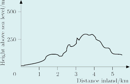
Answer
The graph shows that, starting at sea level, the height rises gently at first, so initially the terrain is quite flat; then, after about 1 km, it rises irregularly, eventually reaching about 300 m after approximately 3.5 km, before falling again.
Sometimes several graphs are plotted together on the same axes so that the reader can compare the information. For example, the figure below shows graphs of the percentages of men in a certain community with various qualifications relative to age.
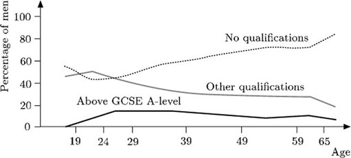
These graphs can be analysed separately. But it is also possible to compare the information from them, as the following observations indicate:
At the age of 49,
about 10% of the men have qualifications above A-level,
about 30% have some other qualification,
about 65% have no qualifications.
Notice that the total percentage is about 10 + 30 + 65 = 105%. The discrepancy arises because percentages can only be read approximately from the graph.
A higher percentage of younger men (aged over 20) have some form of qualification compared with older men.
The percentage of men with qualifications above A-level remains fairly constant for men aged over 26.