

3.3 Bar charts: nuclear power stations
A better way of displaying the data on nuclear power stations is by constructing a rectangular bar for each country, the length of which is proportional to the count. Bars are drawn separated from each other. In this context, the order of the categories (countries) in the original data table does not matter, so the bars in Figure 3 have been drawn in order of decreasing size from top to bottom. This makes the categories easier to compare with one another.
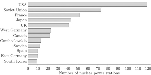
The display in Figure 3 is called a bar chart. The bars may be drawn vertically or horizontally according to preference and convenience. Those in Figure 3 have been drawn horizontally because of the lengths of the names of some of the countries. If the bars had been drawn vertically, the names of the countries would not have fitted along the horizontal axis unless the bars had been drawn far apart or the names had been printed vertically. The former would have made comparison difficult, while the latter would have made the names difficult to read. However, it is conventional to draw the bars vertically whenever possible.