

4.2 Scatterplots
In recent years, graphical displays have come into prominence because computers have made them quick and easy to produce. Techniques of data exploration have been developed which have revolutionised the subject of statistics, and today no serious data analyst would carry out a formal numerical procedure without first inspecting the data by eye. Nowhere is this demonstrated more forcibly than in the way a scatterplot reveals a relationship between two variables.
Look at Figure 13, which displays the data on cirrhosis and alcoholism from Table 5. This display is a scatterplot.
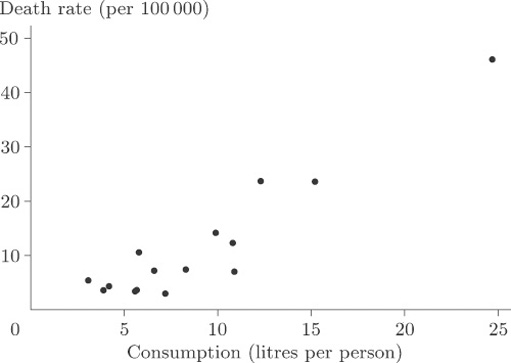
In a scatterplot, one variable is plotted on the horizontal axis and the other on the vertical axis. Each data item corresponds to a point in two-dimensional space. For example, the average annual consumption of alcohol in France for the time over which the data were collected was 24.7 litres per person, and the death rate per hundred thousand of the population through cirrhosis and alcoholism was 46.1. In this diagram consumption is plotted along the horizontal axis and death rate is plotted up the vertical axis. The data point at the coordinate (24.7,46.1) corresponds to France.
Is there a strong relationship between the two variables? In other words, do the points appear to fit fairly ‘tightly’ about a straight line or a curve? It is fairly obvious that there is a relationship, although the overall pattern is not easy to see since most of the points are concentrated in the bottom left-hand corner. There is one point that is a long way from the others and the size of the diagram relative to the page is dictated by the available space into which it must fit. We remarked upon this point, corresponding to France, when we first looked at the data, but seeing it here really does put into perspective the magnitude of the difference between France and the other countries. The best way to look for a general relationship between death rate and consumption of alcohol is to spread out the points representing the more conventional drinking habits of other countries by leaving France, an extreme case, out of the plot. The picture, given in Figure 14, is now much clearer. It shows up a general (and hardly surprising) rule that the incidence of death through alcohol-related disease is strongly linked to average alcohol consumption, the relationship being plausibly linear. A ‘linear’ relationship means that we could draw a straight line through the points that would fit them quite well, and this has been done in Figure 14.
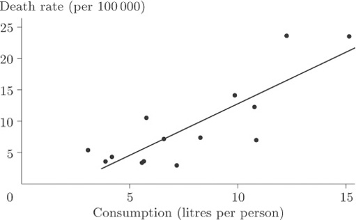
Of course, we would not expect the points to sit precisely on the line but to be scattered about it tightly enough for the relationship to show. In this case you could conclude that, given the average annual alcohol consumption in any country not included among those on the scatterplot, we would be fairly confident of being able to use our straight line for providing a reasonable estimate of the national death rate due to cirrhosis and alcoholism.
It is worth mentioning at this stage that demonstrating the existence of some sort of association is not the same thing as demonstrating causation; that, in this case, alcohol use ‘causes’ (or makes more likely) cirrhosis or an early death. For example, if cirrhosis were stress-related, so might be alcohol consumption, and hence the apparent relationship. It should also be noted that these data were averaged over large populations and (whatever may be inferred from them) they say nothing about the consequences of alcohol use for an individual.
France was left out because that data point was treated as an extreme case. It corresponded to data values so atypical, and so far removed from the others, that we were wary of using them to draw general conclusions.
‘Extreme’, ‘unrepresentative’, ‘atypical’ or possibly ‘rogue’ observations in sets of data are sometimes called outliers. It is important to recognise that, while we would wish to eliminate from a statistical analysis data points which were erroneous (wrongly recorded, perhaps, or observed when background circumstances had profoundly altered), data points that appear ‘surprising’ are not necessarily ‘wrong’. The identification of outliers, and what to do with them, is a research question of great interest to the statistician. Once a possible outlier has been identified, it should be closely inspected and its apparently aberrant behaviour accounted for. If it is to be excluded from the analysis there must be sound reasons for its exclusion. Only then can the data analyst be happy about discarding it. An example will illustrate the point.