
1.1 Simple boxplots
A boxplot is simple to construct. The following example on the β endorphin concentrations of collapsed runners will be used to show how this is done.
Example 1.1 Endorphin concentrations for collapsed runners
The β endorphin concentrations (in pmol/l) recorded for eleven runners who collapsed after the Great North Run are as follows (written in order of increasing size).

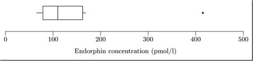
A boxplot for these data is shown in Figure 1.1.
(Data sourced from Dale, G., Fleetwood, J.A., Weddell, A., Ellis, R.D. and Sainsbury, J.R.C. (1987) Beta-endorphin: a factor in 'fun run' collapse? British Medical Journal, 294, 1004.)
The easiest way to understand exactly what a boxplot represents and how it is constructed is to think about how you would draw one by hand. The steps involved in constructing the boxplot in Figure 1.1 for the data set of β endorphin concentrations are as follows.
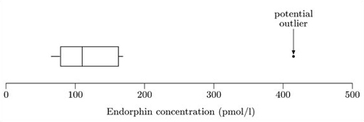
First, a convenient scale is drawn covering the extent of the data. Since the minimum is 66 and the maximum is 414, a scale from 0 to 500 (say) is suitable in this case. The boxplot is drawn against this scale.
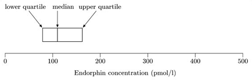
The median and quartiles are used to construct the ‘box’. The median of this data set is 110, and the lower and upper quartiles are 79 and 162, respectively. The box is shown in Figure 1.2.
The ‘box’ is a rectangle with edges defined by the lower and upper quartiles; so it indicates where the ‘middle 50%’ of the data can be found. The vertical line inside the box is located at the median.
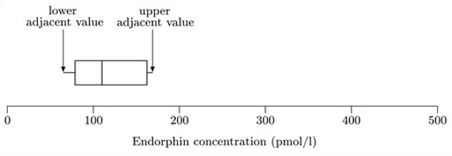
The ‘whiskers’ are constructed next. These are lines drawn parallel to the scale (so they are horizontal in this course). Essentially, each whisker extends outwards from the edge of the box as far as the most extreme observation. However, as you will see in the next step, some observations may be classified as potential outliers; and in fact the whiskers extend only to cover observations which are not classified as potential outliers. The whiskers are drawn outwards as far as observations called adjacent values. The lower adjacent value is the furthest observation which is within one and a half iqr (interquartile range) of the lower end of the box; and the upper adjacent value is the furthest observation which is within one and a half iqr of the upper end of the box. So the interquartile range is needed to construct the whiskers.
For these data, the interquartile range is 162−79=83. So

The highest observation not exceeding 286.5 is 169, so the upper adjacent value is 169, and hence the right-hand whisker extends as far as the observation 169. Similarly,

The lowest observation, 66, is greater than this, so the lower adjacent value is 66, and the left-hand whisker extends to 66. Notice that, in this example, the lower adjacent value is the same as the sample minimum, 66. Figure 1.3 shows the box with the whiskers extending to the upper and lower adjacent values.
Finally, any values not covered by the whiskers are marked separately. In some circumstances, they may be deemed outliers. At the least, they are potential outliers and merit special attention.
In this case, the only observation not covered by the whiskers is the maximum observation of 414. This is shown in Figure 1.4.
It must be stressed that boxplot construction is an area where there are no universally accepted rules. All boxplots show the three quartiles, but the conventions defining the extent of the whiskers vary from text to text and from one computer package to another. The whiskers may extend as low as one or even up to two interquartile ranges either side of the box. Some approaches even distinguish between moderate and severe outliers by using different symbols for them. Some textbooks and software always draw the whiskers right out to the minimum and maximum values and do not mark (potential) outliers separately. The approach adopted here is one of the simplest and is probably the most common.
You can see how a boxplot gives a quick visual assessment of the data. The length of the box represents the interquartile range and the lengths of the whiskers relative to the length of the box give an idea of how stretched out the rest of the values are. Thus these aspects of the diagram give an idea of the dispersion of the data set. The unusually large value in this data set is clearly shown and the median gives an assessment of the centre.
Some kind of assessment of symmetry is possible, since symmetric data will produce a boxplot which is symmetric about the median. These particular data are not symmetric; they are right-skew, and in fact the sample skewness is 2.572. The corresponding lack of symmetry shows up in the boxplot: the right-hand section of the box is longer than the left. However, it should be borne in mind that this particular data set has only eleven values, and this is too small a number to infer anything definite about any underlying structure.
You should now ensure that you understand simple boxplots by constructing one for yourself.
A boxplot displays the median, the quartiles, the range of values covered by the data and any outliers which may be present. It gives a clear picture of all these features and, as you will see, allows a visual appreciation of lack of symmetry.