
1.6 Exercise
Activity 3 Exercise 1.1 Memory recall times
In a study of memory recall times, a series of stimulus words was shown to a subject on a computer screen. For each word, the subject was instructed to recall either a pleasant or an unpleasant memory associated with that word. Successful recall of a memory was indicated by the subject pressing a bar on the computer keyboard. Table 1.5 shows the recall times (in seconds) for twenty pleasant and twenty unpleasant memories.
| Pleasant memory | Unpleasant memory |
|---|---|
| 1.07 | 1.45 |
| 1.17 | 1.67 |
| 1.22 | 1.90 |
| 1.42 | 2.02 |
| 1.63 | 2.32 |
| 1.98 | 2.35 |
| 2.12 | 2.43 |
| 2.32 | 2.47 |
| 2.56 | 2.57 |
| 2.70 | 3.33 |
| 2.93 | 3.87 |
| 2.97 | 4.33 |
| 3.03 | 5.35 |
| 3.15 | 5.72 |
| 3.22 | 6.48 |
| 3.42 | 6.90 |
| 4.63 | 8.68 |
| 4.70 | 9.47 |
| 5.55 | 10.00 |
| 6.17 | 10.93 |
Of key interest in this study was whether pleasant memories could be recalled more easily and quickly than unpleasant ones. Comparative boxplots for the two samples are shown in Figure 1.9.
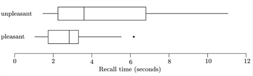
Use the boxplots to compare the distributions of recall times for the two types of memory.
Answer
Solution
The most obvious feature is that the recall times for unpleasant memories are on the whole longer than those for pleasant memories – the median, the lower quartile and the upper quartile for the ‘unpleasant’ sample are all above the corresponding values for the ‘pleasant’ sample. The dispersion is also considerably greater for the ‘unpleasant’ sample. (The interquartile range, as shown by the box lengths, is longer, and indeed so is the overall range and the lengths of the ‘whiskers’.)
Both samples are also skew. The pattern of skewness is simpler for the ‘unpleasant’ sample. It is clearly right-skew, with a long tail to the right (high values), as shown by the longer right whisker and also by the fact that the right part of the box (median to upper quartile) is longer than the left part. The ‘pleasant’ sample is not symmetric, but its pattern of skewness is a little more complicated to describe. The upper (right) whisker is longer than the lowe whisker, but the upper part of the box is shorter than the lower part.
Only one potential outlier is picked out in the boxplot – a relatively high value for the ‘pleasant’ sample. In view of the fact that it is actually not all that much higher than the upper adjacent value, perhaps this value should cause us no particular concern.