5.3 Histograms
5.3.1 What is a histogram?
The simplest definition of a histogram is that it is a bar chart with the adjacent bars touching each other. Unlike a bar chart, histograms are usually drawn only with vertical bars. Generally, histograms are used to illustrate continuous data whereas bar charts are used to illustrate discrete data (distinct categories).
5.3.2 When are histograms used?
A histogram is also a good method of representation if you want to illustrate a set of data in a way that is as easy to understand as it is simple to read. A histogram should be used for data that is continuous or has been measured on a continuous number scale. For example, you could use a histogram to show the number of live births by age of the mother or the pulse-rates of a group of 100 students (Figure 10). The pulse-rates have been grouped into intervals of 5 and represent values from 55 to 104 beats per minute.

5.3.3 When is a histogram not a good format to use?
A histogram is not the best way to show a link or mathematical relationship between two different sets of data.
5.3.4 How do I draw a histogram?
The method for drawing a histogram is very similar to that for a bar chart, but with the important difference that the bars or rectangles touch.
-
Decide on a clear title.
The title should describe the data you want to illustrate.
-
Identify how many bars are needed along the horizontal axis.
The bars correspond to the number of categories you have. Most histograms have intervals that are the same size but occasionally you may be asked to draw one with intervals of differing sizes. It is very important that you always check the size of each interval, as the width of each rectangle should correspond to its interval size. The histogram showing pulse rates (above) has equal intervals of 5.
-
Identify the scale you need for the vertical axis.
The size of the largest category determines what value the vertical scale needs to go up to. It is usual to then mark off intervening values at regular intervals on the vertical axis. However, the size of these regular intervals will probably be determined by the sizes of the other categories. The scale should start from zero.
-
Draw and label the two axes.
The labels should be simple and as clear as possible. The units should be shown, if appropriate.
-
Add the bars.
The bars of a histogram touch each other but should be visually distinct. This serves to illustrate that the data is continuous and is divided into a number of related categories.
Activity 12
You should now follow our calculation of a histogram from the information in Table 6.
100 people were asked to record exactly how much time they spent watching television during one particular weekend in June. The results are given in Table 6, which is untitled.
| Hours | Number of people |
|---|---|
| 0.00–0.99 | 7 |
| 1.00–1.99 | 19 |
| 2.00–2.99 | 24 |
| 3.00–3.99 | 32 |
| 4.00–4.99 | 10 |
| 5.00–5.99 | 5 |
| 6.00–6.99 | 3 |
-
As the title should describe the data, we chose ‘Number of hours of television watched by 100 people’. This title would fit both Table 6 and the histogram we want to draw.
-
There are seven categories, so we need seven bars along the horizontal axis. The intervals are all the same size.
-
The scale for the vertical axis depends on the number of people in each category: the smallest number is 3, the largest is 32, so the scale can run from 0 to 35 in intervals of 5.
-
The vertical axis should be labelled ‘Number of people’ and the horizontal axis ‘Hours’.
-
The bars are all the same width (because the intervals on the horizontal axis are all the same) and should touch each other (Figure 11).
Activity 13
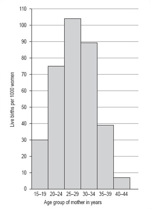
Now try drawing a histogram using the same steps and the information in Table 7 (untitled). The data in Table 7 is from 1997 and gives the number of live births per 1000 women in the UK.
| Age group of mother in years | Live births per 1000 women |
|---|---|
| 15–19 | 30 |
| 20–24 | 75 |
| 25–29 | 104 |
| 30–34 | 89 |
| 35–39 | 39 |
| 40–44 | 7 |
Discussion
The title of this histogram is not as obvious as you might think. You could go for ‘Number of live births by age of the mother in the UK in 1997’ or ‘Age-specific birth rates in the UK in 1997’. We chose ‘Live birth rates in the UK in 1997’.
There are six intervals, each spanning 5 years, which means that each of the six necessary rectangles should be the same width. Note, for example, that the 15–19 interval includes those mothers who have just turned 15 up to those who are about to turn 20.
The largest number of live births per 1000 women is 104 and the smallest is 7. This would suggest a scale that goes from 0 to 110 in steps of 10.
The axes should both be long enough for the chart to be easily read. The longer the vertical axis, the more accurately the height of the rectangles can be judged. The horizontal axis should be labelled ‘Age group of mother in years’ and the vertical axis, ‘Live births per 1000 women’.
The bars should be in order of ascending age. Your histogram should look like Figure 12.