
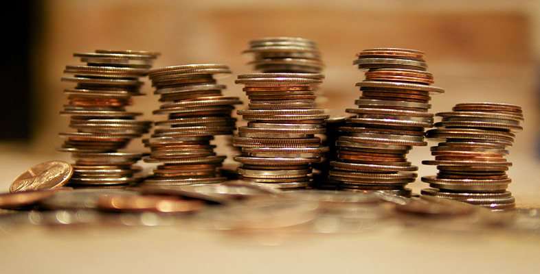
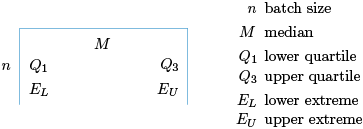
3.3 The five-figure summary and boxplots
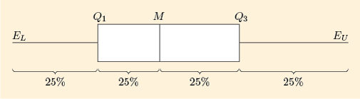
As well as giving us a new measure of spread – the interquartile range – the quartiles are important figures in themselves. Our -shaped diagram, Figure 19, gives five important points which help to summarise the shape of a distribution: the median, the two quartiles and the two extremes.

These are conveniently displayed in the following form, called the five-figure summary of the batch.
Example 18 Five-figure summary for television price data
For the television price data, we have , , , , and . (You last saw these data in Figure 16, Subsection 3.2.)
Therefore, the five-figure summary of this batch is

This diagram contains the following information about the batch of prices.
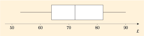
The general level of prices, as measured by the median, is £150.
The individual prices vary from £90 to £270.
About 25% of the prices were less than £130.
About 25% of the prices were more than £180.
About 50% of the prices were between £130 and £180.
We hope you agree that the five-figure summary is quite an efficient way of presenting a summary of a batch of data.
The five values in a five-figure summary can be very effectively presented in a special diagram called a boxplot. For the 14 gas prices (Figure 15, Subsection 3.2) the diagram looks like Figure 22.

The central feature of this diagram is a box – hence the name boxplot. The box extends from the lower quartile (at the left-hand edge of the box) to the upper quartile (the right-hand edge). This part of the diagram contains 50% of the values in the batch. The length of this box is thus the interquartile range.
Outside the box are two whiskers. (Boxplots are sometimes called box-and-whisker diagrams.) In many cases, such as in Figure 22, the whiskers extend all the way out to the extremes. Each whisker then covers the end 25% of the batch and the distance between the two whisker-ends is then the range. (You will see examples later where the whiskers do not go right out to the extremes.)
So far we have dealt with four figures from the five-figure summary: the two quartiles and the two extremes. The remaining figure is perhaps the most important: it is the median, whose position is shown by putting a vertical line through the box.
Thus a boxplot shows clearly the division of the data into four parts: the two whiskers and the two sections of the box; these are the four parts of the -shaped diagram and each contains (approximately) 25% of values in the batch (see Figure 21).
John W. Tukey (1915–2000), inventor of the five-figure summary and boxplot
John Tukey was a prominent and prolific US statistician, based at Princeton University and Bell Laboratories. As well as working in some very technical areas, he was a great promoter of simple ways of picturing and summarising data, and invented both the five-figure summary and the boxplot (except that he called them the ‘five-number summary’ and the ‘box-and-whisker plot’).
He had what has been described as an ‘unusual’ lecturing style. The statistician Peter McCullagh describes a lecture he gave at Imperial College, London in 1977:
Tukey ambled to the podium, a great bear of a man dressed in baggy pants and a black knitted shirt. These might once have been a matching pair, but the vintage was such that it was hard to tell. …The words came …, not many, like overweight parcels, delivered at a slow unfaltering pace. …Tukey turned to face the audience …. ‘Comments, queries, suggestions?’ he asked …. As he waited for a response, he clambered onto the podium and manoeuvred until he was sitting cross-legged facing the audience. …We in the audience sat like spectators at the zoo waiting for the great bear to move or say something. But the great bear appeared to be doing the same thing, and the feeling was not comfortable. …After a long while, …he extracted from his pocket a bag of dried prunes and proceeded to eat them in silence, one by one. The war of nerves continued …four prunes, five prunes. …How many prunes would it take to end the silence?
A typical boxplot looks something like Figure 23 because in most batches of data the values are more densely packed in the middle of the batch and are less densely packed in the extremes. This means that each whisker is usually longer than half the length of the box. This is illustrated again in the next example.
Example 19 Boxplot for the prices of small televisions
The boxplot for the batch of 20 television prices (last worked with in Example 18) is shown in Figure 24.
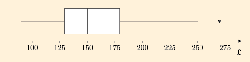
You can see that each whisker is longer than half the length of the box.
However, this boxplot has a new feature. The whisker on the left goes right down to the lower extreme. But the whisker on the right does not go right to the upper extreme. The highest extreme data value, 270, which might potentially be regarded as an outlier, is marked separately with a star. Then the whisker extends only to cover the data values that are not extreme enough to be regarded as potential outliers. The highest of these values is 250.
(This course does not describe the rule to decide which data values (if any) can be regarded as potential outliers that are plotted separately on the diagram. This is another issue that may be dealt with differently by different authors and different software.)
Example 19 is the subject of the following screencast. [Note that the reference to ‘Unit 2’ should be ‘this course’ and ‘Figure 18’ should be ‘Figure 23’. Unit 2 and Figure 18 are references to the Open University course from which this material is adapted.]
Transcript: Screencast 4 Interpreting a boxplot
One important use of boxplots is to picture and describe the overall shape of a batch of data.
Example 20 Skew televisions
The stemplot of small television prices, last seen in Figure 16 (Subsection 3.2), shows a lack of symmetry. Since the higher values are more spread out than the lower values, the data are right-skew.
The boxplot of these data, given in Figure 22, also shows this right-skew fairly clearly. In the box, the right-hand part (corresponding to higher prices) is rather longer than the left-hand part, and the right-hand whisker is longer than the left-hand whisker.
Activity 13 Skew gas prices?
A stemplot of the gas price data from Activity 2 (Subsection 1.2) is shown, yet again, in Figure 25.
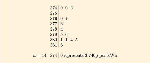
(a) Prepare a five-figure summary of the batch.
Discussion
All the necessary figures have already been calculated. You found the median (3.790) in Activity 2 and the quartiles (, ) in Activity 10. The extremes (, ) and the batch size () are clearly shown in the stemplot.
So the five-figure summary is as follows:

(b) Figure 27 shows the boxplot of these data that you have already seen in Figure 22. What do the stemplot and boxplot tell us about the symmetry and/or skewness of the batch?
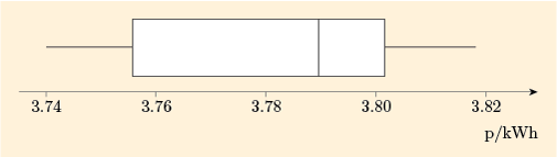
Discussion
Looking at the stemplot, on the whole the lower values are more spread out, indicating that the data are not symmetric and are left-skew.
The central box of the boxplot again shows left skewness, with the left-hand part of the box being clearly longer than the right-hand part. However, this skewness does not show up in the lengths of the whiskers in this batch – they are both the same length.
Example 21 Camera prices: skew or not?
In Example 20 and Activity 13 you saw how boxplots look for batches of data that are right-skew or left-skew. What happens in a batch that is more symmetrical?
For the small batch of camera prices from Table 2 (Subsection 1.2), a (stretched) stemplot is shown in Figure 28.
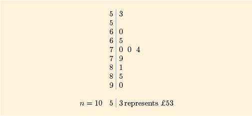
The stemplot looks reasonably symmetric.
A boxplot of the data, Figure 29, confirms the impression of symmetry. The two parts of the box are roughly equal in length, and the two whiskers are also roughly equal in length.
You have now spent quite a lot of time looking at various ways of investigating prices and, in particular, at methods of measuring the location and spread of the prices of particular commodities.
In order to begin to answer our question, Are people getting better or worse off?, we need to know not just location (and spread) of prices but also how these prices are changing from year to year. That is the subject of the rest of this course.