

3.1 Cheating with line charts
Line charts are often used to display the values of particular quantities, such as share prices, or sales figures, over a period of time. Such data is sometimes called time-series data. In this section, you will see various ways in which time-series data and other time-ordered data can be charted and explored in a graphical way.
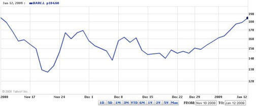
In order for the line chart to be meaningful, the origin of the graph – that is, the value on the vertical axis where it is crossed by the horizontal axis – is often chosen so that the variation in the quantity being graphed fills the chart. This is particularly the case where the range of the charted values (that is, the difference between the highest and lowest values) is much smaller than the magnitude of the values themselves. So, for example, in the chart in Figure 2 taken from Yahoo! (Yahoo! UK & Ireland, 2009) we see the value for the Barclays Bank share price in late 2008 and early 2009. The minimum price shown is around the 130 mark, and the maximum is nearly 190, so it makes sense to use a range on the vertical axis that is just a little larger than this.
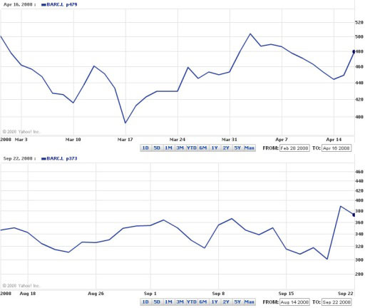
If you compare the two charts shown in Figure 3 for two different periods in 2008, you should notice that the automatically displayed range of values on the vertical axis is different in each case. If you don’t take care looking at the values on the vertical axes, you may fail to appreciate the difference in performance. You also need to be alert to the fact that the vertical scale in both charts is non-linear. This is particularly noticeable in the August to September chart on the bottom: the distance on the chart between the 440 and 460 lines is less than the distance between the 280 and 300 lines.
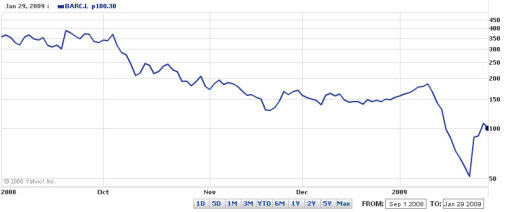
The effect of the non-linear scale is even more marked if we look at the chart in Figure 4, which is over the period September 2008 to January 2009: the horizontal lines are very much closer together near the top of the graph than they are near the bottom. But is a non-linear scale like this misleading for a quantity like share prices?
Activity 5 (exploratory)
Looking at Figure 4, which appears more dramatic: the (approximately) 150 pence drop in early October 2008, or the (approximately) 150 pence drop in January 2009?
Is the non-linear vertical axis misleading? To answer this, find the approximate percentage change in share value in each case.
Comment
The later drop appears far more dramatic. In October the drop was about 150 pence from a starting point of around 350 pence, which is approximately 40%, whereas in January the drop was about 150 pence from a starting point of around 200 pence, which is approximately 75%. So the January fall not only looks more dramatic on the chart, but is more dramatic. The non-linear vertical axis is therefore not misleading, instead it has helped us to visualise the relative severity of the two falls in price.
Activity 6 (exploratory)
Using an interactive line chart, explore a range of time-series data values over different time periods. By selectively choosing different periods of time, can you create different views of the time-series data that appear to tell a different story from the one that is being told when you look at the data over a longer time period. If the website will permit it, also change the origin (that is, the point at which the horizontal axis crosses the vertical axis).
Comment
You probably discovered from your exploration that changing the period of time and changing where the axes cross can create graphs that give very different impressions.
Activity 7 (self-assessment)
For a price varying between 10,000 and 10,250, how might you produce a line chart that at first glance makes it appear as if:
- the value is not changing much at all;
- the value is changing wildly?
Comment
- a.Set the range of the vertical axis range to be 0 to 11,000;
- b.Set the range of the vertical axis range to be 9900 to 10,300.
It is frequently the case that several data series collected over the same period of time will be displayed on the same chart, often using a different colour for the different data series. In such cases, the vertical axis scale may or may not be the same for each data series.
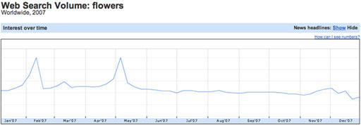
It’s worth bearing in mind that if a time-series data plot is actually an average of two or more related data sets, it may well tell a misleading story. For example, the plot in Figure 5 of Google search trend data suggests that searches for ‘flowers’ are popular three times in the first half of the year.
Or maybe not? See also Figure 6.
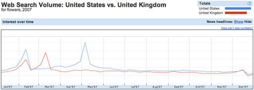
In Figure 6, which shows the search trends for ‘flowers’ in the UK and the USA separately, we see that peaks in search volumes may be localised to particular countries. Here, Valentine’s day is common to both countries, but Mother’s day is celebrated at different times of year.
There is some optional material on time-series data in section 9.1.