

5.2 Making your mark – plotting data points on a map
One of the easiest ways to plot location data onto a map is to add it as an overlay. That is, as a visualisation layer that sits on top of the actual map image layer.
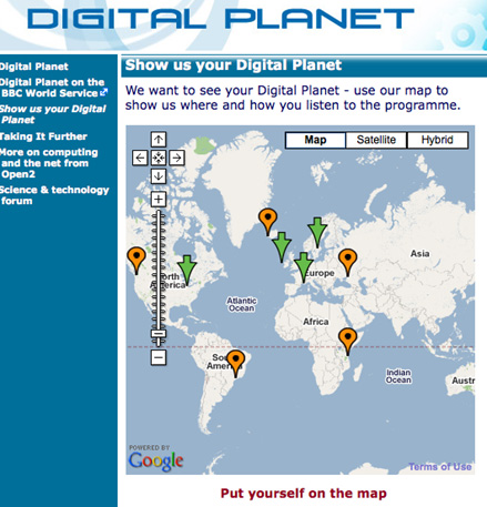
Many web services allow you to place one or more markers on a map and save them so that they can be viewed on a map on the same website – or another website – at a later date. There’s an example of this in Figure 14.
Map data can be syndicated, that is, pulled in to a remote map, using a data exchange format that can encode geographical location information, such as the latitude and longitude of a point, and maybe its altitude above sea level.
Two standards that have come to the fore on the geographical web are geoRSS and KML.
geoRSS is a lightweight, emergent standard that extends the RSS syndication protocol with latitude and longitude co-ordinates. Many online mapping tools accept geoRSS, which means that web publishers who publish their content via RSS feeds already can also push that content into a map-based display, if appropriate.
A good example of a site that supports this approach is flickr, the online photo sharing site, which allows users to add location metadata to their photographs, describing the location where they were taken. This information can then be exposed via geoRSS, or the flickr API, and used to create displays such as flickrvision, which plots recently uploaded photos on a map.
As with many online services, flickr publishes RSS feeds as geoRSS if there is location data available for any of the photos listed in the RSS feed.
A second, far more powerful, mark-up language is KML, once known as the ‘Keyhole Markup Language’. This language was originally created for use with the Keyhole 3D geographical visualisation tool that has become Google Earth. KML is now an Open Geospatial Consortium standard.
As well as describing straightforward location information, KML is capable of representing lines and complex polygons (that is, complex 2D and 3D shape overlays), as well as adding image overlays and carrying payloads (such as HTML and embedded video players) into geo-visualisation tools. KML files are often published in a compressed form as KMZ files, which is why you’ll often see Google Earth overlay files linked to files with the extension .kmz rather than .kml. Most services that are capable of accepting a KML file (that is, that will plot the points and overlays described within a KML file) can also read KMZ files.
As an example, click the following link to load a KML/KMZ file of OU Regional Centres into Google Maps [Tip: hold Ctrl and click a link to open it in a new tab. (Hide tip)] .
There is some optional material on exploring KML further in section 9.4, and some optional material on map overlaying skills in section 9.5.