

5.6 Heat (isopleth) maps
Commonly known as heat maps, density maps or isopleth maps use semi-transparent overlays above a map or other image (such as a web page) to show the density (or frequency) of events happening at each point on the underlying map.
In contrast to a choropleth map, where values are plotted for different predefined regions, heat maps show colour-based contour lines that connect points of equal value.
For example, Figure 17, a house price heat map from mousePrice, shows house price inflation in the north-west of England between May 2007 and May 2008.
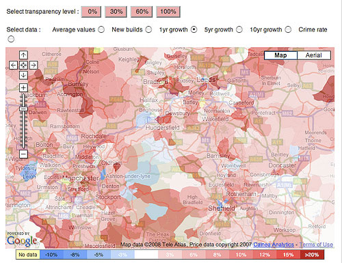
The ‘hot’ colours (reddish) are naturally taken to mean areas where there was a high one-year growth in house prices and the ‘cooler’ (bluish) colours to mean a lower increase in house prices over the same period – or, indeed, a decrease.
Heat maps have come to be widely used for plotting the incidence of crime within city confines, particularly in the larger US cities. An initiative in 2008 required UK police forces to start publishing crime maps reporting on the level of criminal incidents within their own jurisdiction.
Activity 14 (exploratory)
See if you can find the ‘crime map’ published by your local police authority. (If you don’t live in the UK and don’t have an equivalent where you live, you could try some UK city you may have visited.)
Does your local police authority use a heat map to display the results? If not, see if you can find a crime map that does use heat maps (but don’t spend more than ten minutes on this activity).
If possible, compare the crime heat map to a house price heat map for a similar area; from just the heat maps, does there appear to be any correlation between levels of crime and house price?
Heat maps and density mapping techniques are also widely used for displaying radio propagation data and satellite coverage data. For example, the SatBeams [Tip: hold Ctrl and click a link to open it in a new tab. (Hide tip)] website uses density mapping to plot geographical areas that are covered by particular communications satellites.
Heat maps elsewhere
As well as being used as overlays on geographical maps, heat maps are also widely used to provide reports about website usage. Information can be collected at a crude level based on the links that users click through on a web page to produce a click-density map, although it is possible to also track mouse cursor movements, or, in a laboratory setting, collect eye-tracking data.
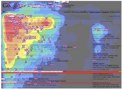
Figure 18 shows the result of eye-tracking and mouse-clicking data collected and aggregated from multiple users of the Google website (Enquiro Search Solutions, Inc., 2005). The hot spots (red, orange and yellow colours) are the places on the page that the users were looking at most, and the purple crosses show where users clicked on the page.
As well as supporting an understanding of user navigation behaviour on websites, eye-tracking heat maps can also be used to understand better how people read from the screen.
Activity 15 (exploratory)
Read F-Shaped Pattern For Reading Web Content, an article by Jakob Nielsen.
What do the eye-tracking results suggest about how people read web pages? How does the visualisation used in the Google ‘golden triangle’ screen make this sort of generalised pattern of behaviour apparent?
Activity 16 (exploratory)
Suggest two drawbacks of each of:
- choropleth maps
- heat or isopleth maps.
Comment
a.
- The fixed area boundaries in a choropleth maps suggest a discontinuity in the values portrayed either side of an area boundary, and different values of a measure within a geographical area are not shown.
- The use of a limited colour palette means that choropleth maps are unable to depict a wide range of actual values.
b.
- Heat or isopleth maps require a large number of data points in order to identify equal-value lines of a particular measure.
- Heat maps cannot be used in cases where the data is largely discrete or discontinuous – for example, the course codes of Open University courses being studied in households in a particular OU region.
There is some optional material on web developer skills in section 9.6.