

5.7 Cartograms
Cartograms are map projections in which the sizes of the countries depicted are dependent on the value of some statistical measure associated with that country. (To a certain extent, treemaps use a similar approach in that the area allocated to a category is proportional to the relative value of a quantity associated with that measure.)
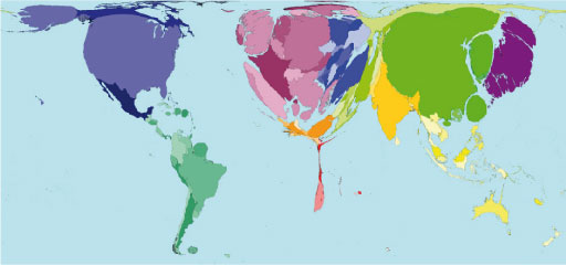
Figure 19 shows a cartogram of the world in which ‘territory size shows the proportion of all telephone mainlines that were found there in 2002’ (Worldmapper, 2006). (Here ‘telephone mainlines’ refers the UN measure of telephone lines connecting a customer’s equipment to the public switched telephone network.)
Note that quantities in international comparative data may often be ‘normalised’. This means that they are not absolute values but are related to the population size itself. So for example, a cartogram might display the number of mobile phones per 1000 people, rather than number of mobile phones in the country as a whole.
Activity 17 (exploratory) [Tip: hold Ctrl and click a link to open it in a new tab. (Hide tip)]
The Show/ World mapper is an online animated cartogram generator that will transform a ‘traditional’ map to an ‘exploded cartogram’ depicting one of several different data sets hosted on the Show/World site:
Worldmapper hosts a collection of several hundred different cartograms, some of which are reprinted in The Atlas of the Real World: Mapping the Way We Live:
Spend a few minutes exploring the cartograms on each site (about five minutes for each site). How easy are the cartograms to understand? What drawbacks are there in using a transformation of country size and shape to communicate statistical measures about different countries, compared to using visualisation techniques such as choropleth and proportional symbols maps within the context of a traditional map projection?
Comment
One major drawback of cartograms is that by distorting the shape of a country, it can become unrecognisable, except in relative terms (for example, I recognise country A, so that mangled shape next to it must be country B). In a choropleth or proportional symbol map, the map colouring or marker placement is typically applied to a map projection we are familiar with
Activity 18 (self-assessment)
You have met several types of map-based visualisation in Section 5. This activity enables you to test your grasp of their relative uses.
What sort of map-based visualisation might you use to display the following sorts of geographical data set?
- a.The approximate travel time to a college campus for students who live within a travel distance of 20 km.
- b.The number of students in each of the universities in England.
- c.The average income in each district of a local city.
- d.Members of your social network who are online at the same time as you.
Comment
- a.Heat maps are a good way of depicting travel time. For example, commuting time maps.
- b.If we assume a single location for each university, a proportional symbol map could be used to display the relative numbers of students at the different universities on a map.
- c.A choropleth map using electoral ward or postcode boundaries could be used to display average income in different areas of a town or city if the data is available for those geographical areas. At a push, you might even get away with using a cartogram to display this information!
- d.A simple marker-based map could be used to display the location of your family and friends on a map.