

Short run cost curves (1)
Activity 22
In the figure below we have an average (total) cost curve, an average fixed cost curve and an average variable cost curve. Using the drag and drop boxes, label the graph correctly.
Active content not displayed. This content requires JavaScript to be enabled.
Figure 35 Short run average cost curves (1)
Interactive feature not available in single page view (see it in standard view).
Answer
The correctly labelled figure is shown below.
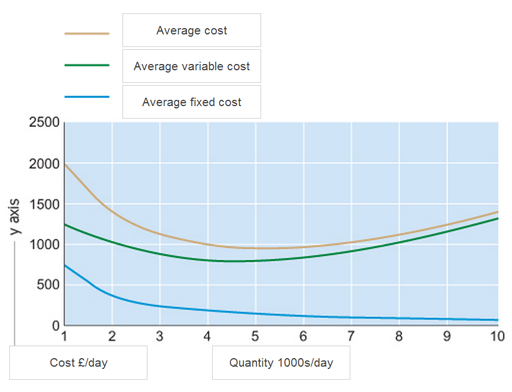
Figure 36
The cost curve has a vertical axis showing the cost in £ per unit. The horizontal axis shows the quantity, or units produced per day. This is shown in thousands of units per day.
The figure shows three short run cost curves.
- The lowest curve shows average fixed cost; average fixed cost will always fall as output increases.
- Next average variable cost; average variable cost has a characteristic ‘u’ shape due to the increasing and diminishing returns to variable factors.
- Finally, the average cost curve (sometimes referred to as average total cost curve) is the sum of average fixed and average variable cost. This means average cost is always greater than average variable or average fixed cost.
Notice that as output increases, the difference between average cost and average variable cost reduces. This is because average fixed cost decreases with output. Another way to think about it is that the difference between average cost and average variable cost equals average fixed cost.